
The problem with exported conic gradients
A branding agency delivered a full set of assets for a new logo, including SVGs of the mark and its loader animation, but the files could not be used as-is. The logo is a ring filled with a five-color conic gradient, and SVG has no native support for angled gradients. Exporting the design therefore requires a workaround—most commonly, converting the gradient to an image and embedding it in the SVG as a base64 string, which is the form the agency supplied.
The cost is in file size: the base64 PNG pushed a single SVG to nearly 1MB, against the roughly 2KB the file should occupy. Across three themes (no text, light text, dark text) that becomes about 3MB of images instead of 3KB of code. Rebuilding the logo as pure SVG was the response.

Building the static ring
Searching for ways to get a conic gradient into SVG turns up many techniques, most of them built on some clip-path arrangement. The implementation that was settled on starts with an SVG: a short <path> describing the ring's shape acts as a clip-path applied to a simple <rect>.
The gradient itself has to be filled in by something other than SVG paint. Color stops were matched by hand against the original over a lengthy tuning pass:
div.gradient {
  background-image: conic-gradient(from 270deg, #ff4800 10%, #dfd902 35%, #20dc68, #0092f4, #da54d8 72% 75%, #ff4800 95%);
}
The vehicle for the gradient is a <foreignObject> wrapping an ordinary <div> whose background-image is a CSS conic-gradient; the clip-path goes on the <foreignObject>. The logo stays fully vector and scalable in under 20 lines of code and under 2KB.
Replacing the GIF loader
The app's login loader was a GIF that had long been slated for replacement by pure CSS/SVG animation—faster rendering and a smaller file being exactly what a loading spinner benefits from.
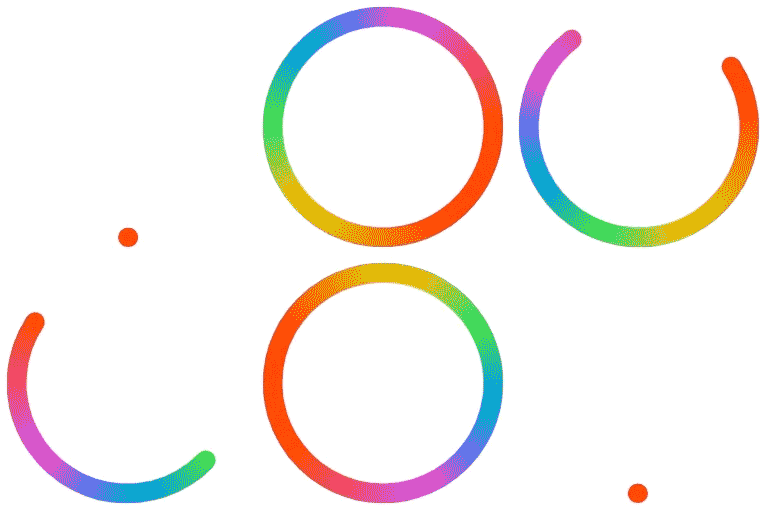
The movement itself follows the familiar stroke-dasharray/stroke-dashoffset technique. A new <path> sits in the center of the ring with no fill, and a stroke at the right stroke-width. Matching the designers' intended motion took iteration; the final version uses two animations, one driving stroke-dashoffset and a second rotating the whole <path> through a full turn.
Why clip-path breaks the animation
Because clip-path operates on an element's fill, animating a stroke disrupts the approach: either the motion must be animated another way, or the colors must be applied to the stroke another way. Most of the clip-path-based ideas found earlier could not be animated at all, so the search shifted toward a non-clip-path method for coloring the stroke. masking was among the options examined before the simplest solution appeared:
.logoBlend {
  mix-blend-mode: lighten;
}
A lighten blend mode compares the RGB value of each pixel of the rendered element against the background pixel behind it and keeps the higher one. White regions of the element stay white; dark regions take on the background's values.
Placing a white <rect> over the black path therefore hides everything behind it, while the area behind the animated black stroke remains visible. The <foreignObject> holding the conic-gradient can then be layered behind the mix-blend-mode element and given a plain rotate animation matching the design. One caveat: the result has a white background rather than the transparent background of the static logo. If transparency is required, the scheme can be inverted—black background, blend mode darken, light areas hidden.
Matching the designers' start animation
Some days later the agency delivered a Lottie-based JSON file of the same animation, which could have been used directly and was surprisingly small, but at 8× the SVG's size it lost out to the hand-built version—which was already nearly finished anyway. The Lottie file did contain a "start animation" in which a small orange dot grows into view, so that had to be added to the custom version.
The fix was a scaling animation at the beginning plus a short 0.5s delay applied to all three animations. Re-running the finished piece plays it from the initial dot.
Implementation notes
The assets are now lightweight and scalable across the company's web platforms. Because the codebase uses React, a small Logo component was written; it renders the SVG according to a theme passed as a prop, which simplifies use and keeps any future changes in one place.




