

The Shape of a Modern Tooltip
Tooltips and speech bubbles are a classic CSS pattern, but the usual approach—hard-coding pixel values and juggling multiple elements—tends to fall apart the moment you need a different tail position or a curved edge. With modern CSS, however, it is possible to build a flexible tooltip from a single element while controlling the shape through variables. The core trick is to combine a large border-image with the clip-path property. The former creates an overflowing area of color, while the latter carves out the rectangular bubble and its tail in one go.
We only need one element in the HTML:
<div class="tooltip">Your text content goes here</div>
That single element is enough to reach a surprising number of variations. Start with the simplest case: a tooltip with a tail at the bottom center. The entire shape fits in two CSS declarations:
.tooltip {
  /* tail dimension */
  --b: 2em; /* base */
  --h: 1em; /* height*/

  border-image: fill 0 // var(--h)
    conic-gradient(#CC333F 0 0); /* the color  */
  clip-path:
    polygon(0 100%, 0 0, 100% 0, 100% 100%,
      calc(50% + var(--b) / 2) 100%,
      50% calc(100% + var(--h)),
      calc(50% - var(--b) / 2) 100%);
}
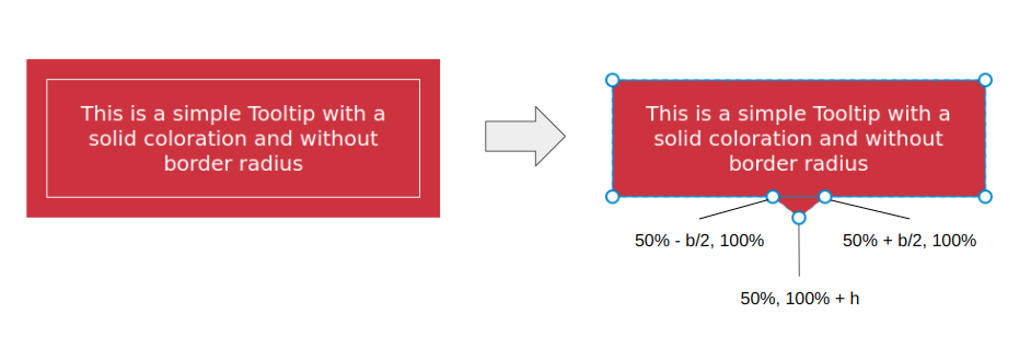
The border-image handles the “overflowing color” and the clip-path defines the coordinates of the polygon that makes up the bubble and the tail. Two variables control the tail’s dimensions:
More intuitive approaches exist, such as using a background color and adding padding for the tail, or applying box-shadow and outline to fill an outer area:
background: #CC333F;
border-bottom: var(--h) solid #0000;
background: #CC333F;
box-shadow: 0 0 0 var(--h) #CC333F;
These alternatives do work, but they require an extra declaration. The border-image method is also the foundation for the more complex shapes we can create later, so it is worth getting comfortable with it.
See the Pen [A simple Tooltip using 2 CSS properties](https://codepen.io/smashingmag/pen/ExrEXoO) by Temani Afif.
Moving the Tail
Adding a third variable, --p, controls the tail’s horizontal position. Earlier we used a fixed 50% value in the clip-path to center the tail. Replacing that with a variable lets you shift it left or right:
.tooltip {
  /* tail dimension */
  --b: 2em; /* base */
  --h: 1em; /* height*/
  --p: 50%; /* tail position */

  border-image: fill 0 // var(--h)
    conic-gradient(#CC333F 0 0); /* the color  */
  clip-path:
    polygon(0 100%, 0 0, 100% 0, 100% 100%,
      calc(var(--p) + var(--b) / 2) 100%,
      var(--p) calc(100% + var(--h)),
      calc(var(--p) - var(--b) / 2) 100%);
}
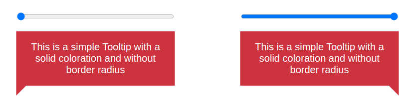
The --p variable accepts values from 0% to 100%, with 0% placing the tail at the far left edge and 100% at the far right. This interactive demo lets you scrub through the options:
See the Pen [Updating the tail position](https://codepen.io/smashingmag/pen/mdoLOGJ) by Temani Afif.
Notice that the tail runs off the edge when --p is set to the extremes. Two coordinates inside the polygon are responsible. The first needs to be clamped to 100% so the right side does not overflow:
calc(var(--p) + var(--b) / 2) 100%
clip-path: polygon(0 100%, 0 0, 100% 0, 100% 100%,min(100%, var(--p) + var(--b) / 2) 100%,var(--p) calc(100% + var(--h)),max(0%, var(--p) - var(--b) / 2) 100%);
The second coordinate is clamped to 0% to prevent overflow on the left:
calc(var(--p) - var(--b) / 2) 100%
See the Pen [Fixing the overflow issue](https://codepen.io/smashingmag/pen/mdoLRVr) by Temani Afif.
The min() and max() functions fix those edge cases. Instead of overflowing, the tail changes shape as it reaches the bubble’s boundary:
Changing the Tail’s Look
To alter the tail’s geometry rather than just its placement, introduce a fourth variable, --x, and add it to the --p value inside the clip-path:
.tooltip { /* tail dimension */ --b: 2em; /* base */ --h: 1em; /* height*/ --p: 50%; /* tail position */--x: -2em; /* tail shape */border-image: fill 0 // 9999px conic-gradient(#CC333F 0 0); /* the color */ clip-path: polygon(0 100%, 0 0, 100% 0, 100% 100%, min(100%, var(--p) + var(--b) / 2) 100%,calc(var(--p) + var(--x)) calc(100% + var(--h)),max(0%, var(--p) - var(--b) / 2) 100%); }
The variable can be positive or negative, in any CSS unit, and controls the tail’s angle:
var(--p) calc(100% + var(--h))
calc(var(--p) + var(--x)) calc(100% + var(--h))
This produces a tail that points left or right based on whether --x is positive or negative. Both variables are independent, so you can reposition the tail and change its slant without magic numbers slipping into the CSS:
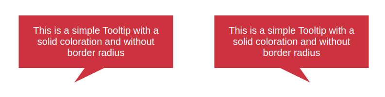
The result is a fully flexible tooltip. When the tail is stretched, it intentionally overflows the container’s bounds, and the earlier min()/max() clamping keeps the placement correct rather than clipping the tip.
See the Pen [Updating the tail shape](https://codepen.io/smashingmag/pen/ExMLZZB) by Temani Afif.
One adjustment I made here was updating the border-image outset to a very large value, 9999px, instead of relying on the --h variable. Since the tail can be many different kinds of triangles, the large outset guarantees that there is always enough colored area to fill the arbitrary shape defined by clip-path.
Gradient Tooltips
Coloring the whole tooltip with a gradient is usually where the pain begins, because the tail’s color must flow seamlessly into the container’s colors. This is not an issue with the border-image technique—it is already dealing with an image. To produce a flat color, the declaration uses a gradient with a single color stop:
border-image: fill 0 // var(--h)
  conic-gradient(#CC333F 0 0);
Swap that for a proper two-color gradient and the tooltip picks it up without any structural changes:
See the Pen [Adding gradient coloration](https://codepen.io/smashingmag/pen/GRedryE) by Temani Afif.
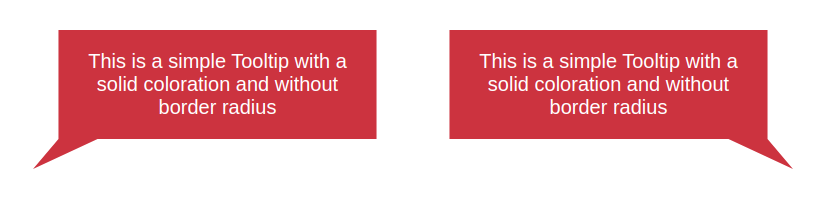
The only catch is aligning the border-image’s outset with its gradient. A solid color does not care how large the outermost visible area is, which is why the 9999px value works so well. With multiple colors, you do not want to stretch the gradient too far, or you risk clipping it. In the gradient example above, I used an outset of 0 0 var(--h) 0—just a bottom value to match the tail’s position and keep the gradient’s extent controlled. If the gradient looks off in your project, check the outset values before touching anything else.
Handling Rounded Corners With Border Images
Adding a border-radius directly to the previous examples won't work because the property is incompatible with border-image. To get rounded corners, you need to combine border-radius with a background on the tooltip, then use a specially tuned border-image value to create an overflowing bar at the bottom. A clip-path then trims the excess to produce the final bubble shape.
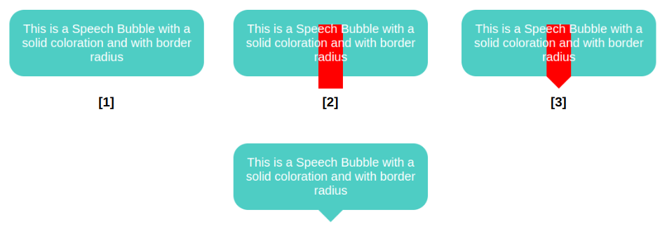
The nuance is in the border-image setup. You're building a gradient-based bar that extends below the element's boundary. Once you have that, applying the clip-path yields the desired silhouette. The technique gets more delicate when the tail sits close to the tooltip's edges; there, the tooltip's rounded corners and the tail's overflow can intersect and create a visual glitch.
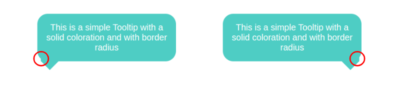
The fix requires adjusting the border-radius based on the tail's current position. The goal is to reduce the radius of the corner nearest to the tail as the tail approaches it. Using the eight-value border-radius syntax—where each corner has separate horizontal and vertical radii—you can apply this dynamic adjustment:
border-radius:
  /* horizontal values */
  var(--r)
  var(--r)
  min(var(--r),100% - var(--p) - var(--b)/2) /* horizontal bottom-right */
  min(var(--r),var(--p) - var(--b)/2) /* horizontal bottom-left */
  /
  /* vertical values */
  var(--r)
  var(--r)
  var(--r)
  var(--r)
When the tail is far from a corner, the horizontal radius remains at --r. But as the tail nears the corner, the radius gradually decreases to zero, maintaining a clean intersection. If you animate the tail's position, the corner radii smoothly and automatically stay in sync.
See the Pen [Fixing the edge cases](https://codepen.io/smashingmag/pen/ZEPoJpG) by Temani Afif.
Beyond Isosceles Tails
The dynamic-radius method is only reliable for a tail that is an isosceles triangle. For custom tail shapes, you must change the border-image itself. Instead of a simple triangle, the border image needs to be a horizontal bar that spans the entire bottom edge and extends far enough to cover the tail regardless of its position or shape.
.tooltip {
  /* tail dimension */
  --b: 2em; /* base */
  --h: 1.5em; /* height */

--p: 50%; /* position */
--x: 1.8em; /* tail position */
--r: 1.2em; /* the radius */
--c: #4ECDC4;

border-radius: var(--r) var(--r) min(var(--r), 100% - var(--p) - var(--b) / 2) min(var(--r), var(--p) - var(--b) / 2) / var(--r);
clip-path: polygon(0 100%, 0 0, 100% 0, 100% 100%,
min(100%, var(--p) + var(--b) / 2) 100%,
calc(var(--p) + var(--x)) calc(100% + var(--h)),
max(0%, var(--p) - var(--b) / 2) 100%);
background: var(--c);
border-image: conic-gradient(var(--c) 0 0) 0 0 1 0 / 0 0 var(--h) 0 / 0 999px var(--h) 999px;
}
This technique captures the custom-shape tail more consistently and handles extremes better at the cost of a more complex border-image declaration. For basic isosceles tails, the simpler approach is recommended since the extended-bar method can occasionally display minor artifacts in certain edge cases.
Combining Everything With One Pseudo-Element
Bringing rounded corners, a custom tail shape, and a gradient fill into a single component requires a cleaner structural approach. The most flexible method drops border-image altogether and delegates the tail to a dedicated pseudo-element.
.tooltip {
  /* triangle dimension */
  --b: 2em; /* base */
  --h: 1em; /* height */

--p: 50%; /* position */
--r: 1.2em; /* the radius */

border-radius: var(--r) var(--r) min(var(--r), 100% - var(--p) - var(--b) / 2) min(var(--r), var(--p) - var(--b) / 2) / var(--r);
background: 0 0 / 100% calc(100% + var(--h))
linear-gradient(60deg, #CC333F, #4ECDC4); /* the gradient */
position: relative;
z-index: 0;
}
.tooltip:before {
content: "";
position: absolute;
z-index: -1;
inset: 0 0 calc(-1*var(--h));
background-image: inherit;
clip-path:
polygon(50% 50%,
min(100%, var(--p) + var(--b) / 2) calc(100% - var(--h)),
var(--p) 100%,
max(0%, var(--p) - var(--b) / 2) calc(100% - var(--h)));
}
A pseudo-element creates the bottom tail and inherits the tooltip's gradient to keep the fill visually continuous. A critical detail is that your background-size must account for the pseudo-element's larger footprint. Because the tail's overflow adds to the total painted area, the gradient's height must be increased to cover it seamlessly:
See the Pen [Gradient and border radius](https://codepen.io/smashingmag/pen/ZEPoayw) by Temani Afif.
Generalizing this for asymmetric tails and side overflows uses the same idea: expand the gradient to match the pseudo-element's final bounds. Two variables act as controls:
--x: controls the tail's shape and direction.--_e: expands the gradient's width, the pseudo-element's inline padding, and its left and right offsets.
Setting --_e to 0 gives you the basic condition where the tail stays within the box. As the tail moves past the left or right boundary, increasing --_e accordingly extends the gradient to prevent any visible clipping.
See the Pen [Custom tail with border radius and gradient](https://codepen.io/smashingmag/pen/RwdyExJ) by Temani Afif.
What 32 Variations Come Down To
Across the examples covered here, the design space breaks down into:
- Two fill styles (solid or gradient).
- Two corner treatments (sharp or rounded).
- Two tail geometries (isosceles or custom).
- Four tail placements (top, bottom, left, right).
That's a total of 32 distinct tooltip shapes, which the final combined method can produce by adjusting its variables appropriately. Simpler control remains better for simple shapes. A basic tooltip needs only two lines of CSS, which is far more maintainable than a fully generalized solution. The techniques required to scale up from that basic case are tricks worth having at hand for parts outside tooltips. The full gallery of generated CSS shapes is available online, offering a reference you can use directly without memorizing every property combination. The remaining shapes still to come are broad enough to warrant their own article, meanwhile experimenting with a few self-built tooltips is a worthwhile preview.


