
The transitional state of block theme styles
Block theme styling is shifting away from hand-authored CSS toward JSON, but the change is incomplete. theme.json remains under active development, and until it covers every rule, themes still mix styles defined in theme.json, style.css, and at the block level. style.css is still required for block themes, though it now mostly carries the metadata used to register the theme. The practical guides are thin: the WordPress Theme Developer Handbook lacks block theme styling documentation, and much of what follows is drawn from release notes, Make WordPress discussions, and observation of the default themes.
Three default themes, three levels of CSS migration
- Twenty Twenty-One (TT1): The first block-compatible classic default theme. All 5,900 lines of its CSS live in
style.cssand it has notheme.json. The companion TT1 Blocks theme is a preview of early block styling rather than a model. All 5,900 lines of its CSS live instyle.cssand it has notheme.json. - Twenty Twenty-Two (TT2): The first true block-based default theme and the first to include
theme.json, at 373 lines. Its authors pushed for a CSS-less theme, but just under 150 lines still shipped instyle.cssbecause opentheme.jsonissues weren't resolved in the Gutenberg plugin before release. - Twenty Twenty-Three (TT3): Ships in WordPress 6.1 and is the first theme with an entirely empty
style.css.
Features landing in WordPress 6.1 move the system closer to styles fully defined in theme.json, but more work remains. The Gutenberg plugin previews that work, since experimental features get tried there first. The substantial remaining questions concern moving all CSS rules into theme.json and consolidating the different theme.json sources into a global styles UI inside the Site Editor.
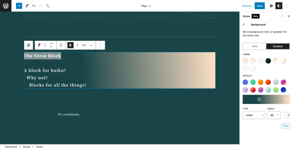
The current situation is awkward in both directions: there's no clear way to override theme styles, and it isn't always evident where a given style originates — one of several theme.json layers, style.css, the Gutenberg plugin, or elsewhere.
Why JSON at all
Gutenberg developer Ben Dwyer describes the problem the JSON approach targets: overriding layout, preset, or block CSS makes it harder to keep the front end and editor visually consistent, can conflict with upgrades to block internals, and produces custom CSS that doesn't travel well between block themes. Steering authors toward the theme.json API where possible lets WordPress resolve a defined hierarchy correctly: base > theme > user. A neutral summary.
JSON is machine-readable, so it can be fetched through an API and surfaced in the Site Editor UI, letting users customize appearance without writing CSS. It also gives blocks a consistent styling mechanism and a specificity structure in which user settings rank above theme-defined values. Theme authors get consistency; users get code-less customization.
JSON elements
Elements are the low-level styling targets of theme.json — representations of HTML primitives that aren't blocks themselves but can appear inside blocks. A single block might contain a heading, a paragraph, and a button; those pieces are elements, and their styles live in the elements object. Links are the clearest case: they aren't a block, but styling elements.link applies anywhere a link is used. Headings and buttons blur the line, since they are also registered as blocks yet can still be nested in other blocks.
Before WordPress 6.1, headings and links were essentially all that could be styled. WordPress 6.1 added buttons, captions, citations, and headings. Heading and H2 styles can be set globally without hunting through CSS files or DevTools, and the structure forms layers of specificity from broad to narrow — all headings, then a single heading level, then a heading inside a particular block.
{
  "version": 2,
  "settings": {},
  // etc.
  "styles": {
    // etc.
    "elements": {
        "button": { ... },
        "h1": { ... },
        "heading": { ... },
    },
  },
  "templateParts": {}
}| Element | Selector | Where it’s supported |
|---|---|---|
link | <a> | WordPress Core |
h1 – h6 | The HTML tag for each heading level: <h1>, <h2>, <h3>, <h4>, <h5> and <h6> | WordPress Core |
heading | Styles all headings globally by individual HTML tag: <h1>, <h2>, <h3>, <h4>, <h5> and <h6> | Gutenberg plugin |
button | .wp-element-button.wp-block-button__link | Gutenberg plugin |
caption | .wp-element-caption,.wp-block-audio figcaption,.wp-block-embed figcaption,.wp-block-gallery figcaption,.wp-block-image figcaption,.wp-block-table figcaption,.wp-block-video figcaption | Gutenberg plugin |
cite | .wp-block-pullquote cite | Gutenberg plugin |
How specificity resolves across layers
Element styles defined in theme.json count as default theme styles, and anything a user sets in the Global Styles UI overrides them. User styles carry more specificity than theme defaults. The Button block shows the ordering.
A button added to a new page in Emptytheme, a blank WordPress theme with no CSS, picks up only the light styling WordPress Core provides.

Activating TT3 changes the button's appearance, and the new rules trace back to TT3's theme.json: element styles in JSON outrank Core styles.

Overriding TT3 from a child theme's theme.json to make the Button block's default background red produces the result below — and the button inside the Search block stays unaffected.

That's the global level behaving as expected; the search button is styled at another level. Changing both buttons requires the user level, via the Global Styles UI in the site editor.

There, setting both buttons to blue with altered text wins over the theme styles.
The Style Engine
Specificity explains what wins, not where the winning CSS is generated. Core has its own defaults; theme.json contributes more rules; Global Styles overrides them. Inline? A separate stylesheet? A <script>? The Style Engine, new in WordPress 6.1, addresses this: a single API responsible for generating block styles from all sources and deciding where they're applied. Work completed so far:
- Consolidated back-end block support CSS generation into one place instead of several, covering margin, padding, typography, colors, and borders.
- Removed repetitive layout-specific styles and generated semantic class names.
- Reduced the number of inline style tags printed to the page for blocks, layouts, and elements.
The result is a foundation for one API holding all of a theme's CSS rules regardless of origin, a cleaner replacement for the pre-6.1 inline style injection, and a system for semantic class names.
Elements in practice: global, then block-level
TT3 styles all buttons at styles.elements.button in its global styles section.
{
  "version": 2,
  "settings": {},
    // ...
  "styles": {
    // ...
    "elements": {
      "button": {
        "border": {
          "radius": "0"
        },
        "color": {
          "background": "var(--wp--preset--color--primary)",
          "text": "var(--wp--preset--color--contrast)"
        },
        ":hover": {
          "color": {
            "background": "var(--wp--preset--color--contrast)",
            "text": "var(--wp--preset--color--base)"
          }
        },
        ":focus": {
          "color": {
            "background": "var(--wp--preset--color--contrast)",
            "text": "var(--wp--preset--color--base)"
          }
        },
        ":active": {
          "color": {
            "background": "var(--wp--preset--color--secondary)",
            "text": "var(--wp--preset--color--base)"
          }
        }
      },
      "h1": {
        "typography": { }
      },
      // ...
      "heading": {
        "typography": {
          "fontWeight": "400",
          "lineHeight": "1.4"
      }
      },
      "link": {
        "color": {
          "text": "var(--wp--preset--color--contrast)"
        },
        ":hover": {
          "typography": {
            "textDecoration": "none"
          }
        },
        ":focus": {
          "typography": {
            "textDecoration": "underline dashed"
          }
        },
        ":active": {
          "color": {
            "text": "var(--wp--preset--color--secondary)"
          },
          "typography": {
            "textDecoration": "none"
          }
        },
        "typography": {
          "textDecoration": "underline"
        }
      }
     },
    // ...
  },
  "templateParts": {}
}
--wp--preset--color--primary CSS variable, or #B4FD55.DevTools confirms the selector: .wp-element-button, the same class used for interactive states. Every button inherits that background because they share the selector and nothing overrides it. WordPress 6.1 also added pseudo-class support for elements in theme.json and the Global Styles UI — :hover, :focus, and :active.
Overriding the global background works through theme.json (preferably in a child theme) or the Global Styles settings without a child theme, but it changes every button. To target only the button inside the Search block, define styles on the styles.blocks object:
{
  "version": 2,
  // ...
  "styles": {
    // Global-level syles
    "elements": { },
    // Block-level styles
    "blocks": {
      "core/search": {
        "elements": {
          "button": {
            "color": {
              "background": "var(--wp--preset--color--quaternary)",
              "text": "var(--wp--preset--color--base)"
            }
          }
        },
        // ...
      }
    }
  }
}
Here styles.blocks.core/search.elements.button sets background and text to two built-in CSS variables. The search button turns red (--wp--preset--color--quaternary) while the default Button block keeps its green.


Worked example: heading styles at three depths
The goal: style all headings, then all Heading 2 elements, then Heading 2 inside the Query Loop block. Start from the outline that establishes global and block-level sections:
{
  "version": 2,
  "styles": {
    // Global-level syles
    "elements": { },
    // Block-level styles
    "blocks": { }
  }
}
Add headings to the global styles and set a color — the preset base color is below:
{
  "version": 2,
  "styles": {
    // Global-level syles
    "elements": {
      "heading": {
        "color": "var(--wp--preset--color--base)"
      },
    },
    // Block-level styles
    "blocks": { }
  }
}
Then change the Heading 2 color and size at the global level, using the primary preset and a fluid font size:
{
  "version": 2,
  "styles": {
    // Global-level syles
    "elements": {
      "heading": {
        "color": "var(--wp--preset--color--base)"
      },
      "h2": {
        "color": "var(--wp--preset--color--primary)",
        "typography": {
          "fontSize": "clamp(2.625rem, calc(2.625rem + ((1vw - 0.48rem) * 8.4135)), 3.25rem)"
        }
      }
    },
    // Block-level styles
    "blocks": { }
  }
}
Finally, fix the fontSize for Heading 2 when it sits inside the Query Loop:
{
  "version": 2,
  "styles": {
    // Global-level syles
    "elements": {
      "heading": {
        "color": "var(--wp--preset--color--base)"
      },
      "h2": {
        "color": "var(--wp--preset--color--primary)",
        "typography": {
          "fontSize": "clamp(2.625rem, calc(2.625rem + ((1vw - 0.48rem) * 8.4135)), 3.25rem)"
        }
      }
    },
    // Block-level styles
    "blocks": {
      "core/query": {
        "elements": {
          "h2": {
            "typography": {
              "fontSize": 3.25rem
            }
          }
        }
      }
    }
  }
}
That yields three stacking levels for Heading 2: all headings, all Heading 2s, and Heading 2s in the Query Loop block.
Where to look for real examples
Documentation for which JSON elements accept which CSS properties, and how to declare them, isn't official yet. Until it is, existing themes' theme.json files are the reference, and several are worth studying for block-level styling on the styles.blocks object in particular.
| Theme | What’s customized | Theme JSON |
|---|---|---|
| Blockbase | Buttons, headings, links, core blocks | Source code |
| Block Canvas | Buttons, headings, links, core blocks | Source code |
| Disco | Buttons, headings, core blocks | Source code |
| Frost | Buttons, headings, links, captions, cite, core blocks | Source code |
| Pixl | Buttons, headings, links, core blocks | Source code |
| Rainfall | Buttons, headings, links, core blocks | Source code |
| Twenty Twenty-Three | Buttons, headings, links, core blocks | Source code |
| Vivre | Buttons, headings, links, core blocks | Source code |
An unsettled editor
Frequent changes to the full-site editor frustrate many users, including technically experienced Gutenberg users. CSS rules that work fine in classic themes can fail in block themes because of the new specificity layers described above. On a GitHub proposal for a redesigned site editor with a new browse mode, WP Tavern's Sara Gooding writes:
It’s easy to get lost while trying to get around the Site Editor unless you are working day and night inside the tool. The navigation is jumpy and confusing, especially when going from template browsing to template editing to modifying individual blocks.
More changes — and probably a bumpy stretch — should be expected while this settles.




