
Accessibility From the Ground Up
Facebook's recent web rebuild was driven by more than a desire for a fresh look. The project presented an opportunity to bake accessibility into the site's foundation, something that was nearly impossible on the old codebase. Built in layers since 2004, the previous site had grown so complex that sweeping changes risked introducing regressions. A new architecture made it feasible to integrate accessibility tools and techniques from day one, leveraging the latest React features to support improved legibility, ARIA markup, and keyboard navigation.
In research with screen reader users conducted after the redesign, all participants chose to remain opted into the site, citing its improved accessibility. The techniques that made this possible span the entire development lifecycle, from static validation to runtime monitoring.
Enforcing Accessible Markup at Build Time
Early introduction of linting and Flow typing helped enforce accessibility standards as new features are developed. The team uses the open-source eslint-plugin-jsx-a11y plugin to catch ARIA violations during development. Flow typing goes a step further, enforcing that every interactive element—such as a button or link—must have a label property with a translated string:
type ButtonProps = $ReadOnly<{
	...
	label: TranslatedString,
	...
}>;
If a developer provides a string without considering internationalization, the build throws an error and blocks the change. This ensures accessibility labels scale globally.
Dynamic Text Scaling
For people with impaired vision, text must respect user-specified defaults or be dynamically resizable. Using rems (relative units) achieves this, but the approach introduces enforcement challenges and engineering overhead. To support font scaling without burdening developers, Facebook set up a build-time transform that lets developers write styles in pixels, then converts them to rems during compilation. All text scales appropriately, even if a component was styled using pixel values.
Contextual Heading Hierarchy
For screen reader users, headings are a primary method for understanding page structure and navigating between sections. An accurate, logical heading order is essential, but maintaining that order in a layout that changes as frequently as Facebook's is difficult. Facebook addressed this with React Context by introducing an API that guarantees a properly descending heading hierarchy. When a heading is nested within another section, the heading level is automatically incremented to match the visual layout:
<Heading>
  Main heading
</Heading>
<section>
   <Heading>
     Nested heading
   </Heading>
   Nested content
</section>
Which renders as:
<h1>Main heading</h1>
<section>
	<h2>Nested heading</h2>
	Nested content
</section>
Centralized Keyboard Command Registry
Debugging keyboard shortcuts and handling key command conflicts was historically a major undertaking, largely due to the inconsistent ways commands were registered across the codebase. Facebook created a centralized API using React Context that registers key commands tied to specific contexts. Developers can define contextual commands based on focus, commands for a specific view, or globally accessible commands. With this central system, it is easy to view all active commands; pressing "shift + ?" anywhere on the site displays a dynamic list that updates as focus moves or as users navigate.
Runtime Analysis Beyond Static Tools
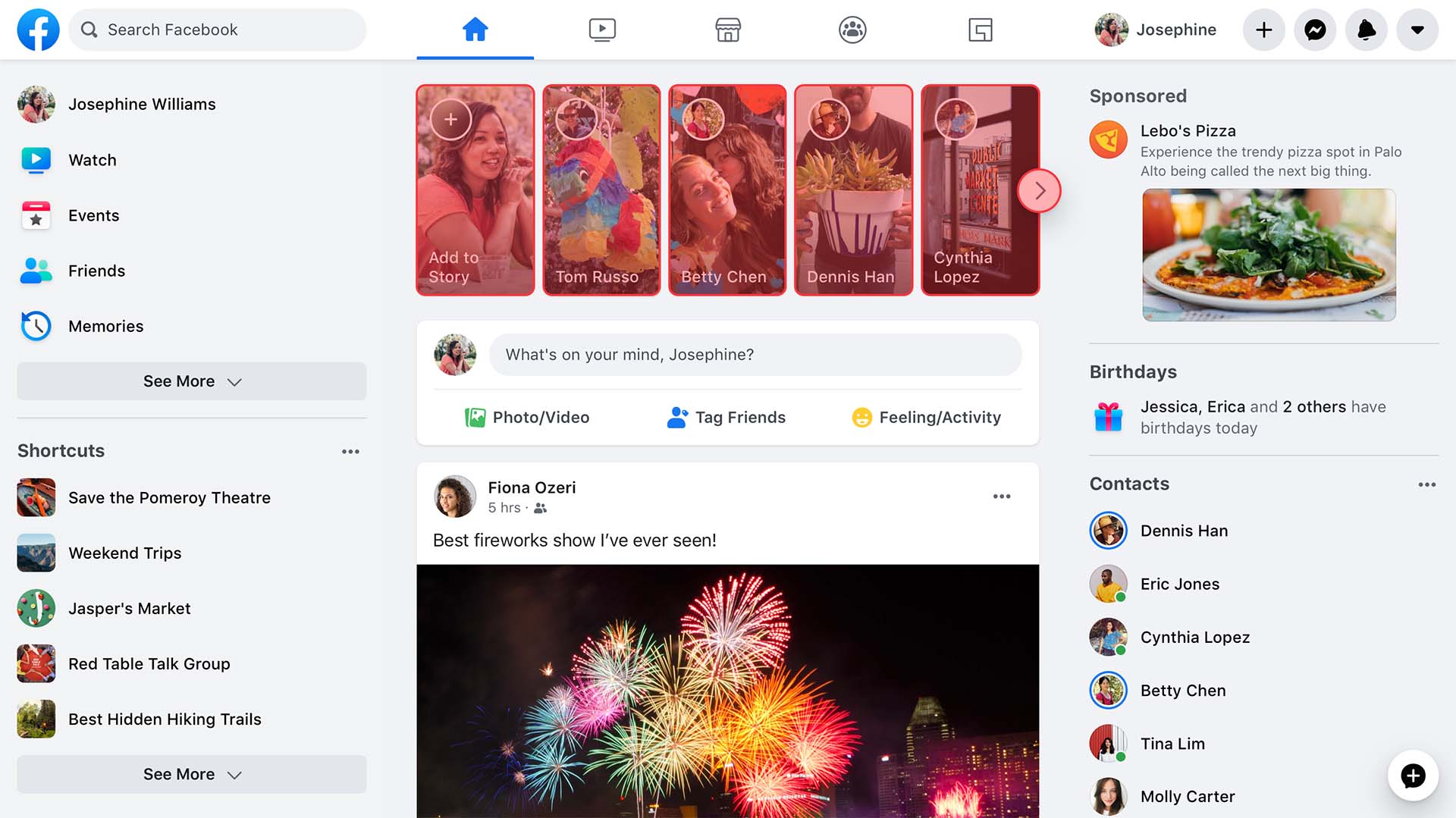
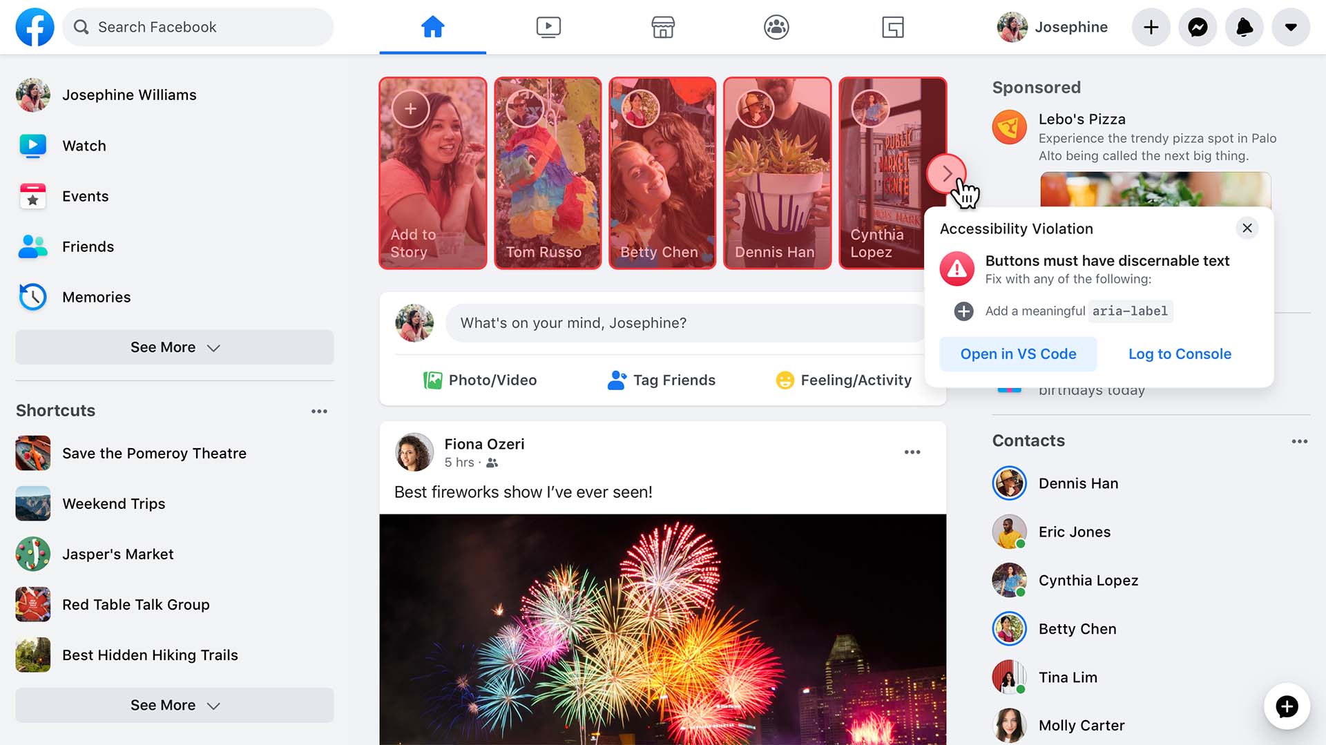
Linting and Flow catch issues at build time, but they only go so far. To validate markup as it appears on the live site, Facebook introduced a runtime analysis tool that runs automatically in the background. Unlike other plugins that require developers to opt in, this tool presents issues visually, using a red overlay to communicate the severity of an accessibility problem for a non-sighted person:
Reusable Accessible Base Components
Reusable components are a key way to help engineers build accessible experiences quickly without deep accessibility expertise. Facebook's base React components, which include interactive widgets like buttons, links, and input fields as well as semantic markers like headings and loading states, come with built-in accessibility. These follow specifications from the ARIA Practices Guide, which defines markup and behavior for both simple widgets and complex patterns like comboboxes, dialogs, tooltips, and carousels. React provides the flexibility to model all of these as components that guarantee correct keyboard behavior and markup while providing no styling, making them reusable across design systems. A button built atop this base structure only requires a developer to supply a label and an event handler:
<BlueButton
   label="Click me"
   onClick={doSomething}
/>
Declarative Focus Management
Focus management is one of the most challenging categories of accessibility, especially for screen reader users and sighted keyboard-only users. Facebook created a set of React components that replace manual .focus() calls, provide arrow key navigation, and control which interactions respond to the mouse and which to the keyboard. These components also handle browser inconsistencies and ensure focus is restored correctly after actions that might cause it to be lost. The FocusList component, for example, manages focus across lists and grids declaratively:
import FacebookMenu from 'FacebookMenu';
import FacebookLink from 'FacebookLink';
import {createFocusList} from 'FocusList';

const [FocusList, FocusItem] = createFocusList();

function DropdownList({navItems}) {
 return (
   <FocusList wrap={true}>
     <FacebookMenu>
       {navItems.map(navItem =>
         <FocusItem>
           <FacebookLink href={navItem.href}>
             {navItem.label}
           </FacebookLink>
         </FocusItem>
       )}
     </FacebookMenu>
   </FocusList>
 );
}
When a user focuses the DropdownList, they can navigate between links with the up/down/pageUp/pageDown keys. The engineer doesn't manage tabIndex or wrap behavior—the wrapping is handled automatically when the wrap prop is passed.
Screen Reader Alerts
To confirm that an action was successful—such as submitting a comment—Facebook introduced a hook that makes screen reader announcements simple:
const sendAccessibilityAlert = useAccessibilityAlert();
sendAccessibilityAlert('Your comment has been submitted');
Behind the scenes, the hook appends an aria-live region to the page, replacing any previous announcement with new alert text. The system also de-dupes repetitive alerts that occur in quick succession.
Next Steps
The work is ongoing. Facebook plans to continue improving the keyboard experience and its automated alt text system. Product flows are also reviewed regularly with disability community members and accessibility specialists to identify and address remaining issues. These efforts are aimed at building a technical foundation that supports an equitable experience for everyone using the site.


