

Organic shapes in CSS with shape()
Monotone geometry — rectangles, circles, rounded rectangles — is routine CSS. Triangles, hexagons, stars and hearts take more effort but remain straightforward with modern features. Shapes with real randomness and many curves are a different problem: wavy, wiggly, blob, squiggly, ragged, torn. Whatever the name, these usually live in the SVG world or arrive as images exported from design tools. The shape() function now lets us build them in CSS.
Building them by hand is still tricky; the math and calculations add up quickly. Daniel C. built a set of generators around the problem — a wavy divider generator, a fancy frame generator and a blob generator — and you can pull the code out after adjusting a few settings. A generator output is a starting point; knowing the underlying technique lets you hand-tune variations the tool does not expose.
The core rule: joining curves smoothly
All of the generated shapes share one technique: a chain of curve commands. The visual trick is making two adjacent curves share a tangent so the result reads as one continuous stroke.
What a single curve draws
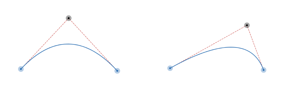
One curve command, using a single control point, divides its segment like this:
Placing two curves side by side
Two curves touch at a shared point: E1, the endpoint of the first, is S2, the start of the second. For the pair to read smoothly, E1/S2 must sit on the segment between C1 and C2, the two control points. Miss that criterion and the join becomes a visible kink.
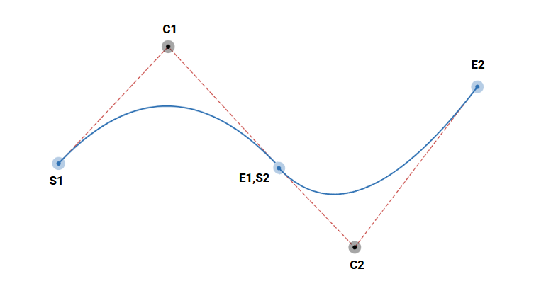
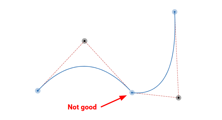
The generative approach follows from there: randomly place consecutive curves while keeping every shared endpoint on the line between its neighbouring control points. For simplicity, treat that shared point as the midpoint of the two control points. Fewer degrees of randomness to manage, and the smoothness criterion is satisfied by construction.
From wavy edge to blob
The simplest variant is a wavy divider: randomness along one edge only.
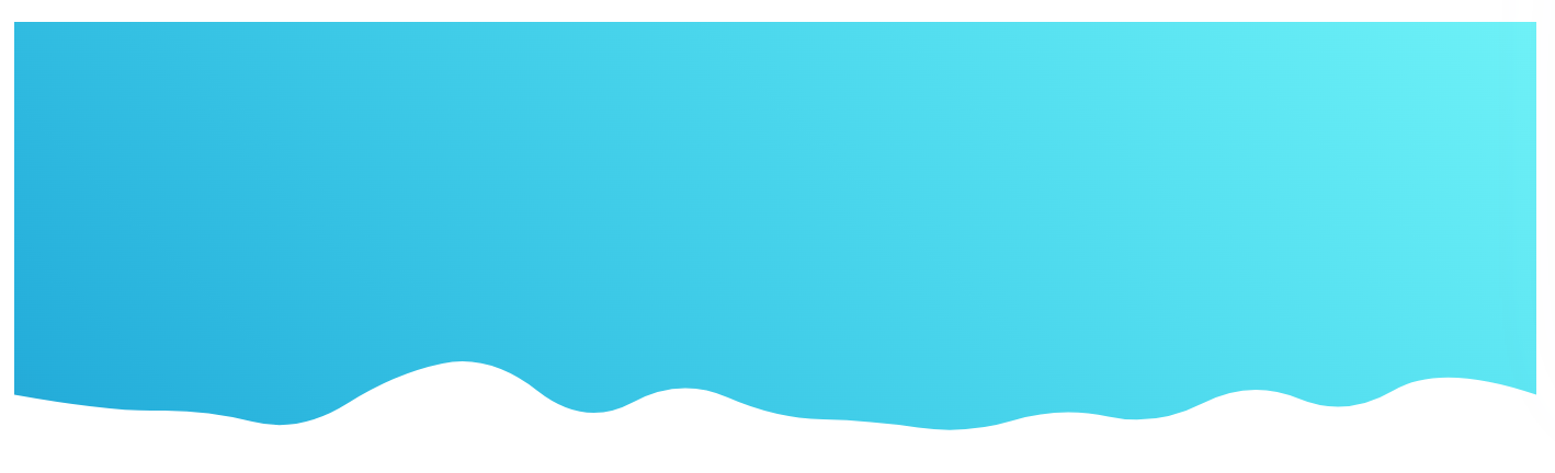
Two variables drive the result. Granularity (an integer) is the number of curves. Size is the space the curves span.
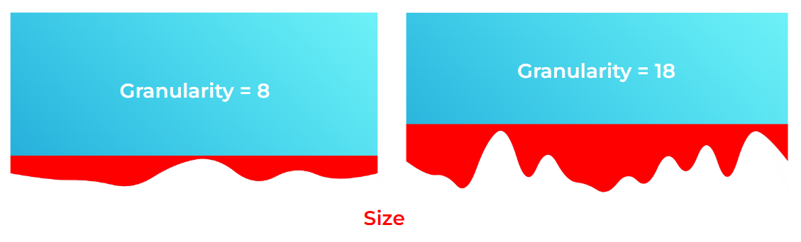
Wavy dividers, step by step
- Create N points evenly along the bottom of the element.
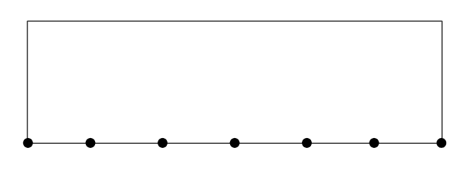
- Offset each point vertically by a random value in the range
[0 size].
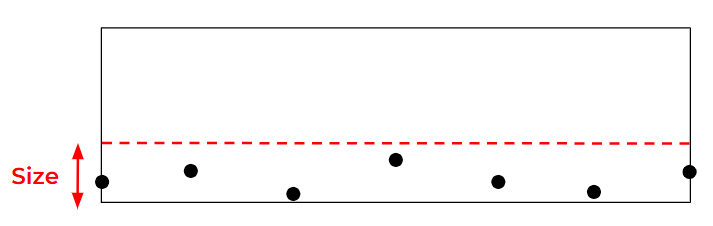
- Take adjacent pairs and compute their midpoints — a second, systematic set of points.
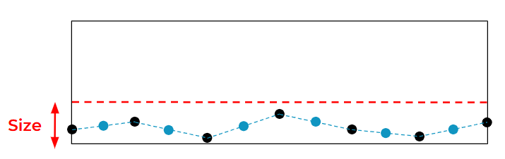
So there are two point sets: the randomly placed control points and the midpoints computed to respect the smooth-join rule. Drawing all curves through them yields the shape. In the CSS output, Ci denote the random control points and Pi the midpoints.
.shape {
  clip-path: shape(from Px1 Py1,
    curve to Px2 Py2 with Cx1 Cy1,
    curve to Px3 Py3 with Cx2 Cy2,
    /* ... */
    curve to Pxi Pyi with Cx(i-1) Cy(i-1)
    /* ... */
  )
}
The same logic extends to top, bottom and top-plus-bottom edges, or all sides at once.
Going circular for blobs
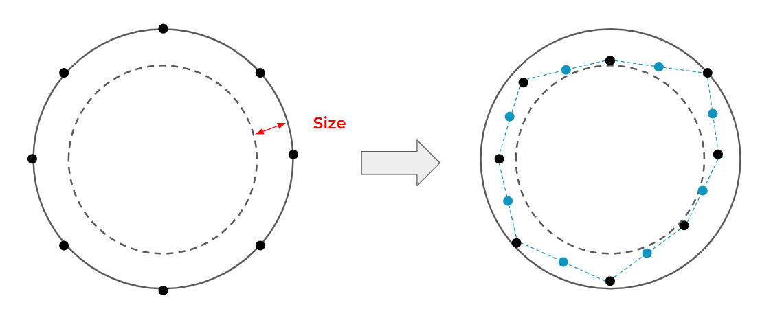
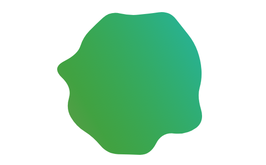
Blobs follow a different mental model. Instead of a rectangle made of straight edges, the reference geometry is a circle. Points are spaced evenly around the circle formed by an element with border-radius: 50%, then randomly offset toward the center; adding the midpoints and drawing the curves completes the shape.
Rounded-rectangle frames
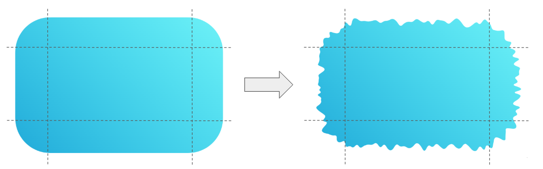
Combining the two techniques — rectangular edges plus rounded corners — produces fancy frames. It is the hardest of the group to implement, since each corner and each side needs its own handling, and the segments can carry different granularities. The payoff is a wide range of frame variations.
Reusing shapes in compositions and animation
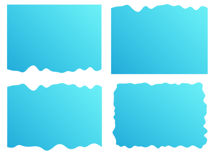
Four shapes copied straight out of the wavy divider generator — bottom configuration for the header, top for the footer, top plus bottom for the inner elements — cover a full classic layout. Animation is the next step; each animated element carries its own --s1 and --s2 shapes:
@media screen and (prefers-reduced-motion: no-preference) {
  .element {
    --s1: shape( ... );
    --s2: shape( ... );
    animation: dance linear 1.6s infinite alternate;
  }

  @keyframes dance {
    0% {clip-path: var(--s1)}
    to {clip-path: var(--s2)}
  }
}
Generate two shapes in the generator with the same granularity and different sizes, and the browser interpolates between them for a smooth, automatic animation. Swapping in animation-timeline: scroll() makes the animation scroll-driven with no further work.
A sticky header variant plays with size instead: keep granularity and shape ID fixed, use a size of 0 for the initial rectangular state and a non-zero size for the wavy state, and let the browser animate the transition. In general, shapes can either sit as static decoration, or you can animate between two or more by holding granularity constant and varying size and shape ID.
Examples worth borrowing from
Quick demonstrations built on these generators and techniques — hover, click, wobble and reveal:
- a bouncing hover effect with blob shapes
- a squishy button with a hover and click effect
- a wobbling frame animation
- a liquid reveal effect
- a set of fancy CSS loaders
These lean on the same two controls: granularity fixed, size and shape ID varied. They show the range of motion — grow, shrink, wobble, reveal — reachable without touching SVG.
For a final demonstration of scale, consider a CSS-only artwork in which each drawing is a single element with a single shape() rule. The code was produced with an SVG-to-CSS converter and other tooling, but the result is a striking demonstration that complex curved artwork can be produced entirely in CSS.




