

The native CSS masonry discussion has split into three syntax proposals: display: masonry, grid-template-rows: masonry, and item-pack: collapse. No consensus exists yet. Firefox already ships the second, Chrome is testing the first, and that divergence is exactly why the feature can't be relied on in production. This polyfill closes the gap using CSS Grid plus roughly 66 lines of JavaScript.
Native support first, fallback second
Firefox's implementation is driven entirely by CSS:
.masonry {
  display: grid;
  grid-template-columns: repeat(
    auto-fit,
    minmax(min(var(--item-width, 200px), 100%), 1fr)
  );
  grid-template-rows: masonry;
  grid-auto-flow: dense; /* Optional, but recommended */
}
Because that native behavior should be left alone, the script begins by testing whether grid-template-rows accepts the masonry value. If it does, the custom code never runs:
function isMasonrySupported(container) {
  return getComputedStyle(container).gridTemplateRows === 'masonry'
}
const containers = document.querySelectorAll('.masonry')
containers.forEach(async container => {
if (isMasonrySupported(container)) return
})The core trick: zero-height rows and a 1px gap
The technique (not original to this author, but adapted here) repurposes a grid quirk instead of fighting it. The steps:
- Set
grid-auto-rows: 0px. Every item collapses in height while CSS Grid keeps rows and columns in their normal order. - Set
row-gap: 1px, so successive rows stack one pixel at a time. - Measure each item's height with
getBoundingClientRect. - Convert that height into a row span by adding the
column-gapvalue, then assign it togrid-row-end.
Each step is worth walking through, since none of it matches ordinary Grid usage.
Collapsing the rows
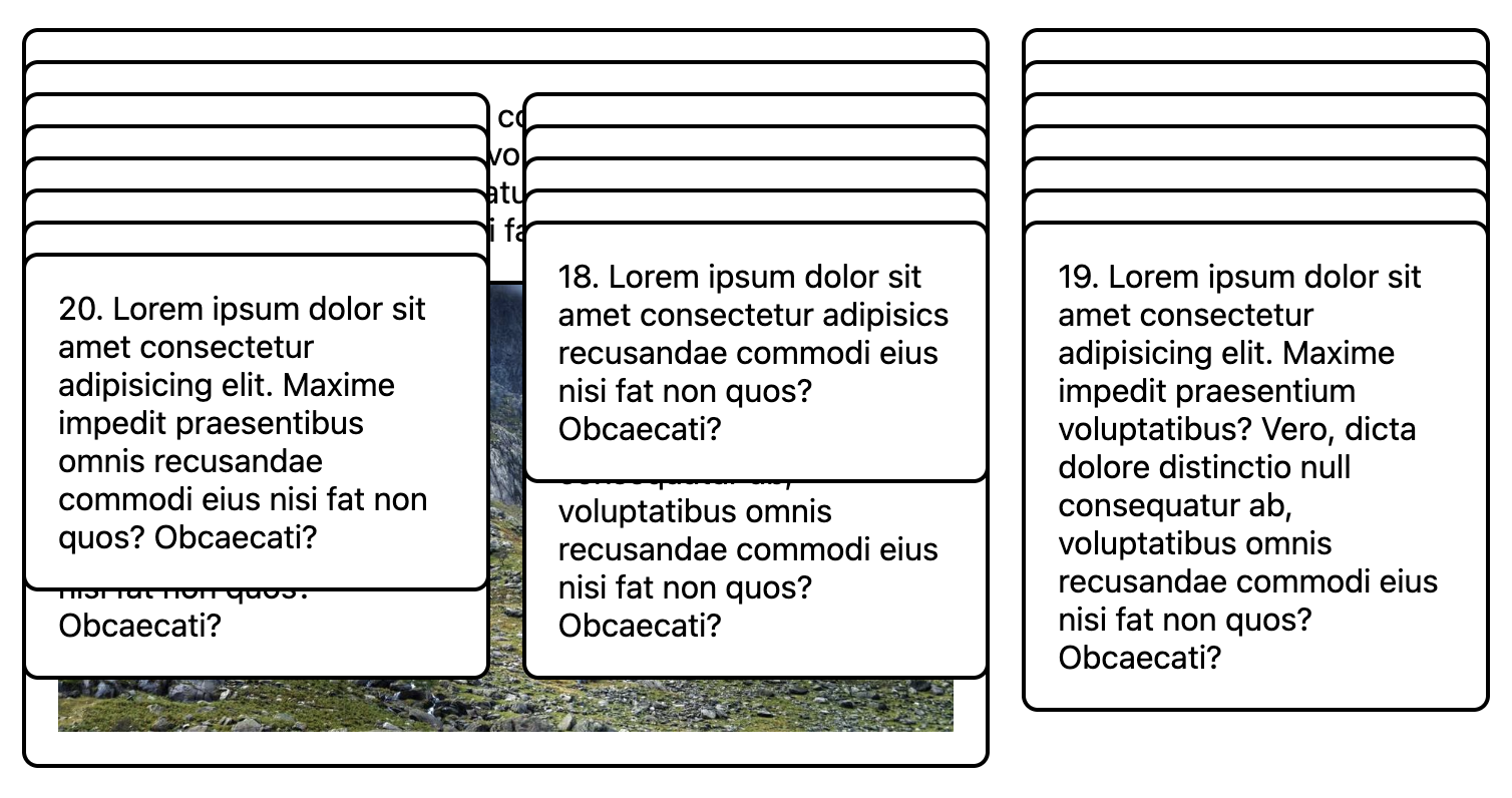
With grid-auto-rows: 0px, items occupy effectively no vertical space, yet the track ordering is preserved.
containers.forEach(async container => {
  // ...
  container.style.gridAutoRows = '0px'
})
Stacking at 1px intervals
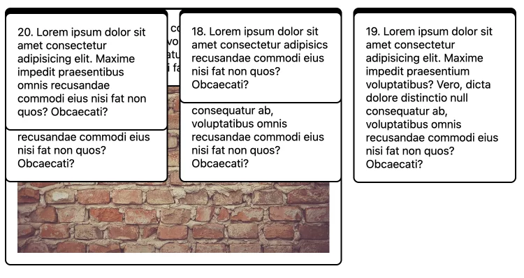
The one-pixel row-gap produces an initial stack where each row sits a single pixel below the one above it.
containers.forEach(async container => {
  // ...
  container.style.gridAutoRows = '0px'
  container.style.setProperty('row-gap', '1px', 'important')
})
Restoring item heights through row spans
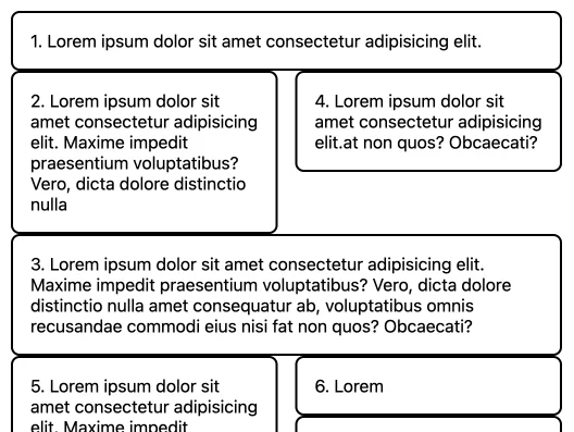
Assuming no media is present, getBoundingClientRect returns a usable height. Writing that value into grid-row-end reclaims the space, and because every gap is now 1px tall, the measurement maps directly onto a number of rows. The layout starts to look coherent again:
containers.forEach(async container => {
  // ...
  let items = container.children
  layout({ items })
})

function layout({ items }) {
  items.forEach(item => {
    const ib = item.getBoundingClientRect()
    item.style.gridRowEnd = `span ${Math.round(ib.height)}`
  })
}
Recreating the gutter
Gaps between items still need to return. Masonry layouts normally use equal column-gap and row-gap values, so the desired row gap can be read from column-gap. Adding it to grid-row-end extends each item's row allocation by the gutter amount:
containers.forEach(async container => {
  // ...
  const items = container.children
  const colGap = parseFloat(getComputedStyle(container).columnGap)
  layout({ items, colGap })
})

function layout({ items, colGap }) {
  items.forEach(item => {
    const ib = item.getBoundingClientRect()
    item.style.gridRowEnd = `span ${Math.round(ib.height + colGap)}`
  })
}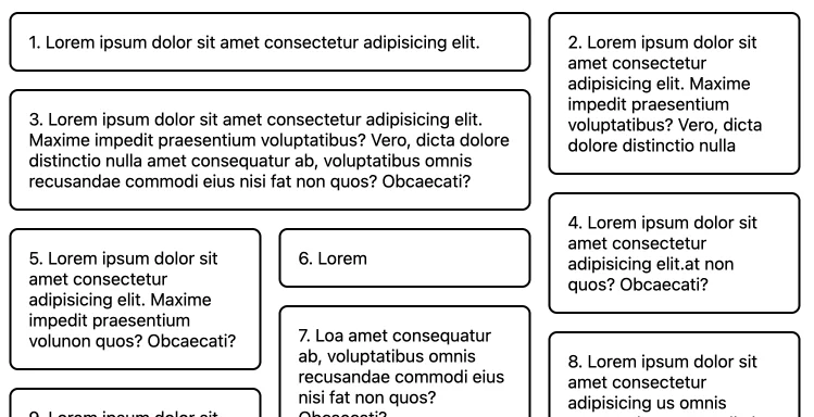
At this point the masonry grid works. The remaining work is production hardening.
Handling media and resize events
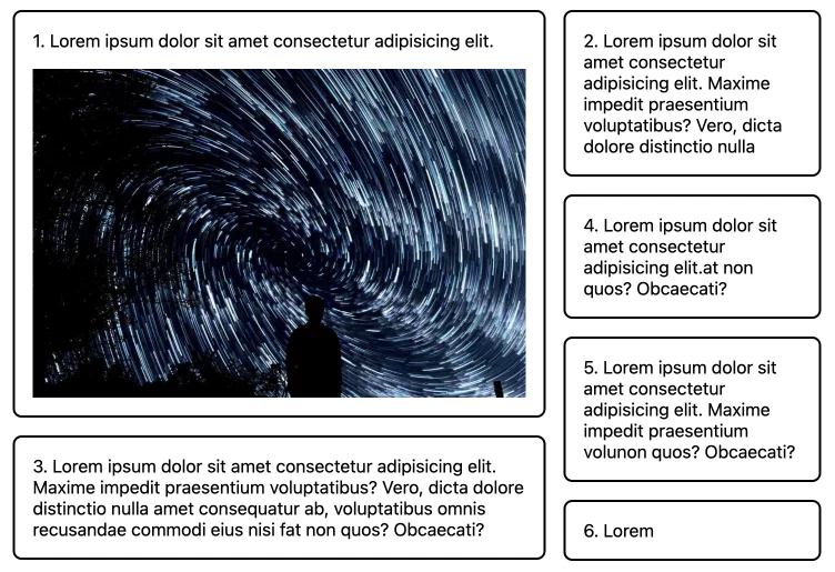
Drop an image into any item and the layout breaks: the height was measured before the image loaded, so the DOM has no dimensions for it yet.
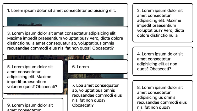
The fix is to defer the layout call until media has finished loading:
containers.forEach(async container => {
  // ...
  try {
    await Promise.all([areImagesLoaded(container), areVideosLoaded(container)])
  } catch(e) {}

  // Run the layout function after images are loaded
  layout({ items, colGap })
})

// Checks if images are loaded
async function areImagesLoaded(container) {
  const images = Array.from(container.querySelectorAll('img'))
  const promises = images.map(img => {
    return new Promise((resolve, reject) => {
      if (img.complete) return resolve()
      img.onload = resolve
      img.onerror = reject
    })
  })
  return Promise.all(promises)
}

// Checks if videos are loaded
function areVideosLoaded(container) {
  const videos = Array.from(container.querySelectorAll('video'))
  const promises = videos.map(video => {
    return new Promise((resolve, reject) => {
      if (video.readyState === 4) return resolve()
      video.onloadedmetadata = resolve
      video.onerror = reject
    })
  })
  return Promise.all(promises)
}
Responsiveness is then a matter of watching the container for dimensional changes with the ResizeObserver API and re-running layout when one occurs:
containers.forEach(async container => {
// ...
const observer = new ResizeObserver(observerFn)
observer.observe(container)

function observerFn(entries) {
  for (const entry of entries) {
    layout({colGap, items})
  }
}
})
The standard API is used above. A wrapped resizeObserver helper offers a shorter form:
containers.forEach(async container => {
  // ...
  const observer = resizeObserver(container, {
    callback () {
      layout({colGap, items})
    }
  })
})
What the fallback covers
The implementation supports an arbitrary number of columns, items that span multiple columns, media-aware measurement, and resize-driven relayout — enough to be more flexible than typical Flexbox-based masonry approaches. One trade-off is disclosed in the demo: measuring waits on image loads, so a grid placed at the top of the page may flash before settling. Skipping images there avoids the delay.
Tailwind's responsive variants and arbitrary values can extend the flexibility further without additional CSS. The same grid is also packaged as a reusable utility in Splendid Labz, installed via a helper library:
# Installing the library
npm install @splendidlabz/styles
/* Import all layouts code */
@import '@splendidlabz/styles/layouts'// Use the masonry script
import { masonry } from '@splendidlabz/styles/scripts'
masonry()



