

A hover effect that pulls a foreground subject out of its background while the two layers scale at different rates is easy to admire and harder to build responsively. The original demonstration of this pop-out comes from Mikael Ainalem's CodePen, which leans on CSS clip-path: path(). Digging into that declaration reveals enough practical problems that an SVG-based alternative is worth working through.
What clip-path does, and where path() falls down
clip-path defines a display region for an element; anything falling outside the clipping path is hidden.
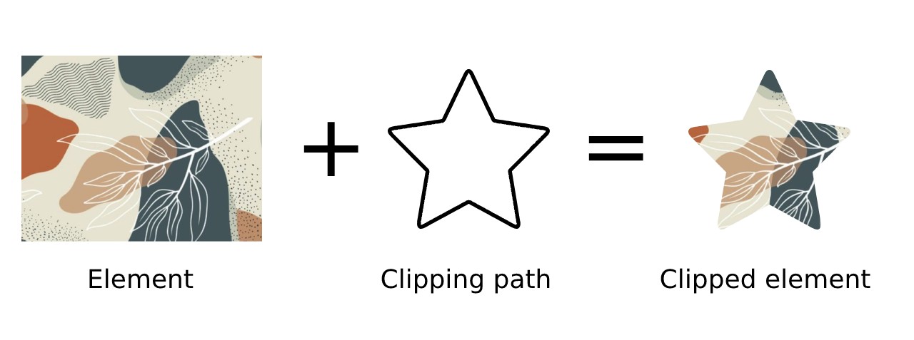
Basic values such as circle, ellipse and polygon restrict you to those shapes. The newer path value was meant to lift that restriction by accepting arbitrary SVG paths, and it has now seen proper support in most modern browsers.
Two obstacles remain. First, coverage sits at around 82% at the time of writing, which leaves mobile support limited to Chrome and Safari. Second, and more oddly, the path value only accepts pixel values, so it does not respond to changes in element size. Zooming the page is enough to make the clip start cutting off content.


The practical consequence is that clip-path: path() works only on fixed-size elements — an awkward constraint for a property introduced long after responsive design became standard. A reimplementation with widely supported CSS is the way around it.
The overflow problem
The desired behaviour is for overflow to remain visible at the top of the image only. CSS overflow cannot deliver this, since it clips at both the top and the bottom.

overflow-y: hidden, the bottom part looks good, but the image is cut-off at the top where the overflow should be visible.The remaining option is the SVG <clipPath> element, a different mechanism from the CSS clip-path: path value.
Why SVG clipping scales
SVG <clipPath> and <path> elements follow the coordinate system of their parent SVG, so they are responsive by default. When the SVG scales, its coordinate system scales with it and proportions are preserved. Browser support for using clip-path in CSS on SVG sits at 95% — 13 percentage points above clip-path: path.
The base markup and clipping paths here were drawn in Inkscape and then annotated with custom class attributes.
<svg xmlns="http://www.w3.org/2000/svg" viewBox="0 -10 100 120" class="image">
  <defs>
    <clipPath id="maskImage" clipPathUnits="userSpaceOnUse">
      <path d="..." />
    </clipPath>
    <clipPath id="maskBackground" clipPathUnits="userSpaceOnUse">
      <path d="..." />
    </clipPath>
  </defs>
  <g clip-path="url(#maskImage)" transform="translate(0 -7)">
    <!-- Background image -->
    <image clip-path="url(#maskBackground)" width="120" height="120" x="70" y="38" href="..." transform="translate(-90 -31)" />
    <!-- Foreground image -->
    <image width="120" height="144" x="-15" y="0" fill="none" class="image__foreground" href="..." />
  </g>
</svg>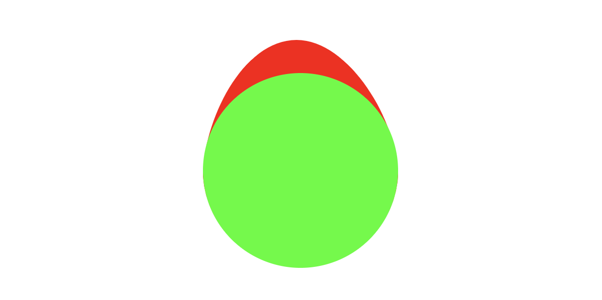
<clipPath> elements created in Inkscape. The green element represents a clipping path that will be applied to the background image. The red is a clipping path that will be applied to both the background and foreground image.The markup is portable to other artwork: swap the URL in the href attribute of each image element and the same structure applies.
Building the hover animation
With the structure in place, transforms and transitions are sufficient. Centre the foreground, then scale and translate on hover, letting the foreground layer move and grow independently of the background layer, which only scales.
.image {
  transform: scale(0.9, 0.9);
  transition: transform 0.2s ease-in;
}

.image__foreground {
  transform-origin: 50% 50%;
  transform: translateY(4px) scale(1, 1);
  transition: transform 0.2s ease-in;
}

.image:hover {
  transform: scale(1, 1);
}

.image:hover .image__foreground {
  transform: translateY(-7px) scale(1.05, 1.05);
}
The effect now follows the dimensions of the container. Resize the viewport or change the SVG's size and the clip scales along with it.
Fixing SEO and accessibility
Moving from an HTML image element to an inline SVG introduces regressions. Inline SVG is not indexed by search crawlers, so images central to the page content may be missed and SEO can suffer.
The fix is a hidden, conventional <img> element alongside the SVG. Images declared that way are picked up by crawlers and can be referenced in an image sitemap. The fallback uses loading="lazy", leaving the decision to defer loading to the browser. Both elements sit inside a <figure>, which documents their relationship.
<figure>
  <!-- SVG element -->
  <svg xmlns="http://www.w3.org/2000/svg" viewBox="0 -10 100 120" class="image">
     <!-- ... -->
  </svg>
  <!-- Fallback image -->
  <img src="..." alt="..." class="fallback-image" />
</figure>
Animation preferences and screen readers need attention too. Making an SVG fully accessible requires a good deal of extra markup, and suppressing transitions means overriding a number of CSS properties — a fragile exercise if selector specificity is inconsistent. The plain <img> already carries solid accessibility behaviour and serves as a substitute for users browsing without animation.
<figure>
  <!-- Animated SVG element -->
  <svg xmlns="http://www.w3.org/2000/svg" viewBox="0 -10 100 120" class="image" aria-hidden="true">
    <!-- ... -->
  </svg>

  <!-- Fallback SEO & a11y image -->
  <img src="..." alt="..." class="fallback-image" />
</figure>
Concretely: add aria-hidden="true" to hide the SVG from assistive devices, and add a prefers-reduced-motion media query to the CSS. The fallback image is inclusively hidden for users without that preference while remaining available to screen readers.
@media (prefers-reduced-motion: no-preference) {
.fallback-image {
  clip: rect(0 0 0 0);
  clip-path: inset(50%);
  height: 1px;
  overflow: hidden;
  position: absolute;
  white-space: nowrap;
  width: 1px;
  }
}

@media (prefers-reduced-motion) {
  .image {
    display: none;
  }
}
Users without the prefers-reduced-motion preference and users not relying on screen readers see no change in the effect.
Takeaway
The appeal of clip-path: path was clear, and the pixel-only restriction has been a letdown: responsiveness is lost and the set of viable use cases shrinks sharply. Rebuilding the pop-out on the SVG <clipPath> element recovers responsiveness. The SEO and accessibility gaps that come with inline SVG are covered by a small amount of added markup and a fallback image.