
What prefixes were for, and how they went wrong
Vendor prefixes originated as a mechanism for browser-specific extensions and as a way to ship experimental or preview implementations of features still in Working Drafts. Prefixed features were already present in Internet Explorer and Firefox by 2006; by 2012 the W3C CSS Working Group had published guidance formalizing their use for properties, values and @-rules that were either vendor-specific extensions or experimental implementations.
Prefixing then became an industry norm, and the prefix count kept growing. The result was partial implementations, bugs and a fractured browser ecosystem, with developers building tooling to automate the problem away. Browser vendors gradually shifted toward feature flags in browser settings instead, and it looked as though prefixing would fade out. An analysis of the caniuse dataset and the MDN Compat dataset was run to see whether it actually has.
How usage moved, browser by browser
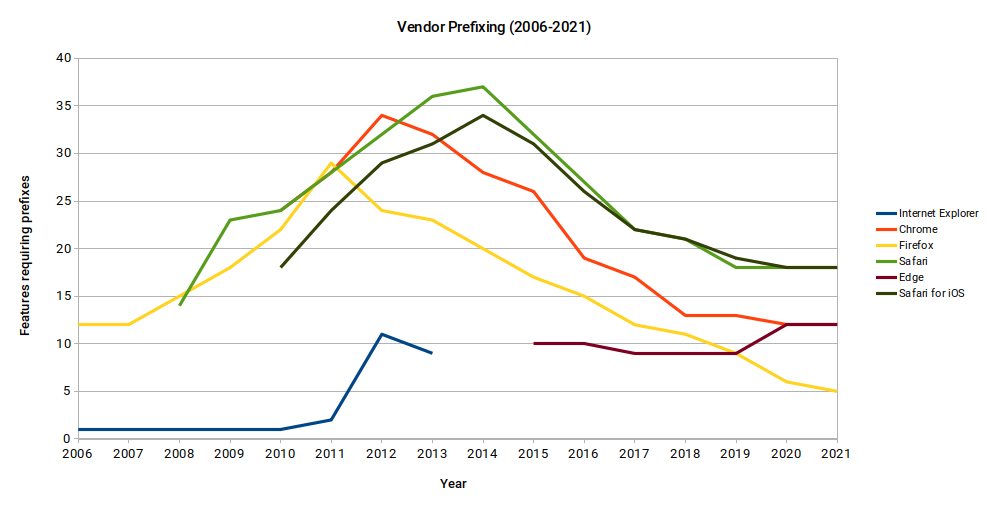
Chrome for Android is excluded from the chart for lack of data. From 2007 to 2011, prefixed features rose steadily in every browser; Internet Explorer’s only uptick came in 2011. In 2012 Mozilla began removing prefixes — -moz-border-radius* and -moz-box-shadow among them — from Firefox, and from then on dropped prefixed properties once the standard version was fully implemented. In 2013 Mozilla started shipping features behind pref flags, and Chrome moved from WebKit to Blink as part of Chromium; both were turning points in shedding prefixed features.
WebKit did not announce an end to prefixing experimental features until April 2016, and because Safari and iOS browsers have always run on WebKit, their prefix counts came down later. Microsoft was never enthusiastic about prefixing and consistently carried the fewest prefixed features — yet when Edge moved to Blink in 2019, its count of prefixed properties actually went up.
Measuring the decline
Comparing the height of prefixing in 2013 with 2021:
The raw figure is a fall of roughly 33% in the number of features requiring prefixes between 2013 and 2021 — a fairly modest reduction. Raw counts also flatten real differences: a whole family of properties such as animation may need prefixes, while a single property or value may be all that a feature like user-select: none requires.
Over the period, twenty features became unprefixed and fully implemented across the major browsers, while three new prefixed features appeared: backdrop-filter, CSS text-orientation and CSS initial-letter. The unprefixed group includes several former pain points:
- CSS Flexible Box Layout Module
- CSS3 Box Sizing
- CSS Animation
- CSS3 2D Transforms
- CSS3 3D Transforms
- CSS Filter Effects
The remaining fourteen are lower-profile: :any-link, ::placeholder, ::selection, :focus-visible, :is(), :read-only, :read-write, font-feature-settings, text-align-last, writing-mode, the grab and grabbing cursors, CSS Logical Properties, the zoom-in and zoom-out cursors, and CSS3 Multiple Column Layout. Dropping Internet Explorer 11 support removes another seven from the list, bringing 2021 down to 28 features needing prefixes — a 46% reduction since 2013.
What still needs a prefix today
| # | Name | Properties/Values | Description | Prefix required | Unprefixed support | Prefixed support | Improvement with prefixes |
|---|---|---|---|---|---|---|---|
| 1 | appearance |
appearance |
Defines how elements (particularly form controls) appear by default. Setting the value to none causes in the element’s default appearance being entirely redefined using other CSS properties. |
|
69.80% | 97.03% | 27.23% |
| 2 | background-clip-text |
background-clip: text |
Non-standard method of clipping a background image to the foreground text. |
|
3.89% | 96.65% | 92.76% |
| 3 | backdrop-filter |
backdrop-filter |
Method of applying filter effects (like blur, grayscale or hue) to content or elements below the target element. |
|
70.20% | 88.20% | 18.00% |
| 4 | background-image: crossfade() |
background-image: crossfade() |
Image function to create a “crossfade” between images. This allows one image to transition (fade) into another based on a percentage value. |
|
17.77% | 92.62% | 74.85% |
| 5 | background-image: image-set() |
background-image: image-set() |
Method of letting the browser pick the most appropriate CSS background image from a given set, primarily for high PPI screens. |
|
17.77% | 92.48% | 74.71% |
| 6 | box-decoration-break |
box-decoration-break |
Controls whether the box’s margins, borders, padding, and other decorations wrap the broken edges of the box fragments, when the box is split by a break, like a page, column, region, or line. |
|
6.39% | 97.17% | 90.78% |
| 7 | clip-path |
clip-path |
Method of defining the visible region of an HTML element using SVG or a shape definition. |
|
72.00% | 96.33% | 24.33% |
| 8 | color-adjust |
color-adjust |
A non-standard CSS extension that can be used to force background colors and images to print. |
|
3.69% | 39.77% | 36.08% |
| 9 | element() |
background: element() |
This function renders a live image generated from an arbitrary HTML element |
|
0.00% | 4.04% | 4.04% |
| 10 | font-kerning |
font-kerning |
Controls the usage of the spacing between lettersstored in the font. Note that this only affects OpenType fonts with kerning information, it has no effect on other fonts. |
|
81.73% | 96.03% | 14.30% |
| 11 | font-smooth |
font-smooth |
Controls how anti-aliasing is applied when fonts are rendered. Though present in early 2002 drafts of the CSS3 Fonts specification, this property has since been removed and is currently not on the standard track. |
|
0.00% | 39.64% | 39.64% |
| 12 | hyphens |
hyphens |
Method of controlling when words at the end of lines should be hyphenated. |
|
76.49% | 96.51% | 20.02% |
| 13 | initial-letter |
initial-letter |
Method of creating an enlarged cap, including a drop or raised cap, in a robust way. |
|
0.00% | 18.00% | 18.00% |
| 14 | line-clamp |
line-clamp |
Contains text to a given amount of lines when used in combination with display: -webkit-box. Any text that overflows the space produces anellipsis when text-overflow: ellipsis is included. |
|
0.19% | 96.28% | 96.09% |
| 15 | position: sticky |
position: sticky |
Keeps elements positioned as”fixed” or”relative” depending on how it appears in the viewport. As a result the element is “stuck” in place while scrolling. |
|
93.50% | 95.36% | 1.86% |
| 16 | tab-size |
tab-size |
Method of customizing the width of the Tab character. Only effective alongside white-space: pre or white-space: pre-wrap. |
|
92.33% | 97.38% | 5.05% |
| 17 | text-decoration styling |
text-decorationtext-decoration-* properties. |
Method of defining the type, style and color of lines in the text-decoration property. These can be defined as a shorthand (e.g. text-decoration: line-through dashed blue) or as single properties (e.g. text-decoration-color: blue). |
|
80.25% | 94.86% | 14.61% |
| 18 | text-emphasis styling |
text-emphasistext-emphasis-* properties |
Method of using small symbols next to each glyph to emphasize a run of text, commonly used in East Asian languages. The text-emphasis shorthand property, and its text-emphasis-style and text-emphasis-color constituent properties can be used to apply marks to the text. The text-emphasis-position property, which inherits separately, allows setting theposition ofemphasis marks with respect to the text. |
|
21.96% | 95.99% | 74.03% |
| 19 | text-orientation |
text-orientation |
Specifies the orientation of text within a line. Current values only have an effect in vertical typographic modes (defined with the writing-mode property). |
Safari ( -webkit) |
90.88% | 94.84% | 3.96% |
| 20 | text-size-adjust |
text-size-adjust |
Control if and how the text-inflating algorithm is applied to the textual content of the element it is applied to. |
|
72.75% | 87.48% | 14.73% |
| 21 | user-select: none |
user-select |
Method of preventing text or element selection. |
|
74.81% | 96.49% | 21.68% |
| 22 | CSS Canvas Drawings | background: -webkit-canvas(mycanvas) |
Method of using HTML5 Canvas as a background image. Not currently part of any specification. |
|
0.00% | 19.40% | 19.40% |
| 23 | CSS Masks | mask mask-* properties |
Method of displaying part of an element, using a selected image as a mask. |
Partial support in WebKit/Blink browsers refers to supporting the |
4.18% | 96.93% | 92.75% |
| 24 | CSS Reflections | -webkit-box-reflect |
Method of displaying a reflection of an element. |
|
0.00% | 91.20% | 91.20% |
| 25 | CSS Scrollbar Styling | scrollbar-colorscollbar-width |
Methods of styling scrollbar color and width. |
|
4.28% | 96.87% | 92.59% |
| 26 | CSS Text Fill & Stroking | text-stroketext-stroke-* properties |
Method of declaring the outline (stroke) width and color for text. |
|
0.00% | 96.65% | 96.65% |
| 27 | Intrinsic & Extrinsi Sizing | max-contentmin-contentfit-contentstretch (formerly fill). |
Allows for the height and width of an element to be specified in intrinsic values rather than fixed numeric values. |
|
91.99% | 96.36% | 4.37% |
| 28 | Media Queries: Resolution Feature | @media (min-resolution: 300dpi) { … }, @media (max-resolution: 300dpi) { … } |
Allows a media query to be set based on the device pixels used per CSS unit. While the standard uses min-resolution and max-resolution, some browsers support the older non-standard device-pixel-ratio media query. |
Browsers that support |
80.40% | 99.16% | 18.76% |
Much of this list covers things a developer rarely encounters. Some properties have never been fully implemented and likely never will be; the element() function and CSS Canvas Drawings are examples. Safari has recently dropped prefixing for position: sticky, so that entry should disappear shortly.
Trimming the list through deliberate browser-support choices is possible, but the list remains long enough that managing prefixes by hand is impractical. The question worth answering is how far cross-browser support needs to go — if the answer is “a high level,” prefixes belong in the development effort.
Current browser properties are only part of the picture. Older devices with older browsers still lack unprefixed versions of some features: animation was last unprefixed by Chrome in 2015, yet 1.3% of users worldwide still run a browser without support for the unprefixed version.

Recent real-world cases are common enough. A reading progress bar for a blog needed -webkit-appearance: none; and -moz-appearance: none; to reset the default styling of the progress element, plus a prefixed position: sticky for Safari. A PNG used as a mask image worked properly only via -webkit-mask-image; masking is erratic in general because most browsers implement the spec only partially. Flavio Copes hit the same problem in “How to apply padding to multiple lines in CSS,” where equal padding on every line of a multi-line heading required box-decoration-break: clone — and most browsers need the -webkit-prefixed form.
Tooling
Plenty of the tools written to handle prefixing and browser support have been abandoned, so verify maintenance status before adopting one. Autoprefixer, a PostCSS plugin, is maintained and draws its data directly from caniuse, keeping it current. Emmet also handles prefixes well, including a css.autoInsertVendorPrefixes preference that inserts them automatically; its currency is unverified but it is worth considering for the development environment. Since most code editors support Emmet, editing prefixed properties is easier there too — its CSS reflect value command updates the value across all prefixed versions of a property in a rule, and the Emmet docs cover the rest.
Where that leaves us
Vendor prefixing is not dead; we are still living with the legacy. The count of prefixed features continues a steady decline, and browser vendors deserve credit for implementing unprefixed features in place of prefixed ones, which removed most of the burden from developers. Prefix-requiring scenarios still turn up, though, and for the widest possible browser support an auto-prefixing strategy remains the sensible default.




