
A Generator That Produces Shadow Palettes, Not Single Shadows
Most shadow generators on the web output one shadow at a time. That misses how modern applications actually use depth. When a UI relies on elevations to signal interactivity, the shadows need to be a cohesive set—otherwise the illusion of depth collapses.
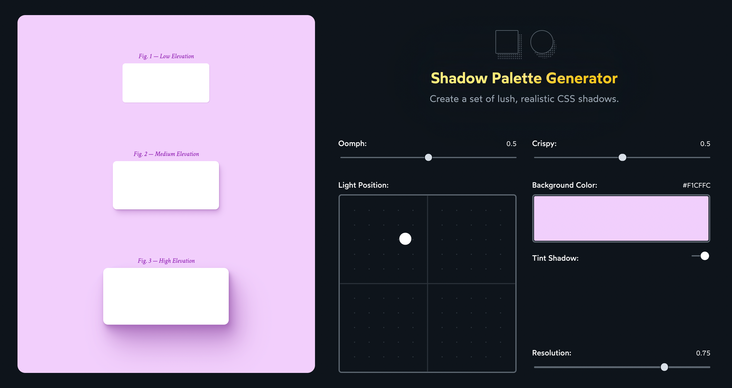
Josh Comeau's Shadow Palette Generator takes a different approach. Instead of dialing in a single box-shadow, the tool produces a trio of complementary shadows that represent three distinct elevations. When you need a shadow, you don't hunt for a brand-new style; you pick the elevation that matches how high the element should appear.
Abstraction Over Raw Values
The fundamental problem with authoring shadows by hand is that the box-shadow API is low-level. Tweaking offsets, blur radius, spread, and color opacity layer by layer is tedious, even when the theory is clear.
The generator abstracts these underlying values away. Instead of manipulating raw numbers, you adjust parameters that describe the feel of the shadow. The "Oomph" control, for instance, changes how emphasized the shadow is by adjusting several underlying box-shadow values at once.
Output and CSS Custom Properties
Once the controls are set, the generator produces a CSS snippet using custom properties for easy reuse throughout an application:
:root {
  --shadow-color: 123deg 45% 67%;
  --shadow-elevation-low: /* Shadow CSS */;
  --shadow-elevation-medium: /* Shadow CSS */;
  --shadow-elevation-high: /* Shadow CSS */;
}
The output can be dropped into a global stylesheet, with shadows applied as:
.subtle-box {
  box-shadow: var(--shadow-elevation-low);
}
.in-your-face-box {
  box-shadow: var(--shadow-elevation-high);
}
Because the output relies on CSS Custom Properties, it renders in all modern desktop and mobile browsers—Chrome, Firefox, Safari, and Edge. Older browsers like Internet Explorer will ignore the shadows, but that's acceptable. Shadows are a progressive enhancement; the product remains functional without them.
Varying Tint Colors by Context
The generator lets you select a background color and produces a shadow tint based on it. This blending makes shadows look natural against that specific backdrop.
The limitation is that the generated shadow color is fixed. In real applications, elements sit in front of different backdrops, so a shadow tinted for a purple background will look wrong over a light gray one:
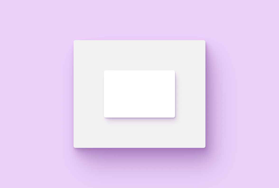
When that scenario occurs, the shadow variables need to be redefined wherever the color changes. For example, a nested element can override the shadow color and redeclare the variable:
<style> /* Copy the provided snippet from Shadow Palette Generator. (I'm using a simplified snippet here, to make it easier to follow) */ :root { --shadow-color: 286deg 36% 58%; --shadow-elevation-medium: 2px 4px 8px hsl(var(--shadow-color) / 0.5); } .box { background: hsl(0deg 0% 95%); /* Use the purple-tinted shadow on the outer box: */ box-shadow: var(--shadow-elevation-medium); } .inner-box { /* This box should have a different shadow color! So we provide a new --shadow-color, and reset --shadow-elevation-medium */ --shadow-color: 0deg 0% 58%; --shadow-elevation-medium: 2px 4px 8px hsl(var(--shadow-color) / 0.5); background: white; box-shadow: var(--shadow-elevation-medium); }</style><div class="box"> <div class="inner-box"></div></div>
Within that client, --shadow-elevation-medium becomes:
2px 4px 8px hsl(var(--shadow-color) / 0.5);Copy-pasting the full shadow definition to change only the color is not DRY. Vanilla CSS lacks tools to avoid this duplication, but preprocessors and CSS-in-JS libraries offer workarounds. With styled-components, a shared function or component can encapsulate the values:
const ELEVATIONS = {
  medium: '2px 4px 8px hsl(var(--shadow-color) / 0.5)',
};

const GlobalStyles = createGlobalStyle`
  :root {
    --shadow-color: 286deg 36% 58%;
    --shadow-elevation-medium: ${ELEVATIONS.medium};
  }
`;

const Box = styled.div`
  background: hsl(0deg 0% 95%);
  box-shadow: var(--shadow-elevation-medium);
`;

const InnerBox = styled.div`
  --shadow-color: 0deg 0% 58%;
  --shadow-elevation-medium: ${ELEVATIONS.medium};
  background: white;
  box-shadow: var(--shadow-elevation-medium);
`;
Context and Prior Art
The layered shadow approach this tool depends on comes from Tobias Ahlin's work on smooth, layered box-shadows—stacking several individually styled layers rather than relying on one strong, single cast shadow. Inspiration on the generator's interface itself comes from Philipp Brumm's now-offline Smooth Shadow tool.


