

Otto Storch: Editorial Ideas That Translate to the Screen
Otto Storch spent the 1950s and 1960s turning magazine spreads into something closer to visual arguments. Working at McCall’s after studying under Alexey Brodovitch, Storch treated the double-page spread as a single canvas. He let images bleed across the gutter, set type on curves, and placed models on beds of copy. His work was never merely decorative — idea, copy, art and typography were fused into one message.
Storch’s name is rarely heard in web design circles, and there is no Wikipedia page devoted to him. Yet his approach speaks directly to the constraints of a medium that is business-focused, fast-moving, and technically bounded. Magazines were a cut-throat business too, and Storch’s titles were not high fashion. “Good art direction does not come from an uncertain person,” he once said. “I am capable of intense feeling and was willing to lose a popularity contest with departmental editors when necessary. The visual responsibility of the magazine was mine.”
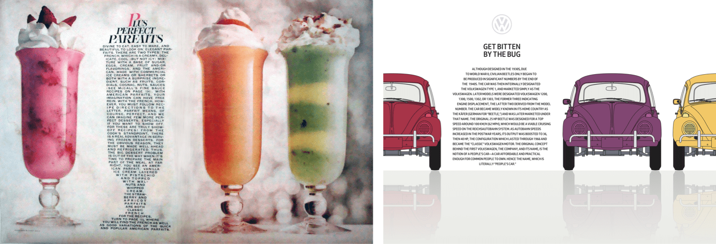
That conviction produced memorable layouts. A corn cob drips butter across both pages of a feature on corn. A sleeping model stretches out on a bed of running text, the copy sinking under her weight. In a story about teenage marriages, concentric circles dominate three of four columns, pulling the eye toward a headline at their centre. Two children face off forehead to forehead across the gutter, with text aligned in opposing directions to reinforce the tension.
Storch also knew type could be more than readable content. For a McCall’s extract, he mirrored the recto and verso pages and set text into a circle reflecting a telephone dial. Scale shifted unpredictably, as in a paintbox feature where both models and tightly packed text fit inside the box’s compartments. None of this looked forced, but it came from years of practice — and it offers a model for the web, where appeal can connect people to a brand, product, or story just as effectively as in print.
CSS Shapes Beyond the Basics
The tools Storch used can be approximated today with CSS Shapes. The W3C’s CSS Shapes Module Level 1 became a Candidate Recommendation in 2014, and every contemporary desktop and mobile browser has implemented its shape-outside, shape-margin, and shape-image-threshold properties. There is no compatibility excuse left: support is solid, and properties degrade gracefully in legacy browsers.
Web designers often overlook the creative potential here. CSS Shapes can add energy without relying on SVG or complex JavaScript. A simple two-column layout with wrapping text suddenly feels dynamic when images are angled and copy flows around them organically.
[src="shape.png"] {
float: left;
shape-outside: url(shape.png);
shape-margin: 20px; }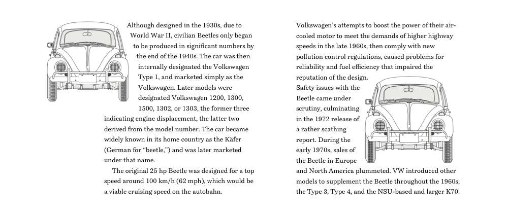
A Beetle-Inspired Layout
Consider a Storch-inspired design built around the Volkswagen Beetle. The structure is deliberately simple: a main element and an aside, each holding paragraphs of running text and two picture elements. The picture elements let the browser swap small images for larger ones depending on screen size. This lets me place four brightly coloured Beetles at angles that contrast with two tall justified columns, creating the playful movement Storch achieved.
<main>
<picture>…</picture>
<p>…</p>
<p>…</p>
<picture>…</picture>
<p>…</p>
<p>…</p>
</main>

<aside>
<picture>…</picture>
<p>…</p>
<p>…</p>
<picture>…</picture>
<p>…</p>
<p>…</p>
</aside>
On small screens, the picture elements fit to the edges, but whitespace must remain on both sides of the copy. Using viewport width units ensures that space stays proportional to the screen:
p {
margin-right: 10vw;
margin-left: 10vw; }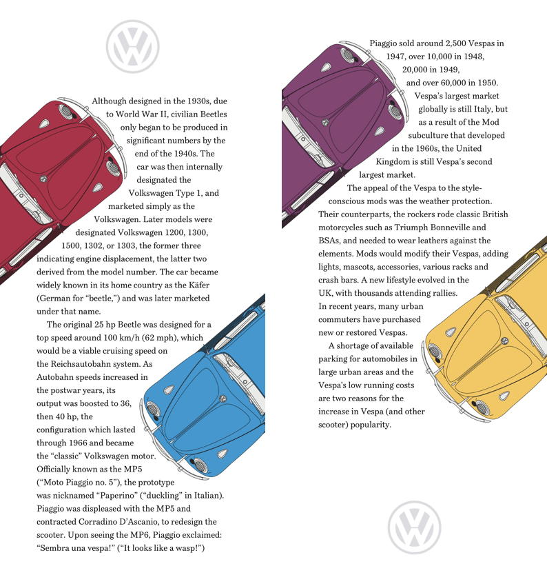
The picture element is one of the most useful additions to HTML — it pairs media queries with multiple images so the browser selects what is most appropriate for a given layout. The media property with a min-width value is the common case; more images or combined media values can build more complex queries.
<picture>
<source media="(min-width: 48em)">
<img src="small.png" alt="Volkswagen Beetle">
<</picture>
Each picture contains a cropped image of a Beetle suited to smaller screens. All images share the same width, with a shape-margin set in anticipation of the shapes that follow.
picture {
width: 160px;
shape-margin: 20px; }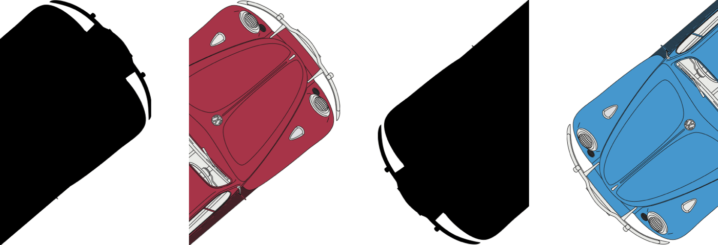
Building a shape from an image is faster and often simpler than mapping polygon coordinates. The image needs an alpha channel that is wholly or partially transparent; where there is partial transparency, shape-image-threshold controls which areas contribute to the shape. Even with four different coloured cars, only two distinct shape images are needed — the same image can generate more than one shape.
main picture:first-of-type,
aside picture:first-of-type {
float: left;
shape-outside: url(shape-1-sm.png); }

main picture:last-of-type,
aside picture:last-of-type {
float: right;
shape-outside: url(shape-2-sm.png); }
At medium screen sizes, larger images and matching shape images replace the small-screen versions. New widths are applied so the images fit the expanded layout.
@media (min-width: 48em) {

main picture:first-of-type {
width: 290px;
shape-outside: url(shape-1-lg.png); }

main picture:last-of-type {
width: 230px;
shape-outside: url(shape-2-lg.png); }

aside picture:first-of-type {
width: 230px;
shape-outside: url(shape-3-lg.png); }

aside picture:last-of-type {
width: 290px;
shape-outside: url(shape-4-lg.png); }
}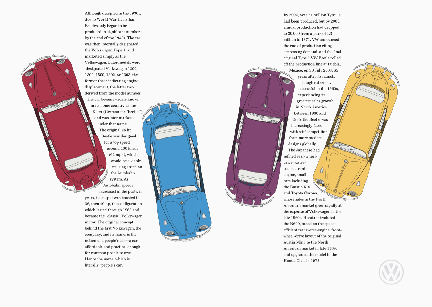
Though the large-screen design looks complex at first glance, its underlying structure is simply two symmetrical columns from those same main and aside elements. Whitespace carries a large part of this composition: the 10vw horizontal margins on paragraphs mean whitespace accounts for 40% of the layout.
@media (min-width: 64em) {

body {
display: grid;
grid-template-columns: 1fr 1fr; }
}
Like Storch’s pages, this layout does not merely present content — it implies something about the Volkswagen Beetle itself. The structure, the tilted cars, the copy flowing around rounded forms all hint at how fun that iconic little car was to drive. The lesson from Storch is that a strong idea makes copy, imagery, and typography inseparable, and that idea should shape the layout as much as any grid or breakpoint.
Shape Your Copy Into the Subject
Otto Storch often carved text into forms that echoed his imagery — a technique that draws readers deeper into a story. While such typographic sculpture remains rare on the web, CSS Shapes make it possible. One approach: shape a paragraph to match the silhouette of a Volkswagen Beetle, with the copy flowing between two invisible images that define the car's face.
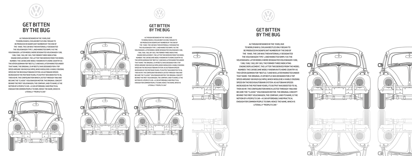
Three layout variants are needed: a single scrolling column for small screens, a 2×2 grid for medium screens, and a wide design with horizontal scrolling for large viewports. The structure calls for one main content element plus three large images of differently coloured Beetles, all wrapped in a section, with an additional presentational division used to depict a tarmac road beneath the car.
<section>

<img src="shape-1.png" alt="">

<main>

<h1>Get bitten by the bug</h1>

</main>

<img src="img-1.png" alt="Volkswagen Beetle">
<img src="img-2.png" alt="Volkswagen Beetle">

</section>

<div> </div>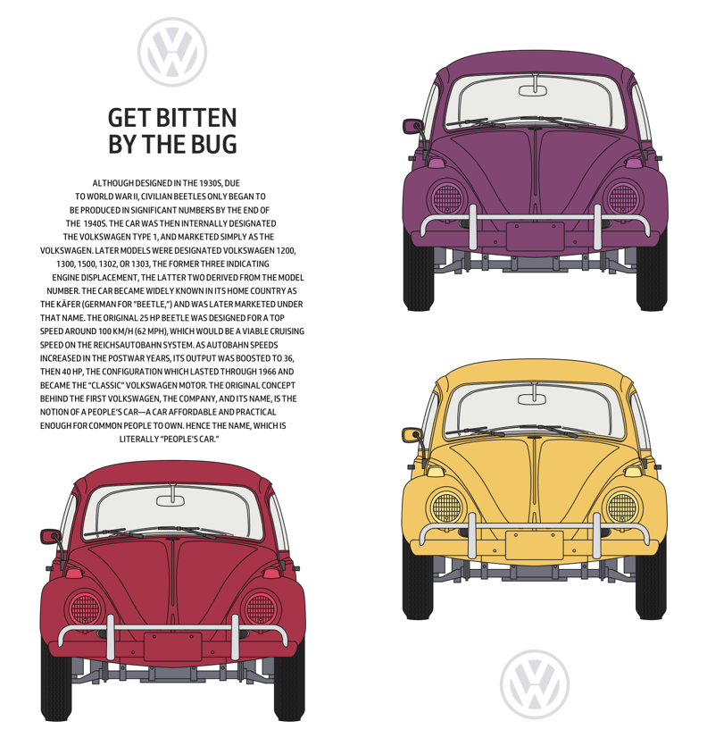
Building the Silhouette
The horizontally scrolling panel is unnecessary on small screens, so only foundation styles and the text-shaping elements are added there. Paragraphs are centre-aligned and set in uppercase — a treatment that works here because solid letterforms emphasise the Beetle outline, even though long uppercase passages are usually harder to read than mixed case.
p {
text-align: center;
text-transform: uppercase; }
The original CSS Shapes specification included a shape-inside property that would have wrapped text inside a shape exactly as Storch did. The W3C deferred it to CSS Shapes Module Level 2, which is still in Editor's Draft. Similar effects are achievable with shape-outside, but true inner shaping is not yet possible.
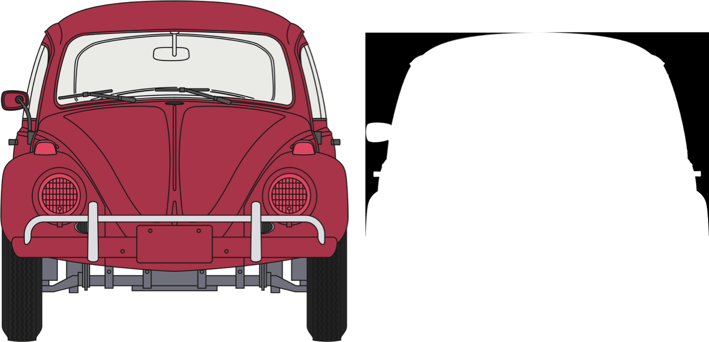
Two shape images are added to the paragraph. Text flows between them, tracing the face of the Beetle. These images get explicit dimensions and an opacity of zero, since they exist only for shape-outside and must not be seen. They also carry role and aria-hidden attributes to strip them of semantics and remove them from the accessibility tree.
<p>
<img src="shape-2.png" alt="">
<img src="shape-3.png" alt="">
…
</p>
p img {
width: 100px;
height: 125px;
opacity: 0; }<img src="shape-2.png" alt="" role="presentation" aria-hidden="true">With shape-outside applied to both images, the first floats left and the second right, carving the copy into the car's profile. The presentational road division receives identical role and aria-hidden attributes. On small screens, that division is hidden with display: none;.
p img:nth-of-type(1) {
float: left;
shape-outside: url(shape-l.png); }

p img:nth-of-type(2) {
float: right;
shape-outside: url(shape-r.png); }
<div role="presentation" aria-hidden="true"> </div>div {
display: none; }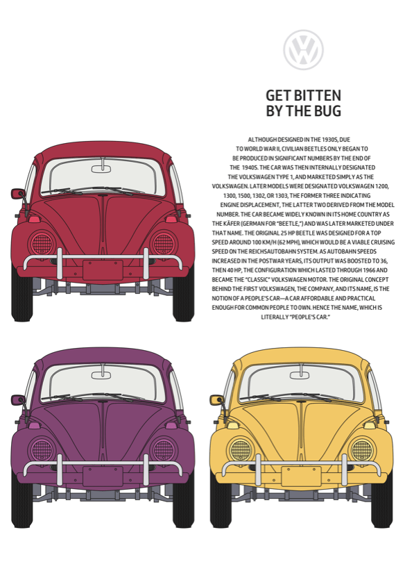
Medium and Large Screen Layouts
The medium screen design is a 2×2 symmetrical grid, which lets the sculpted text sit alongside the images it imitates. Before coding, a storyboard helps decide how elements rearrange across breakpoints. Using minmax() column values ensures the grid fills available space while columns stay at least 400px wide.
@media (min-width: 48em) {

section {
display: grid;
grid-template-columns: minmax(400px, 1fr) minmax(400px, 1fr);
grid-gap: 2vw;
align-items: end; }
}
Larger screens require two rows of equal height that occupy all vertical space.
@media (min-width: 64em) {

body {
display: grid;
grid-template-rows: 1fr 1fr; }
The large design is dominated by a horizontally scrolling content area wider than the viewport. It contains four columns — three for pictures, one for the sculpted copy — each with a minimum of 400px. The panel's maximum width is set to the viewport, with scrolling allowed only on the horizontal axis. Content outside the viewport is hidden but still reachable.
section {
grid-template-columns: repeat(4, minmax(400px, 1fr));
max-width: 100vw;
overflow-x: scroll; }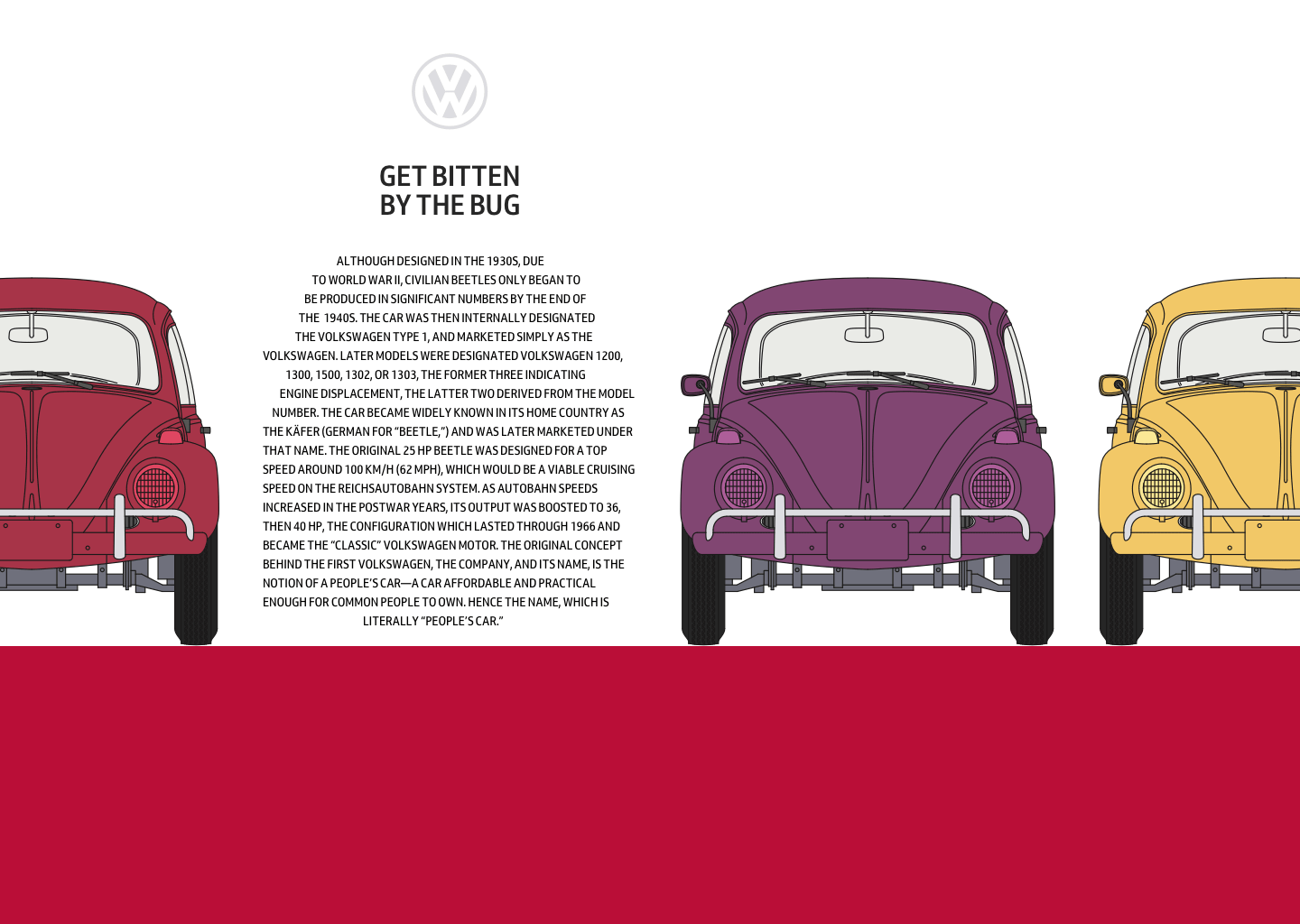
Below the content, the road division becomes visible on large screens. Its display property flips from none to block, and a light grey background is added. The height of this division is controlled by grid properties set on the body element.
div {
display: block;
background-color: #a73448; }
}
Adding Reflections Where Supported
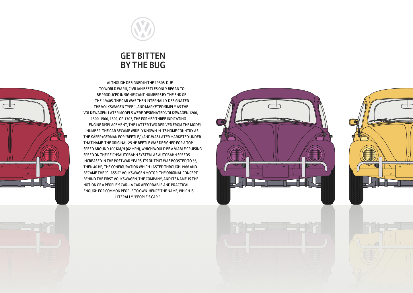
CSS Reflections were proposed by WebKit's Dave Hyatt in 2008 but remain implemented only in Google Chrome. A reflection creates a copy of an element, which can appear above, below, or to either side. The distance between element and reflection is controlled by an offset, and a mask — for example, a gradient — can gradually fade the reflection's intensity.
Reflections should be applied only where supported, and only when the screen is large enough to benefit. Nested media and feature queries test both the viewport's minimum width and whether the browser supports -webkit-box-reflect:below. Only then are reflections added and the presentation division coloured red.
@media (min-width: 64em) {
@supports (-webkit-box-reflect:below) {

section {
-webkit-box-reflect: below 0 linear-gradient(transparent, white); }

div {
background-color: #f0f0f1; }
}
}
Mirroring Storch's Symmetry
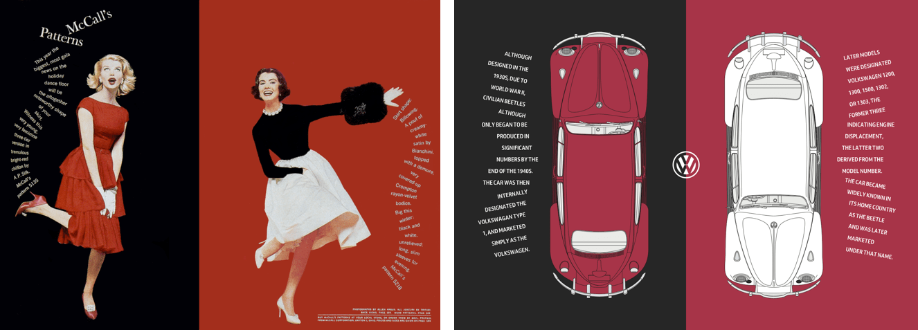
One of Storch's most distinctive spreads from McCall's Patterns pairs black and red across two pages with reassuring symmetry. Recreating that effect calls for just two structural elements — a main and an aside — each containing a picture element and a paragraph.
<main>
<picture>…</picture>
<p>…</p>
</main>

<aside>
<picture>…</picture>
<p>…</p>
</aside>
Because the design demands rotated lines, every line of text is wrapped in a span. These presentational elements are not ideal semantically, but without extra styles they do not disrupt paragraph readability.
<p>
<span>Although </span>
<span>designed in the </span>
<span>1930s, due to </span>
<span>World War II, </span>
<span>civilian Beetles </span>
<span>only began to </span>
<span>be produced in </span>
<span>significant </span>
<span>numbers by the </span>
<span>end of the 1940s.</span>
</p>
On small screens, main and aside stack vertically, each matching the viewport height, over a dark grey body background. The main element's background is set to the same red as the Beetle image it contains.
body {
background-color: #262626; }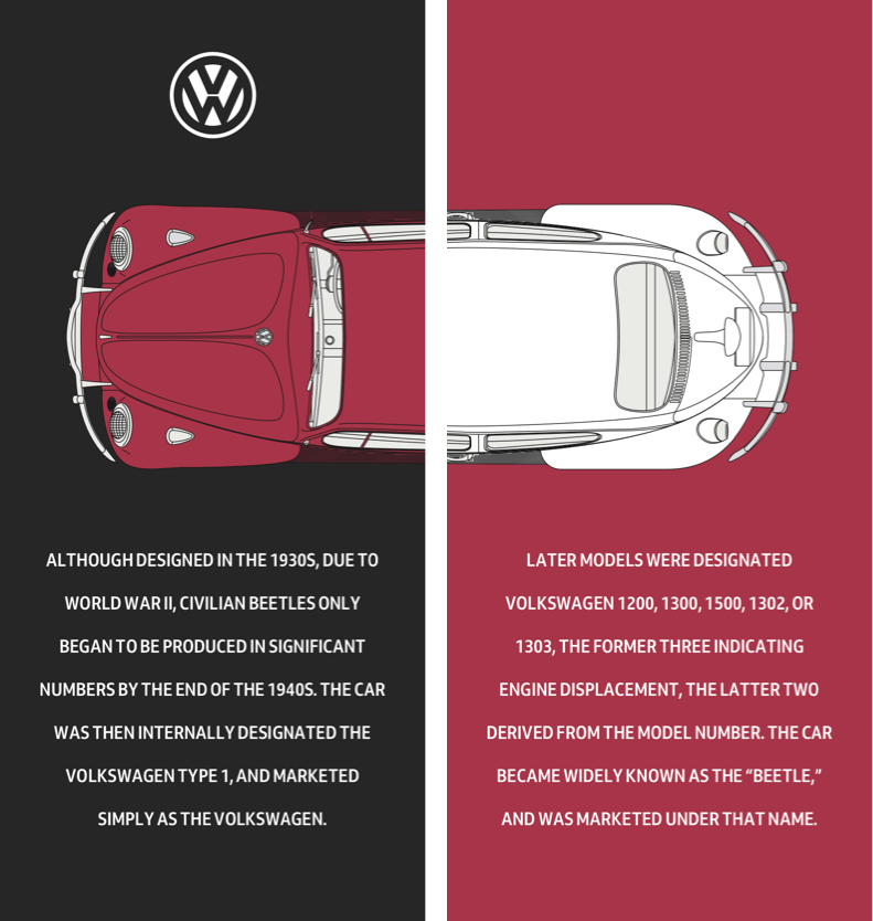
main,
aside {
display: flex;
flex-direction: column;
justify-content: center;
align-items: center;
min-height: 100vh;
padding: 2rem 0;
box-sizing: border-box;
color: #fff; }
aside {
background-color: #a73448; }Uppercase text is generally more difficult to read in long stretches, but it suits short passages and yields a stylish look.
p {
margin: 0 2rem;
text-align: center;
text-transform: uppercase; }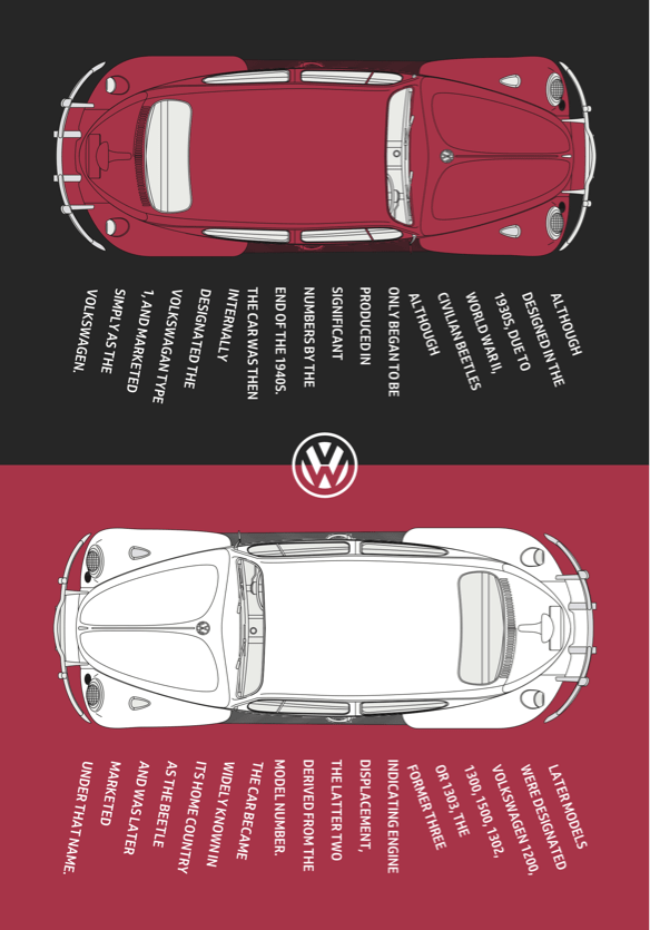
For medium screens, the two elements fill half the viewport each. Extra space allows the writing mode to change so the paragraphs display vertically, reading from right to left.
@media (min-width: 48em) {

main,
aside {
min-height: 50vh;
padding: 2rem; }
p {
max-height: 12em;
margin: 0;
text-align: left;
writing-mode: vertical-rl; }Setting the span elements' display to block splits each paragraph across multiple lines. Line-height adds space between them, making room for rotations.
p span {
display: block;
line-height: 2; }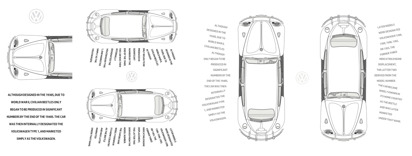
Transforms — including rotate, scale, and translate — have existed in CSS for nearly two decades. They take a transform function such as rotate plus a value in parenthesis.
To recreate Storch's effect, the first six lines rotate fifteen degrees anti-clockwise, the final six lines rotate fifteen degrees clockwise, and the middle lines stay untouched. Margins added to two lines give the rotated text enough space.
p span:nth-child(-n+6) {
transform: rotate(-15deg); }

p span:nth-child(n+12) {
transform: rotate(15deg); }
p span:nth-child(6) {
margin-left: 1em; }
p span:nth-child(12) {
margin-right: 1em; }
}In future, functions like rotate will work independently of the transform property, but only Firefox has implemented individual transforms so far.
A Symmetrical Large Screen Arrangement
On large screens, the body becomes a two-column grid with equal-height columns, giving the design its mirrored balance.
@media (min-width: 64em) {

body {
display: grid;
grid-template-columns: 1fr 1fr; }
Both main and aside get their own symmetric three-column grids, extending to full viewport height. The main picture spans the second and third columns; the aside picture spreads across the first and second. Paragraphs occupy the remaining columns. Assigning the same row number to every element keeps them aligned, independent of source order.
main,
aside {
display: grid;
grid-template-columns: 1fr 1fr 1fr;
grid-column-gap: 0;
padding: 2rem;
min-height: 100vh; }
main picture {
grid-column: 2 / -1;
grid-row: 1;
padding: 0 5vw; }
aside picture {
grid-column: 1 / 3;
padding: 0 5vw; }main p {
grid-column: 1;
grid-row: 1; }
aside p {
grid-column: 3; }The text here runs top to bottom, so the writing-mode is reset to horizontal, top-bottom, with right alignment.
main p,
aside p {
max-height: none;
writing-mode: horizontal-tb; }

main span {
text-align: right; }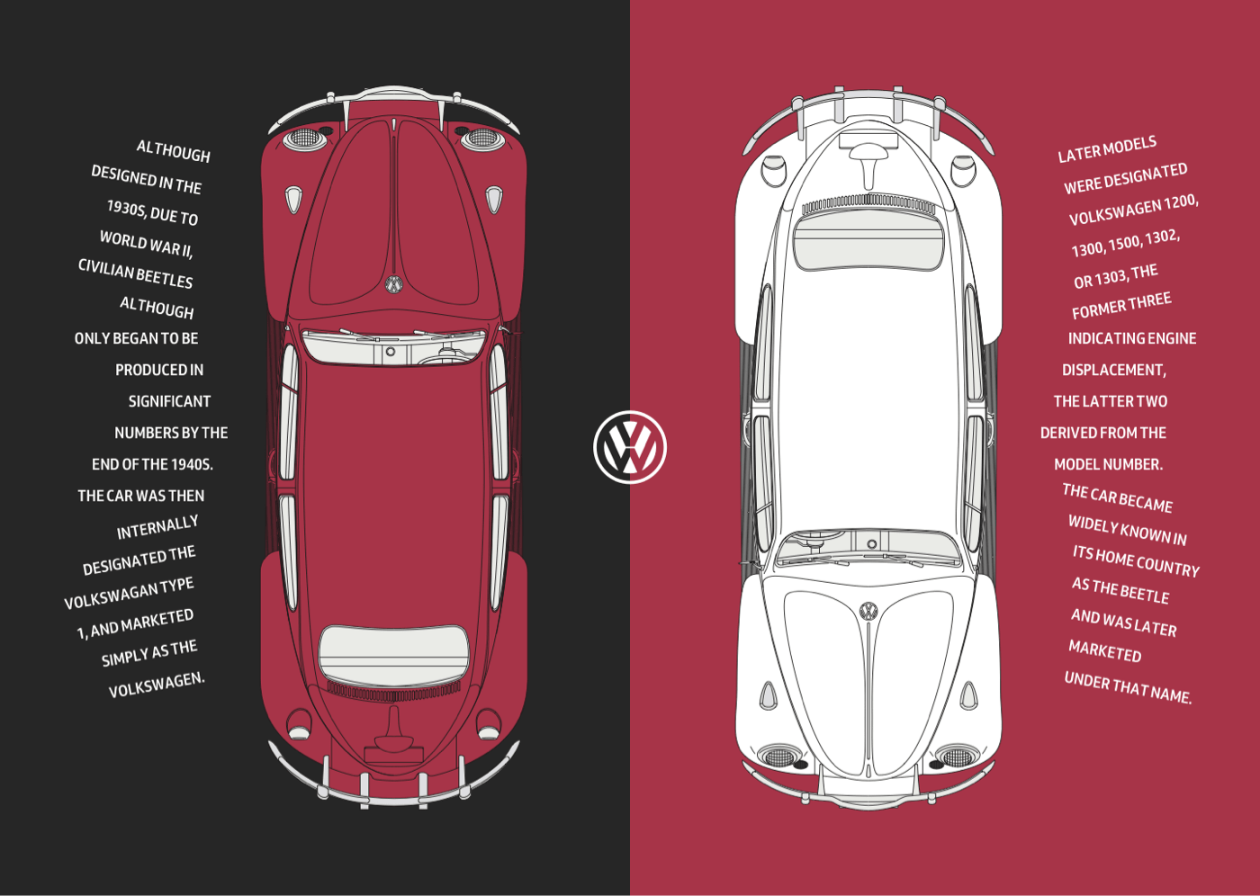
Finally, rotation values and margins from the medium layout are replaced with values that suit the larger viewport.
main p span:nth-child(-n+6) {
transform: rotate(10deg); }

main p span:nth-child(n+12) {
transform: rotate(-10deg); }

main p span:nth-child(6) {
margin: 0 0 15px; }

main p span:nth-child(12) {
margin: 15px 0 0; }

aside p span:nth-child(-n+6) {
transform: rotate(-10deg); }

aside p span:nth-child(n+12) {
transform: rotate(10deg); }

aside p span:nth-child(6) {
margin: 0 0 15px; }

aside p span:nth-child(12) {
margin: 15px 0 0; }
}
Letting Elements Span Columns
Storch frequently let large images and typographic elements bleed across two pages. A buttered corn cob floating above two columns of justified text is one memorable example. The final Beetle design aims for a similar effect — a large yellow Volkswagen placed over two columns of running text that wrap around the car's wheels.
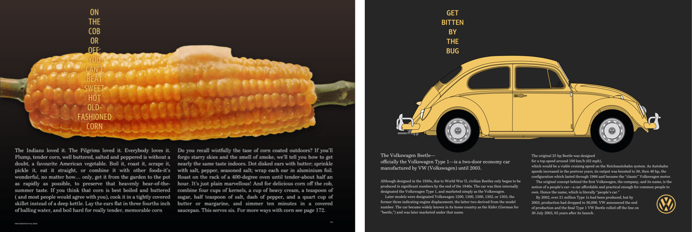
The markup needs only three structural elements: a header with an SVG logo, headline, and picture of the yellow Beetle, plus main and aside elements.
<header>
<svg>…</svg>
<h1>Get bitten by the bug</h1>
<figure>
<picture>…</picture>
</figure>
</header>

<main>…</main>
<aside>…</aside>
Normal flow plus a few foundation styles handle the small screen version. A dark body background and white text are set first.
body {
padding: 2rem;
background-color: #262626;
color: #fff; }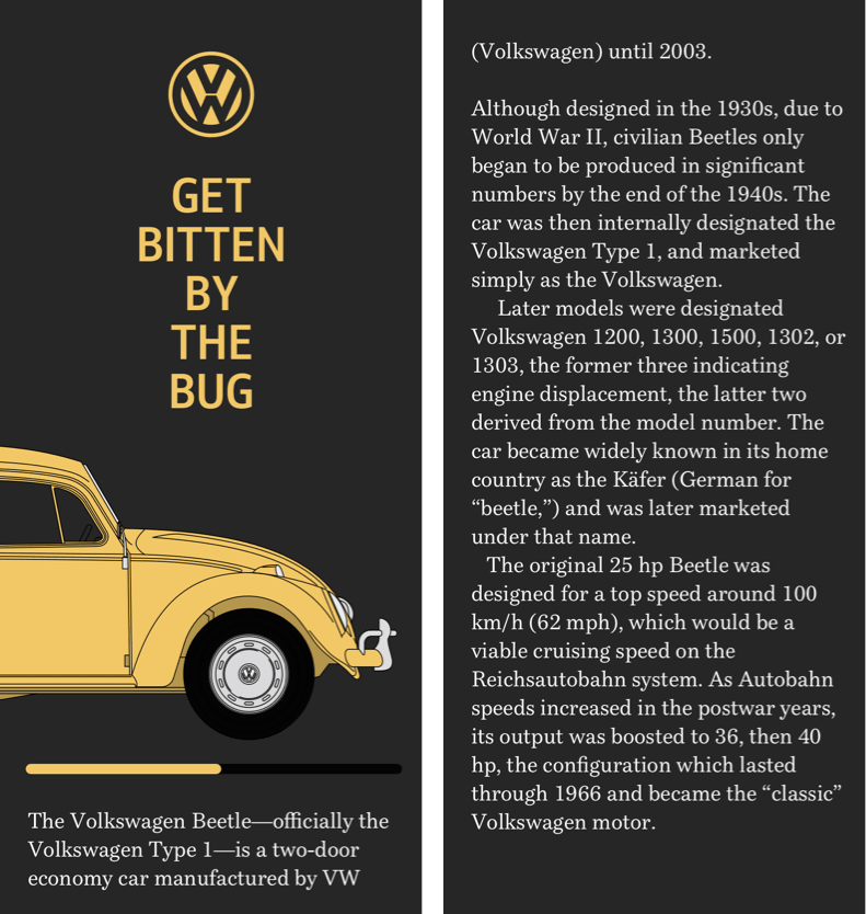
Margins centre the headline, which has a maximum width set in text-based units, and its uppercase words are centre-aligned.
h1 {
margin: 0 auto 1.5rem;
max-width: 8rem;
text-align: center;
text-transform: uppercase; }
Rather than resizing wide images to fit the viewport, a horizontally scrolling panel makes the full profile — including the wheels — accessible. Adding overflow-x: scroll; to the figure reveals the parts of the picture beyond the viewport.
figure {
overflow-x: scroll; }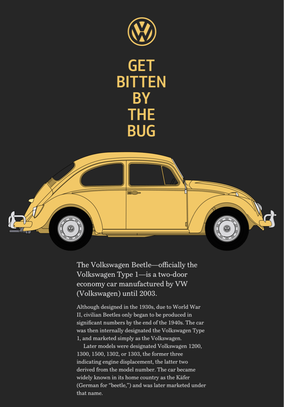
Medium screens inherit most foundation styles but use wide viewport-based margins to create a narrow column of text. The figure's overflow is also reset so all content becomes visible.
@media (min-width: 48em) {

figure {
overflow-x: visible; }

p {
margin-right: 25vw;
margin-left: 25vw; }
}
A Two-Column Grid With Text Wrapping Around Wheels
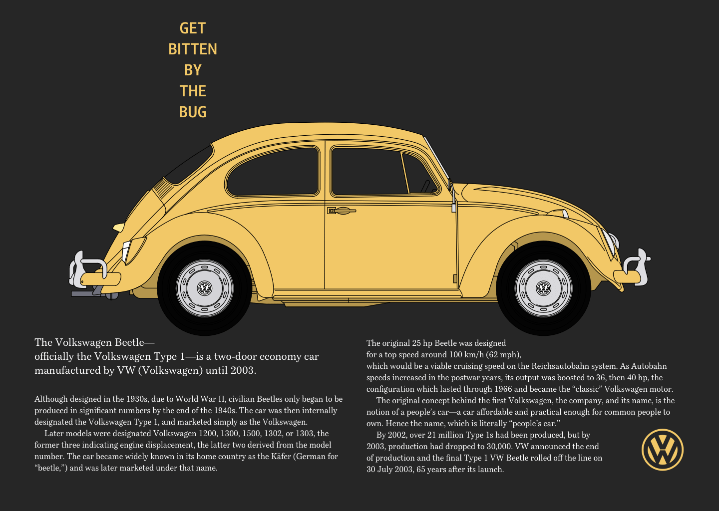
The largest version is the most complex. The body becomes a symmetrical two-column grid on large screens, and the header spans both columns. Nested grid values arrange the logo, headline, and Beetle image within the header — the two outer columns take all remaining space, while the centre column auto-sizes to its content.
@media (min-width: 64em) {

body {
display: grid;
grid-template-columns: 1fr 1fr;
padding: 4rem; }
header {
grid-column: 1 / -1;
display: grid;
grid-template-columns: 1fr auto 1fr;
grid-row-gap: 4vh; }The logo and headline sit in that centre column.
svg,
h1 {
grid-column: 2; }
Margins add space between paragraphs.
p {
margin-right: 1rem;
margin-left: 1rem; }
For this layout, the picture element contains two images: one with wheels for small and medium screens, and one without wheels for large screens. The wheels are reattached using :before pseudo-elements inside both main and aside, with a shape-margin separating them from surrounding text.
main:before,
aside:before {
display: block;
shape-margin: 10px; }
Generated content places the rear wheel before the main element and floats it right; shape-outside then wraps the text around the wheel. Equivalent values apply to the aside element, floating its wheel left.
main:before {
content: url(shape-l.png);
float: right;
shape-outside: url(shape-l.png); }
aside:before {
content: url(shape-r.png);
float: left;
shape-outside: url(shape-r.png); }
}The final design lets running text wrap around the Beetle's wheels — an effect that holds attention without losing readability or responsiveness.
Storch’s Legacy and the Untapped Power of CSS Shapes
Otto Storch produced a remarkable body of work, yet his name has faded in a way that feels unjust. There is no Wikipedia entry dedicated to him, and no book has been published on his life or portfolio. That silence is a loss, because Storch’s layouts hold real value for designers building for today’s web, and discovering his output should not require digging through archives.
His work also points to wider potential for CSS that remains underused. The shape-outside property and related Shapes features are now broadly supported by browsers, but they have received a fraction of the attention Storch’s designs deserve. Too often Shapes are treated only as a tool for subtle text wrapping. In Storch’s magazine spreads, form and content push against each other; translating that energy to the screen means thinking of Shapes as a layout instrument rather than a finishing touch.
The full range of what the CSS Shapes module can do, from polygon paths to image-masked flow, has yet to be explored thoroughly in production work. If Storch’s pages are any guide, that exploration is overdue. The hope is that more designers experiment with the property and that the techniques reach a point where they become a standard part of the workflow.

More From the Series
- Inspired Design Decisions: Avaunt Magazine
- Inspired Design Decisions: Pressing Matters
- Inspired Design Decisions: Ernest Journal
- Inspired Design Decisions: Alexey Brodovitch
- Inspired Design Decisions: Bea Feitler
- Inspired Design Decisions: Neville Brody
- Inspired Design Decisions: Herb Lubalin
- Inspired Design Decisions: Max Huber
- Inspired Design Decisions: Giovanni Pintori
- Inspired Design Decisions: Emmett McBain
- Inspired Design Decisions: Bradbury Thompson
Note: Smashing members receive access to a beautifully designed PDF of Andy’s Inspired Design Decisions magazine, along with full code examples from this article. The PDF for this issue and all others can be purchased directly from Andy’s website.


