

Typography With the Conviction of Lubalin
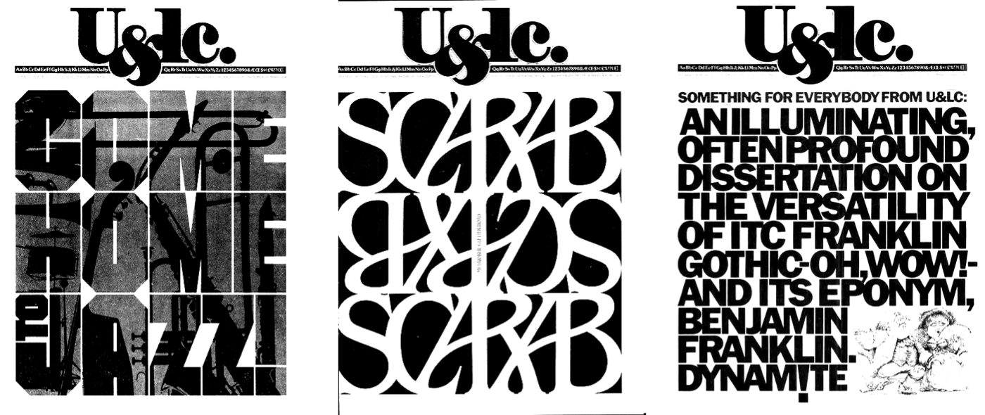
Good typography helps people read. Great typography does more: it articulates an idea and communicates a message with the force of any illustration or photograph. That conviction drove Herb Lubalin, the American graphic designer and typographer whose work — from advertising to postage stamps — was defined by an obsession with how words look and sound.
Lubalin understood that combining art, copy, and typography gives graphic designers the power to add conviction to communication. As he put it:
“The better people communicate, the greater will be the need for better typography-expressive typography.”
— Herb Lubalin
His path was not smooth. After narrowly passing the Cooper Union entrance exam, Lubalin was fired from his first job as a graphic artist for requesting a $2-per-week raise. In pre-war American agencies, layout artists simply placed headlines, copy, and images into available space. The post-war influx of European immigrant designers — Austrian Herbert Bayer, Russian Mehemed Fehmy Agha, and Belarusian Alexey Brodovitch — changed that, bringing art directors, layout artists, and writers together into the creative teams popularized by Bill Bernbach in the 1960s and 1970s.
In 1945, Lubalin became art director at Sudler & Hennessey, a studio specializing in the pharmaceutical industry, where he led a team of designers, illustrators, and photographers. His process, established there and continued from 1964 in his own studio, began with “tissues”: pen-and-ink sketches establishing spatial arrangement, accompanied by detailed notes on typeface choices, sizes, and weights. He layered tissue upon tissue, rapidly refining designs. His assistants recovered discarded sketches from floor and trash; they became collectors’ items.
Precision as Process
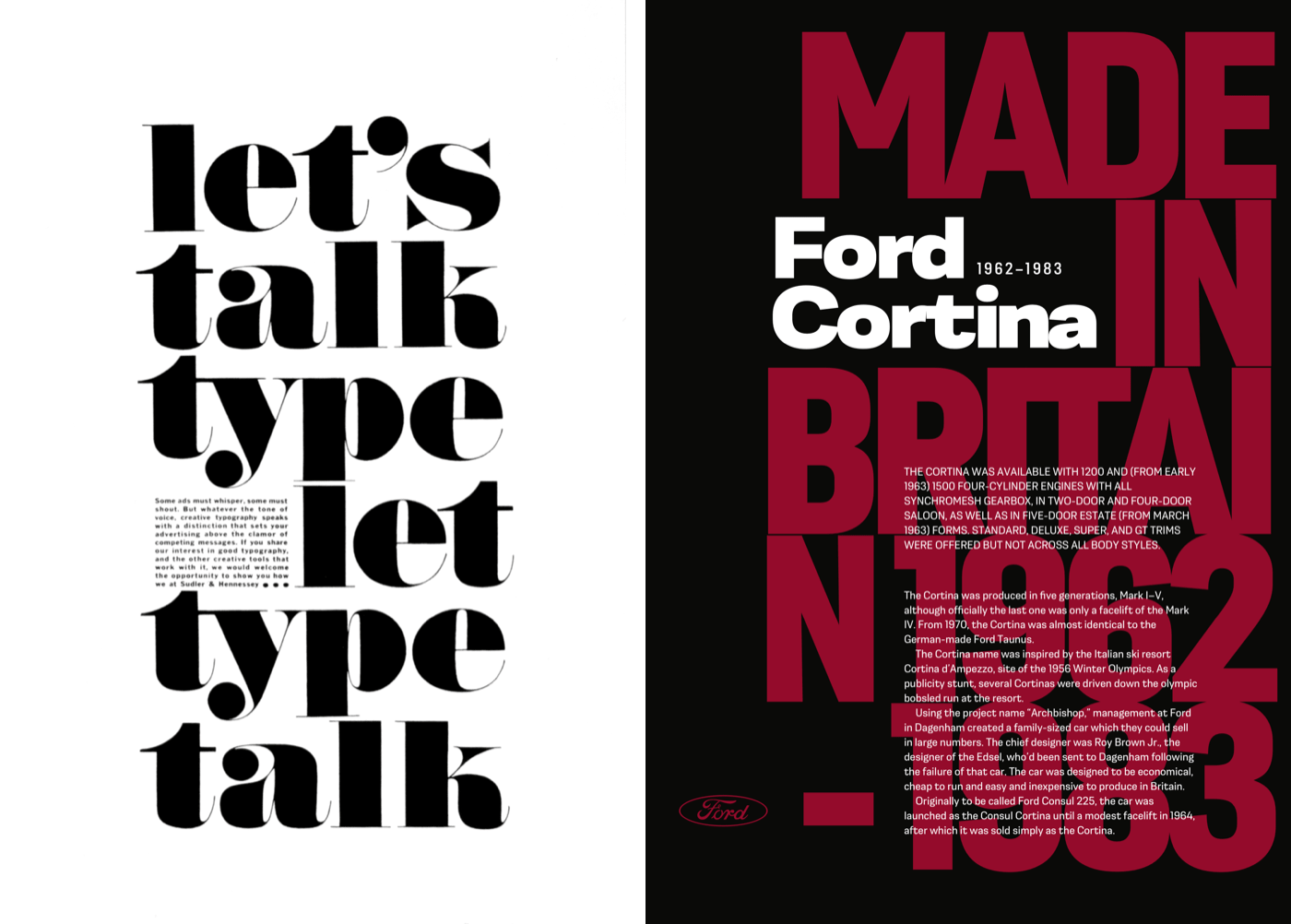
Lubalin was an obsessive perfectionist. For “Let’s talk type,” a trade advertisement for Sudler & Hennessey, he precisely placed the single paragraph so it sat perfectly on the baseline alongside the word “let,” its size and leading accommodating the descender from the “y” above. He frequently took a scalpel blade to type, adjusting letter spacing and altering ascender and descender heights to fit his designs.
In the “No More War” poster announcing the Avant Garde anti-war competition, headline letters are precisely sized and aligned, with the tracking of the uppercase blue standfirst creating a block of copy that fits its space exactly. For “The fourth of July means picnics…,” Lubalin used perspective to represent the road ahead, tracking every line of text and sometimes altering words to fit the design. The work was demanding. As one assistant later described:
“To make everything line up, you’ve got to do it over and over again, and then, if the client alters the text, you’ve got to redo the whole thing. To him (Lubalin,) it was worth it. How long it took or how much it cost wasn’t as important to him as it was to other designers.”
His relentless conviction made Lubalin one of the twentieth century’s most celebrated graphic designers and typographers. Two books document his work: Herb Lubalin: Art Director, Graphic Designer and Typographer (1985) by Gertrude Snyder and Alan Peckolick — out of print, but available second-hand — and Herb Lubalin: American Graphic Designer (2013) by Adrian Shaughnessy, a limited edition of 2000 published by Unit Editions.
Expressive Headlines Without Fancy Fonts
Headlines are the natural place to experiment with expressive type. You don’t need exotic fonts when extended families like Montserrat — designed by Julieta Ulanovsky, available on Google Fonts — offer weights from thin and light to extra-bold and black. Mixing those styles, with negative tracking (letter-spacing) and tight leading (line-height), creates a block of type that demands attention.
In the past, such headlines were hard-coded into HTML with breaks between individual words:
<h1><strong>UK’s <br>
best-<br>
selling <br>
car</strong> <br>
during <br>
the <br>
1970s</h1>
Or each word was wrapped in an inline span element whose display property was changed to block:
<h1><strong><span>UK’s</span>
<span>best-</span>
<span>selling</span>
<span>car</span></strong>
<span>during</span>
<span>the</span>
<span>1970s</span></h1>
A cleaner approach adds explicit line breaks directly in HTML:
<h1><strong>UK’s
best-
selling
car</strong>
during
the
1970s</h1>
Browsers ignore more than a single space between words, so on small viewports the headline reads like a sentence. Foundation styles handle colors, sizes, and weights, plus the negative tracking and tight leading that give the headline its character:
h1 {
font-size: 6vmax;
font-weight: 300;
line-height: .75;
letter-spacing: -.05em;
text-transform: uppercase;
color: #fff; }

h1 strong {
font-weight: 600;
color: #bd1f3a; }
Where HTML’s pre element presents text exactly as written, the CSS white-space property achieves similar results without sacrificing semantics. Of the six available values, four prove most useful:
white-space: normal;— text fills line-boxes and breaks as requiredwhite-space: nowrap;— text won’t wrap and may overflow its containerwhite-space: pre;— explicit line-breaks are respected; text breaks with new lines andbrelementswhite-space: pre-wrap;— white-space is respected, but text also wraps to fill line-boxes
Since the effects are needed only on larger viewports, isolate them with a media query:
@media (min-width: 64em) {

h1 {
white-space: pre; }
}
Building a Lubalin-Inspired Layout
Using several styles from one font family adds visual interest. The design here incorporates light, bold, and black weights, plus condensed and regular styles of Montserrat to produce a variety of text treatments.
Two structural elements drive the layout: main and aside:
<main>…</main>
<aside>…</aside>
The main element holds the headline and running text. The aside contains four images in a division and five articles about versions of the classic Cortina:
<aside>
<div>
<img src="img-1.svg" alt="Ford Cortina Mark 1 front profile">
<img src="img-2.svg" alt="Ford Cortina Mark 3 rear">
<img src="img-3.svg" alt="Ford Cortina Mark 4 front">
<img src="img-4.svg" alt="Ford Cortina Mark 5 rear profile">
</div>

<article>…</article>
<article>…</article>
<article>…</article>
<article>…</article>
<article>…</article>
</aside>
Paragraphs in each article are styled with pseudo-class selectors, each using a different combination of font styles and weights with mixed-case and uppercase letters:
article:nth-of-type(1) p {
font-family: 'light';
text-transform: uppercase; }

article:nth-of-type(2) p {
font-family: 'bold-condensed';
font-weight: 600;
text-transform: uppercase; }

article:nth-of-type(3) p {
font-family: 'bold-condensed';
font-weight: 600; }

article:nth-of-type(4) p {
font-family: 'light';
text-transform: uppercase; }

article:nth-of-type(5) p {
font-family: 'bold-condensed';
font-weight: 600; }
With foundation styles in place for all screen sizes, layout is introduced on the aside element for medium-size screens. For layouts where elements don’t overlap, grid-template-areas offers simplicity. This design has nine grid areas, named with letters rather than content descriptions to make moving items around the grid easier:
@media (min-width: 48em) {

aside {
display: grid;
grid-template-areas:
"a b c"
"d e f"
"g h i";
grid-gap: 1.5rem; }
}
The four images need placement into template areas, not into the division containing them. Changing that element’s display property to contents effectively removes it from the DOM for styling purposes:
aside div {
display: contents; }
Images are then placed using area names. Moving them to another area requires only referencing a different area name — no change to their order in HTML:
aside img:nth-of-type(1) {
grid-area: a; }

aside img:nth-of-type(2) {
grid-area: e; }

aside img:nth-of-type(3) {
grid-area: g; }

aside img:nth-of-type(4) {
grid-area: i; }
Articles fill the five remaining areas to complete the layout:
aside article:nth-of-type(1) {
grid-area: b; }

aside article:nth-of-type(2) {
grid-area: c; }

aside article:nth-of-type(3) {
grid-area: d; }

aside article:nth-of-type(4) {
grid-area: f; }

aside article:nth-of-type(5) {
grid-area: h; }
On small and medium screens, main and aside stack vertically in their HTML order. Larger viewports allow side-by-side placement, balancing visual weight across the screen. A five-column symmetrical grid on the body element starts the process:
@media (min-width: 64em) {

body {
display: grid;
grid-template-columns: repeat(5, 1fr); }
}
Both elements are then placed using line numbers, producing an asymmetrical design with a column of white space between main content and supporting articles:
main {
grid-column: 1; }

aside {
grid-column: 3 / -1; }
}
Grid, Flexbox, And Typographic Order
CSS Grid has become the most effective tool for translating experimental layouts into working code, and its properties are equally valuable when the goal is an intricate typographic treatment. A header containing a headline and two paragraphs can be ordered in HTML so the content makes sense unstyled, but then rearranged visually without touching the markup.
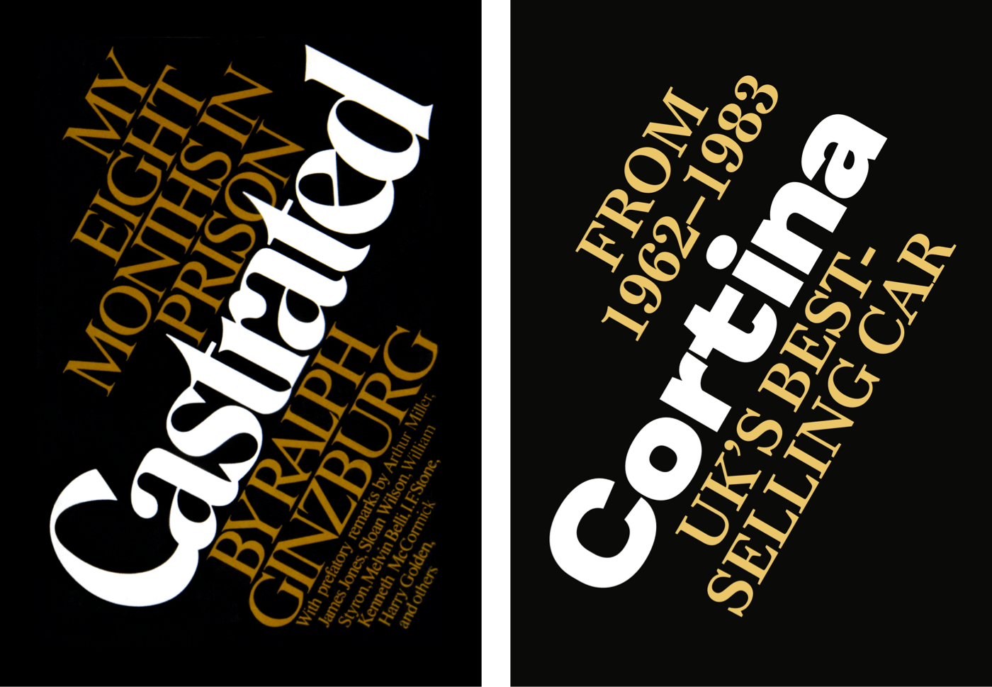
Start with foundation styles for both elements — alignment, colors, and sizes:
header h1,
header p {
margin: 0;
text-align: center; }

header h1 {
font-size: 10vmax;
color: #ebc76a;
line-height: 1; }

header p {
font-size: 4vmax;
line-height: 1.1;
text-transform: uppercase; }
Because the HTML follows a semantic sentence structure rather than a visual one, Flexbox on the header with a flex-direction of column lets the elements be reordered freely:
header {
display: flex;
flex-direction: column; }
All elements have a default order value of 0. Giving the final paragraph an order of -1 moves it above the headline while leaving the source order intact:
header p:last-of-type {
order: -1; }
On medium screens, two large background color bands appear, created with a CSS gradient. The foreground colors of the headline and paragraphs shift to keep contrast against the new background:
@media (min-width: 48em) {

body {
background-image: linear-gradient(to right,
#0a0a08 0%,
#0a0a08 50%,
#fff 50%,
#fff 100%); }

header h1 {
color: #fff; }

header p {
color: #ebc76a; }
}
An unusual diagonal alignment across the three elements comes from nesting CSS Grid inside Flexbox. The headline and paragraphs sit on a four-column symmetrical grid; leaving a column empty in the first and last rows creates the diagonal.
@media (min-width: 64em) {

header {
display: grid;
grid-template-columns: repeat(4, 1fr);
align-items: start;
padding-top: 0; }
}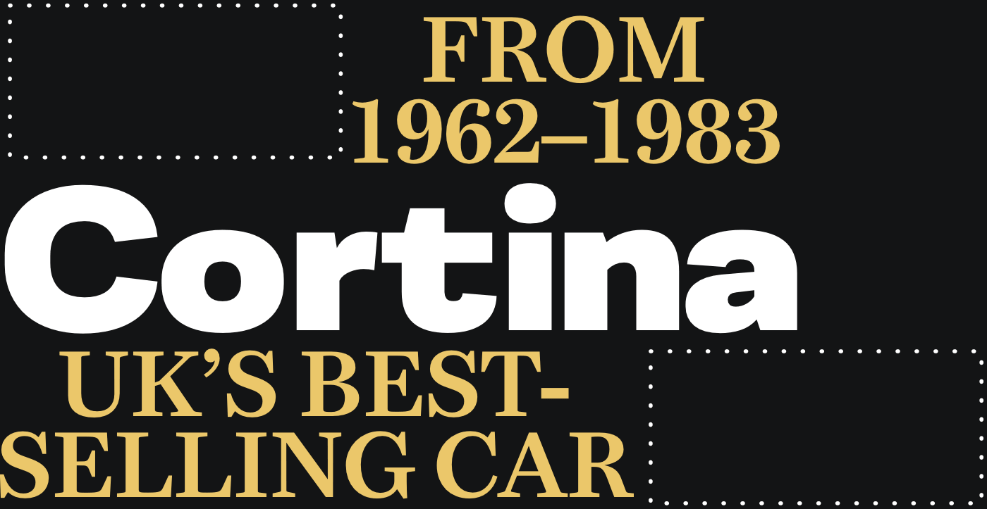
The headline spans all four columns:
header h1 {
grid-column: 1 / -1; }
The first paragraph — positioned at the bottom — leaves the first column empty:
header p:first-of-type {
grid-column: 2 / -1; }
The final paragraph, now at the top, spans the first three columns and leaves space on the left:
header p:last-of-type {
grid-column: 1 / 4; }
Rotated text remains rare on the web, which makes it memorable when used well. To rotate the headline anti-clockwise, add a transform that rotates it negatively by 30 degrees and shifts it down 150px:
header {
transform: rotate(-30deg) translateY(150px);
transform-origin: 0 100%; }
transform-origin determines the point around which the transform happens. Origins include the center, any corner (such as top-left (0 0) or bottom-right (100% 100%)), or values in pixels, em, or rem.
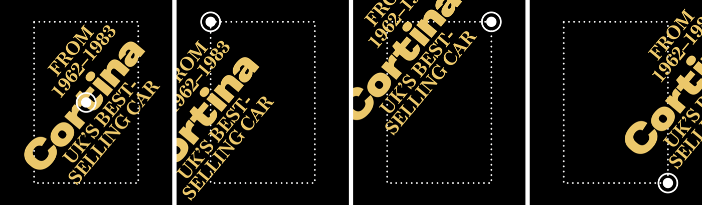
A subtle transition on the transform reduces the rotation on hover for an extra surprise:
header {
transition: transform .5s ease-in; }

header:hover {
transform: rotate(-25deg) translateY(150px); }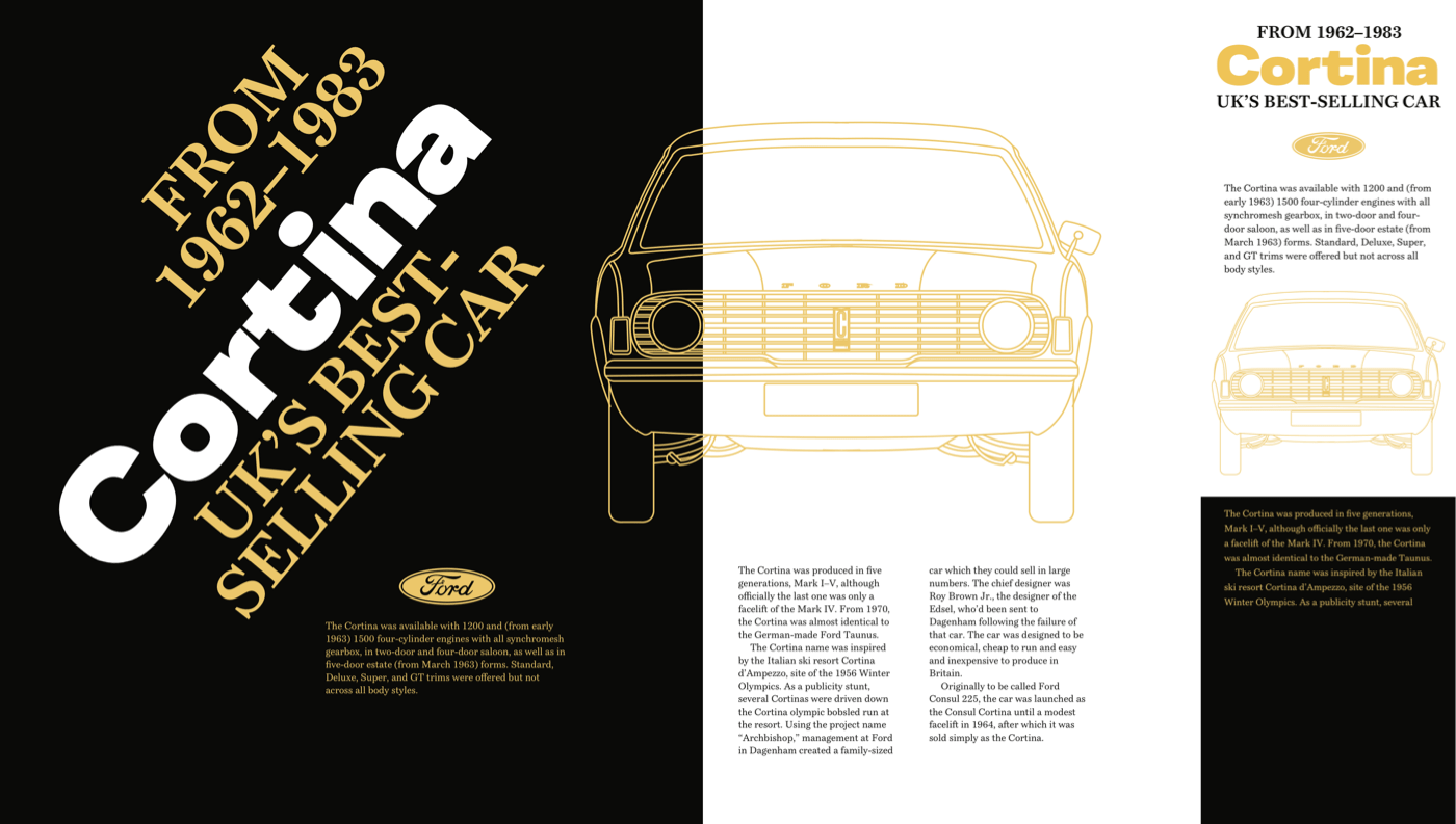
Headlines And Lists As One Composition
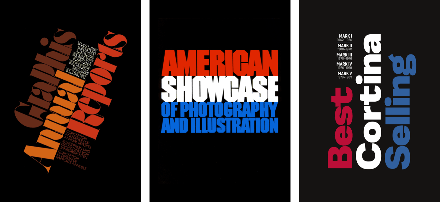
An ordered list of Cortina models paired with a multi-colored headline turns a header into a strong visual statement:
<header>
<div>
<h1>…</h1>
<ol>…</ol>
</div>
</header>
The headline has three lines, each styled differently. That requires three inline span elements:
<h1>
<span>Best</span>
<span>Selling</span>
<span>Cortina</span>
</h1>
For the models and their manufacturing years, an ordered list is the most semantic choice. Wrapping each model name in a strong element adds semantic weight and gets bold styling from default browser styles:
<ol>
<li><strong>Mark I</strong> 1962–1966</li>
<li><strong>Mark II</strong> 1966–1970</li>
<li><strong>Mark III</strong> 1970–1976</li>
<li><strong>Mark IV</strong> 1976–1979</li>
<li><strong>Mark V</strong> 1979–1983</li>
</ol>
On small viewports, foundation styles suffice. A large font size with tight leading forms a solid block. Changing the spans from inline to block, then using pseudo-classes to color the first and third lines differently, completes the baseline treatment:
h1 {
font-size: 18vmin;
line-height: .9;
color: #fff; }

h1 span {
display: block; }

h1 span:nth-of-type(1) {
color: #ba0e37; }

h1 span:nth-of-type(3) {
color: #31609e; }
The ordered list items form a two-column symmetrical grid with equal column widths:
ol {
list-style-type: none;
display: grid;
grid-template-columns: 1fr 1fr; }
Leading tightens and all but the last list-item receive a solid blue bottom border:
li {
display: inline-block;
line-height: 1.2; }

li:not(:last-of-type) {
border-bottom: 1px solid #31609e; }
No explicit column or row numbers are needed — CSS Grid places items automatically through normal flow. The strong elements become block-level and uppercase for emphasis:
li strong {
display: block;
font-size: 1.266rem;
font-weight: 600;
text-transform: uppercase; }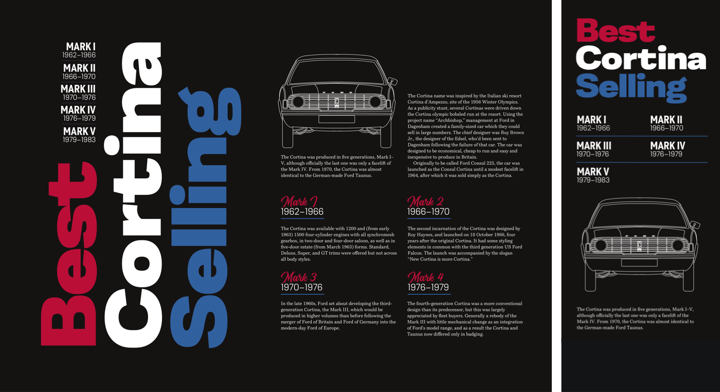
Horizontal and vertical centering once required workarounds; Flexbox makes it trivial. With a row-based flex-direction, align-items: center centers on the cross axis (vertical) and justify-content: center on the main axis (horizontal):
@media (min-width: 48em) {

header {
display: flex;
align-items: center;
justify-content: center; }
}
With content in place, a grid of three columns and two rows, sized by content, is applied to the header:
header > div {
display: grid;
grid-template-columns: repeat(3, min-content);
grid-template-rows: auto auto; }
The three headline lines anchor the design. Setting display: contents; on the headline lets each span participate directly in the grid:
h1 {
display: contents; }
Each line is then placed by line numbers:
h1 span:nth-of-type(1) {
grid-column: 1;
grid-row: 2; }

h1 span:nth-of-type(2) {
grid-column: 2;
grid-row: 1 / 3; }

h1 span:nth-of-type(3) {
grid-column: 3;
grid-row: 1 / 3; }
Vertical text comes from rotating each span 180 degrees and switching the writing mode to vertical left-right:
h1 span {
transform: rotate(180deg);
writing-mode: vertical-lr; }
To pack the headline and list into a solid unit, the list switches from grid to block, and each list-item's content is right-aligned onto the headline's baseline:
ol {
display: block; }

li {
text-align: right; }
SVG Text As A Design Tool
SVG does far more than draw basic shapes — its text element is one of the more powerful features. Like HTML text, SVG text is accessible, selectable, and infinitely styleable with clipping paths, gradient fills, filters, masks, and strokes. Only content inside text elements is rendered; everything else in the SVG is ignored. Multiple text elements are allowed, though a single one often suffices:
<svg>
<text>’70’s best-selling Cortina British car</text>
</svg>
Several SVG properties apply directly to text. Many — letter spacing, word spacing, text-decoration — exist in CSS as well, but the attributes unique to SVG account for much of its appeal. textLength sets rendered text width, and the text shrinks or stretches to fit according to the chosen lengthAdjust value:
textLength
Scales the text to fit; set it in percentages or any numeric value, ideally in em or rem units.lengthAdjust
Defines how the text compresses or stretches to match the width intextLength.
Used inline on a text element, SVG properties behave like inline styles:
<svg>
<text textLength="400">’70’s best-selling Cortina British car</text>
</svg>
Better results come from CSS — either embedded in HTML or in an external stylesheet. A style element works inside an external SVG file or within inline SVG in HTML:
<svg>
<text class="display">’70’s best-selling Cortina British car</text>
</svg>

<style>
.display {
font-size: 100px;
font-family: 'black-extended';
font-weight: 600;
letter-spacing: -1px;
text-anchor: middle;
text-transform: uppercase; }
</style>
SVG's tspan element serves the same purpose as HTML's span, splitting text into smaller, independently styleable pieces. This headline divides its content across six tspan elements:
<text>
<tspan>’70’s</tspan>
<tspan>best-</tspan>
<tspan>selling</tspan>
<tspan>Cortina</tspan>
<tspan>British</tspan>
<tspan>car</tspan>
</text>
Splitting the headline allows per-word styling and precise positioning — baseline-relative or relative to nearby elements:
x— horizontal starting point of the text baseline;y— vertical starting point of the text baseline;dx— horizontal shift from a previous element;dy— vertical shift from an earlier element.

For this headline, the first tspan sits 80px from the top and each subsequent element falls another 80px below it:
<text>
<tspan y="80">’70’s</tspan>
<tspan dy="80">best-</tspan>
<tspan dy="80">selling</tspan>
<tspan dy="80">Cortina</tspan>
<tspan dy="80">British</tspan>
<tspan dy="80">car</tspan>
</text>
tspan elements support precise layout, but they create accessibility problems. Assistive technology may read each one as a separate word — worse, it can spell out individual letters when a tspan wraps single characters. These elements, for example, are spoken as:
<tspan>C</tspan>
<tspan>o</tspan>
<tspan>r</tspan>
<tspan>t</tspan>
<tspan>i</tspan>
<tspan>n</tspan>
<tspan>a</tspan>
“C”, “o”, “r”, “t”, “i”, “n”, “a”
Accessibility should never be sacrificed for a styling choice, so keep tspan use purposeful and never wrap a single letter in one.
Typographic Strokes, CSS and SVG
Outlining text can improve legibility over busy backgrounds and produce everything from subtle refinement to bold graphic impact. CSS has no official text-stroke property — it remains experimental with a Webkit vendor prefix — but modern browsers support it widely.
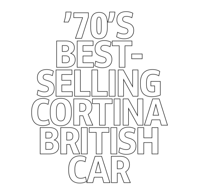
text-stroke is shorthand for text-stroke-color and text-stroke-width. Start with foundation typography for family, size and weight, adjust leading and tracking, then apply the stroke. Adding text-fill-color: transparent overrides the foreground colour and reveals the outline alone:
h1 {
font-size: 100px;
font-family: 'black-extended';
font-weight: 600;
letter-spacing: -6px;
line-height: .8;
color: #fff; }
h1 {
/* -webkit-text-stroke-color: #fff; */
/* -webkit-text-stroke-width: 5px; */
-webkit-text-stroke: 5px #fff;
-webkit-text-fill-color: transparent; }Though not part of any W3C specification, the property is already implemented across browsers and unlikely to be withdrawn. For legacy concerns, wrap the stroke styles in a feature query and provide a fallback for unsupporting browsers.
SVG offers its own stroke properties plus options CSS lacks — including opacity control. An SVG header with six tspan elements applies the equivalent of text-stroke-color and text-stroke-width, while a reduced stroke opacity creates a softer edge:
<svg>
<text>
<tspan>’70’s</tspan>
<tspan>best-</tspan>
<tspan>selling</tspan>
<tspan>Cortina</tspan>
<tspan>British</tspan>
<tspan>car</tspan>
</text>
</svg>
text {
stroke: #fff;
stroke-width: 1.5px;
stroke-opacity=".8"; }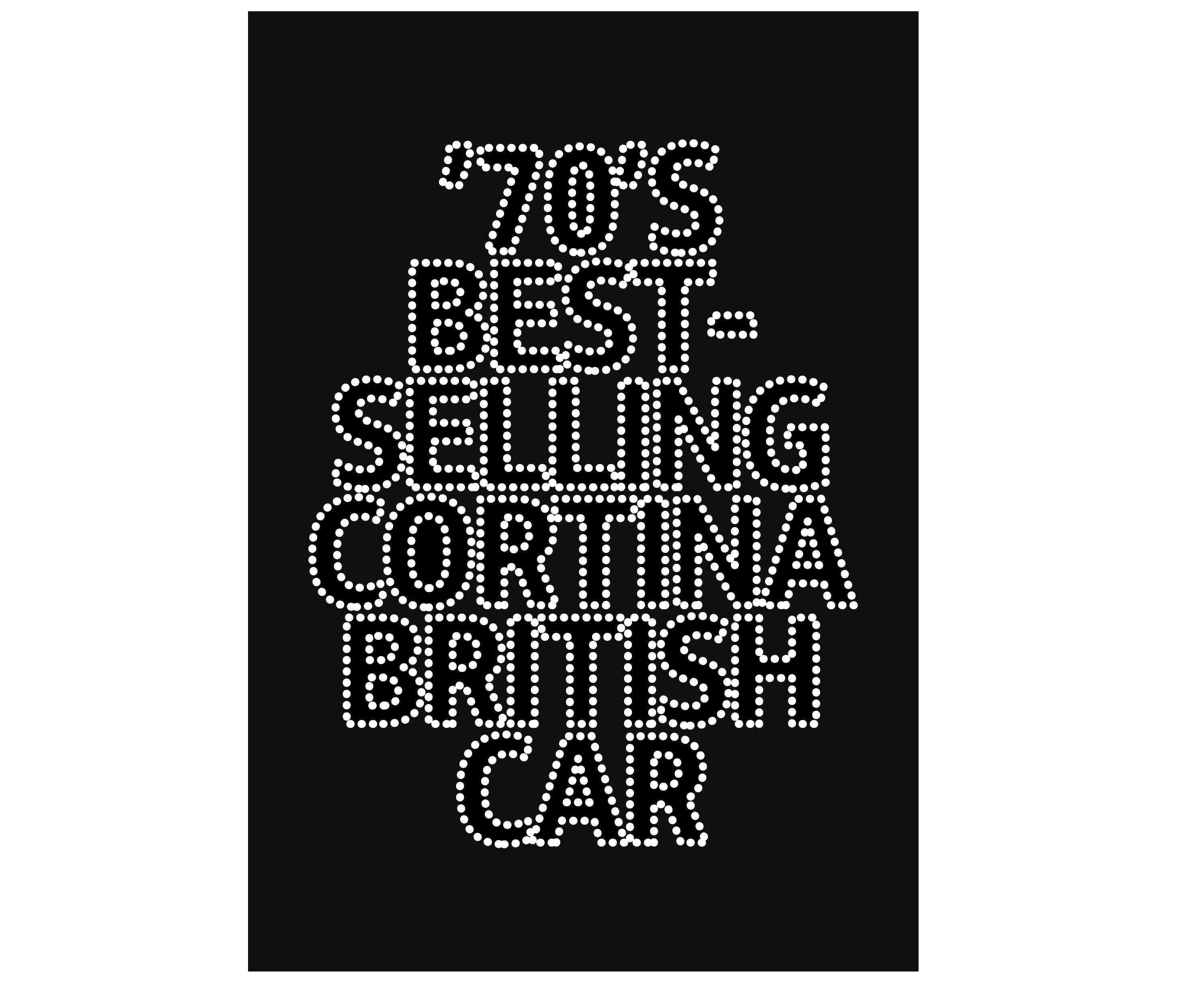
SVG strokes can also be dashed with stroke-dasharray. Alternate values set filled and blank segments, so a value of 1, 10 produces one unit filled, ten units blank. Adding more numbers builds complex patterns: 1, 10, 1 yields 1 (filled), 10 (blank), 1 (filled), 1 (blank), 10 (filled), 1 (blank), and repeats.
text {
stroke-dasharray: 1, 10; }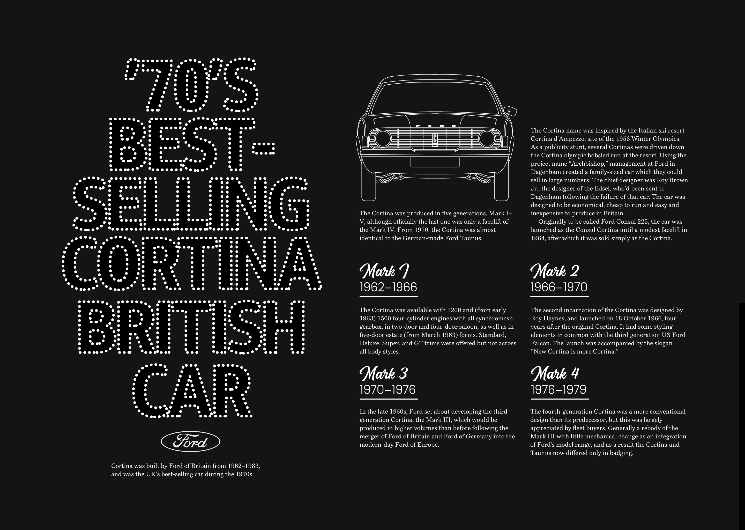


Accessible SVG Typography
CSS typography has never been more capable, but some designs call for more than styled HTML text. SVG — external or inline — renders scalable text effects and, when optimised well, can outperform image replacement techniques and support assistive technology.
Consider a header with two typefaces: Magehand, a retro script by Indonesian designer Arief Setyo Wahyudi, and Mokoko, a seven-weight slab serif from London's Dalton Maag. Embedding both fonts in WOFF and WOFF2 adds over 150kb. Converting the type to outlines and delivering the header as an optimised SVG adds just 17kb.
Three paths form the image:
<svg xmlns="https://www.w3.org/2000/svg">
<path id="top">…</path>
<path id="bottom">…</path>
<path id="middle">…</path>
</svg>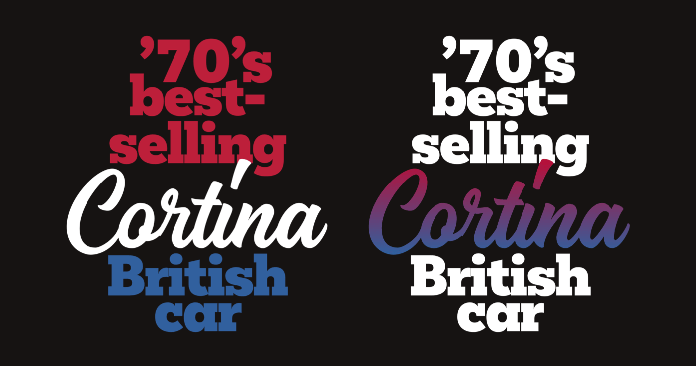
Path order matters — elements stack in document order just as in HTML. SVG properties like fill apply to any element, colouring each path individually. A linear gradient with two colour stops can replace a solid fill for a richer script effect:
<path fill="#bd1f3a">…</path>
<path fill="#31609e">…</path>
<path fill="#fff">…</path>
<defs>
<linearGradient id="cortina" gradientTransform="rotate(90)">
<stop offset="0%" stop-color="#bd1f3a" />
<stop offset="100%" stop-color="#31609e" />
</linearGradient>
</defs>
<path fill="#fff">…</path>
<path fill="#fff">…</path>
<path fill="url('#cortina')">…</path>SVG files are often far lighter than bitmaps or multiple font files, but optimisation still matters. Each element, handle and node adds weight, so prefer basic shapes (circles, ellipses, rectangles) over paths where possible and simplify curves to cut nodes and handles. Export tools like Adobe Illustrator and Affinity Designer frequently pad files with metadata; SVGOMG by Jake Archibald strips that overhead and can shrink file size substantially.
Text-outline SVGs stay accessible through alternative text and ARIA. For external SVG files, add alt text as for any non-decorative image:
<img src="header.svg"
alt="Cortina. ’70s best-selling British car">
Inline SVG is the most assistive-friendly option. An ARIA role and descriptive label let screen readers treat the SVG as one element:
<svg role="img" aria-label="Cortina. ’70s best-selling British car">
…
</svg>
A title element — never rendered in the browser — distinguishes multiple SVG blocks for assistive technology:
<svg>
<title>Cortina. ’70s best-selling british car</title>
</svg>
Give each block a unique ID and reference it in the title when a document contains several SVGs:
<svg>
<title id="header">…</title>
</svg>
For purely decorative SVG, hide it with aria-hidden:
<svg aria-hidden="true">
…
</svg>
Where SVG replaces an HTML heading, restore semantics with role="heading" and a matching aria-level:
<svg role="heading" aria-level="1">
…
</svg>
Clipping Type for Image-Filled Letterforms
The CSS background-clip property normally accepts three box-model values:
border-box
Background extends beneath the border to the border's outer edge.padding-box
Background is confined to the padding box.content-box
Background renders only within the content box.

One further value unlocks expressive typography: text clips the background to the letterforms themselves.

The brake-disk background underneath a headline appears only inside the glyphs. Adding content or increasing font size reveals more of the image:
h1 {
background-image: url(pattern.svg);
background-clip: text;
-webkit-background-clip: text;
color: transparent; }
Any element except the :root can use background-clip: text. Given limited support, a feature query restricts these styles to capable browsers:
h1 {
color: #fff; }

@supports (background-clip: text) or (-webkit-background-clip: text) {
h1 {
background-color: #fff;
background-image: url(pattern.svg);
background-position: 50% 100%;
background-repeat: no-repeat;
background-size: 50%;
background-clip: text;
-webkit-background-clip: text;
color: transparent; }
}
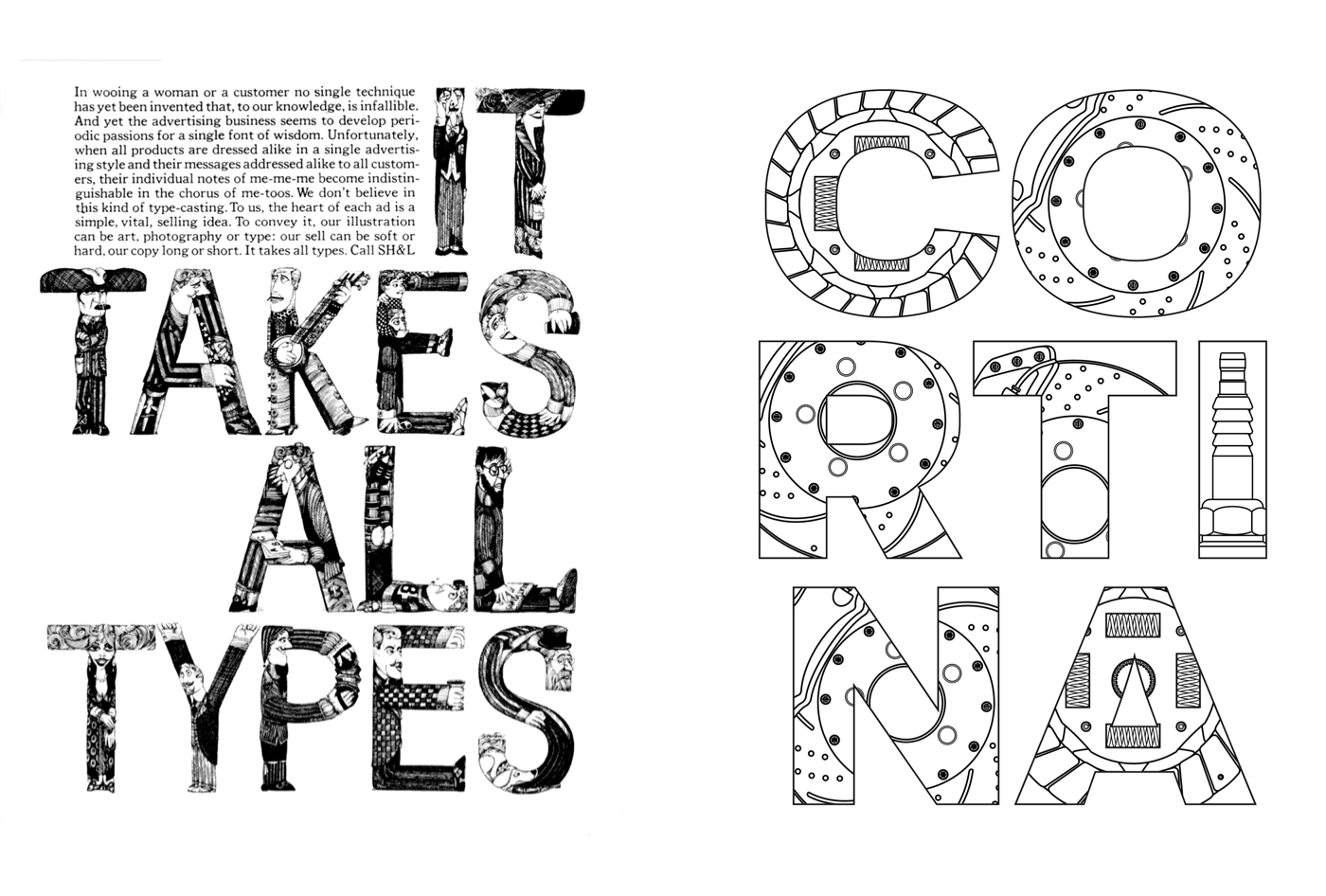
SVG's image element pushes the idea further by letting pictures fill each letter — a technique echoed from Lubalin's era:
Heading semantics are preserved with alternative text plus ARIA role and level:
<img src="header.svg" alt="Cortina"
role="heading" aria-level="1">
Graphical objects stored in the defs element can be referenced elsewhere in the file. Defining one pattern per letter keeps content out of the initial render; referencing each pattern by its unique ID fills a path in the word “Cortina”:
<svg>
<defs>
<pattern id="letter-c">…</pattern>
<pattern id="letter-o">…</pattern>
<pattern id="letter-r">…</pattern>
…
</defs>
…
</svg>
<svg>
<defs>…</defs>
<path fill="url(#letter-c)">…</path>
<path fill="url(#letter-o)">…</path>
<path fill="url(#letter-r)">…</path>
…
</svg>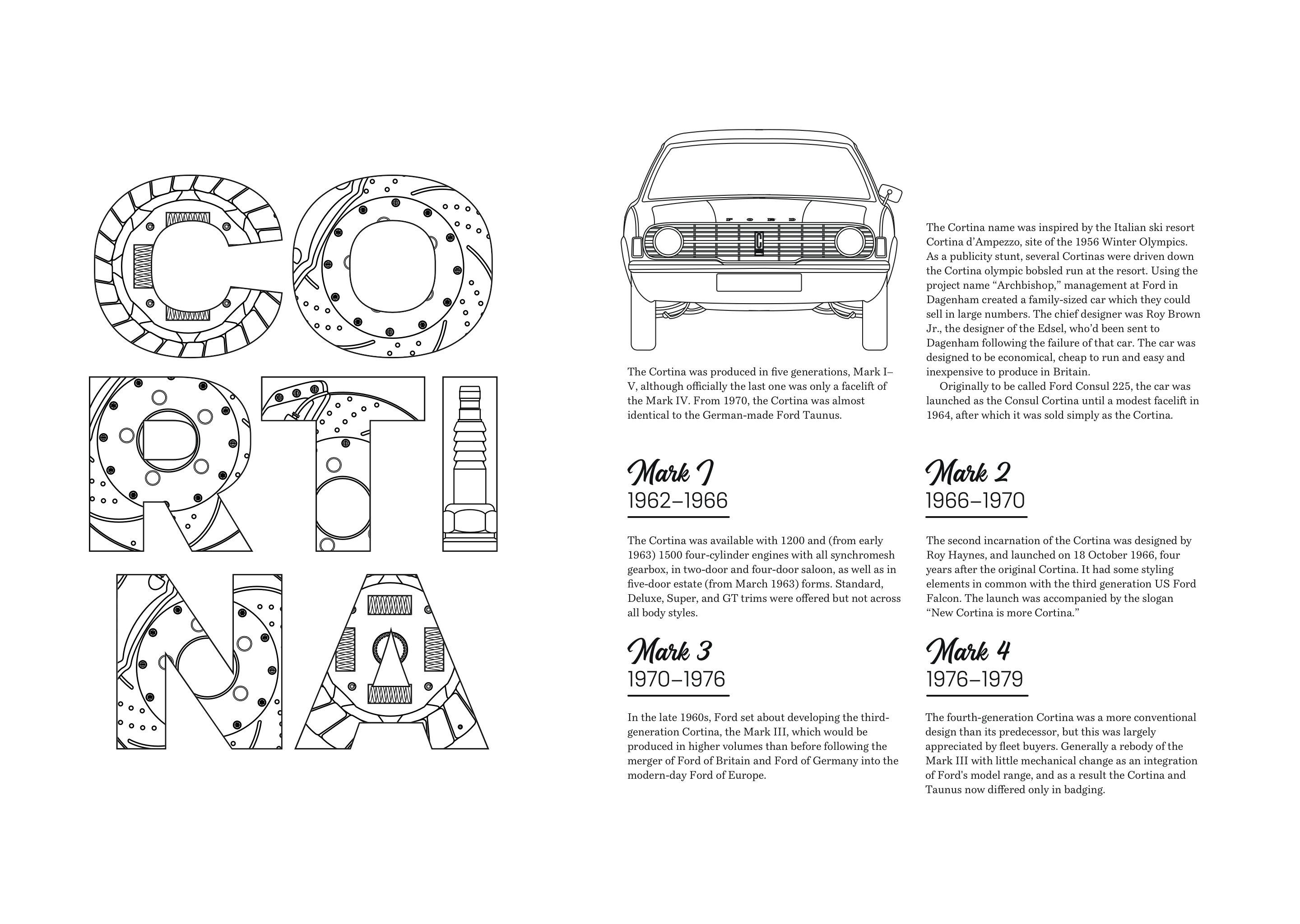
The image element renders bitmap or vector sources inside SVG. Three car-part blueprint images are linked via a standard href attribute:
<defs>
<pattern id="letter-c" width="100%" height="100%">
<image href="pattern-c.png" height="250" width="250"/>
</pattern>
…
</defs>
Filling each letter with a different blueprint creates a headline that captures attention without resorting to static imagery.
Building a Lubalin-Inspired Layout
Herb Lubalin’s ability to make typography carry a composition is unmatched. For a final example inspired by his work, the techniques shown throughout this series come together in a design for a classic ’70s Ford Cortina.
The structure relies on two familiar elements: a main and an aside.
<main>…</main>
<aside>…</aside>
Inside the main, a header holds an SVG headline, followed by a div containing the running text. To keep the SVG text accessible, the headline gets an explicit ARIA role and level:
<main>

<header>
<svg role="heading" aria-level="1">…</svg>
</header>

<div>…</div>

</main>
Responsive imagery is handled with a picture element: full-size images serve to small screens, while a minimum-width media query swaps in a half-size version for larger viewports.
<aside>
<picture>
<source media="(min-width: 74em)">
<img src="full.svg" alt="Ford Cortina">
</picture>
</aside>
Lubalin’s work is rarely static, so the main element uses CSS Grid with three columns and five rows to build an asymmetrical, energetic composition.
main {
display: grid;
grid-template-columns: 1fr 1fr 1fr;
grid-template-rows: repeat(5, 1fr); }
Two visual layers dominate: an outline of the Cortina and a text-based SVG background image that covers the main element. The SVG is scaled to fill, and background-origin is changed so the image sits behind the content only, not the border or padding.
main {
background-image: url(main.svg);
background-origin: content-box;
background-position: top right;
background-repeat: no-repeat;
background-size: 100% 100%; }
Empty columns around the header and text div create negative space that guides the eye. The header spans the first two columns, and the text division fills the last two, overlapping slightly:
header {
grid-column: 1 / 3;
grid-row: 2 / 3; }

main div {
grid-column: 2 / 4;
grid-row: 3 / 6; }
SVG text elements allow precise positioning, either by baseline or relative to other elements. The headline contains two text nodes for the car’s name and a third for the production period. That final element is placed exactly 250px from the left and 60px from the top of the SVG:
<svg>
<text x="0" y="60">Ford</text>
<text x="0" dy="70">Cortina</text>
<text x="250" y="60">1962–1983</text>
</svg>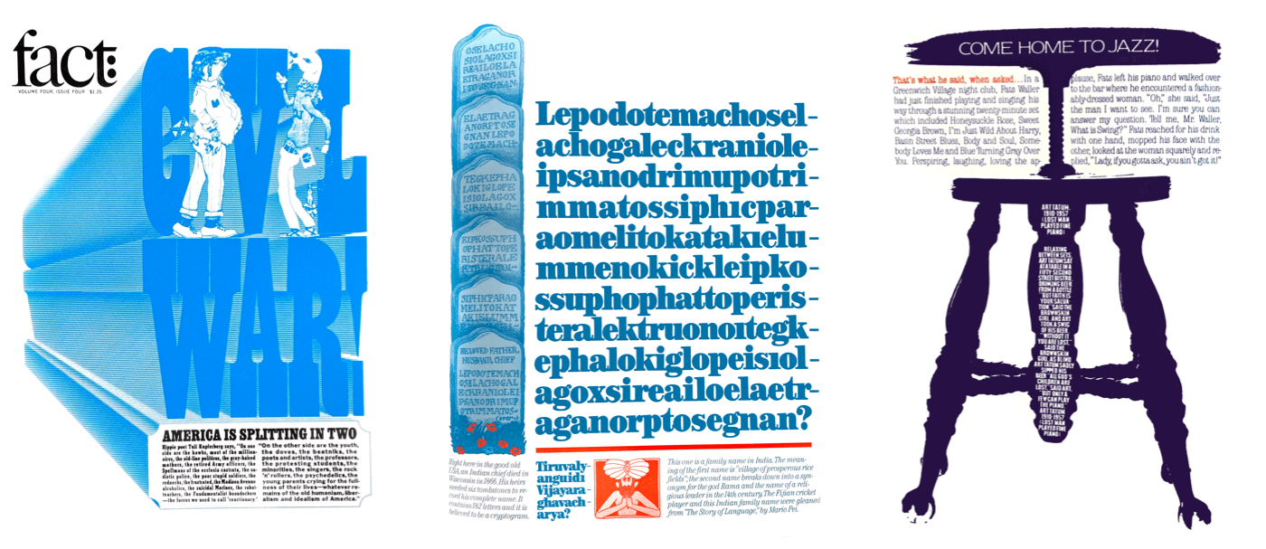
On larger screens, the design gains impact when the text-based background and the Cortina outline sit side by side. Applying a two-column symmetrical grid to the body achieves this:
@media (min-width: 74em) {

body {
display: grid;
grid-template-columns: [main] 1fr [aside] 1fr; }
}
The main and aside are then positioned on that grid with named lines:
main {
grid-column: main; }

aside {
grid-column: aside; }
}
Typography on the web must be both attractive and readable, and the background behind running text can easily compromise the latter. The backdrop-filter property applies CSS filter effects — such as blur, brightness, contrast, or color adjustments — to elements behind the text. These can significantly improve legibility over images, graphics, or patterns.
Multiple filters can be combined using the same CSS filter syntax shown earlier in the series:
main {
backdrop-filter: brightness(25%); }

main {
backdrop-filter: brightness(25%) contrast(50%); }
backdrop-filter is defined in Filter Effects Module Level 2. It enjoys solid browser support today, though some engines still require the WebKit vendor prefix:
main div {
-webkit-backdrop-filter: blur(3px);
backdrop-filter: blur(3px); }


