
Designing interactive elements for real-world usage
Accessibility starts with the basics: making sure that the controls people need to click or tap are actually clickable and tappable. On the Next.js Conf registration site, the team found a concrete problem in the auto-expanding footer at the bottom of the page. The footer’s hover target was only 36px tall, which required more precision than many users can reliably manage — especially when moving a cursor from across the screen.
This is a practical application of Fitts’s Law, which states that the time needed to reach a target depends on both the distance to it and its size. A small target in a far corner combined with a collapsing menu made the footer frustrating to use. In one case, the menu would collapse mid-interaction while a user was trying to log out.
The fix was to increase the touch target by 12px on each side, bringing the total height to 60px. That simple change gives users enough room to move the cursor into the footer and have it expand without the menu disappearing underneath them.
Takeaway: Check the size and placement of interactive targets. Make sure they’re big enough and positioned in a way that doesn’t require precise cursor control.
Rely on semantics rather than assumptions
Screen readers parse the semantic structure of an HTML document to present content and actions to non-sighted users. If that structure is weak, a page that looks fine visually can be effectively unusable for people relying on assistive technology. This becomes more critical as page complexity grows.
The ticket theme picker on the Next.js Conf site is a good example. A first pass at the control might look something like this:
const THEMES = ["a", "b", "c"];
const TicketThemePicker = () => {
const [activeTheme, setActiveTheme] = useState(THEMES[0]);
return THEMES.map((theme) => (
<button
key={theme}
onClick={() => {
setActiveTheme(theme);
}}
>
<Image src={getImage(theme)} />
{activeTheme === theme && <CheckmarkIcon />}
</button>
));
};
To a sighted developer, this appears complete: it uses semantic <button> elements, supports keyboard navigation with TAB, and fits the design mockup. But according to WebAIM and US Census data, up to 20% of website visitors have a disability that would prevent them from using a control built this way.
For complex interactive widgets, the W3C’s ARIA group publishes tested patterns. The team chose the Radio Group pattern because it satisfies a fuller checklist for keyboard behavior and assistive technology exposure. The implementation uses <input> elements with proper type, alt, and aria attributes, and keyboard interactions follow the specification exactly.
const THEMES = ["a", "b", "c"];
const TicketThemePicker = () => {
const [activeTheme, setActiveTheme] = useState(THEMES[0]);
return THEMES.map((theme) => (
<React.Fragment key={theme}>
<input
checked={activeTheme === theme}
id={`ticket-theme-${theme}`}
onChange={() => {
setActiveTheme(theme);
}}
type="radio"
value={theme}
/>
<label htmlFor={`ticket-theme-${theme}`}>
<Image alt={getDescription(theme)} src={getImage(theme)} />
{activeTheme === theme && <CheckmarkIcon aria-hidden="true" />}
</label>
</>
));
};
Takeaway: When building anything more complex than a simple button or link, consult the ARIA Patterns documentation and use the proven structure rather than inventing your own.
Write alt text that actually describes the image
Imagery can be a major accessibility gap. A common shortcut when adding alt text is to describe labels rather than content, like “Ticket theme #1,” “Ticket theme #2,” and “Ticket theme #3.” While that technically satisfies the requirement for alt attributes, it fails to give non-visual users the same experience as someone who can see the designs.

Better alt text would describe what the themes actually look like. For example, the three Next.js Conf ticket themes might be described as followed:
- A black and white theme featuring an image of light rays exiting a prism in three directions. The light rays are not vertical but leave the prism at various angles, creating a dynamic composition.
- A colored theme featuring an image of light rays exiting a prism in three directions. The light rays split into a rainbow showcasing the full dynamic range of light.
- A pure form of illumination, the all-white prism with three light rays is a rare sight to behold. This special edition highlights the simplicity and brilliance of white light.
Takeaway: Alt text should convey what the visual shows, so non-visual users get the same quality of information as everyone else.
Make error messages announce themselves
Form validation is another area where accessibility details matter. Native browser validation is accessible by default, so it’s fine if your design has no special requirements for how errors display. But when custom styling is needed, error messages can easily fail to reach assistive technology users.
A naive design might render an error message conditionally whenever an input fails validation:
const EmailForm = () => {
const [errorMessage, setErrorMessage] = useState(null);
const onChangeHandler = () => { /* Code to handle change */ }
const onSubmitHandler = () => { /* Code to handle success or error */ }
return (
<form onSubmit={onSubmitHandler}>
<label htmlFor="email">Email</label>
<input id="email" name="email" onChange={onChangeHandler} />
{
errorMessage && <p>{errorMessage}</p>
}
</form>
)
}
Visually, that works. But a screen reader won’t announce the error to the user because the error message has no way to bind to the input. Users only discover the problem if they happen to encounter the message while tabbing through the page. To fix this, two small changes make the difference:
const EmailForm = () => {
const [errorMessage, setErrorMessage] = useState(null);
const onChangeHandler = () => { /* Code to handle change */ }
const onSubmitHandler = () => { /* Code to handle success or error */ }
return (
<form onSubmit={onSubmitHandler}>
<input onChange={onChangeHandler} />
<p role="alert" aria-atomic="true">{errorMessage}</p>
</form>
)
}
First, the error <p> must always be rendered in the DOM with a role="alert" attribute. Screen readers can only announce changes in content that already exists on the page, so conditional rendering prevents the announcement from ever being triggered.
Second, aria-atomic="true" tells assistive technology to read out the full content of the alert when it changes. Without that attribute, a screen reader would only say the difference between the old and new text, which may be confusing for users.
Takeaway: For custom form errors, always keep the message element mounted, give it role="alert", and consider aria-atomic when the error text updates in place.
Respect user preferences for reduced motion
All major browsers and operating systems offer a prefers-reduced-motion setting for users who are sensitive to motion or find it distracting. Websites that ignore this preference can make users physically unwell. On the Next.js Conf page, several accommodations are implemented when this media query matches:
- Decrease the brightness intensity of the prism
- Pause looping animations after 5 seconds
- Disable transform and layout animations while keeping animations for other properties like
opacityandbackground-color
Takeaway: Animation can be a barrier rather than an enhancement. Always provide a way to opt out, either by respecting the user’s system preference or by offering a site-level control.
Accessibility work applies to games too
The registration page also has a word game, Vordle, where players get six chances to guess a five-letter word with per-letter feedback after each attempt. While building accessible games is similar to building accessible pages, it adds some extra requirements around presenting game state.
The developers set three goals: full support for keyboard, mouse, and touch input; a visually compelling presentation; and a comparable audio experience for screen reader users. They used an HTML <table> for the game board because tables already give both screen reader and visual users a familiar, structured navigation pattern.
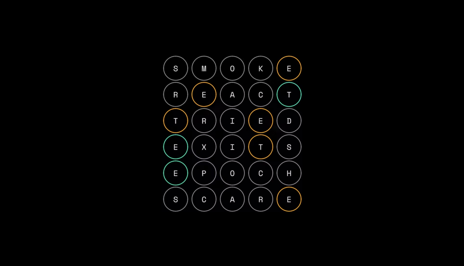
But structure alone isn’t enough. To convey the game’s progress and result to non-visual users, they added:
- A table heading in each row that describes the word’s score in full sentences, such as: “Guess 1 out of 6: You guessed 'smoke' and it was incorrect...”
- A visually hidden
<h1>that explains the game mechanics and acts as a landmark that assistive technology users can easily find and navigate to by header. - A visually hidden table
<caption>that explains how to play.
Shareable scoreboards also deserve attention. When sharing game results via an OpenGraph image, the og:image:alt property should describe what the image depicts, offering something like a textual summary that the game board is from Vordle and what the user’s guesses were.
Takeaway: Treat games like any other interface — semantic structure plus explicit labeling for assistive technologies is the way in, and don’t forget metadata for shared content.


