
Why Dark Mode Matters
Dark mode has moved from a nice-to-have to an expected feature in many applications. It reduces eye strain during extended use, especially in low-light environments, and it can significantly extend battery life on OLED displays. At 50% brightness, dark mode in the YouTube app saves roughly 15% more screen energy than a light background; at 100% brightness, that figure jumps to around 60%. Beyond practical benefits, dark mode offers visual variety from the uniform white interfaces common across modern products, and it can present dashboards, images, and other content in a fresh way.
If you're building a React application and want to offer both light and dark themes, styled-components provides a clean solution. This library uses CSS-in-JS — a pattern where CSS is composed with JavaScript via tagged template literals — and ships with built-in theming support that makes toggling between color schemes straightforward.
What styled-components Brings to the Table
styled-components is a popular CSS-in-JS library that supports all standard CSS features including media queries, pseudo-selectors, and nesting. It was designed to solve several common styling pain points:
- No class name collisions. The library generates unique class names for your styles, so you never have to invent or debug meaningless class names.
- Props-driven styling. You can conditionally apply styles based on React
props, letting component styles react to application state. - Sass-like syntax built in. No preprocessors or extra build tools are needed; you can use the
&character to target components, apply pseudo-selectors, and nest rules. - First-class theming. styled-components exports a
ThemeProviderwrapper that injects a theme object into all nested components via React's Context API. Every styled-component below it can access the active theme, regardless of depth.
This theming capability is the core mechanism for implementing dark mode. With ThemeProvider, you define theme objects for light and dark, then swap them based on user preference or a toggle action.
Setting Up Themes
To start, install styled-components and create your theme definitions. A theme is a plain JavaScript object holding color values and other design tokens. For example, you might define a light theme and a dark theme, each specifying properties like text color, background color, and component-specific colors.
With themes in place, wrap your application root in a ThemeProvider. The provider takes a theme prop; when it changes, all styled-components re-render with the new colors. You can manage the current theme using React's useState hook, with a boolean or string state that switches between your theme objects. A toggle button or select control can flip the state and update the theme across the entire component tree.
Components that need theme values can access them via a function passed to styled(). For instance, a paragraph's color can be set to props => props.theme.body or similar, pulling the correct value from whichever theme is active. Because styled-components passes the theme to every styled component, you don't need to thread props manually through the tree.
Persisting and Handling User Preference
A good dark mode implementation does more than toggle on demand; it respects the user's device preferences and remembers their choice across sessions. To detect the system color scheme, you can use the matchMedia API in JavaScript, checking for (prefers-color-scheme: dark). This lets you set the initial theme before the first render, avoiding a flash of the wrong colors.
For persistence, store the user's selection in localStorage. When a user toggles dark mode, save the choice; on the next visit, check localStorage first, then fall back to the system preference if nothing has been saved. This combination keeps the app responsive to both explicit and implicit user behavior.
Dark mode implementation with styled-components is a practical way to improve ergonomics and user satisfaction. The library handles the heavy lifting of theme propagation, so you only need to define your palettes and manage a single piece of state. Combining theme toggling with media query detection and localStorage persistence delivers a polished experience that meets modern accessibility expectations.
Building a Theme Toggler
We'll implement dark mode on a simple YouTube-style page. Start by cloning the original repository from the starter branch, then install dependencies and run npm start.
npm install
The page renders without any theme switching yet. Install styled-components with npm install styled-components.
The implementation relies on four pieces:
Theme: Defines color properties for light and dark themes.GlobalStyles: Injects document-wide styles based on the active theme.Toggler: Renders the button that flips between themes.useDarkMode: Custom hook managing theme state and persistence inlocalStorage.
Theme Definitions
In the src/components folder, create Themes.js and export lightTheme and darkTheme objects with distinct color variables:
export const lightTheme = {
    body: '#FFF',
    text: '#363537',
    toggleBorder: '#FFF',
    background: '#363537',
}
export const darkTheme = {
    body: '#363537',
    text: '#FAFAFA',
    toggleBorder: '#6B8096',
    background: '#999',
}
Global Styles
Create globalStyles.js in the same folder. Import createGlobalStyle from styled-components—this replaces the deprecated injectGlobal from v3. It returns a component that injects global styles when mounted in the tree, e.g., in App.js:
import { createGlobalStyle} from "styled-components"
export const GlobalStyles = createGlobalStyle`
  body {
    background: ${({ theme }) => theme.body};
    color: ${({ theme }) => theme.text};
    font-family: Tahoma, Helvetica, Arial, Roboto, sans-serif;
    transition: all 0.50s linear;
  }
  `
The GlobalStyle component picks background and color from the theme object, so switching themes updates those values. A 0.50s transition smooths the change.
Toggling Logic in App
Wire theming into App.js with ThemeProvider, a styled-components helper that injects a theme into all descendant components via the Context API:
import React, { useState, useEffect } from "react";import {ThemeProvider} from "styled-components"; import { GlobalStyles } from "./components/Globalstyle"; import { lightTheme, darkTheme } from "./components/Themes"import "./App.css"; import dummyData from "./data"; import CardList from "./components/CardList"; const App = () => { const [videos, setVideos] = useState([]);const [theme, setTheme] = useState('light'); const themeToggler = () => { theme === 'light' ? setTheme('dark') : setTheme('light') }useEffect(() => { const timer = setTimeout(() => { setVideos(dummyData); }, 1000); return () => clearTimeout(timer); }, []); return (<ThemeProvider theme={theme === 'light' ? lightTheme : darkTheme}> <> <GlobalStyles/><div className="App"><button onClick={themeToggler}>Switch Theme</button>{ videos.map((list, index) => { return ( <section key={index}> <h2 className="section-title">{list.section}</h2> <CardList list={list} /> <hr /> </section> ); })} </div></> </ThemeProvider>); }; export default App;
Create a theme state initialized to light via useState. A themeToggler method uses a ternary to flip between dark and light. Wrap the JSX in ThemeProvider, place GlobalStyle inside it, and attach themeToggler to a button's onClick:
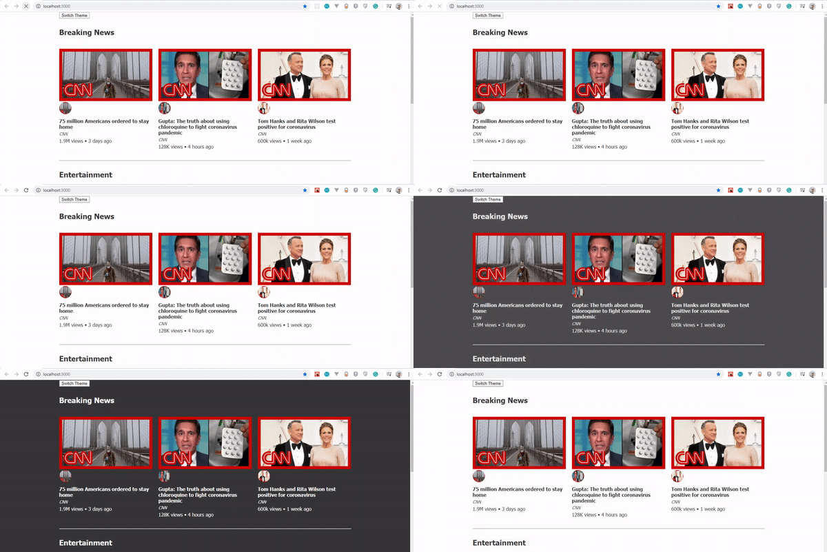
This works but concentrates too much logic in App.js. To follow DRY principles, extract the toggle into its own component.
Toggler Component
Create Toggler.js in the components folder. Style buttons with the styled function:
import React from 'react'
import { func, string } from 'prop-types';
import styled from "styled-components"
const Button = styled.button`
  background: ${({ theme }) => theme.background};
  border: 2px solid ${({ theme }) => theme.toggleBorder};
  color: ${({ theme }) => theme.text};
  border-radius: 30px;
  cursor: pointer;
  font-size:0.8rem;
  padding: 0.6rem;
  }
\`;
const Toggle = ({theme,  toggleTheme }) => {
    return (
        <Button onClick={toggleTheme} >
          Switch Theme
        </Button>
    );
};
Toggle.propTypes = {
    theme: string.isRequired,
    toggleTheme: func.isRequired,
}
export default Toggle;
The component accepts two props: theme (the current theme, a string) and toggleTheme (the function to switch). It assigns toggleTheme to onClick. Use propTypes to require both props with proper types.
Custom Hook for Reusability
Move the stateful logic into a reusable hook. Create useDarkMode.js in the components folder:
import { useEffect, useState } from 'react';
export const useDarkMode = () => {
    const [theme, setTheme] = useState('light');

    const setMode = mode => {
        window.localStorage.setItem('theme', mode)
        setTheme(mode)
    };

    const themeToggler = () => {
        theme === 'light' ? setMode('dark') : setMode('light')
    };

    useEffect(() => {
        const localTheme = window.localStorage.getItem('theme');
        localTheme && setTheme(localTheme)
    }, []);
    return [theme, themeToggler]
};
setModepersists the theme tolocalStorage.themeTogglerflips between light and dark.useEffectreadslocalStorageon mount and applies any saved preference.
The hook returns theme and themeToggler for callers.
Refactor App.js to use the hook—the useDarkMode method replaces the local theme state. Determine themeMode from the current theme, pass it to ThemeProvider, and swap the plain button for the Toggle component with the appropriate props:
import React, { useState, useEffect } from "react"; import {ThemeProvider} from "styled-components";import {useDarkMode} from "./components/useDarkMode"import { GlobalStyles } from "./components/Globalstyle"; import { lightTheme, darkTheme } from "./components/Themes" import Toggle from "./components/Toggler" import "./App.css"; import dummyData from "./data"; import CardList from "./components/CardList"; const App = () => { const [videos, setVideos] = useState([]);const [theme, themeToggler] = useDarkMode(); const themeMode = theme === 'light' ? lightTheme : darkTheme;useEffect(() => { const timer = setTimeout(() => { setVideos(dummyData); }, 1000); return () => clearTimeout(timer); }, []); return (<ThemeProvider theme={themeMode}><> <GlobalStyles/> <div className="App"><Toggle theme={theme} toggleTheme={themeToggler} />{ videos.map((list, index) => { return ( <section key={index}> <h2 className="section-title">{list.section}</h2> <CardList list={list} /> <hr /> </section> ); })} </div> </> </ThemeProvider> ); }; export default App;
The theme now persists across reloads and new tabs.
Preventing Flash of Wrong Theme
On reload in dark mode, the button may briefly flash the light-theme blue before gray appears. This happens because useState initializes to light; useEffect runs afterward and only then applies the stored theme. Fix it by tracking mount state in the hook:
import { useEffect, useState } from 'react'; export const useDarkMode = () => { const [theme, setTheme] = useState('light');const [mountedComponent, setMountedComponent] = useState(false)const setMode = mode => { window.localStorage.setItem('theme', mode) setTheme(mode) }; const themeToggler = () => { theme === 'light' ? setMode('dark') : setMode('light') }; useEffect(() => { const localTheme = window.localStorage.getItem('theme'); localTheme ? setTheme(localTheme) : setMode('light')setMountedComponent(true)}, []); return [theme, themeToggler,mountedComponent]};
Add a mountedComponent state defaulting to false, set it to true inside useEffect, and include it in the returned array.
In App.js, destructure mountedComponent and render an empty div until it becomes true:
import React, { useState, useEffect } from "react"; import {ThemeProvider} from "styled-components"; import {useDarkMode} from "./components/useDarkMode" import { GlobalStyles } from "./components/Globalstyle"; import { lightTheme, darkTheme } from "./components/Themes" import Toggle from "./components/Toggler" import "./App.css"; import dummyData from "./data"; import CardList from "./components/CardList"; const App = () => { const [videos, setVideos] = useState([]);const [theme, themeToggler, mountedComponent] = useDarkMode();const themeMode = theme === 'light' ? lightTheme : darkTheme; useEffect(() => { const timer = setTimeout(() => { setVideos(dummyData); }, 1000); return () => clearTimeout(timer); }, []);if(!mountedComponent) return <div/>return ( <ThemeProvider theme={themeMode}> <> <GlobalStyles/> <div className="App"> <Toggle theme={theme} toggleTheme={themeToggler} /> { videos.map((list, index) => { return ( <section key={index}> <h2 className="section-title">{list.section}</h2> <CardList list={list} /> <hr /> </section> ); })} </div> </> </ThemeProvider> ); }; export default App;
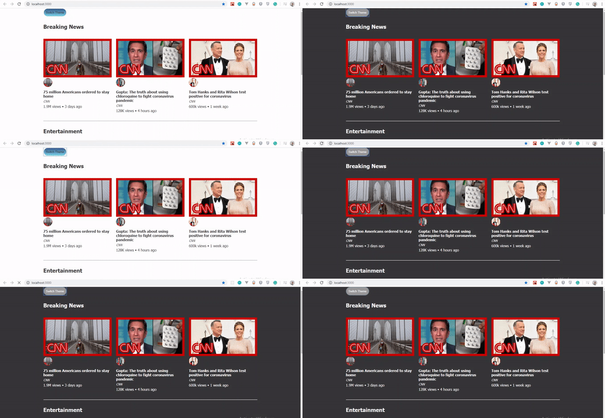
The flash disappears; dark mode loads directly.
Final Notes
styled-components' ThemeProvider makes theme switching straightforward. Consider customizing beyond a button—icons or other UI elements can trigger the toggle. The supporting repository is available on GitHub, with a live demo on CodeSandbox. Consult the styled-components documentation for theming details and Tom Nolan's article for another take on the approach.


