
Glassmorphism effects are trivial when the overlay is a rectangle, or a rectangle with border-radius. Irregular shapes — emoji or SVG icons — are a different problem entirely. What follows is the path to a working implementation for a nav bar whose icons get the frosted-glass treatment, along with the traps found along the way.
Starting point: emoji layers
The demo avoids SVG icons, using emojis with filters applied to match the theme instead. The first idea was to stack the two pseudos of each navigation link — both holding emoji content — offset and rotated via transform so they only partly overlap, then make the top one semitransparent and give it backdrop-filter: blur().

The Pug below generates the nav bar:
- let data = {
-   home: { ico: '🏠', hue: 200 },
-   notes: { ico: '🗒️', hue: 260 },
-   activity: { ico: '🔔', hue: 320 },
-   discovery: { ico: '🧭', hue: 30 }
- };
- let e = Object.entries(data);
- let n = e.length;

nav
  - for(let i = 0; i > n; i++)
    a(href='#' data-ico=e[i][1].ico style=`--hue: ${e[i][1].hue}deg`) #{e[i][0]}
and compiles to the HTML that follows:
<nav>
  <a href='#' data-ico='🏠' style='--hue: 200deg'>home</a>
  <a href='#' data-ico='🗒️' style='--hue: 260deg'>notes</a>
  <a href='#' data-ico='🔔' style='--hue: 320deg'>activity</a>
  <a href='#' data-ico='🧭' style='--hue: 30deg'>iscovery</a>
</nav>
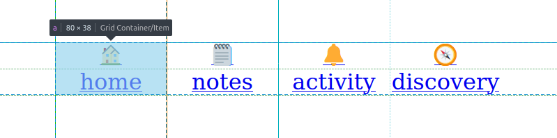
Layout comes first: the elements become grid items, the nav sits in the middle, links get explicit widths, both pseudos of each link go in the top cell (pushing the link text into the bottom cell), and the link text and pseudos are middle-aligned.
body, nav, a { display: grid; }

body {
  margin: 0;
  height: 100vh;
}

nav {
  grid-auto-flow: column;
  place-self: center;
  padding: .75em 0 .375em;
}

a {
  width: 5em;
  text-align: center;

  &::before, &::after {
    grid-area: 1/ 1;
    content: attr(data-ico);
  }
}
Emoji rendering varies by browser. A legible font is picked and its size bumped up, icons are made larger, backgrounds are set, and each link gets a color derived from its --hue custom property:
body {
  /* same as before */
  background: #333;
}

nav {
  /* same as before */
  background: #fff;
  font: clamp(.625em, 5vw, 1.25em)/ 1.25 ubuntu, sans-serif;
}

a {
  /* same as before */
  color: hsl(var(--hue), 100%, 50%);
  text-decoration: none;

  &::before, &::after {
    /* same as before */
    font-size: 2.5em;
  }
}
The two emoji layers are then differentiated. The ::before pseudo is slightly moved and rotated, made monochrome with sepia(1), brought to the right hue and given extra contrast(). The ::after pseudo gets filter: grayscale(1) and is made semitransparent, otherwise the other pseudo would be invisible through it.
a {
  /* same as before */

  &::before {
    transform:
      translate(.375em, -.25em)
      rotate(22.5deg);
    filter:
      sepia(1)
      hue-rotate(calc(var(--hue) - 50deg))
      saturate(3);
  }

  &::after {
    opacity: .5;
    filter: grayscale(1);
  }
}
The backdrop-filter wall
The next step was to set backdrop-filter: blur(5px) on the top (::after) layer. Firefox needs the gfx.webrender.all and layout.css.backdrop-filter.enabled flags set to true in about:config before the property works at all.
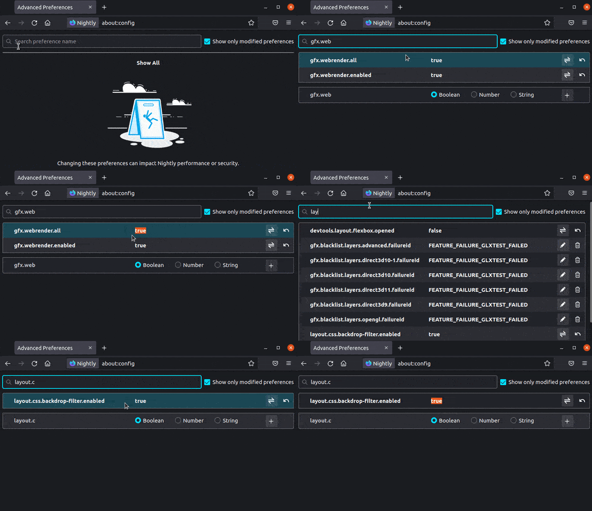
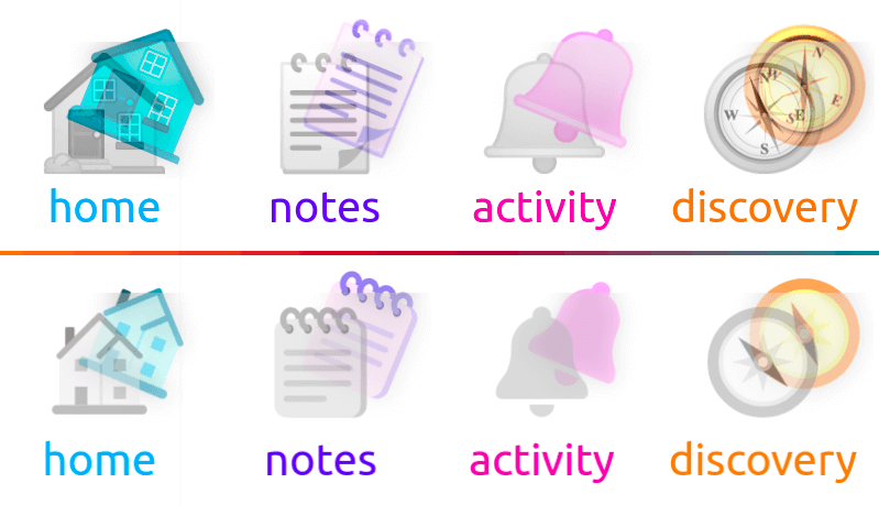
backdrop-filter to work.The result is an overlay the size of the entire top icon bounding box, with no visible blur on the bottom icon.
backdrop-filter.Reducing to a known-working case
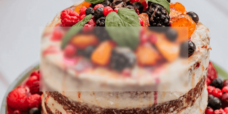
The debugging method: take an example that does work, adapt it until it breaks. The simplified working demo is an article inside a section. The section gets an image background, the article a semitransparent one, plus backdrop-filter on the article.
section { background: url(cake.jpg) 50%/ cover; }

article {
  margin: 25vmin;
  height: 40vh;
  background: hsla(0, 0%, 97%, .25);
  backdrop-filter: blur(5px);
}
That works, but the two layers need to be siblings, not nested. Making both layers sibling article elements and partially overlapping them keeps the effect in Chrome and, mostly, in Firefox — except that Firefox's blur() edge handling looks awkward. Based on the images in the spec, the Firefox result also appears incorrect.
<article class='base'></article>
<article class='grey'></article>
article { width: 66%; height: 40vh; }
.base { background: url(cake.jpg) 50%/ cover; }
.grey {
margin: -50% 0 0 33%;
background: hsla(0, 0%, 97%, .25);
backdrop-filter: blur(5px);
}
For layers sitting on a solid background (white here), one fix is a box-shadow on the bottom layer (.base) with no offsets, no blur and a spread radius twice the blur radius of the top layer's backdrop-filter. It works in this case. If the parent has an image background that isn't fixed, a layered backgrounds approach could handle Firefox — out of scope here.
The real icons can't be square boxes, so semitransparency can't come from an hsla() background; it has to use opacity.
.grey {
  /* same as before */
  opacity: .25;
  background: hsl(0, 0%, 97%);
}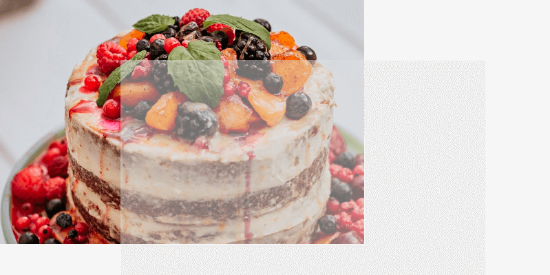
opacity instead of a hsla() background.That is the break: making the top layer semitransparent via opacity kills the backdrop-filter effect in both Chrome and Firefox.
Spec and documentation
MDN's backdrop-filter page states:
Because it applies to everything behind the element, to see the effect you must make the element or its background at least partially transparent.
Read plainly, that suggests opacity shouldn't break the effect — but it does, in both browsers. The spec offers this, which may or may not be relevant:
The effect of the backdrop-filter will not be visible unless some portion of element B is semi-transparent. Also note that any opacity applied to element B will be applied to the filtered backdrop image as well.
An attempt with filter: opacity() instead of the opacity property produced inconsistent results across identical browsers, and a Twitter query returned mixed answers, so no reliable conclusion emerged.
Text, and what the blur respects
Swapping rectangles for text: the article elements get text content, explicit sizing is dropped, font-size is bumped up, the margin producing partial overlap is adjusted, and the background declarations are replaced with color. The bottom one gets aria-hidden='true'.
<article class='base' aria-hidden='true'>Lion 🧡</article>
<article class='grey'>Lion 🖤</article>
article { font: 900 21vw/ 1 cursive; }
.base { color: #ff7a18; }
.grey {
margin: -.75em 0 0 .5em;
color: hsla(0, 0%, 50%, .25);
backdrop-filter: blur(5px);
}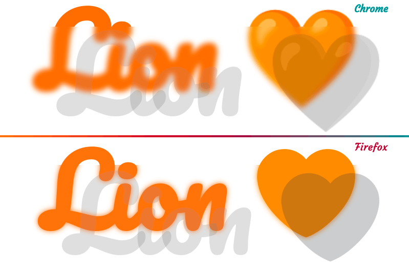
Two observations. First, setting color to a value with a subunitary alpha makes emojis semitransparent too, in both Chrome and Firefox — the other channels don't influence emojis. Second, both browsers blur the entire area of the orange text and emoji underneath the top layer's bounding box rather than only what lies under the actual glyphs. Firefox adds its sharp-edge artifact on top of that.
The box blur is consistent with the spec: "transparent" here means the full filtered backdrop image is visible, as with background-color: transparent. A test with non-text shapes — a background gradient, clip-path, mask — shows both browsers blurring the whole top-layer box for the gradient case, while Chrome honors the clip-path and mask shapes and Firefox does not.

Chrome: mask the backdrop to the glyphs
Applying a mask clipped to text on the top layer (.grey) makes the blur follow the text edges. This is Chrome-only: text is a non-standard mask-clip value supported only in WebKit browsers, and Firefox (above) doesn't confine the blur to a mask shape anyway.
/* same as before */

.grey {
  /* same as before */
  -webkit-mask: linear-gradient(red, red) text; /* only works in WebKit browsers */
}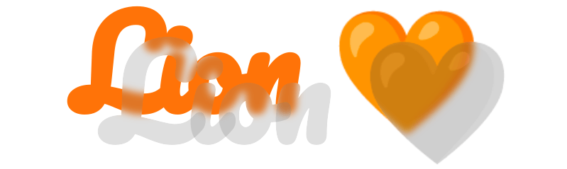
Chrome now shows the right result, but only because the demo used a heart emoji, which exists in orange and black. Other emojis don't come in black and white, so the next attempt made both layers identical, the top one semitransparent with filter: grayscale(1) — which also desaturated the blurred area underneath.
article {
  color: hsla(25, 100%, 55%, var(--a, 1));
  font: 900 21vw/ 1.25 cursive;
}

.grey {
  --a: .25;
  margin: -1em 0 0 .5em;
  filter: grayscale(1);
  backdrop-filter: blur(5px);
  -webkit-mask: linear-gradient(red, red) text;
}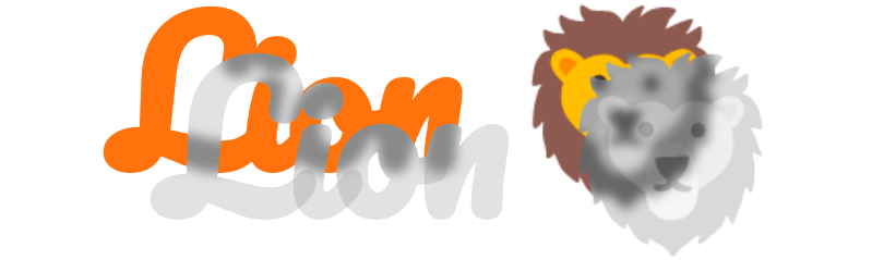
grayscale(1) filter.The fix is a third layer: the base layer stays slightly offset, the middle layer is a transparent "ghost" carrying the backdrop-filter, and the top layer is semitransparent with grayscale(1).
body { display: grid; }

article {
  grid-area: 1/ 1;
  place-self: center;
  padding: .25em;
  color: hsla(25, 100%, 55%, var(--a, 1));
  font: 900 21vw/ 1.25 pacifico, z003, segoe script, comic sans ms, cursive;
}

.base { margin: -.5em 0 0 -.5em; }

.midl {
  --a: 0;
  backdrop-filter: blur(5px);
  -webkit-mask: linear-gradient(red, red) text;
}

.grey { filter: grayscale(1) opacity(.25) }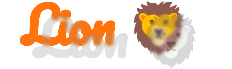
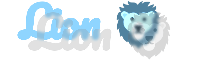
All that remains is making the base layer monochrome, and the Chrome effect is what was wanted.
/* same as before */

.base {
  margin: -.5em 0 0 -.5em;
  filter: sepia(1) hue-rotate(165deg) contrast(1.5);
}
Firefox: element() as a background
Firefox alone supports element(), which uses an element as another element's background — the basis for a Firefox version. .base and .grey keep the Chrome styles; the middle layer's background is, via element(), a blurred copy of the layers.
<article id='blur' aria-hidden='true'>Lion 🦁</article>
<article class='midl'>Lion 🦁</article>
The blurred element is absolutely positioned (and kept in view initially), made monochrome and blurred, then used as the .midl background:
#blur {
  position: absolute;
  top: 2em; right: 0;
  margin: -.5em 0 0 -.5em;
  filter: sepia(1) hue-rotate(165deg) contrast(1.5) blur(5px);
}

.midl {
  --a: .5;
  background: -moz-element(#blur);
}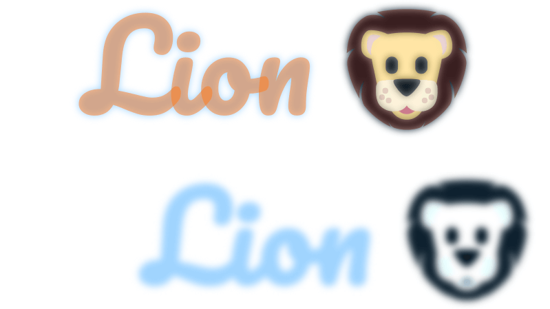
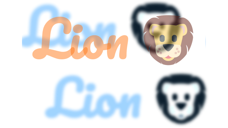
#blur as a background.One immediate issue: margin offsets the actual #blur element but has no effect on its use as a background; a transform is needed for that, which also allows rotation and other transforms. A translation is used for now:
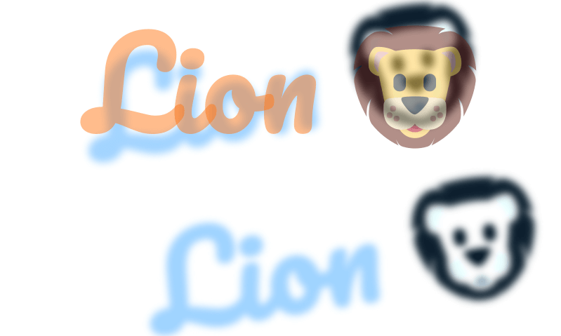
transform: rotate() instead of margin on the #blur element.#blur {
/* same as before */
transform: translate(-.25em, -.25em); /* replaced margin */
}
transform: translate() instead of margin on the #blur element.Part of the blurred background gets cut off outside the middle layer's padding-box — harmless, since the next move clips the background to text, but useful space because .base will be translated the same distance. So padding is bumped up a little, alongside background-clip: text on .midl:
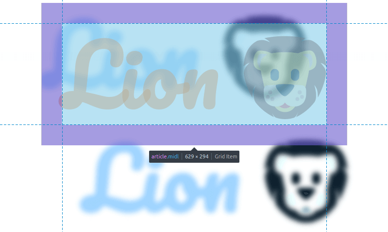
#blur background exceeds the limits of the padding-box on the .midl element.article {
/* same as before */
padding: .5em;
}
#blur {
position: absolute;
bottom: 100vh;
transform: translate(-.25em, -.25em);
filter: sepia(1) hue-rotate(165deg) contrast(1.5) blur(5px);
}
.midl {
--a: .1;
background: -moz-element(#blur);
background-clip: text;
}
.midl element’s background to text.Next, the .base element gets essentially the Chrome styles, with transform replacing margin:
<article id='blur' aria-hidden='true'>Lion 🦁</article>
<article class='base' aria-hidden='true'>Lion 🦁</article>
<article class='midl'>Lion 🦁</article>
#blur {
position: absolute;
bottom: 100vh;
transform: translate(-.25em, -.25em);
filter: sepia(1) hue-rotate(165deg) contrast(1.5) blur(5px);
}
.base {
transform: translate(-.25em, -.25em);
filter: sepia(1) hue-rotate(165deg) contrast(1.5);
}Shared styles are factored out by adding the .base class to #blur to avoid duplication:
<article id='blur' class='base' aria-hidden='true'>Lion 🦁</article>
<article class='base' aria-hidden='true'>Lion 🦁</article>
<article class='midl'>Lion 🦁</article>
#blur {
--r: 5px;
position: absolute;
bottom: 100vh;
}
.base {
transform: translate(-.25em, -.25em);
filter: sepia(1) hue-rotate(165deg) contrast(1.5) blur(var(--r, 0));
}
.base layer.Because .base has a transform, it paints above .midl despite DOM order. The simplest fix is z-index: 2 on .midl:
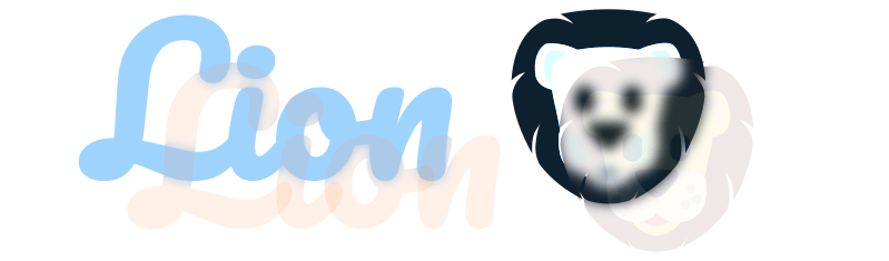
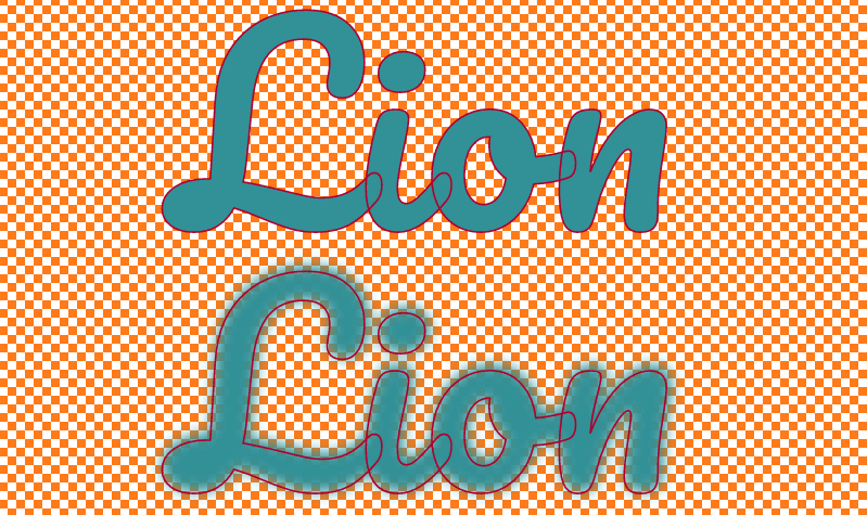
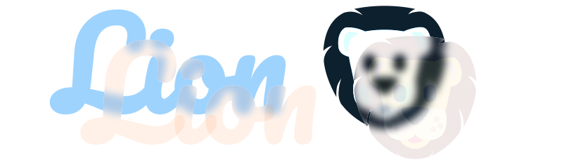
.base is underneath .midl.A subtler issue follows: .base remains visible under the semitransparent parts of the blurred .midl background, because blurring makes edge-adjacent pixels semitransparent. On a solid parent background — the case here — setting background-color on .midl to that same value removes the sharp edges showing through.
.midl {
/* same as before */
background: -moz-element(#blur) #fff;
background-clip: text;
}
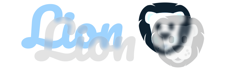
.base layer isn’t visible through the background of the .midl one.Adding the top .grey layer with the Chrome styles fails: .midl's z-index: 2 puts it above what should be the top layer, despite DOM order. The fix is z-index: 3 on .grey. It's layer after layer of z-index, but low effort and functional.
.grey { filter: grayscale(1) opacity(.25); }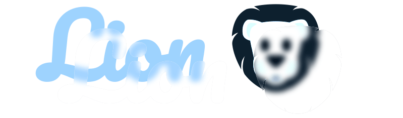
.grey layer..grey {
z-index: 3;
filter: grayscale(1) opacity(.25);
}
Merging into one cross-browser version
The Firefox code is the more complete of the two, so it's the base. Its extra z-index declarations and the out-of-sight #blur element don't affect Chrome. What Chrome still needs is backdrop-filter and mask on .midl:
<article id='blur' class='base' aria-hidden='true'>Lion 🦁</article>
<article class='base' aria-hidden='true'>Lion 🦁</article>
<article class='midl' aria-hidden='true'>Lion 🦁</article>
<article class='grey'>Lion 🦁</article>body { display: grid; }
article {
grid-area: 1/ 1;
place-self: center;
padding: .5em;
color: hsla(25, 100%, 55%, var(--a, 1));
font: 900 21vw/ 1.25 cursive;
}
#blur {
  --r: 5px;
  position: absolute;
  bottom: 100vh;
}

.base {
  transform: translate(-.25em, -.25em);
  filter: sepia(1) hue-rotate(165deg) contrast(1.5) blur(var(--r, 0));
}
.midl {
--a: 0;
z-index: 2;
background: -moz-element(#blur) #fff;
background-clip: text;
}
.grey {
  z-index: 3;
  filter: grayscale(1) opacity(.25);
}backdrop-filter: blur(5px);
-webkit-mask: linear-gradient(red, red) text;Since neither declaration should apply in the other browser, @supports separates them:
$r: 5px;

/* same as before */

#blur {
  /* same as before */
  --r: #{$r};
}

.midl {
  --a: 0;
  z-index: 2;
  /* need to reset inside @supports so it doesn't get applied in Firefox */
  backdrop-filter: blur($r);
  /* invalid value in Firefox, not applied anyway, no need to reset */
  -webkit-mask: linear-gradient(red, red) text;

  @supports (background: -moz-element(#blur)) { /* for Firefox */
    background: -moz-element(#blur) #fff;
    background-clip: text;
    backdrop-filter: none;
  }
}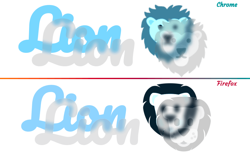
The two browsers don't render identically, but the results are similar.
Why one element isn't enough
Collapsing the solution into a single element isn't possible. The Firefox version needs at least two elements, since one supplies the background for another via its id. For the remaining three layers (all the Chrome version needs), each carries at least one property that irreversibly propagates to children and pseudos: filter on .base and .grey, mask on the middle layer.
Plain text without emojis is a lighter case: two elements suffice, only one of which is needed by Chrome, the other being #blur for Firefox. The two pseudos of .text build the base layer (::before) and a combination of the other two layers (::after). Without emojis, no grayscale(1) is needed — saturation of the color value is controlled directly. The pseudos are stacked, the lower one offset by the same amount and colored like #blur; that color depends on a flag, --f, which drives saturation and alpha: 100% saturation and alpha 1 for #blur and ::before (--f: 1), 0% saturation and alpha .25 for ::after (--f: 0).
<article id='blur'>Blood</article>
<article class='text' aria-hidden='true' data-text='Blood'></article>
$r: 5px;
%text { // used by #blur and both .text pseudos
--f: 1;
grid-area: 1/ 1; // stack pseudos, ignored for absolutely positioned #base
padding: .5em;
color: hsla(345, calc(var(--f)*100%), 55%, calc(.25 + .75*var(--f)));
content: attr(data-text);
}
article { font: 900 21vw/ 1.25 cursive }
#blur {
position: absolute;
bottom: 100vh;
filter: blur($r);
}
#blur, .text::before {
transform: translate(-.125em, -.125em);
@extend %text;
}
.text {
display: grid;
&::after {
--f: 0;
@extend %text;
z-index: 2;
backdrop-filter: blur($r);
-webkit-mask: linear-gradient(red, red) text;
@supports (background: -moz-element(#blur)) {
background: -moz-element(#blur) #fff;
background-clip: text;
backdrop-filter: none;
}
}
}Back to the nav bar
In this use case the glassmorphism applies only to the link icon, not the whole link with text, which simplifies things slightly. The Pug:
- let data = {
-   home: { ico: '🏠', hue: 200 },
-   notes: { ico: '🗒️', hue: 260 },
-   activity: { ico: '🔔', hue: 320 },
-   discovery: { ico: '🧭', hue: 30 }
- };
- let e = Object.entries(data);
- let n = e.length;

nav
  - for(let i = 0; i < n; i++)
    - let ico = e[i][1].ico;
    a.item(href='#' style=`--hue: ${e[i][1].hue}deg`)
      span.icon.tint(id=`blur${i}` aria-hidden='true') #{ico}
      span.icon.tint(aria-hidden='true') #{ico}
      span.icon.midl(aria-hidden='true' style=`background-image: -moz-element(#blur${i})`) #{ico}
      span.icon.grey(aria-hidden='true') #{ico}
      | #{e[i][0]}
and the resulting HTML:
<nav>
  <a class='item' href='#' style='--hue: 200deg'>
    <span class='icon tint' id='blur0' aria-hidden='true'>🏠</span>
    <span class='icon tint' aria-hidden='true'>🏠</span>
    <span class='icon midl' aria-hidden='true' style='background-image: -moz-element(#blur0)'>🏠</span>
    <span class='icon grey' aria-hidden='true'>🏠</span>
    home
  </a>
  <!-- the other nav items -->
</nav>
Part of these spans could be pseudos, but spans are more consistent and easier. Since every item has its own icon, each has a different blurred icon layer — the .midl element's background is set in the style attribute, so adding or removing entries in the data object (and thus changing the item count) requires no CSS changes.
Layout and prettifying styles stay close to the initial nav bar; the pseudos in each item's grid top cell are simply spans now:
span {
  grid-area: 1/ 1; /* stack all emojis on top of one another */
  font-size: 4em; /* bump up emoji size */
}
The icon layers keep the original transform and filter chains chosen when the pseudos were used. The color: hsla() declaration on the span layers is dropped: with emojis only the alpha channel matters, and while the default of 1 is preserved on .base and .grey, .midl gets color: transparent directly. background-color on .midl is only needed in the Firefox case, since background-image already comes from the style attribute:
.base { /* mono emoji version */
  transform: translate(.375em, -.25em) rotate(22.5deg);
  filter: sepia(1) hue-rotate(var(--hue)) saturate(3) blur(var(--r, 0));
}

.midl { /* middle, transparent emoji version */
  color: transparent; /* so it's not visible */
  backdrop-filter: blur(5px);
  -webkit-mask: linear-gradient(red 0 0) text;

  @supports (background: -moz-element(#b)) {
    background-color: #fff;
    background-clip: text;
    backdrop-filter: none;
  }
}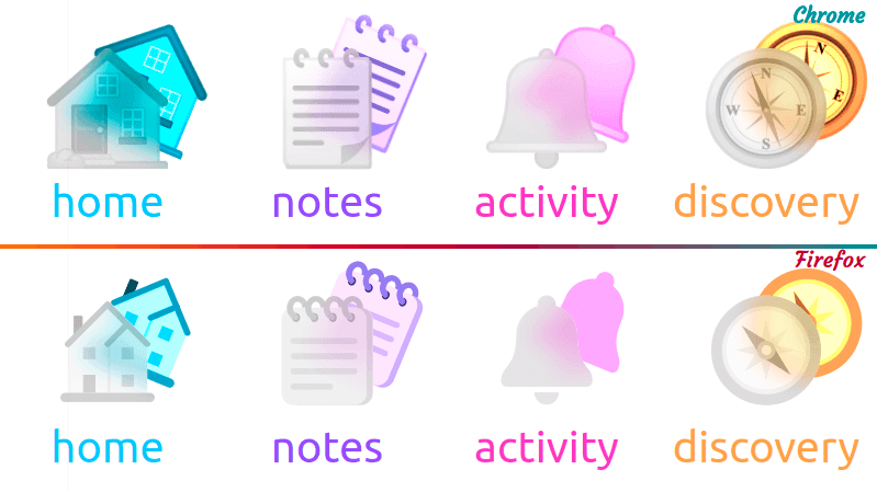
The effect shouldn't be permanent — only on :hover and :focus. A flag, --hl, is 0 normally and 1 in those states, controlling opacity and transform on the .base spans:
$t: .3s;

a {
  /* same as before */
  --hl: 0;
  color: hsl(var(--hue), calc(var(--hl)*100%), 65%);
  transition: color $t;

  &:hover, &:focus { --hl: 1; }
}

.base {
  transform:
    translate(calc(var(--hl)*.375em), calc(var(--hl)*-.25em))
    rotate(calc(var(--hl)*22.5deg));
  opacity: var(--hl);
  transition: transform $t, opacity $t;
}
Open question: SVG
Would real SVG icons be simpler than a span sandwich? It would make more sense — not every icon exists as an emoji — but, having gone through all of the above for the emoji version, it is neither less code nor simpler.




