

A Vue 3 File Uploader: Drop Zone First
When building an uploader in Vue 3, the first decision is where to split responsibilities. A component that handles raw drag-and-drop events is a natural candidate for reuse, so we isolate it as a DropZone component rather than burying that logic inside a larger file-list component.
The component itself is deliberately small: a wrapper div with a drop event handler, a slot, and an emitted files-dropped event. The handler converts the FileList from e.dataTransfer.files into an array using the spread operator. One caveat: browsers tend to open files when dropped outside expected targets, so we must also prevent default behavior for dragover and dragenter events on the document body. We attach those listeners in onMounted and remove them in onUnmounted.
<template>
    <div @drop.prevent="onDrop">
        <slot></slot>
    </div>
</template>

<script setup>
import { onMounted, onUnmounted } from 'vue'
const emit = defineEmits(['files-dropped'])

function onDrop(e) {
    emit('files-dropped', [...e.dataTransfer.files])
}

function preventDefaults(e) {
    e.preventDefault()
}

const events = ['dragenter', 'dragover', 'dragleave', 'drop']

onMounted(() => {
    events.forEach((eventName) => {
        document.body.addEventListener(eventName, preventDefaults)
    })
})

onUnmounted(() => {
    events.forEach((eventName) => {
        document.body.removeEventListener(eventName, preventDefaults)
    })
})
</script>
Tracking the Active State
Raw drag handling works, but a good drop zone needs visible feedback. We add an active ref that flips true when a file is dragged over the zone and false when the drag leaves or the file is dropped. To let the parent component react to this state, we expose it through a scoped slot. As an alternative, we could emit events for each state change, but a scoped slot keeps everything contained in the template.
For styling hooks, we also bind a data-active attribute to the active value. This gives us a clean way to apply visual feedback through CSS without adding a separate state class.
<template>
    <!-- add `data-active` and the event listeners -->
    <div :data-active="active" @dragenter.prevent="setActive" @dragover.prevent="setActive" @dragleave.prevent="setInactive" @drop.prevent="onDrop">
        <!-- share state with the scoped slot -->
        <slot :dropZoneActive="active"></slot>
    </div>
</template>

<script setup>
// make sure to import `ref` from Vue
import { ref, onMounted, onUnmounted } from 'vue'
const emit = defineEmits(['files-dropped'])

// Create `active` state and manage it with functions
let active = ref(false)

function setActive() {
    active.value = true
}
function setInactive() {
    active.value = false
}

function onDrop(e) {
    setInactive() // add this line too
    emit('files-dropped', [...e.dataTransfer.files])
}

// ... nothing changed below this
</script>
One problem emerges quickly. If the drop zone contains child elements, dragging over them fires dragenter on the child and dragleave on the drop zone itself. Since the dragleave event fires before the bubbling dragenter reaches the zone, the active state flickers on and off as the drag moves over the content.
We fix this with two paired functions. setActive clears a pending timeout, and setInactive wraps the state change in a 50-millisecond delay. If the drag moves over a child quickly, setActive fires before the delay elapses and cancels the pending switch to inactive. The timeout value is a balance: long enough to prevent fl
// Nothing changed above

let active = ref(false)
let inActiveTimeout = null // add a variable to hold the timeout key

function setActive() {
    active.value = true
    clearTimeout(inActiveTimeout) // clear the timeout
}
function setInactive() {
    // wrap it in a `setTimeout`
    inActiveTimeout = setTimeout(() => {
        active.value = false
    }, 50)
}

// Nothing below this changes
With the drop zone handling drag events cleanly and exposing its state, the next step is the file list manager that consumes those dropped files.
Managing the File List
Before we wire everything together, we need a way to manage the state of the files the user selects. I’ve chosen to implement this as a composition function living in src/compositions/file-list.js. It could be moved into a Pinia or Vuex store, but for a feature this self-contained — uploads don’t usually need state shared across the whole app — a composition function avoids adding a dependency that isn’t strictly necessary. Keeping it out of the DropZone component also preserves component readability, so the component’s template reads clearly without burying the logic behind file handling.
The file list manager performs four jobs:
- Track files selected by the user;
- Filter out duplicates;
- Allow removal of individual files;
- Wrap each file with metadata — an ID, a preview URL, and an upload status.
import { ref } from 'vue'

export default function () {
    const files = ref([])

    function addFiles(newFiles) {
        let newUploadableFiles = [...newFiles]
            .map((file) => new UploadableFile(file))
            .filter((file) => !fileExists(file.id))
        files.value = files.value.concat(newUploadableFiles)
    }

    function fileExists(otherId) {
        return files.value.some(({ id }) => id === otherId)
    }

    function removeFile(file) {
        const index = files.value.indexOf(file)

        if (index > -1) files.value.splice(index, 1)
    }

    return { files, addFiles, removeFile }
}

class UploadableFile {
    constructor(file) {
        this.file = file
        this.id = `${file.name}-${file.size}-${file.lastModified}-${file.type}`
        this.url = URL.createObjectURL(file)
        this.status = null
    }
}
The exported function returns the file list as a ref along with addFiles and removeFile methods. You might consider wrapping the list with Vue’s readonly to enforce mutation through the provided methods, but the uploader we’re building later needs direct write access, so we’ll leave it mutable.
Note that since files is declared inside the function, each call receives its own list. If you ever need to share state across components, hoist the declaration to module scope so it’s created once. For our single-uploader use case, per-call state is fine; any shared data can be passed down as props.
The interesting part is addFiles. It first normalizes its input: if a FileList object comes in rather than an array, it converts it with Array.from(). Each file is then wrapped in an UploadableFile class that attaches:
- an
idderived from the file’s metadata to catch duplicates; - a
blob://URL for preview thumbnails; - a
statusfield for tracking the future upload state.
Finally, existing files are filtered out before the new, unique ones are appended to the list.
Refinements Worth Considering
The UploadableFile wrapper is straightforward, but it means accessing the original file always requires something like file.file. A proxy could intercept property lookups and forward anything unknown to the underlying File object, hiding the indirection entirely. Alternatively, you could skip the wrapper and provide utility functions that compute the ID or URL from a raw File — that’s less convenient and might recompute values on each render, though that’s only a concern for batches in the thousands, where memoization solves it.
Upload status doesn’t come from the File object itself, so it can’t be handled by a plain utility. You could instead store statuses in the uploader (which we’ll cover later), keeping UploadableFile free of properties that only serve one part of the application. For our scope, having the metadata directly on the file object is certainly the most convenient — even if a case could be made that it isn’t the cleanest architecture in a larger codebase.
One more upgrade worth mentioning: passing a filter to addFiles to restrict accepted file types, with per-file errors returned so the UI can tell the user exactly what was rejected. Any production-ready uploader should include that, but we’ll keep the current implementation lean.
Putting the Pieces Together
It’s time to verify what we have. We’ll wire the composition function and DropZone into /src/App.vue — you can just as easily use a page or section component, just ignore anything in this code tied to the root #app element.
<template>
    <div id="app">
        <DropZone class="drop-area" @files-dropped="addFiles" #default="{ dropZoneActive }">
            <div v-if="dropZoneActive">
                <div>Drop Them</div>
            </div>
            <div v-else>
                <div>Drag Your Files Here</div>
            </div>
        </DropZone>
    </div>
</template>

<script setup>
import useFileList from './compositions/file-list'
import DropZone from './components/DropZone.vue'

const { files, addFiles, removeFile } = useFileList()
</script>
In the script block, we import useFileList and DropZone, then initialize the file list. The files and removeFile values aren’t used yet, so ESLint may complain — files will at least be referenced shortly to verify everything works.
The template renders DropZone with a class for styling, passes addFiles as the files-dropped handler, and uses the component’s scoped slot for dynamic content. The inner div shows a “drag files here” message when inactive, swapping to a “drop them” prompt while dragging over the zone.
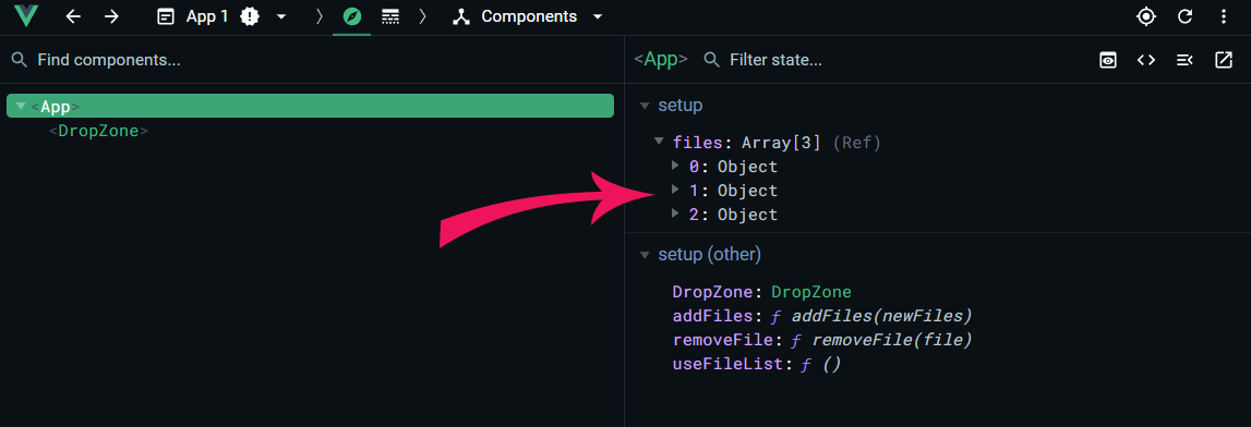
Styles aren’t reproduced here, but the repo includes the CSS used to make the zone prominent. Before testing, note that the stable Vue DevTools doesn’t support Vue 3 — you’ll need the beta install for Chrome-based browsers or Firefox. Once installed, run the app with npm run serve, npm run dev, or your usual command and open the devtools. Dropping images should reveal the growing file array in the component’s state.
Keyboard and Click Access
Not everyone can — or wants to — drag files. We need a hidden file input, wrapped in a visible label so users can activate it by clicking. To keep that accessible, the input should become visible when focused via the keyboard (included in the repo’s styles). We’ll also attach a change listener so a file picked through the dialog is added to our list.
First, add this function to the script:
function onInputChange(e) {
    addFiles(e.target.files)
    e.target.value = null
}
The handler passes the input’s files to addFiles. Note the final line, which resets the input’s value. Without it, a user who picks a file, removes it from the list, then selects the same file again would see no “change” event, because the input’s value never changed. Clearing it guarantees the event fires each time.
Now, replace the template content inside the DropZone slot:
<label for="file-input">
    <span v-if="dropZoneActive">
        <span>Drop Them Here</span>
        <span class="smaller">to add them</span>
    </span>
    <span v-else>
        <span>Drag Your Files Here</span>
        <span class="smaller">
            or <strong><em>click here</em></strong> to select files
        </span>
    </span>

    <input type="file" id="file-input" multiple @change="onInputChange" />
</label>
The whole thing is now wrapped in a label tied to the file input. The prompt text explains you can click, adding a line so the drop area doesn’t change height between idle and active messages. The final piece is the hidden file input with its multiple attribute and change listener wired to the function we just added.
Restart the app if needed. Dragging files or clicking the box to open the file picker should produce the same result in the Vue DevTools component tree.
Rendering a Preview List
Users won't know if their files were accepted without visual feedback, so let's display them. Starting in the main component, add a simple list below the label that outputs each file's name:
<ul v-show="files.length">
    <li v-for="file of files" :key="file.id">{{ file.file.name }}</li>
</ul>
With the list in place, dropped files now appear as bullets. Note that each item uses the file's unique ID (assigned by the file list manager) as its key. Accessing the original object requires file.file, which is a minor trade-off for having tracked IDs.
To keep the main component lean and make the feature reusable, move preview rendering into a dedicated /src/FilePreview.vue component:
<template>
    <component :is="tag" class="file-preview">
        <img :src="file.url" :alt="file.file.name" :title="file.file.name" />
    </component>
</template>

<script setup>
defineProps({
    file: { type: Object, required: true },
    tag: { type: String, default: 'li' },
})
</script>
The template wraps everything in a dynamic component tag whose type is set via the tag prop, allowing this component to render as an li inside a list or any other element elsewhere. The image uses the object URL supplied by the file list manager, with the file name applied as both alt text and the title attribute for a hover tooltip. The script section defines two props: the file object and the tag name for the wrapper.
Now wire it into the main template by swapping the plain text list for FilePreview components:
<ul class="image-list" v-show="files.length">
    <FilePreview v-for="file of files" :key="file.id" :file="file" tag="li" />
</ul>
Don't forget the import in the script block:
import FilePreview from './components/FilePreview.vue'Running the app now shows thumbnails for every selected image.
Removing Files
To let users clear mistakes, add a dismissal control to FilePreview.vue. Place an "X" button just above the img tag:
<button @click="$emit('remove', file)" class="close-icon" aria-label="Remove">×</button>And emit the associated event from the script section:
defineEmits(['remove'])Clicking the button fires a remove event with the file as its payload. Handle that in the main component by adding the listener to the FilePreview element:
<FilePreview v-for="file of files" :key="file.id" :file="file" tag="li" @remove="removeFile" />The existing removeFile method from the file list manager accepts the same arguments, so no extra logic is needed. A quick reload and click on the "X" removes that image from the list.
Possible Refinements
Several adjustments could make this more flexible. Styles could be decoupled so the component is not tied to a particular look. Adding props to hide elements like the remove button would prevent their display when that functionality isn't needed. Finally, splitting the file prop into separate url, name, and later status props would let this component handle plain image URLs instead of requiring a full UploadableFile instance.
Uploading and Tracking Progress
With selection and preview covered, the next step is sending files to a server. Create /compositions/file-uploader.js to hold the upload logic:
export async function uploadFile(file, url) {
    // set up the request data
    let formData = new FormData()
    formData.append('file', file.file)

    // track status and upload file
    file.status = 'loading'
    let response = await fetch(url, { method: 'POST', body: formData })

    // change status to indicate the success of the upload request
    file.status = response.ok

    return response
}

export function uploadFiles(files, url) {
    return Promise.all(files.map((file) => uploadFile(file, url)))
}

export default function createUploader(url) {
    return {
        uploadFile: function (file) {
            return uploadFile(file, url)
        },
        uploadFiles: function (files) {
            return uploadFiles(files, url)
        },
    }
}
Each function in the file is individually exported, so they can be used standalone. The module provides a single-file uploader, an array-based uploader, and a factory that binds a fixed URL to the other two via closures.
The core async upload function follows a familiar pattern but uses await and updates a status property on the passed file. That status takes one of four values:
null: not yet started"loading": upload in progresstrue: succeededfalse: failed
The status is set to "loading" at the start, then switched to true or false based on the response's ok property, and the full response is returned for callers. Depending on your upload endpoint, you may need to add authorization headers or other service-specific parameters to the request.
Wiring the Uploader In
Back in the main component's script section, import the needed functions:
import  createUploader  from  './compositions/file-uploader'
const { uploadFiles } = createUploader('YOUR URL HERE')
Update the endpoint URL to match your upload server. To trigger the upload, add a button at the end of the template:
<button @click.prevent="uploadFiles(files)" class="upload-button">Upload</button>The app now sends files when the button is clicked, though there's still no visible confirmation of success or failure. That's the next gap to close.
Displaying Upload Status
In FilePreview.vue, append the status indicators after the img tag but within the component wrapper:
<span class="status-indicator loading-indicator" v-show="file.status == 'loading'">In Progress</span>
<span class="status-indicator success-indicator" v-show="file.status == true">Uploaded</span>
<span class="status-indicator failure-indicator" v-show="file.status == false">Error</span>
The indicators occupy the image's bottom-right corner, with only one visible at a time according to file.status. Since the markup uses v-show, all elements remain in the DOM, making it easy to inspect or force visibility for testing without changing app state. An alternative is toggling "Editable props" in Vue DevTools — just know that editing the file object severs its reference to the original array entry, so removal and upload interactions on that preview copy will no longer behave as expected.
Potential Enhancements
Several improvements could strengthen this implementation. Status tracking relies on ambiguous string and boolean values; constants, TypeScript enums, or a proper state machine would reduce typo-related bugs and enforce valid transitions. Error handling is likewise minimal — users see only that an upload failed, with no explanation of whether the cause was the network, file size, or server. Switching from fetch to XHR would enable progress events, which is valuable for large files on slow connections. The uploader could also accept extra options such as custom headers, check a file's status to prevent duplicate uploads, and disable the upload button while busy or when no files are selected. Finally, screen reader users should be notified of added, removed, and uploaded files via ARIA Live Regions, a worthwhile accessibility addition beyond this article's scope.
Wrapping Up the Uploader
That completes the Vue Drag-and-Drop Image Uploader. You can check out the live demo or browse the full source code in the repository to see everything in action.
Working through the suggested enhancements on your own is a solid way to reinforce what the component does under the hood. Beyond those ideas, there’s plenty of room to extend the uploader—whether that means adding upload progress indicators, supporting multiple file types, or integrating with a specific backend API. If you come up with your own variations or implement any of the proposed improvements, sharing them with the community is a great way to contribute.
Related Reading
- Increasing workflow efficiency and reducing stress with nature sounds
- Conducting a digital health check for your projects
- Designing custom images to speed up online content publishing
- Moving past being an afterthought in the design process



