

Component Variants in Penpot: Managing Design Systems With Tokens
Component variants let you reuse the same component while adapting its look or state — essential for design systems that need consistency without rigid duplication. In Penpot, variants work alongside design tokens to make those adaptations manageable at scale.
Since Brad Frost introduced atomic design in 2013, design systems have become a standard practice for teams building reusable patterns. Variants are a core part of that: they let you design components that are structurally identical but contextually distinct, so you don't end up maintaining dozens of near-duplicate components. Instead, variants are grouped together, keeping your system organized and visually coherent.
Start With Design Tokens
Most variants differ from one another by the design tokens they reference. A design token is simply a named value — for example, a brand color saved as color.brand.default instead of a cumbersome CSS value like hsl(270 100 42).
You can go further by creating semantic aliases. For instance, a token named background.button.primary.default can reference {color.brand.default}, giving you two names for the same value. This separation lets you change the underlying color everywhere at once, or swap the color used by a specific component without touching others. The goal is to make changes at the right scope — not just all-or-nothing edits.
Here’s a sample set of color tokens for a primary button with states:
| Token name | Token value |
|---|---|
color.brand.default | hsl(270 100 42) |
color.brand.lighter | hsl(270 100 52) |
color.brand.lightest | hsl(270 100 95) |
color.brand.muted | hsl(270 5 50) |
background.button.primary.default | {color.brand.default} |
background.button.primary.hover | {color.brand.lighter} |
background.button.primary.disabled | {color.brand.muted} |
text.button.primary.default | {color.brand.lightest} |
text.button.primary.hover | {color.brand.lightest} |
text.button.primary.disabled | {color.brand.lightest} |
To create a color token in Penpot, open the "Tokens" tab in the left panel, click the plus (+) icon next to "Color," and specify a name, value, and optional description:
- Name:
color.brand.default - Value:
hsl(270 100 42)(or use the color picker)
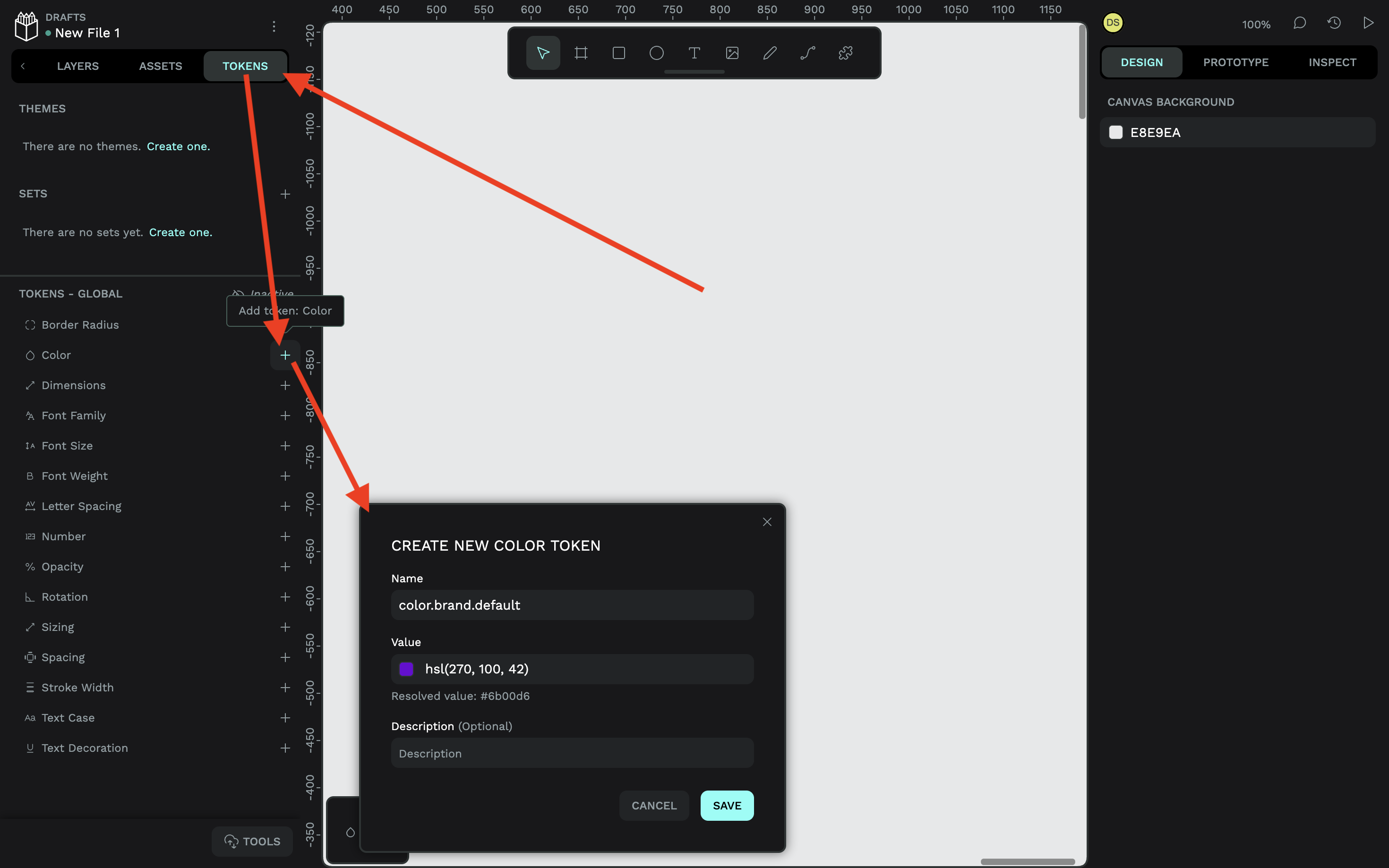
Creating an alias follows the same process — just reference another token using curly braces as the value:
- Name:
background.button.primary.default - Value:
{color.brand.default}
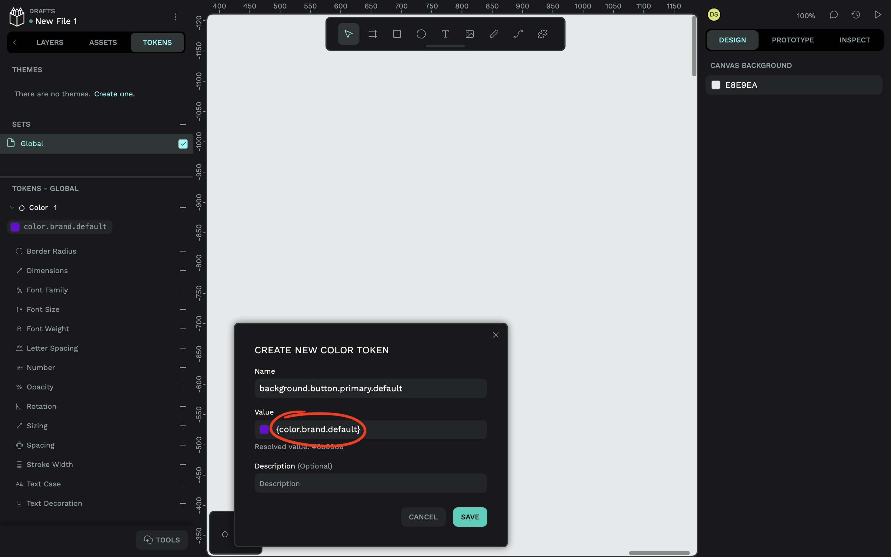
If the value of color.brand.default changes, so does the button background. And if you want to decouple the component from that color, you simply reference a different token. Penpot's tokens follow the W3C DTCG format, making them platform-agnostic and portable to web, iOS, and Android projects.
Build the Main Component
Start by creating a "main" component — the source of truth that all instances will reference. Changes to the main component propagate to every instance in your designs.
Here’s a button component before colors are applied:
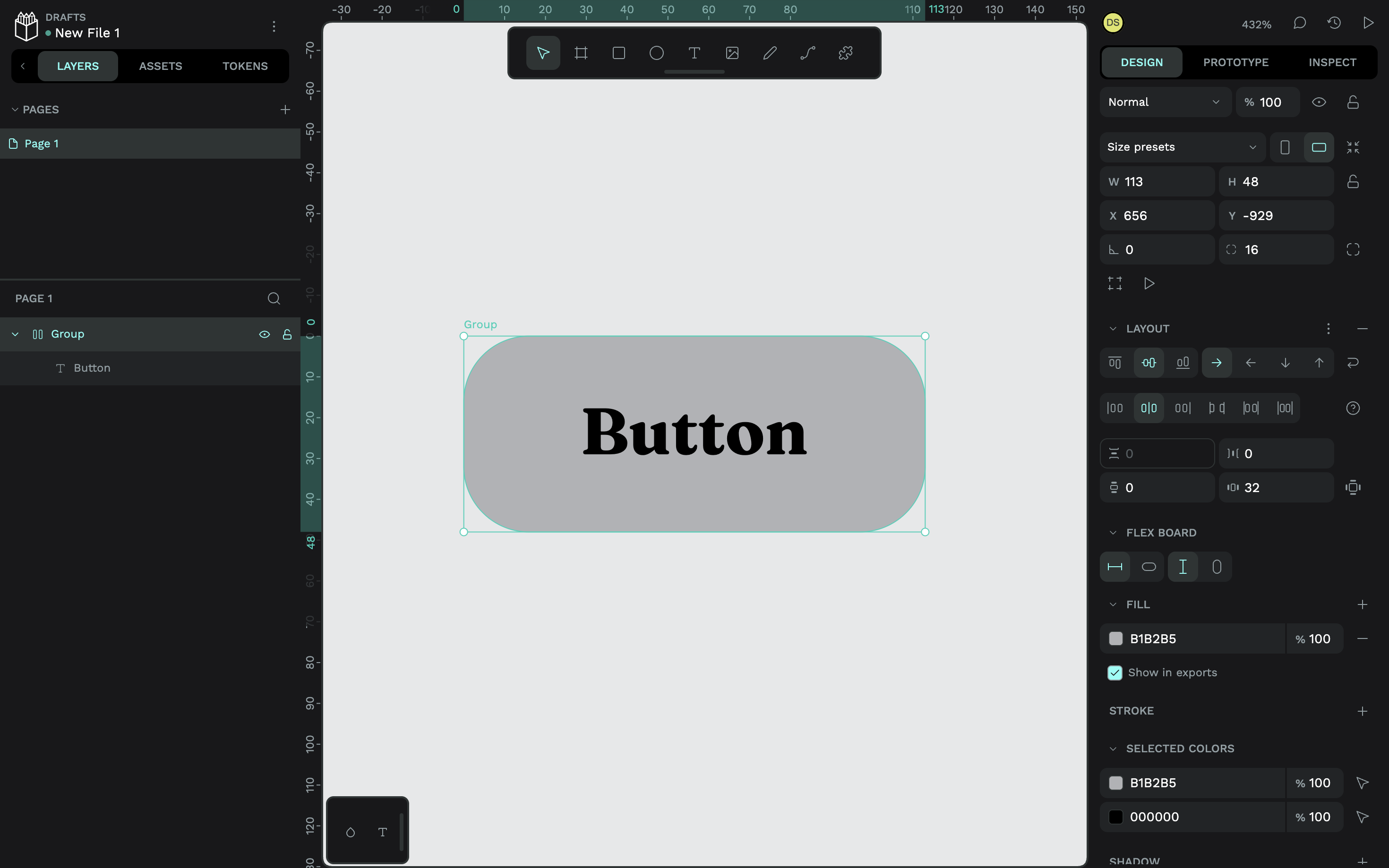
To apply a token, select the relevant layer, stay on the "Tokens" tab, and choose the token you want to assign:
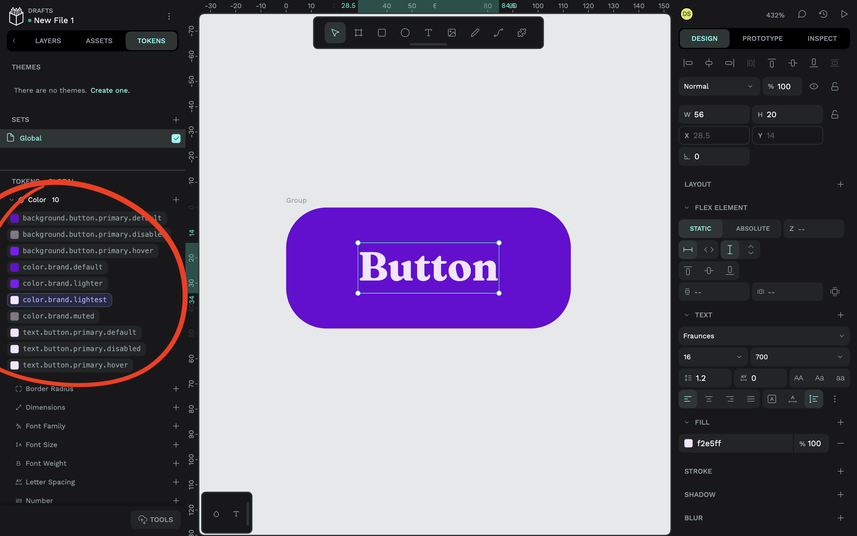
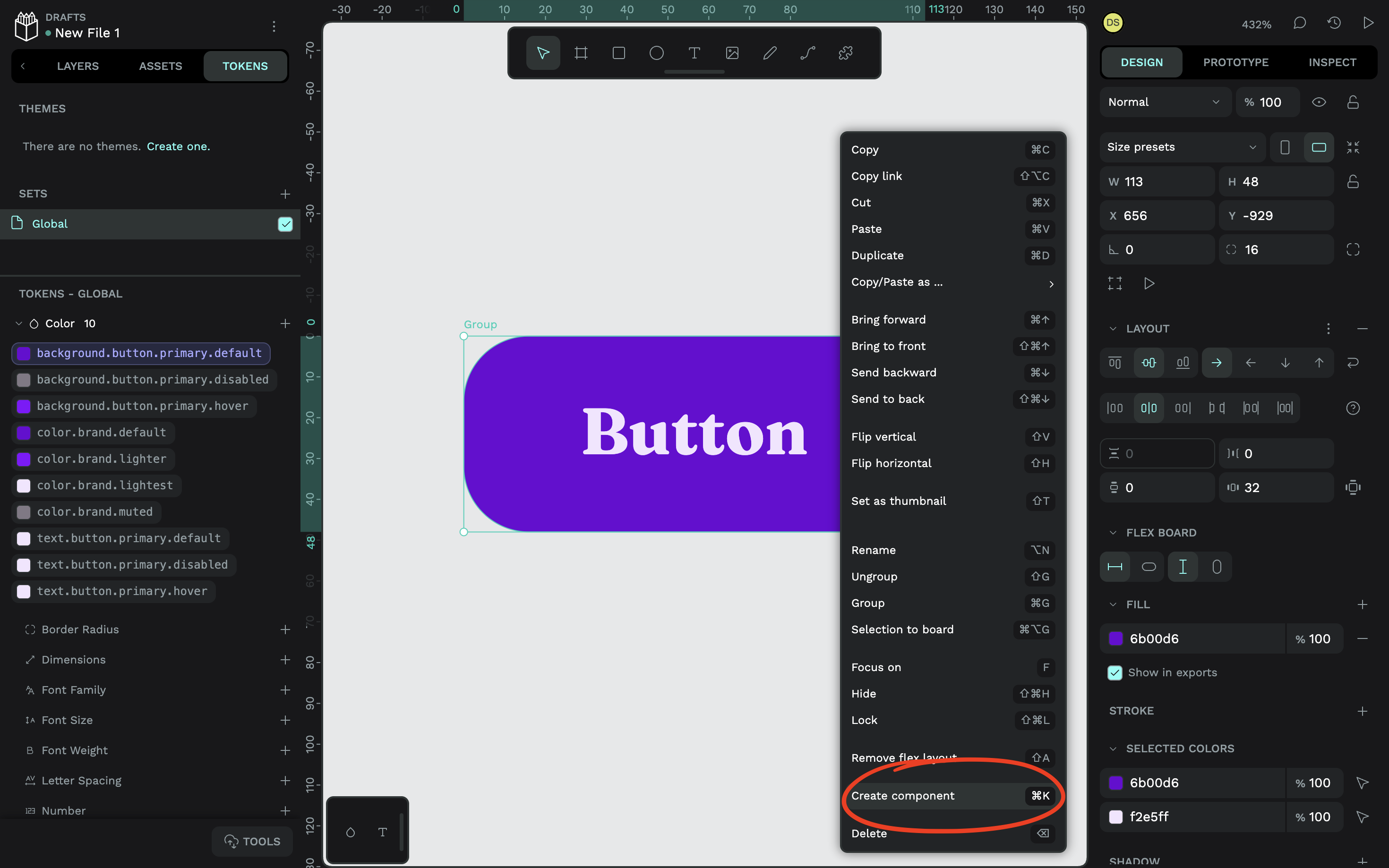
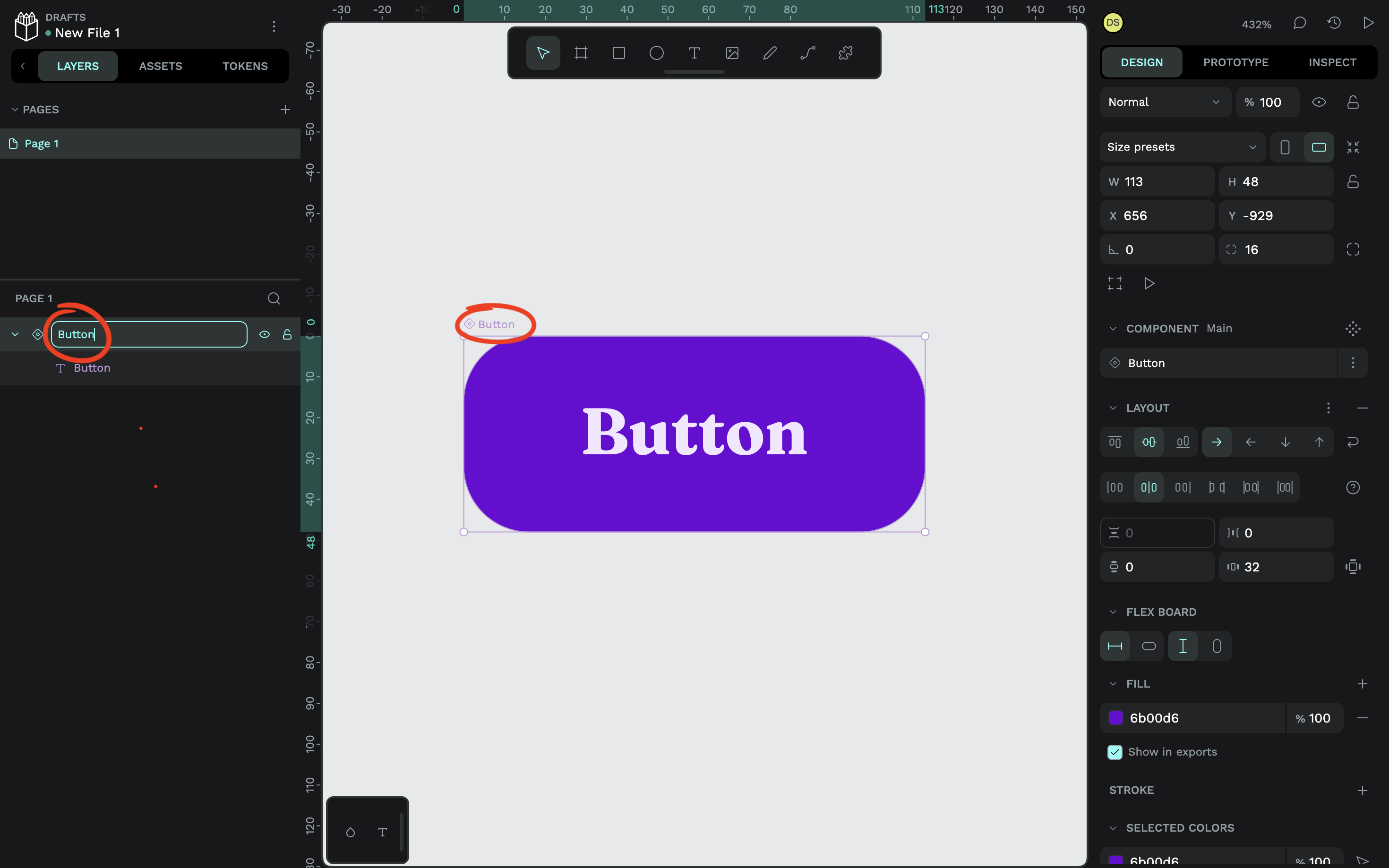
Create the default variant first as a baseline. Select the button on the canvas (or in the "Layers" tab), right-click, and choose "Create component" — or press Ctrl / ⌘ + K. Double-click the component name to rename it.
Create Variants
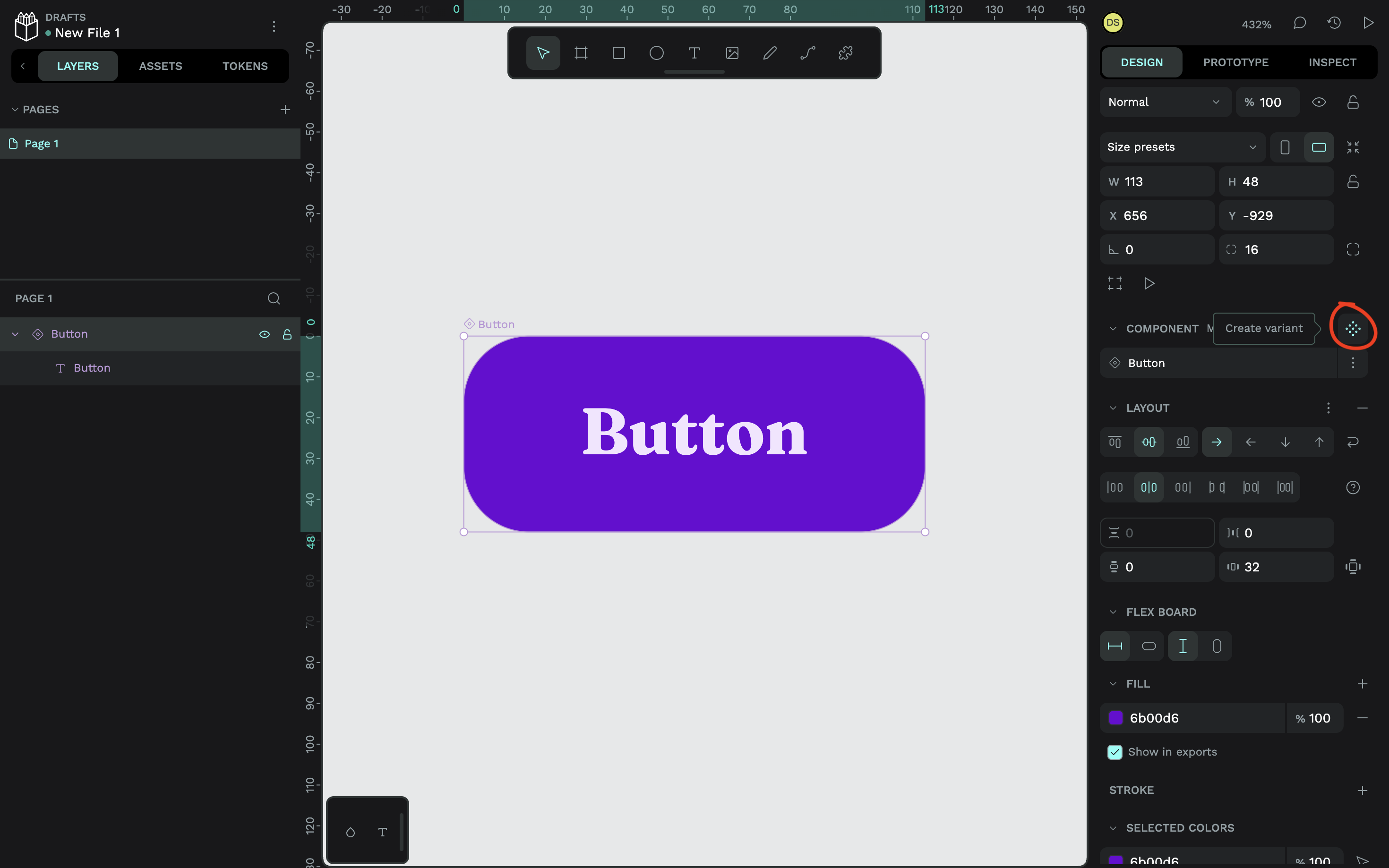
To add a variant, select the main component and press Ctrl / ⌘ + K again, or use the "Create variant" icon in the "Design" tab of the right panel.
With the new variant still selected, make the needed design changes — including swapping design tokens via the "Tokens" tab. Repeat until all variants are on the canvas:
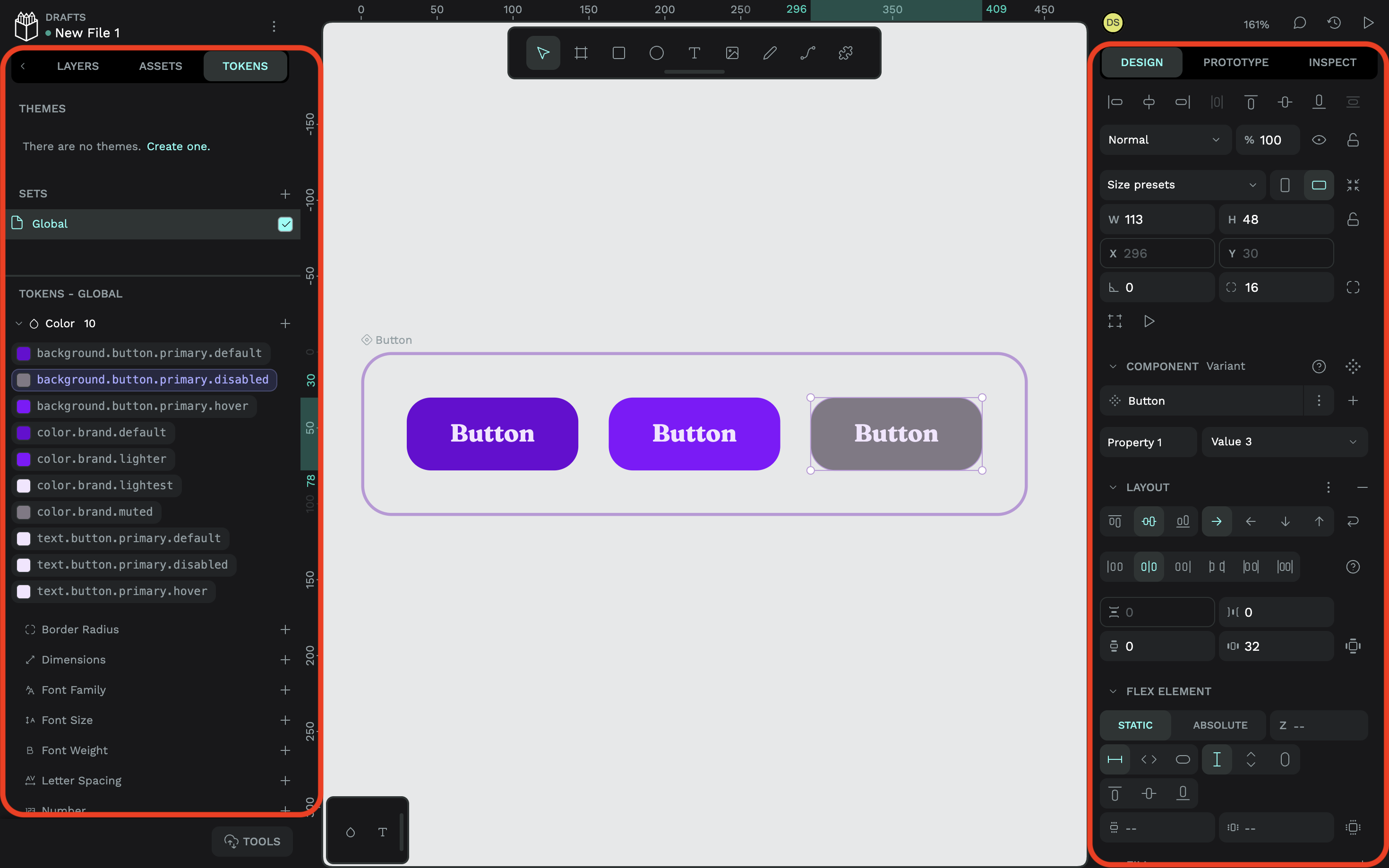
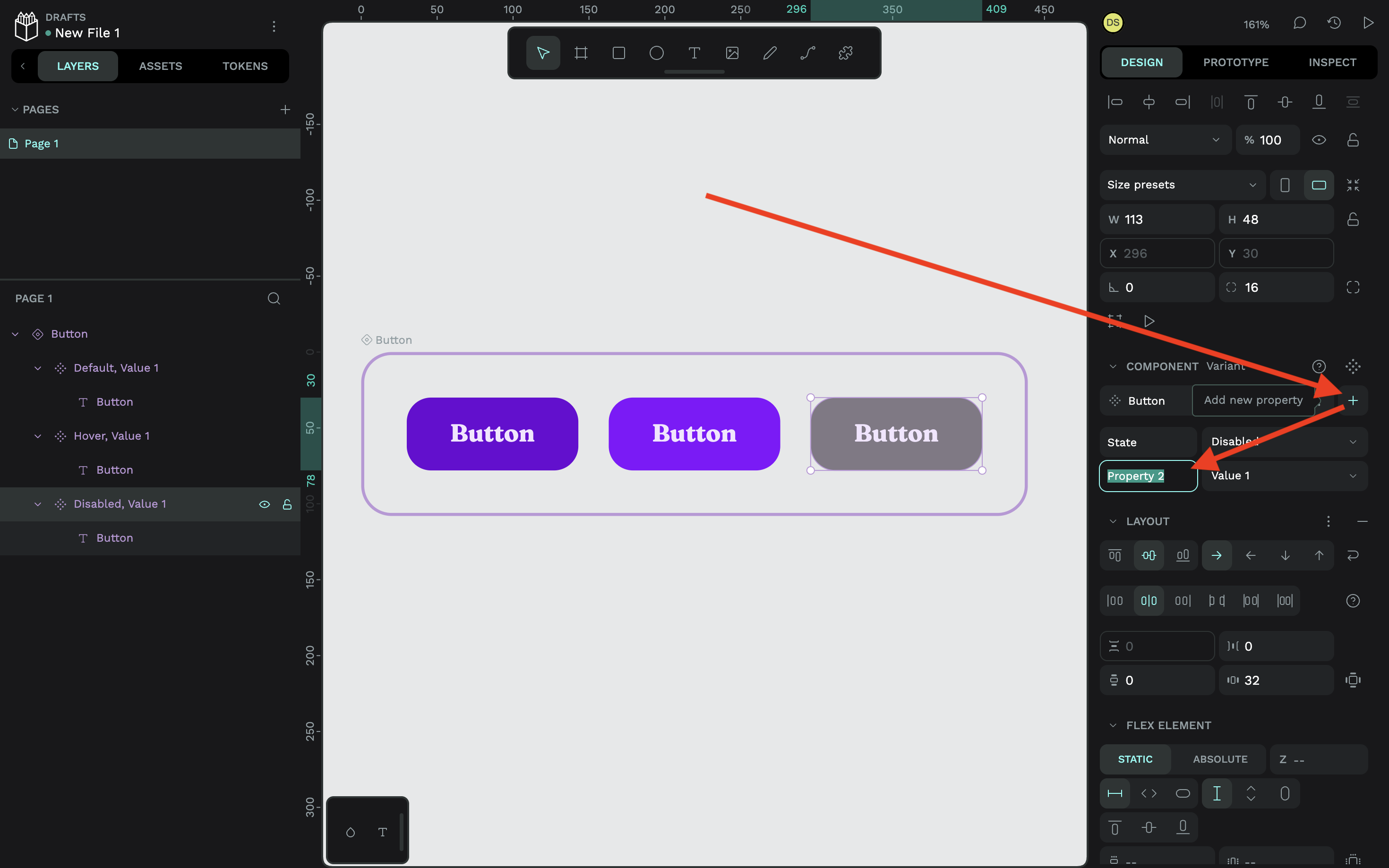
Name each variant from the "Design" tab, not the "Layers" panel. Replace the placeholder "Property 1" with a label describing what differs — for a button with states, that'd be "State." This applies across all variants, so you only set it once. Then give each variant its own value, such as "Default," "Hover," or "Disabled." You can add more properties by clicking the nearby plus (+) icon.
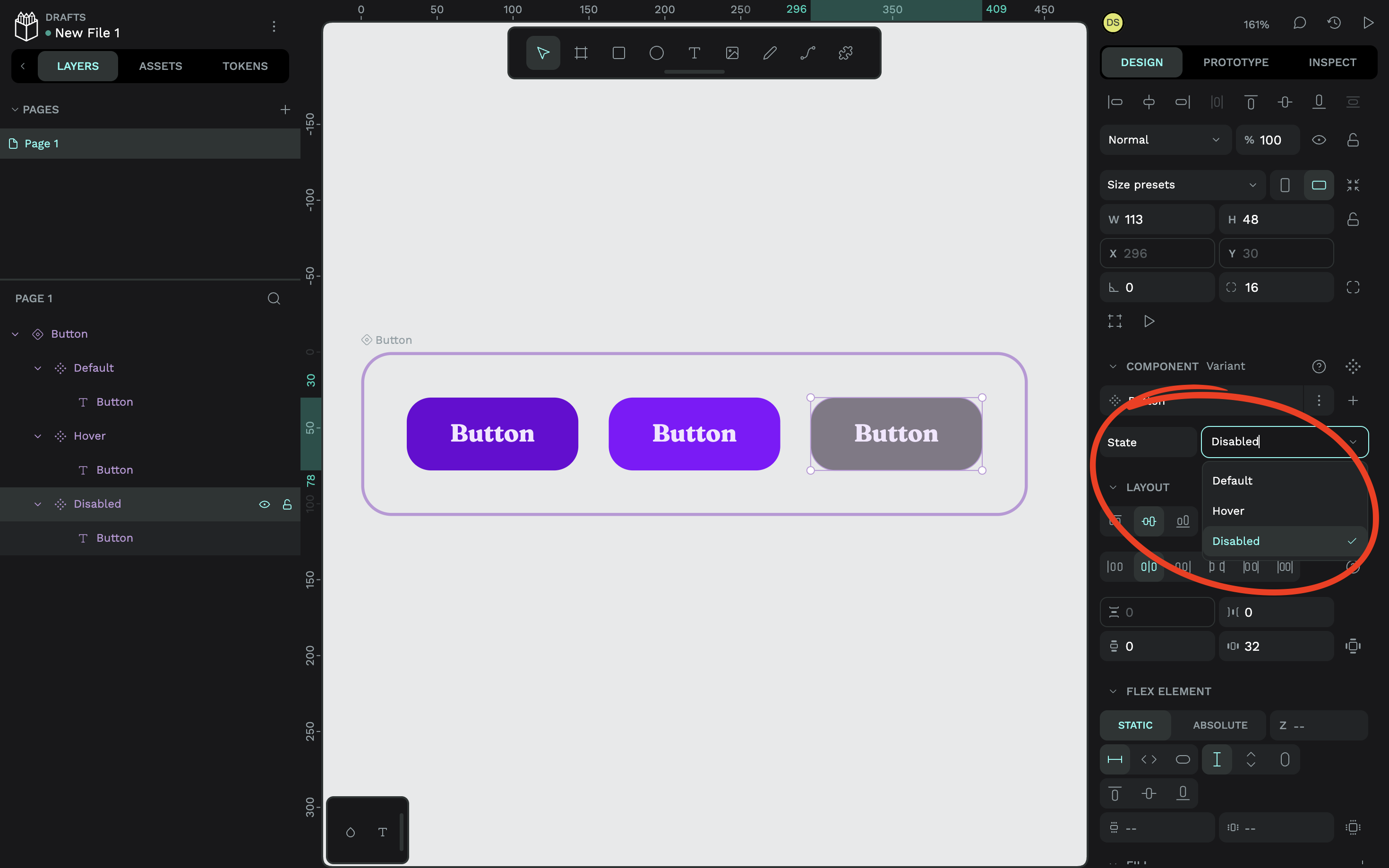
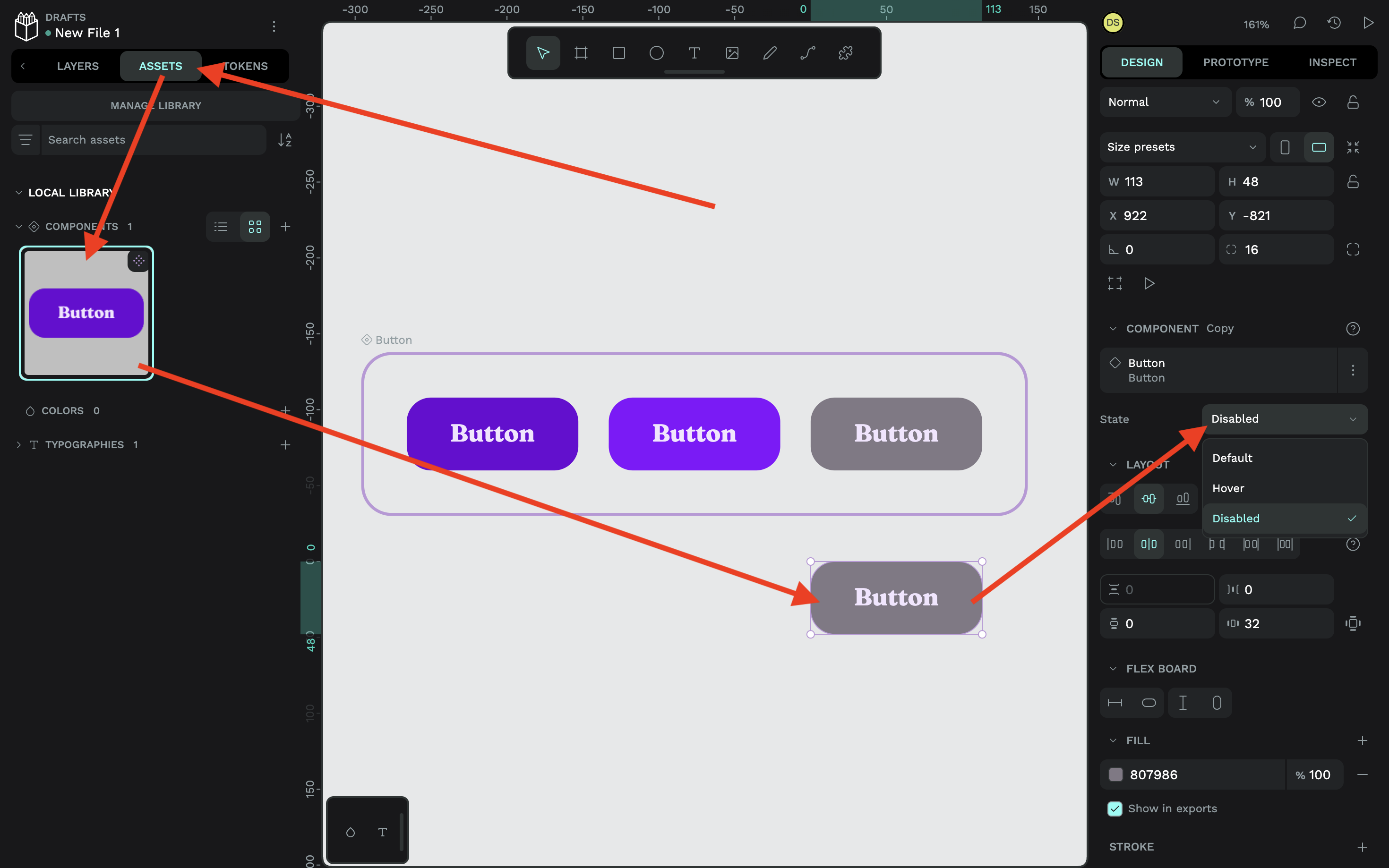
To use the component, go to the "Assets" tab in the left panel, drag the component onto the canvas, and pick the desired property value from the "Design" tab:
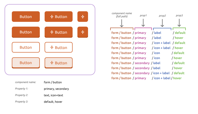
If you already have a Penpot design system, consolidating multiple components into one variant set is straightforward — especially if you use a property naming scheme with forward slashes (/). The diagram below shows how existing components map into the variant structure:
Scaling Variants With Tokens
Design tokens, components, and variants work together as the foundation of a scalable, sustainable design system. The key is planning ahead — starting with token aliases that separate the raw value from its purpose.
For example, instead of plugging color.brand.lightest directly into variant text, you'd create an alias like text.button.primary.default. That way, you can change the text color of one variant later without editing the canvas, and without forcing a document-wide change that could affect unrelated components.
Components give you reusability of structure; tokens give you reusability of style. The two connect in ways that may not be obvious upfront, so a little initial organization goes a long way. Before building, consider:
- Which design tokens you'll reuse (colors, font sizes, etc.)
- Where token aliases will apply (buttons, headings, etc.)
- How to organize tokens into sets
- How to group those sets into themes and groups
- Which components you'll need
- Which variants and properties each component requires
Even a simple button can spawn many variants: secondary and tertiary colors, confirmation and warning states, light and dark mode palettes, plus active and focus properties. You might end up with a full matrix — disabled-but-hoverable buttons, focused states on every variant, or buttons that mix icons with text.
Once your system is organized into tokens, components, and variants in Penpot, complexity becomes manageable. You can see everything on the canvas and make significant changes in seconds without breaking anything — getting both reusability and the flexibility to fork any detail of the system without leaving it behind.



