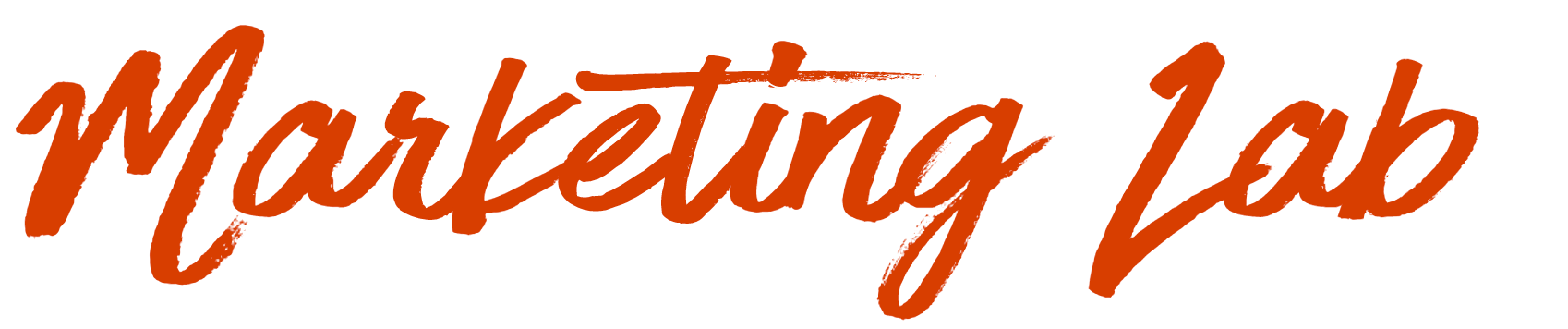
Calligraphy fonts are an awkward fit for the usual handwriting animation approach. Because their stroke width varies across a letter, the "writing" effect can't be driven by animating stroke attributes on text. The workaround is to build the lettering as SVG paths, then reveal them with an animated mask.
Why stroke dash animation falls short
The standard technique — animating stroke-dasharray and stroke-offset — works well when stroke width is uniform across the lettering. With uneven brush-style letterforms, the shape has to be a <path>, and that technique no longer applies. Masking is the alternative used here.
The font in this walkthrough is HaveHeartOne, chosen for its brush stroke look.
Two layers, one trick
The effect needs the same sentence twice, stacked:
- Bottom layer: the words set in the chosen font.
- Top layer: a hand-drawn path that approximates those words.
The top layer becomes a <mask>, filled white so it sits invisibly against the page and hides the layer beneath. Animating the mask progressively exposes the bottom layer, producing the writing effect.
Converting letters to paths
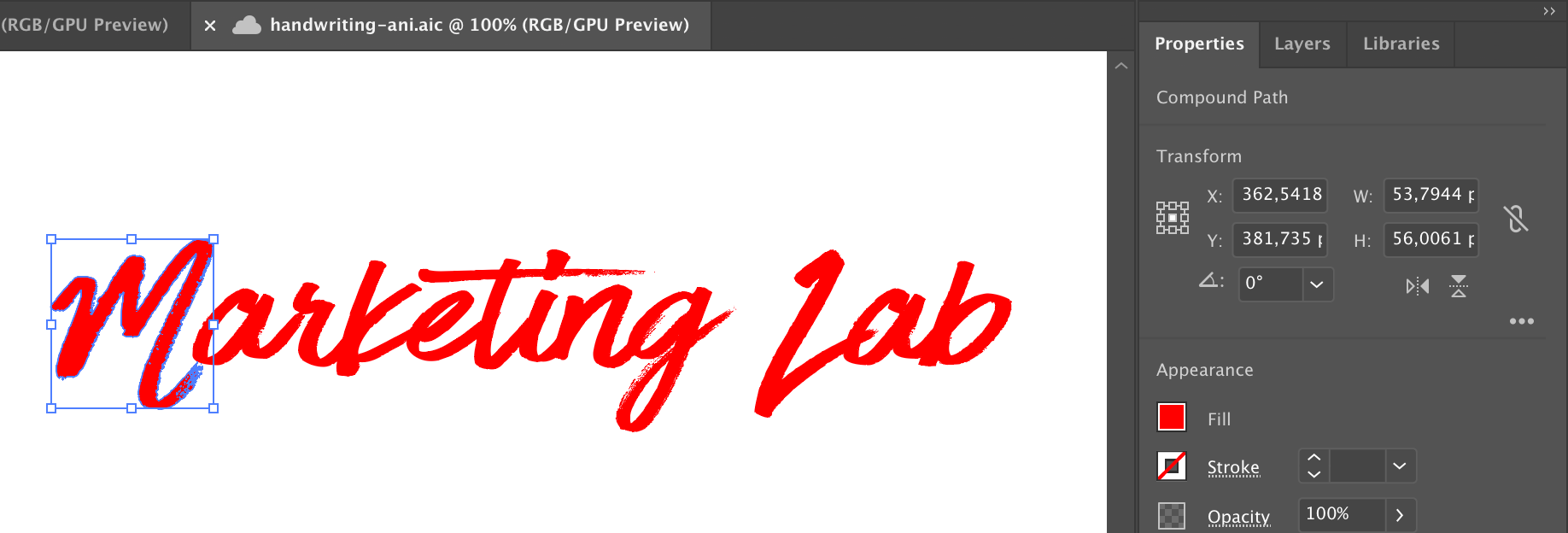
The top layer must be a continuous path so it can be animated, which rules out <text>. Illustrator and comparable apps can convert lettering to outlines: select the words, open the Properties panel and click Create outline. The letters become paths with vector points following their shape.
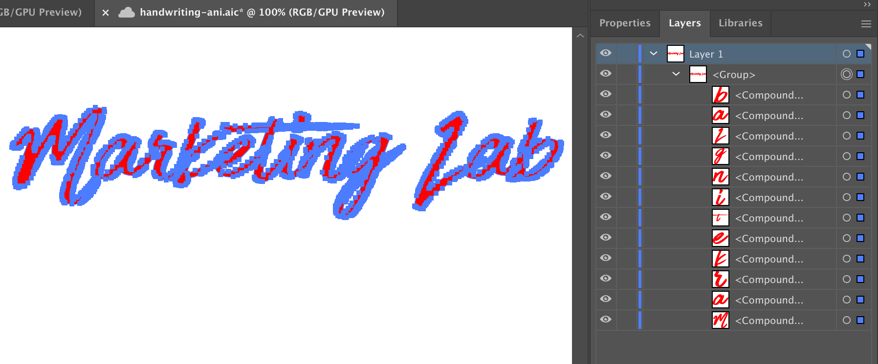
Name the resulting layers meaningfully before export — the app derives the SVG IDs and classes from those layer names, so the names are what you'll be working with in code.
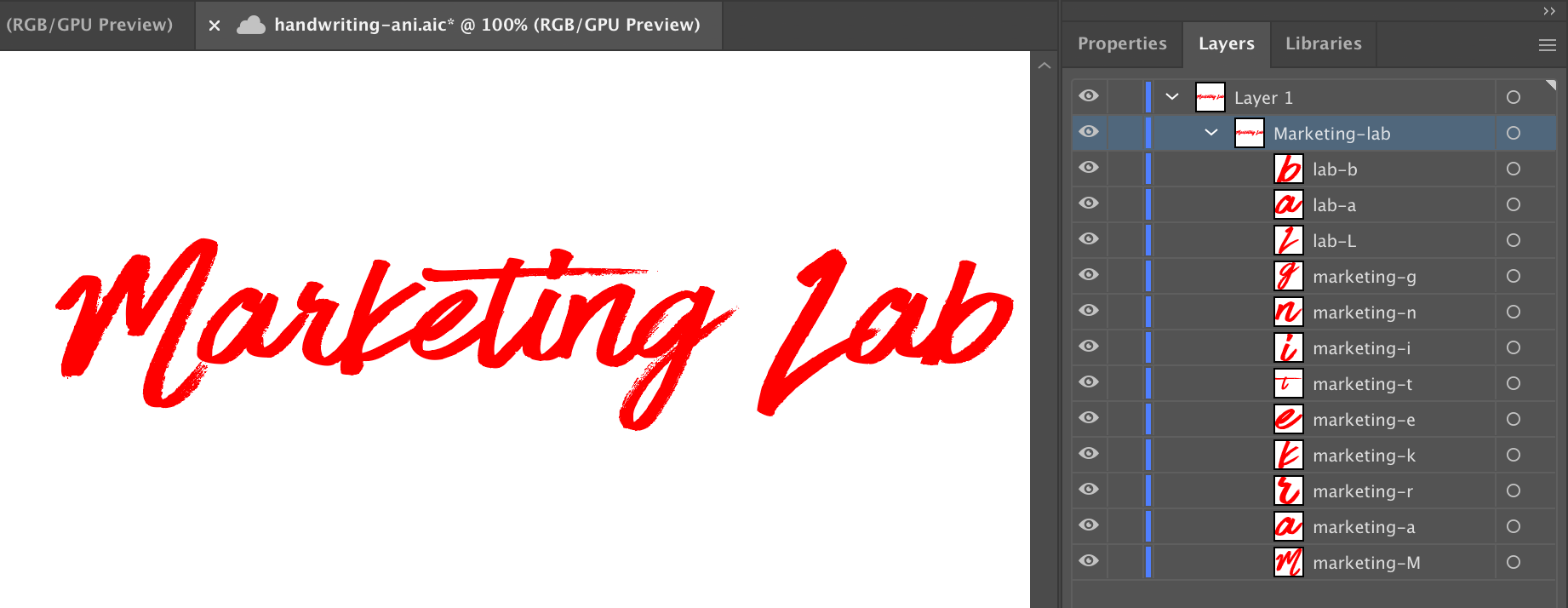
The converted letters carry a fill but no stroke:
Tracing the mask layer
With the pen tool, trace each letter to build the animated stroke. Set Fill to "None," choose a stroke color (black here) and set the stroke width to suit the font — 5px in this example. Precision isn't the goal; coverage is. Each mask must fully cover the letter beneath it.
Draw masks per letter, name the layers well, and reuse a mask wherever the same letter appears instead of redrawing it.

Export and cleaning up the code
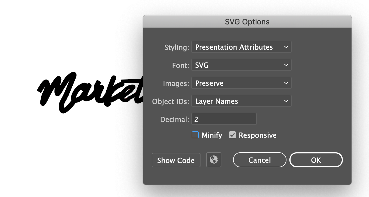
In Illustrator the export path is File → Export → Export as → SVG, with these options:
Output quality varies between apps — some generate lean SVG, others considerably less so — so plan on editing the file. To keep the result small: fewer points, a smaller viewBox, and a dedicated optimization pass if needed.
Manual edits worth making
- Set
widthandheightattributes on the<svg>element to size the final design. - Add a
<title>element. Paths aren't read as words by screen readers, so this is what makes the text accessible. - The app will emit
<g>groups carrying the layer names as IDs — here#marketing-labfor the outlines and#marketing-masksfor the masks. Move the masks group into a<defs>element so it isn't rendered. - Strip the
transformattribute from paths inside the masks group. - Wrap each path in a
<mask>with a.maskclass and an ID naming the letter it masks.
<mask id="mask-marketing-M">
  <path class="mask" id="mask-M" ... />
</mask>
Inside the outline group, reference the mask on the matching character path with mask="url(#mask-marketing-M)":
<g id="marketting-lab">
  <path mask="url(#mask-marketing-M)" id="marketting-char-M" d="M427,360, ... " />
</g>
A single finished character looks like this:
<svg xmlns="http://www.w3.org/2000/svg" viewBox="0 0 381 81" class="marketing-lab">
  <title>Marketing Lab</title>
  <defs>
    <g id="marketing-masks">
      <mask id="mask-marketing-M">
        <path class="mask" id="mask-M"
          d="M375.5, ... ,9-10" stroke-linecap="square" stroke-linejoin="bevel" stroke-width="7" />
      </mask>
    </g>
  </defs>
  <g id="marketting-lab">
    <path
      mask="url(#mask-marketing-M)" id="marketting-char-M"
      d="M427,360.22c-.11.08-.17.14-.17.18H427c0" />
  </g>
</svg>
Finally, CSS sets the .mask stroke to white so the mask disappears against the document background:
.mask {
  fill: none;
  stroke: #fff;
}
Driving the reveal
The animation itself is the familiar stroke-dasharray reveal. Path length can be precomputed once and hardcoded into CSS, calculated at runtime with JavaScript, or handled by GSAP's drawSVG plugin, which can progressively reveal the stroke of a <path>, <line>, <polyline>, <polygon>, <rect> or <ellipse>, using stroke-dashoffset and stroke-dasharray internally.
Pure CSS, with or without JavaScript
/* Set the stroke-dasharray and stroke-dashoffset */
.mask {
  stroke-dasharray: 1000;
  stroke-dashoffset: 1000;
}


/* Animation the stroke-dashoffset to a zero length */
@keyframes strokeOffset {
  to {
    stroke-dashoffset: 0;
  }
}


/* Apply the animation to each mask */
#mask-M {
  animation: strokeOffset 1s linear forwards;
}
If you'd rather not hardcode, JavaScript can measure the path length for you:
// Put the masks in an array
const masks = ['M', 'a', 'r', 'k-1', 'k-2', 'e', 't-line-v', 't-line-h', 'i-2', 'i-dot', 'n', 'g', 'lab-l', 'lab-a', 'lab-b']


masks.forEach((mask, index, el) => {
  const id = `#mask-${mask}` // Prepend #mask- to each mask element name
  let path = document.querySelector(id)
  const length = path.getTotalLength() // Calculate the length of a path
  path.style.strokeDasharray = length; // Set the length to stroke-dasharray in the styles
  path.style.strokeDashoffset = length; // Set the length to stroke-dashoffset in the styles
})
GSAP drawSVG
- Include the GSAP and drawSVG scripts.
- Hide the graphic initially with
autoAlpha. - Build a timeline, switching
autoAlphatotruefor the graphic. - Add the character mask IDs to the timeline in sequence.
- Animate the characters with drawSVG.




