

A Three-Layer Model for CSS Color Variables
Color organization often stops at a single flat list of custom properties in :root. That works for small projects, but it gets painful the moment you need theming, white labeling, or a brand refresh. Every change requires hunting down and updating values scattered across the stylesheet.
A more resilient structure splits colors into three levels: a static palette, a functional layer that defines theme semantics, and component variables scoped to individual UI pieces. Custom Properties support the cascade, so each level can inherit and override values from the level above it at runtime — something preprocessor variables cannot do.
Level 1: Build the Palette
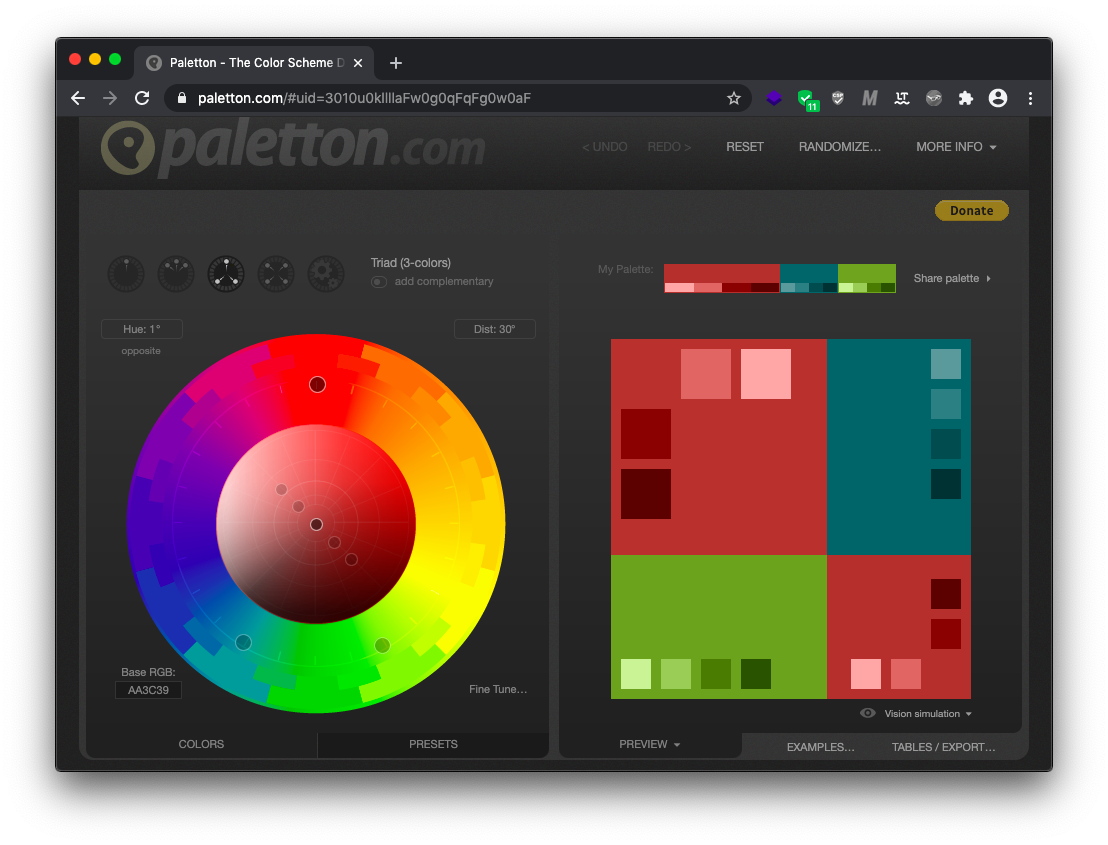
Every color system starts with a palette derived from the color wheel. Color theory recognizes a handful of scheme patterns:
- Monochromatic (one primary color)
- Complementary (two primary colors)
- Triad (three primary colors)
- Tetradic (four primary colors)
- Adjacent (two or three primary colors)
A triad scheme, for instance, yields three primary colors. From those, you can derive tones and mid-tones by adjusting lightness. Storing base colors in HSL and using the calc function to vary the lightness value generates a full palette automatically; changing a single primary color recalculates all of its shades.
If you work in HEX or RGB, the same palette generation can happen at build time with a preprocessor like SCSS and its color-adjust function. Because this layer rarely changes while the application runs, static compilation is fine. Whichever format you choose, generate both HEX and RGB representations for each color so you can manipulate the alpha channel later.
This is the only level where variable names encode an actual color value — --blue-500 means something you can identify by eye. Higher levels use names that describe purpose instead.
Level 2: Define Functional Colors
The functional layer is where color meaning lives. The value itself matters less than its role: primary brand color, border color, text on dark backgrounds, link color, hover state, or hint text. These variables pull their values strictly from the palette layer, and together they define the application theme.
Because functional variables reference palette values, swapping themes becomes a matter of redefining a few key variables rather than editing dozens of rules. This can be driven at runtime through the CSSOM API using setProperty, or statically per page by redefining a single functional variable in a page-specific scope.

Level 3: Scope Variables to Components
Decomposed projects reuse components across many contexts. Component-level color variables make sense in two main situations.
First, when a component appears in multiple variants per the style guide — primary, secondary, and tertiary buttons, for instance. Scoped variables let each instance declare its own colors without affecting siblings.
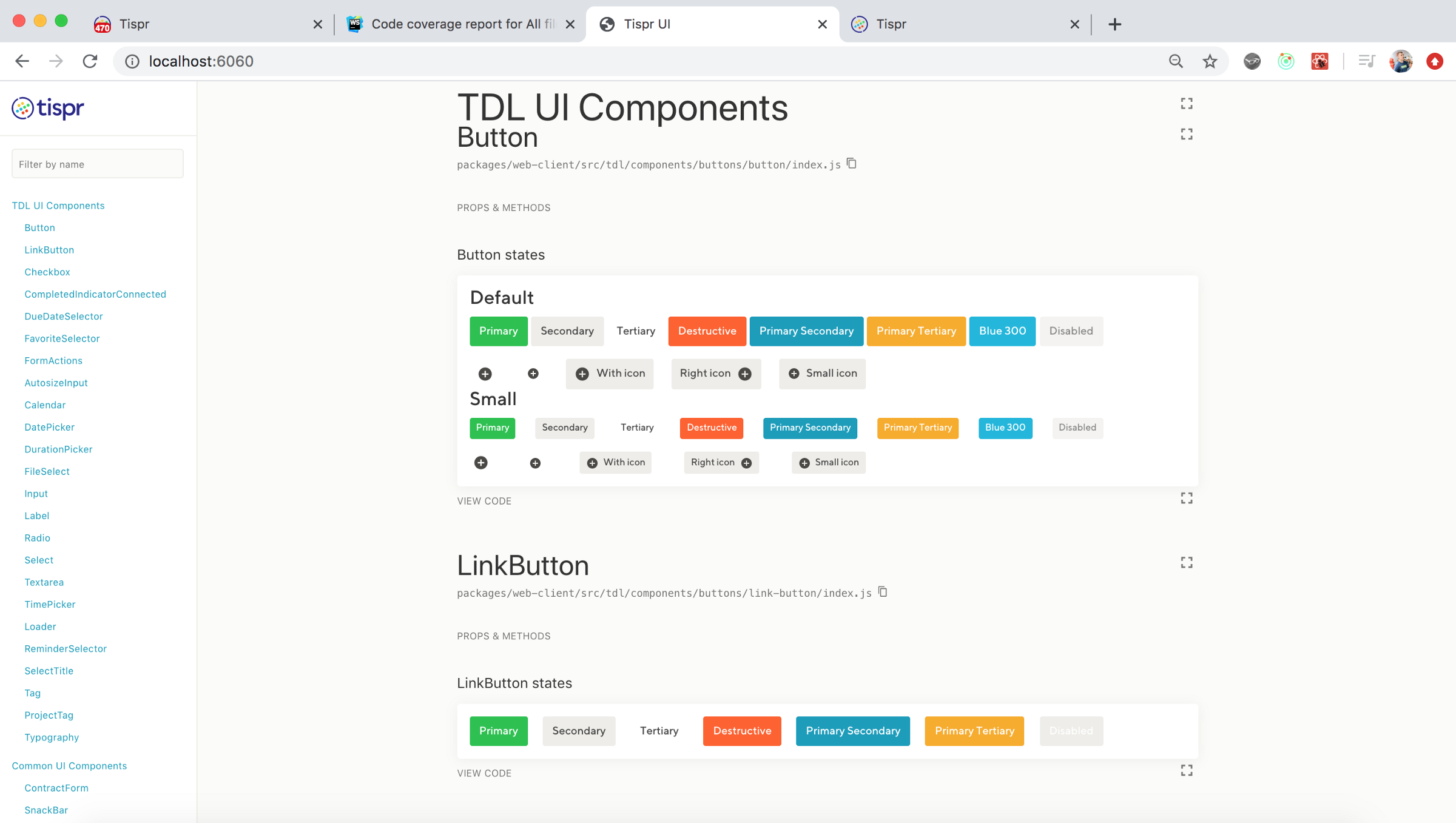
Second, when a component has different colored states: hover, active, and focus for buttons, or normal and invalid states for inputs. Conflicts can occur when a state's color differs from a functional variable used elsewhere — the error state of one component may not match the destructive button scheme. Naming those colors at the component level resolves the conflict cleanly.
A rarer use case is the white-label feature, where users rebrand portions of a UI — like email templates or shared electronic documents — independently of the application-wide theme. Component variables enable that isolated customization.
Deciding Where a Variable Belongs
The hard question is whether a repeated color belongs in the functional root or stays at the component level. The programmer's instinct to refactor three identical blocks does not transfer here: repeated colors do not imply a shared rule.
Consider an input border, a close-icon fill, and a secondary button background that all use the same dark gray. These components have no relationship. Changing the input border does not mean the secondary button background should change. In such a case, those components should reference a palette variable directly, not a shared functional one.
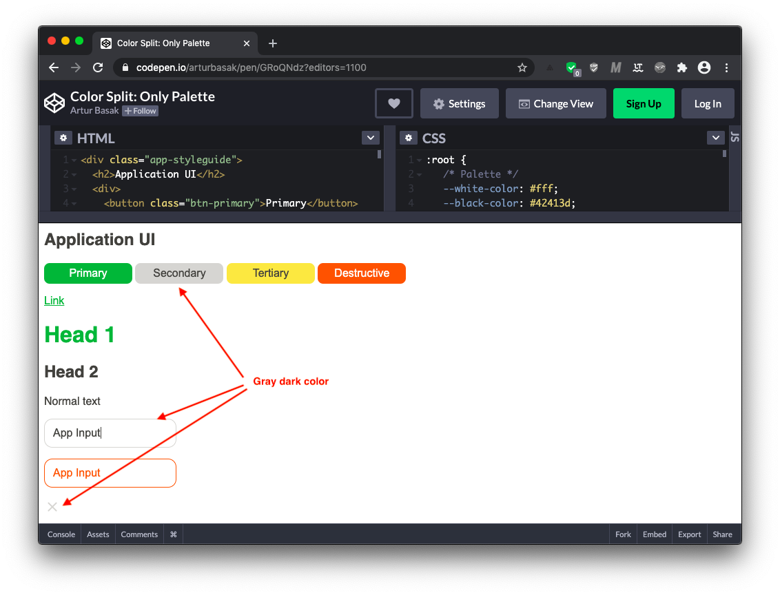
Green, by contrast, is a clear brand or primary color: if the main button changes color, the links and first-level headings change too. Red follows a pattern as well — invalid inputs, error messages, and destructive buttons share an application-wide meaning. Those belong on the functional level, defined once in :root.
Components that get customized, like multi-variant buttons or inputs with invalid states, warrant their own local variables. The rest of the components do not need local color definitions — adding them would be redundant.
Figuring out the correct split means understanding the visual language of the project and where its patterns align. Some things are obvious: page background, main text color, and related theme-level toggles for dark or light mode belong at the functional level. Beyond that, engineers must work with the design team's pattern language to separate true theme rules from coincidental repetitions.
Scope Creep: Why the Root Selector Isn’t Always the Answer
It’s tempting to declare every color variable in the :root block. This makes sense when you need global access or are supporting legacy environments where cascade logic is hard to process. One real-world case involved a project needing IE11 support for a web app but not for marketing pages. To share a common UI kit, all variables were centralized in :root, which allowed the code to be passed through a post-processor that converted variables into literals for every component. That technique only works if everything is at the root, since the post-processor can’t interpret cascade nuances.

However, this approach introduces architectural debt. Centralizing component-specific colors in the root breaks separation of concerns. If you later delete a button component, you must manually clean up its related variables from the global stylesheet, leading to redundant and stale CSS.
Performance is another consideration. Changing a CSS variable triggers repaint but not reflow or layout, so the operation itself is cheap. The problem is the scope of the invalidation. Updating a variable at the top level forces the browser to check the entire DOM tree, whereas a local change only affects a small subtree. Lisi Linhart’s performance benchmark digs into these costs.
On a larger production project, the team chose a split architecture instead: keeping only the palette and functional colors at the highest level, while moving component variables into their respective component scopes. IE11 support was handled with a polyfill rather than by centralizing everything. The ie11-custom-properties npm module can be imported directly into a JS bundle:
// Use ES6 syntax
import "ie11-custom-properties";
// or CommonJS
require('ie11-custom-properties');
Or included traditionally with a script tag:
<script async src="./node_modules/ie11-custom-properties/ie11CustomProperties.js">The polyfill works because IE11 actually supports custom properties when they use a single leading dash — the double-dash syntax isn’t respected, but the single-dash mechanism is similar to how vendor prefixes work. Details and limitations are documented in the repository. Browsers that natively support CSS custom properties ignore the polyfill entirely.
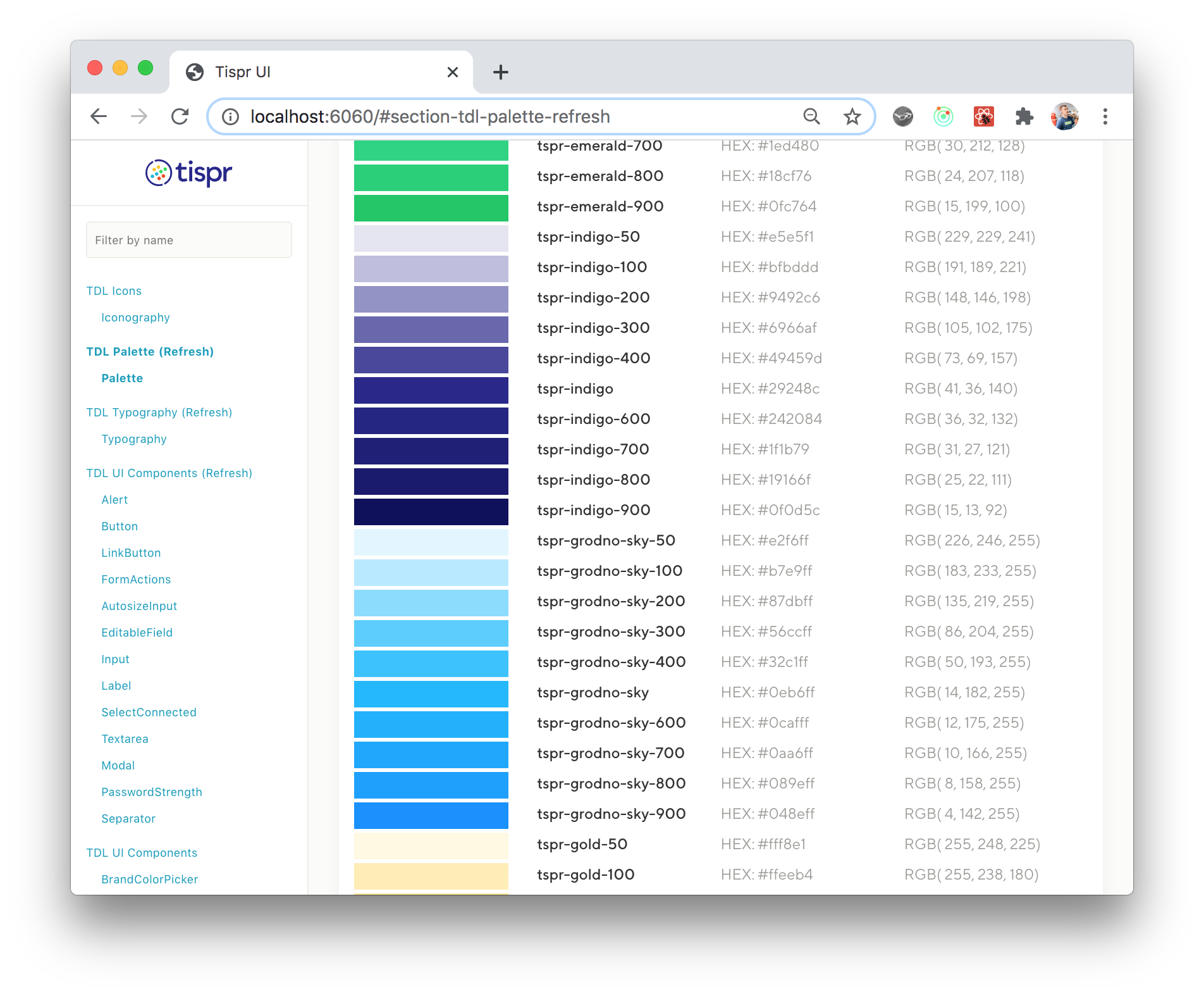
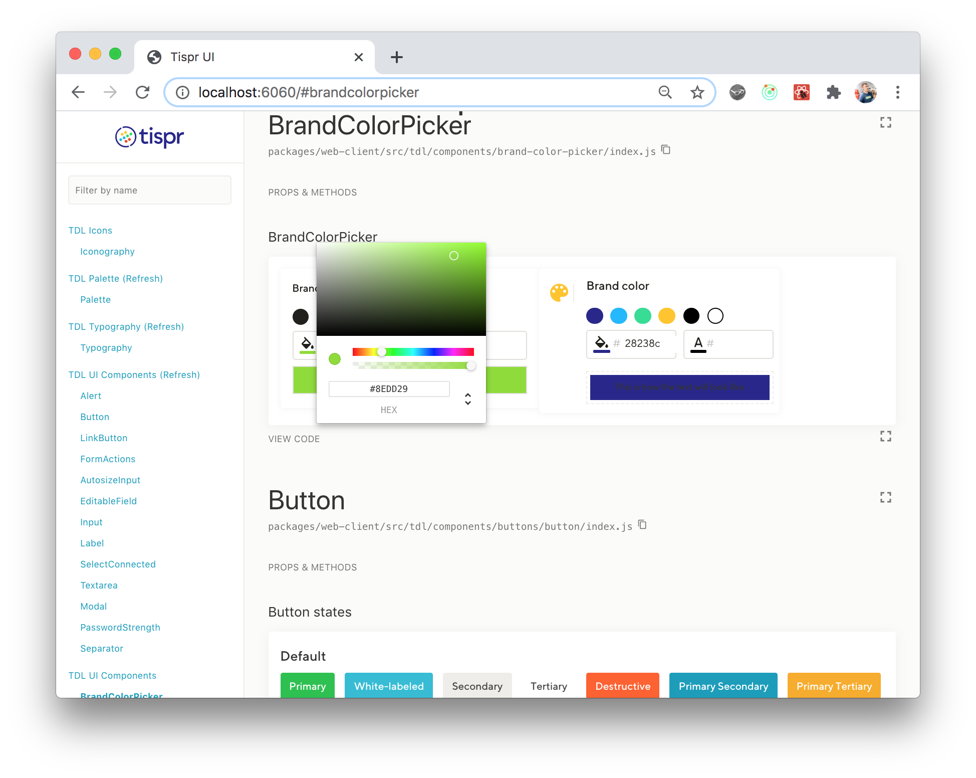
The project’s palette and a white-label feature control panel for electronic documents serve as a practical example of this color architecture:
JavaScript Variables as an Alternative?
Storing palette and functional variables in JavaScript is another option. You could mutate them and reapply values as inline styles. But this requires reading changing color properties on specific elements directly. With CSS variables, you update a single variable declaration and the cascade handles the rest.
JavaScript doesn’t have native color manipulation APIs, while the CSS Color Module 5 specification will bring built-in color derivation and calculation functions. CSS custom properties also inherently support cascade inheritance. A JavaScript-based color system is more brittle, requiring manual propagation of changes to every affected element.
The Three-Tier Color Split
Organizing colors into three layers — palette, functional, and component — is the recommended strategy. It makes a project more responsive to changing design requirements, regardless of whether the styles are written in pure CSS, a preprocessor, or CSS-in-JS.
Similar approaches have been documented elsewhere. Sara Soueidan’s article on style settings advocates separating variables into global and component levels. Lea Verou’s CSS variables guide also explores broad use cases beyond color handling.
For more reading on the topic, the following resources may be useful:
- Setting And Persisting Color Scheme Preferences With CSS And A “Touch” Of JavaScript
- CSS Blurry Shimmer Effect
- Mastering Typography In Logo Design
- It’s Time To Talk About “CSS5”



