Animating a Border with Nine-Slice SVGs
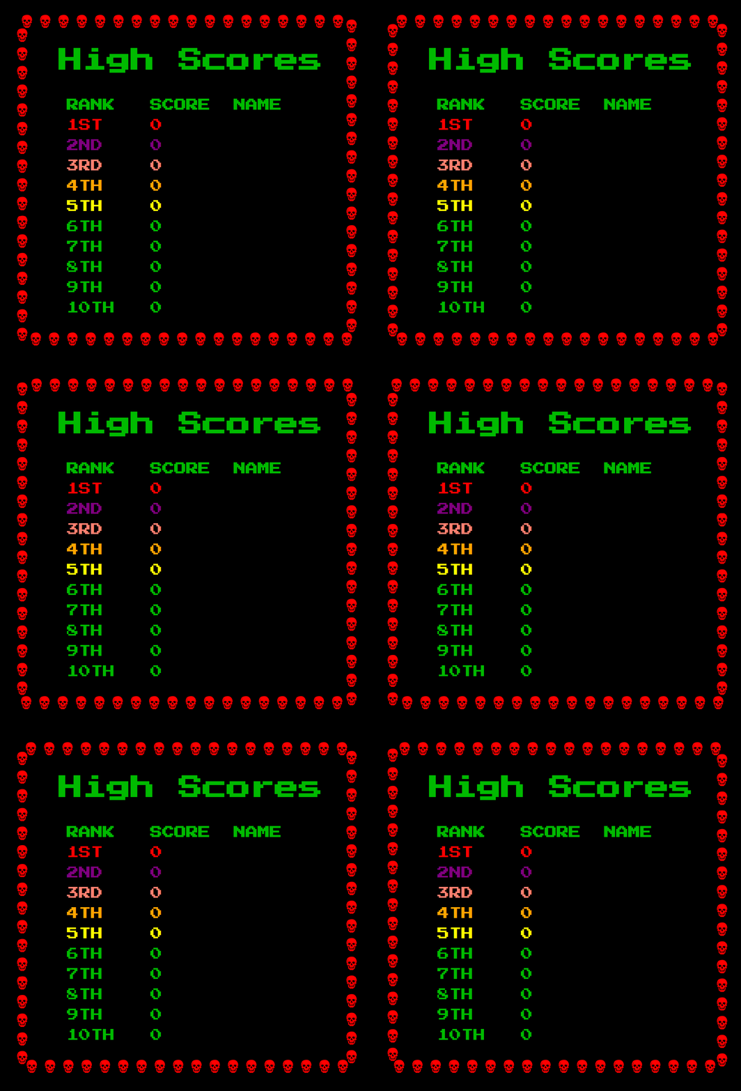
Moving a shape around an element's edge is possible with border-image paired with animated SVG nine-slice artwork. This approach animates skulls traveling around a container's border, and the SVG can be hand-crafted so it resizes and can be customized. It was developed as part of The Skull, a capture-the-flag riddle exploring Arduino and its microcontroller.
Existing resources on animated borders mostly cover "marching ants" techniques. The stroke-dasharray method does not accommodate skulls or more complex shapes, so a different mechanism is needed.
background versus border-image
An early attempt used a ::before pseudo-element with an animated background-position. It produced partial results, but completing the border would have required at least eight separate elements or pseudo-elements, cluttering the HTML.
border-image handles the job directly. It uses a supplied image (or CSS gradient) for an element's border in a nine-slice fashion, like a tic-tac-toe board drawn over the image. The nine regions map to the border's top, right, left, and bottom edges, the four corners, and a middle region that is ignored.
For static skulls, SVG patterns can repeat the skull nine times. A 24×24 pattern is defined from the skull's path, then used as the fill for a 72×72 rect:
<svg version="1.1" height="72" width="72" xmlns="http://www.w3.org/2000/svg">
 <defs>
  <pattern id="skull-fill" width="24" height="24"
patternUnits="userSpaceOnUse">
    <path d="..." fill="red"/>
  </pattern>
 </defs>
 <rect fill="url(#skull-fill)" width="72" height="72" />
</svg>
With that image ready, declare a border and set border-image on the target element:
.skulls {
  border: 24px solid transparent;
  border-image: url("https://skullctf.com/images/skull-9.svg") 24 round;
}
The result is a border made of skulls.
Animating the slices
Animation comes from giving each border image region its own animation. In the top-left corner, for example, one skull moves right-to-left while a second moves top-to-bottom simultaneously. The movement animates the transform property, and SVG's <use> element avoids repeating the lengthy <path> definition for every skull:
<svg version="1.1" height="96" width="96" xmlns="http://www.w3.org/2000/svg" xmlns:xlink="http://www.w3.org/1999/xlink">
 <style>
  @keyframes left {to {transform: translate(-32px, 0)}}
  @keyframes down {to {transform: translate(0, 32px)}}
 </style>
 <defs>
  <path id="skull" d="..." fill="red"/>
 </defs>

 <!-- Top-left corner: one skull goes left, another goes down -->
 <use href="#skull" x="0" y="0"  style="animation: down .4s infinite linear"/>
 <use href="#skull" x="32" y="0" style="animation: left .4s infinite linear"/>
</svg>
The animation is driven by ordinary CSS animations rather than an SVG-specific syntax such as SMIL, which keeps the technique familiar.
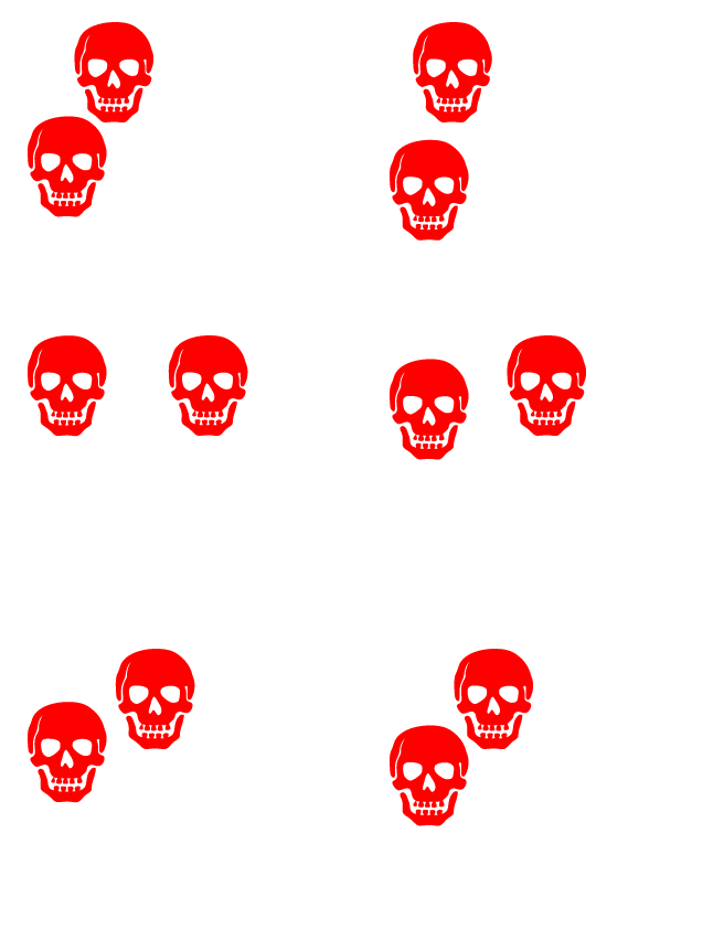
Overlaying a grid shows that this animation also reaches into part of the top and left edges:

Adding the remaining three edges covers all eight border image regions:
<svg version="1.1" height="96" width="96" xmlns="http://www.w3.org/2000/svg" xmlns:xlink="http://www.w3.org/1999/xlink">
 <style>
  @keyframes left {to {transform: translate(-32px, 0)}}
  @keyframes down {to {transform: translate(0, 32px)}}
  @keyframes right {to {transform: translate(32px, 0)}}
  @keyframes up {to {transform: translate(0, -32px)}}
 </style>
 <defs>
  <path id="skull" d="..." fill="red"/>
 </defs>

 <!-- Top-left corner: one skull goes left, another goes down -->
 <use href="#skull" x="0" y="0"  style="animation: down .4s infinite linear"/>
 <use href="#skull" x="32" y="0" style="animation: left .4s infinite linear"/>

 <!-- Top-right corner: one skull goes up, another goes left -->
 <use href="#skull" x="64" y="0" style="animation: left .4s infinite linear"/>
 <use href="#skull" x="64" y="32" style="animation: up .4s infinite linear"/>

 <!-- Bottom-left corner: one skull goes down, another goes right -->
 <use href="#skull" x="0" y="32" style="animation: down .4s infinite linear"/>
 <use href="#skull" x="0" y="64" style="animation: right .4s infinite linear"/>

 <!-- Bottom-right corner: one skull goes right, another goes up -->
 <use href="#skull" x="32" y="64" style="animation: right .4s infinite linear"/>
 <use href="#skull" x="64" y="64" style="animation: up .4s infinite linear"/>
</svg>
The full circuit:

That animated SVG is then used as the border-image to achieve the effect.
Tuning the motion
Working with SVG rather than GIFs makes the animation easy to modify: changing its character means editing a single CSS property in the SVG source and seeing the result immediately. SVGs also bring smaller file sizes (particularly with gradients), full color support, and crisp scaling.
Switching the timing function to ease is one option. The skulls can also fade between red and green, or change orientation as they travel around a high score table.
Rendering caveats
The technique is not without problems. Firefox does not render the animation at the edges of the border, only at the corners:

Curiously, substituting a GIF with the same animation renders correctly in Firefox—but then the edges stop animating in Chrome. The behavior appears to be a browser bug. Setting border-image-repeat to stretch makes Firefox animate the edges, though the result is somewhat quirky (which may suit the page's theme):

space also seems to work, but only when the element's width is not a whole multiple of the skull size, which introduces gaps in the animation.
Additional visual artifacts appeared when the container size is not a multiple of the patch size (32px here), including tiny black lines on the skulls. This likely stems from floating-point rounding, and the rendering also tends to break when zooming in.