A two-line CSS answer for image-and-paragraph layouts
A reader email asking how to place images down one side of a page with paragraphs lined up alongside them turns out to have a remarkably tidy answer in modern CSS — with room to add polish afterward.
The markup is the obvious alternating sequence: image, text, image, text, and so on.
<img src="..." alt="..." height="" width="" />
<p>Text text text...</p>

<img src="..." alt="..." height="" width="" />
<p>Text text text...</p>

<img src="..." alt="..." height="" width="" />
<p>Text text text...</p>
Given only that body content, the core question is answered by literally two lines of CSS.
body {
  display: grid;
  grid-template-columns: min-content 1fr;
}
The result already looks something like the screenshot below.
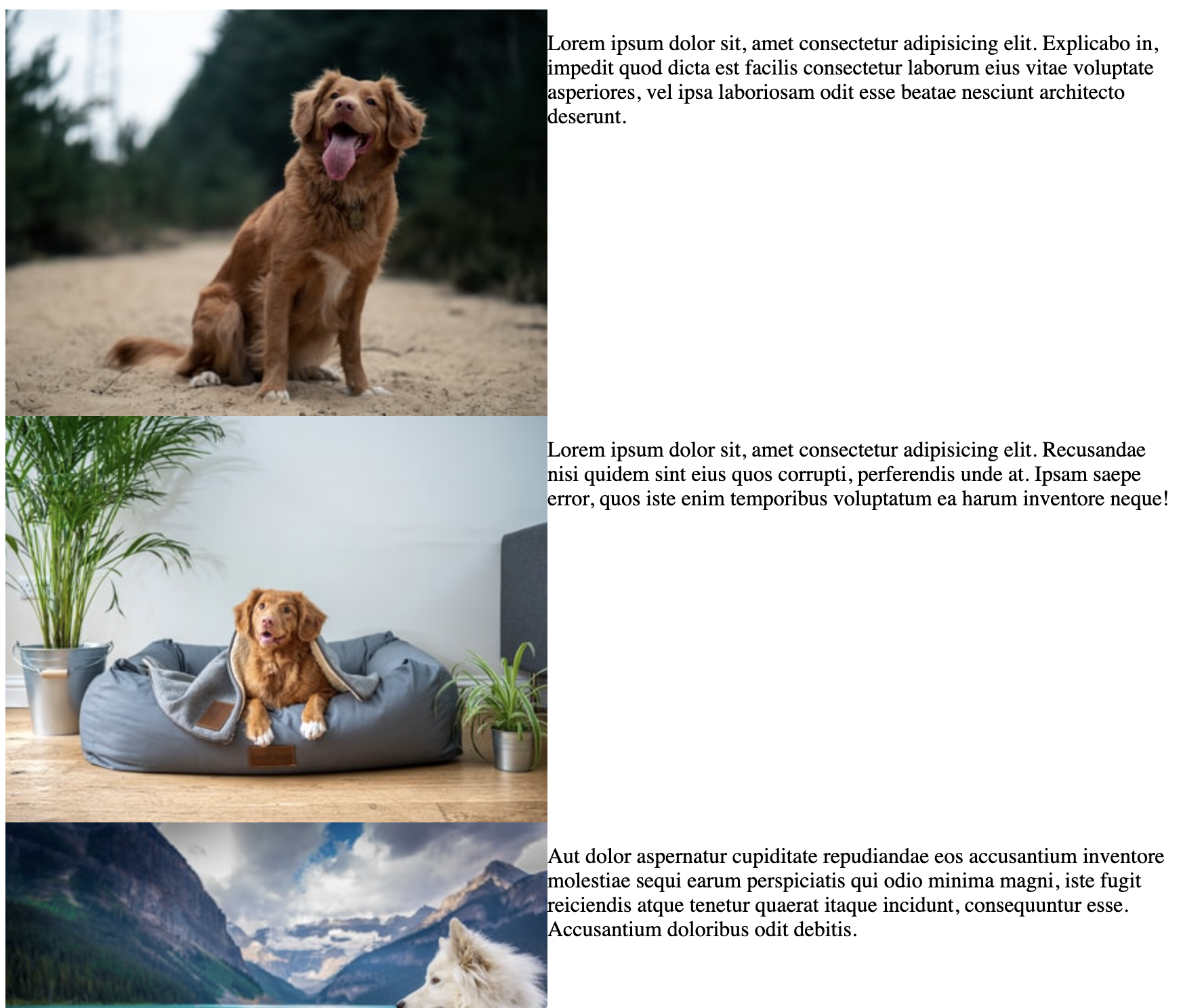
From there it's a matter of cleanup: add a gap, set the default type, and rein in the layout.
body {
  display: grid;
  padding: 2rem;
  grid-template-columns: 300px 1fr;
  gap: 1rem;
  align-items: center;
  max-width: 800px;
  margin: 0 auto;
  font: 500 100%/1.5 system-ui;
}
img {
  max-width: 100%;
  height: auto;
}
Close enough to ship? Not quite — a quick mobile style is the last piece.
@media (max-width: 650px) {
  body {
    display: block;
    font-size: 80%;
  }
  p {
    position: relative;
    margin: -3rem 0 2rem 1rem;
    padding: 1rem;
    background: rgba(white, 0.8);
  }
}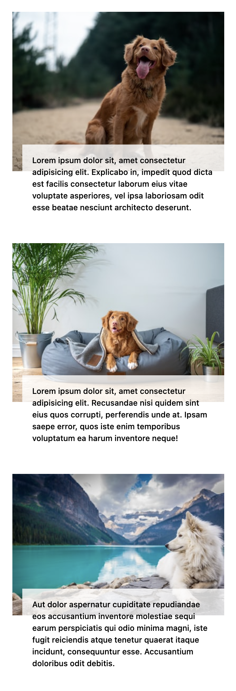
Now it's ready to ship.




