

The mechanics
The effect uses two stacked containers, each holding an identical fixed <h1>. One container pairs a white background with knockout text; the other pairs a background image with plain white text. Clipping rules hide each container's heading once the scroll position leaves that container's bounds, so the title appears to switch backgrounds as you scroll.
Two caveats: it fails on older Internet Explorer versions, and fixed background images can be awkward on mobile WebKit, so plan fallback behavior for both.
Building the markup
An outer wrapper holds two identical containers. Each has an <h1> wrapped in .title_wrapper. Both containers share a .container class for common styles and carry their own identifier class — .container_solid and .container_image — for per-container rules.
<header>

  <!-- First container -->
  <div class="container container_solid">
    <div class="title_wrapper">
      <h1>The Great Outdoors</h1>
    </div>
  </div>

  <!-- Second container -->
  <div class="container container_image">
    <div class="title_wrapper">
      <h1>The Great Outdoors</h1>
    </div>
  </div>

</header>
Initial container and heading styles
Each container should fill the viewport height. Give .container_solid a white background and .container_image a fixed background image.
.container {
  height: 100vh;
}

/* First container */
.container_solid {
  background: white;
}

/* Second container */
.container_image {
  /* Grab a free image from unsplash */
  background-image: url(/path/to/img.jpg);
  background-size: 100vw auto;
  background-position: center;
  background-attachment: fixed;
}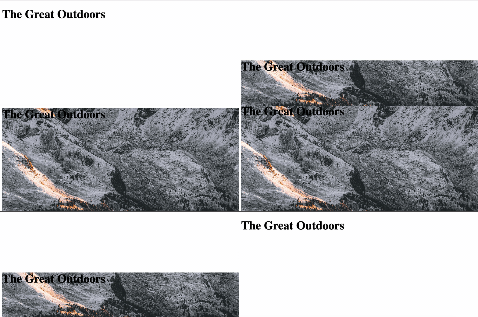
The heading inside .container_image can be white. For the knockout version, set a background image on the <h1> and use text-fill-color together with background-clip so the background fills the glyphs instead of the element box. The heading's background must use the same sizing as .container_image so the two layers line up.
.container_solid .title_wrapper h1 {
  /* The text background */
  background: url(https://images.unsplash.com/photo-1575058752200-a9d6c0f41945?ixlib=rb-1.2.1&q=85&fm=jpg&crop=entropy&cs=srgb&ixid=eyJhcHBfaWQiOjE0NTg5fQ);
  background-size: 100vw auto;
  background-position: center;

  /* Clip the text, if possible */
  /* Including -webkit` prefix for bester browser support */
  /* https://caniuse.com/text-stroke */
  -webkit-text-fill-color: transparent;
  text-fill-color: transparent;
  -webkit-background-clip: text;
  background-clip: text;

  /* Fallback text color */
  color: black;
}

.container_image .title_wrapper h1 {
  color: white;
}
On the shared .title_wrapper, apply fixed positioning and attach it to the vertical center of the window; text-align centers the <h1> horizontally. At this stage both headings sit exactly on top of each other and stay pinned to the window as the page scrolls.
.header-text {
  display: block;
  position: fixed;
  margin: auto;
  width: 100%;
  /* Center the text wrapper vertically */
  top: 50%;
  -webkit-transform: translateY(-50%);
      -ms-transform: translateY(-50%);
          transform: translateY(-50%);
}

.header-text h1 {
  text-align: center;
}
Clipping fixed headings
The heading in a container should only be visible while the viewport center falls inside that container. Normally overflow: hidden; on the parent would handle this, but a fixed-position heading is positioned against the browser window, not its parent, so overflow has no effect here.
Instead, use the CSS clip property with absolute positioning to cut off content outside an element's boundaries — this works even on fixed elements.
.container {
  /* Hide fixed overflow contents */
  clip: rect(0, auto, auto, 0);

  /* Does not work if overflow = visible */
  overflow: hidden;

  /* Only works with absolute positioning */
  position: absolute;

  /* Make sure containers are full-width and height */
  height: 100vh;
  left: 0;
  width: 100%;
}
Absolute positioning takes the containers out of normal flow, so they must be placed relative to their parent manually.
.container_solid {
  /* ... */

  /* Position this container at the top of its parent element */
  top: 0;
}

.container_image {
  /* ... */

/* Position the second container below the first container */
  top: 100vh;
}
With that in place, scrolling produces the illusion of the knockout title changing backgrounds. In reality, the clipping mask simply reveals the other <h1> depending on which parent container overlaps the center of the screen.
Safari fix
Safari's rendering engine can fail to refresh the view during scroll. Adding the following rule to .container forces the correct refresh:
.container {
  /* ... */

  /* Safari hack */
  -webkit-mask-image: -webkit-linear-gradient(top, #ffffff 0%,#ffffff 100%);
}
Screen reader cleanup
The two headings are identical, and while the duplication is invisible visually, a screen reader announces both. Mark the second container aria-hidden so it is treated as purely decorative.
<!-- Second container -->
<div class="container container_image" aria-hidden="true">
  <div class="title_wrapper">
    <h1>The Great Outdoors</h1>
  </div>
</div>
From here the styling is open: font choice and sizing can change freely. The technique also extends to a parallax effect or a background video in place of the image — but those additions call for extra accessibility work so people who prefer reduced motion get an appropriate experience.




