

Organizing CSS in Next.js Without Fighting the Framework
Next.js is highly opinionated about JavaScript structure but notably quiet when it comes to CSS organization. That leaves teams to invent their own conventions, often turning to CSS-in-JS libraries that add bundle weight and runtime rendering overhead — work that runs counter to Next.js's static-first philosophy.
A more straightforward path is to write plain CSS and organize it around two questions: how to respect the framework's conventions, and how to balance site-wide concerns (fonts, colors, layout) with component-specific ones. The approach that has worked well across projects breaks down into four layers: design tokens, global styles, utility classes, and component styles. This pattern draws heavily from Andy Bell's CUBE CSS methodology, particularly its embrace of the cascade rather than fighting it.
Starting With Style Tokens
Before anything else, establish a single source of truth for shared values using CSS Custom Properties. If a client requests a color change, it becomes a one-line edit instead of a search-and-replace operation. While Sass variables work fine for this purpose, CSS custom properties offer an advantage: they participate in the cascade and can change at runtime rather than compiling statically.
Create a styles/design_tokens.css file with all site-wide values:
:root {
  --green: #3FE79E;
  --dark: #0F0235;
  --off-white: #F5F5F3;

  --space-sm: 0.5rem;
  --space-md: 1rem;
  --space-lg: 1.5rem;

  --font-size-sm: 0.5rem;
  --font-size-md: 1rem;
  --font-size-lg: 2rem;
}
Then register it in pages/_app.jsx, the main layout wrapper for every page:
import '../styles/design_tokens.css'These tokens serve as the connective tissue for the entire project. They get referenced globally and inside individual components, keeping the design language unified even as the codebase grows.
Reasonable Global Defaults
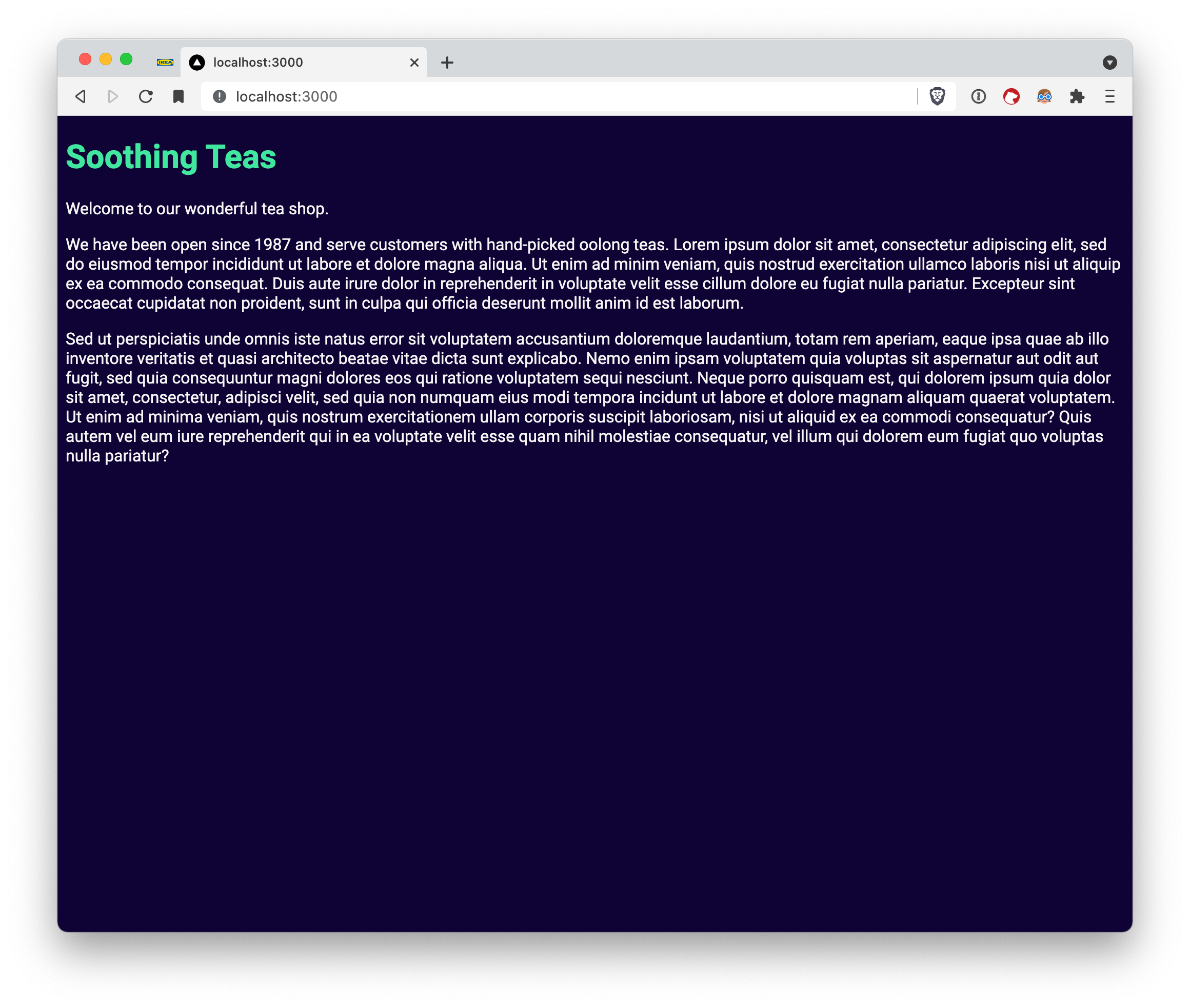
With a homepage defined in pages/index.jsx, the base styling likely looks sparse. That's where global styles come in — setting sensible defaults for basic HTML elements like headings, body text, and links, without wrapping them in unnecessary React components or utility classes.
export default function Home() {
  return <main>
    <h1>Soothing Teas</h1>

    <p>Welcome to our wonderful tea shop.</p>

    <p>We have been open since 1987 and serve customers with hand-picked oolong teas.</p>
  </main>
}
Place these rules in the default styles/globals.css file:
*,
*::before,
*::after {
  box-sizing: border-box;
}

body {
  color: var(--off-white);
  background-color: var(--dark);
}

h1 {
  color: var(--green);
  font-size: var(--font-size-lg);
}

p {
  font-size: var(--font-size-md);
}

p, article, section {
  line-height: 1.5;
}

:focus {
  outline: 0.15rem dashed var(--off-white);
  outline-offset: 0.25rem;
}
main:focus {
  outline: none;
}

img {
  max-width: 100%;
}
This file typically stays modest in size. It covers element-level defaults and browser resets, plus any site-wide layout patterns that apply to every page. One rule worth always including is :focus styling to make interactive elements clearly visible for keyboard users — make it part of the site's design identity from the start.
Utility Classes With Restraint
If the homepage text stretches edge-to-edge, constraining its width is a layout need likely to recur across pages. That qualifies as a utility class candidate. The bar should be high before adding one:
- It's needed repeatedly.
- It does exactly one thing well.
- It applies across different components or pages.
In this case, a .lockup utility fits the criteria. Create styles/utilities.css with the rule:
.lockup {
  max-width: 90ch;
  margin: 0 auto;
}
Import the file in pages/_app.jsx alongside the other stylesheets, then apply the class to the page's <main> element:
<main className="lockup">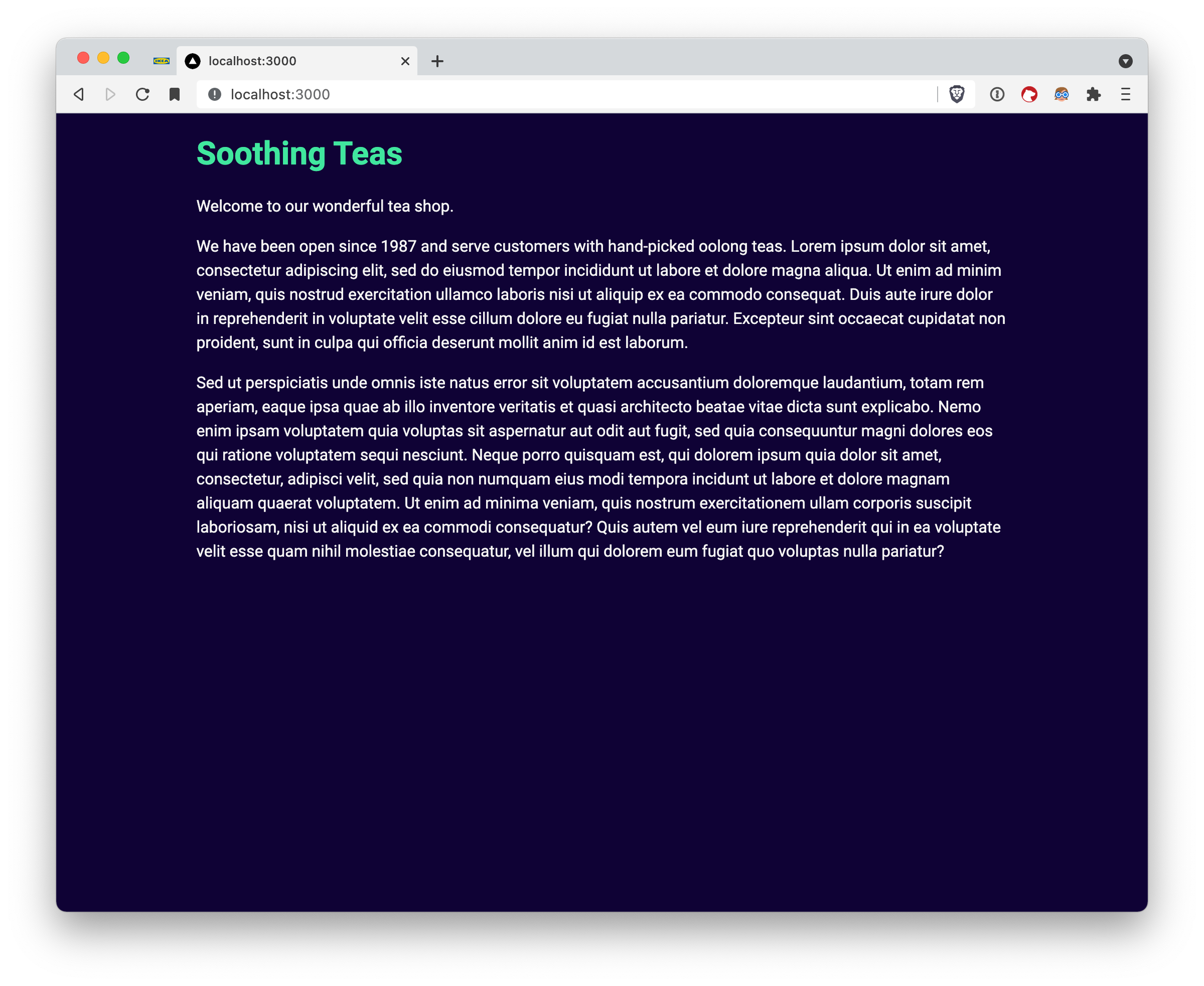
The max-width property eliminates the need for media queries at this level, and the ch unit — roughly the width of one character — keeps sizing responsive to the user's browser font settings.
Utility classes should grow organically rather than exhaustively. Add one only when actively needed; pre-building every conceivable class bloats file size and obscures the codebase. On larger projects, splitting utilities into a styles/utilities/ directory with themed files can help, but only if the project benefits from the separation.
Styling the Storefront Components
Moving on from the homepage, the online store needs a card grid of teas. First, add a new page at pages/shop.jsx with a basic array of tea data, including name, description, and image path for each item.
export default function Shop() {
  return <main>
    <div className="lockup">
      <h1>Shop Our Teas</h1>
    </div>

  </main>
}
Because this isn't a data-fetching tutorial, a hardcoded array at the top of the file is sufficient for demonstrating the styling patterns.
const teas = [
  { name: "Oolong", description: "A partially fermented tea.", image: "/oolong.jpg" },
  // ...
]
Next, create a components/ directory (Next.js doesn't generate one by default) with a TeaList subfolder. Grouping all files related to a single component inside a dedicated folder keeps things organized as the component count grows. Define the list component:
import TeaListItem from './TeaListItem'

const TeaList = (props) => {
  const { teas } = props

  return <ul role="list">
    {teas.map(tea =>
      <TeaListItem tea={tea} key={tea.name} />)}
  </ul>
}

export default TeaList
The list iterates over the teas and renders a TeaListItem for each. That component uses Next.js's built-in image component:
import Image from 'next/image'

const TeaListItem = (props) => {
  const { tea } = props

  return <li>
    <div>
      <Image src={tea.image} alt="" objectFit="cover" objectPosition="center" layout="fill" />
    </div>

  <div>
      <h2>{tea.name}</h2>
      <p>{tea.description}</p>
    </div>
  </li>
}

export default TeaListItem
The alt attribute is intentionally empty because these images serve a purely decorative purpose and shouldn't clutter screen reader output with lengthy descriptions. An index.js barrel file in the folder keeps imports clean:
import TeaList from './TeaList'
import TeaListItem from './TeaListItem'

export { TeaListItem }

export default TeaList
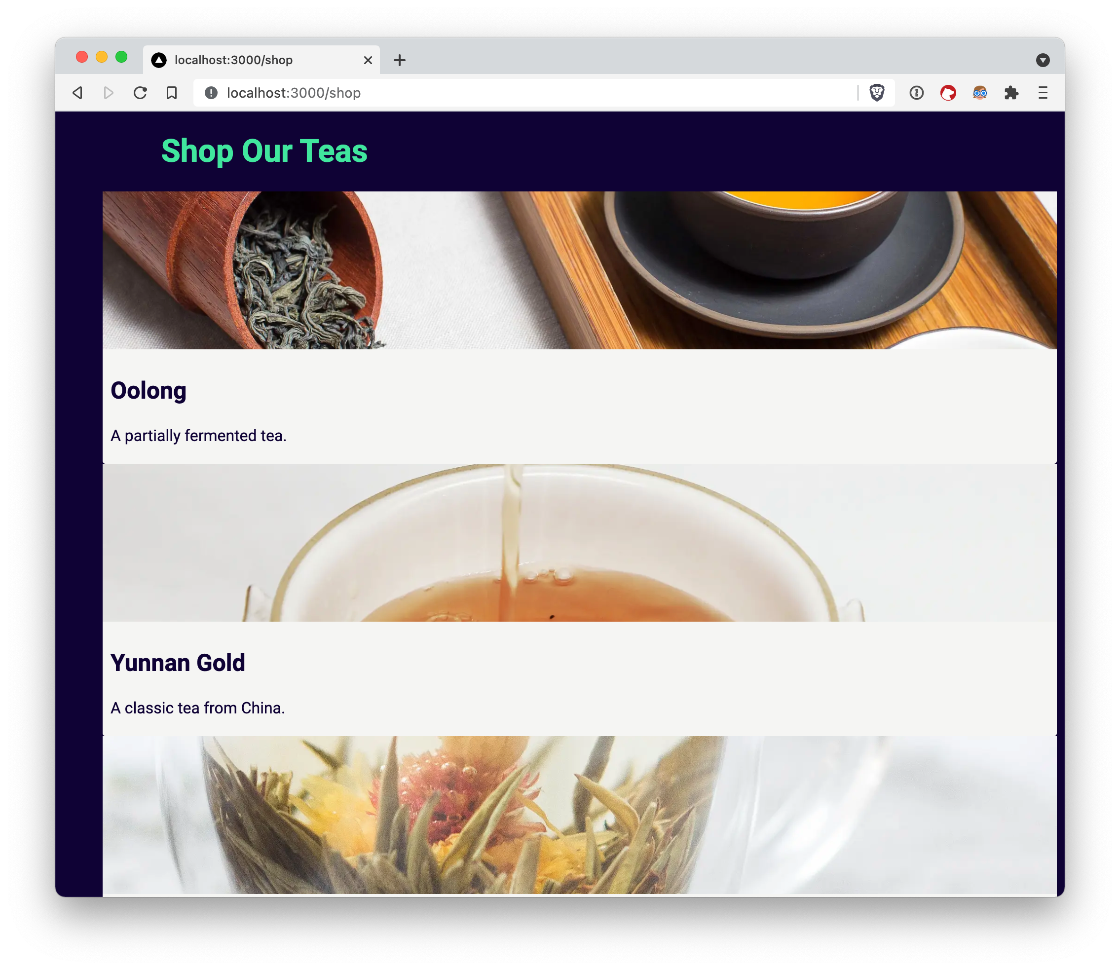
After wiring TeaList into the shop page with the tea array, the data renders but lacks visual polish.
Component-Scoped CSS Modules
For the card styling, create components/TeaList/TeaListItem.module.css. The .module extension signals a CSS Module, which Next.js supports out of the box. Any class name written in this file, such as .TeaListItem, gets transformed into a hashed, unique identifier (e.g., .TeaListItem_TeaListItem__TFOk_). This guarantees zero collisions with other class names across the site.
CSS Modules also pair well with Next.js's dynamic-import feature. Lazy-loaded components can have their local styles lazy-loaded alongside them, which avoids pushing unnecessary CSS into the initial bundle. For that reason, it's a good habit to create a dedicated CSS Module file for any component needing local styles.
Start with a base style for the card item:
.TeaListItem {
  display: flex;
  flex-direction: column;
  gap: var(--space-sm);
  background-color: var(--color, var(--off-white));
  color: var(--dark);
  border-radius: 3px;
  box-shadow: 1px 1px 1px rgba(0, 0, 0, 0.1);
}
Import the stylesheet in the component with import style from './TeaListItem.module.css', which exposes the class names as properties of a JavaScript object. A convention worth adopting: capitalize class names inside modules, and keep global utility classes lowercase, to make the origin of a class visually obvious. Attach the class to the list item:
<li className={style.TeaListComponent}>
The var(--color, var(--off-white)) declaration uses a fallback: the background defaults to --off-white unless an individual card overrides the --color custom property. This works like React props — set a default value and expose a slot for override. Treat custom properties as CSS's version of props. The Next.js Image component with layout="fill" applies position: absolute, so it needs a wrapper with position: relative to be contained. Add a container style:
.ImageContainer {
  position: relative;
  width: 100%;
  height: 10em;
  overflow: hidden;
}
Apply className={style.ImageContainer} to the div wrapping the image. Inside a CSS Module, generic names like ImageContainer are safe from conflicts. Pack the text with padding using the spacing variables already set up:
.Title {
  padding-left: var(--space-sm);
  padding-right: var(--space-sm);
}
Attach this class to the div containing the name and description to finish the card layout:
Mixing Global Utilities With Local Styles
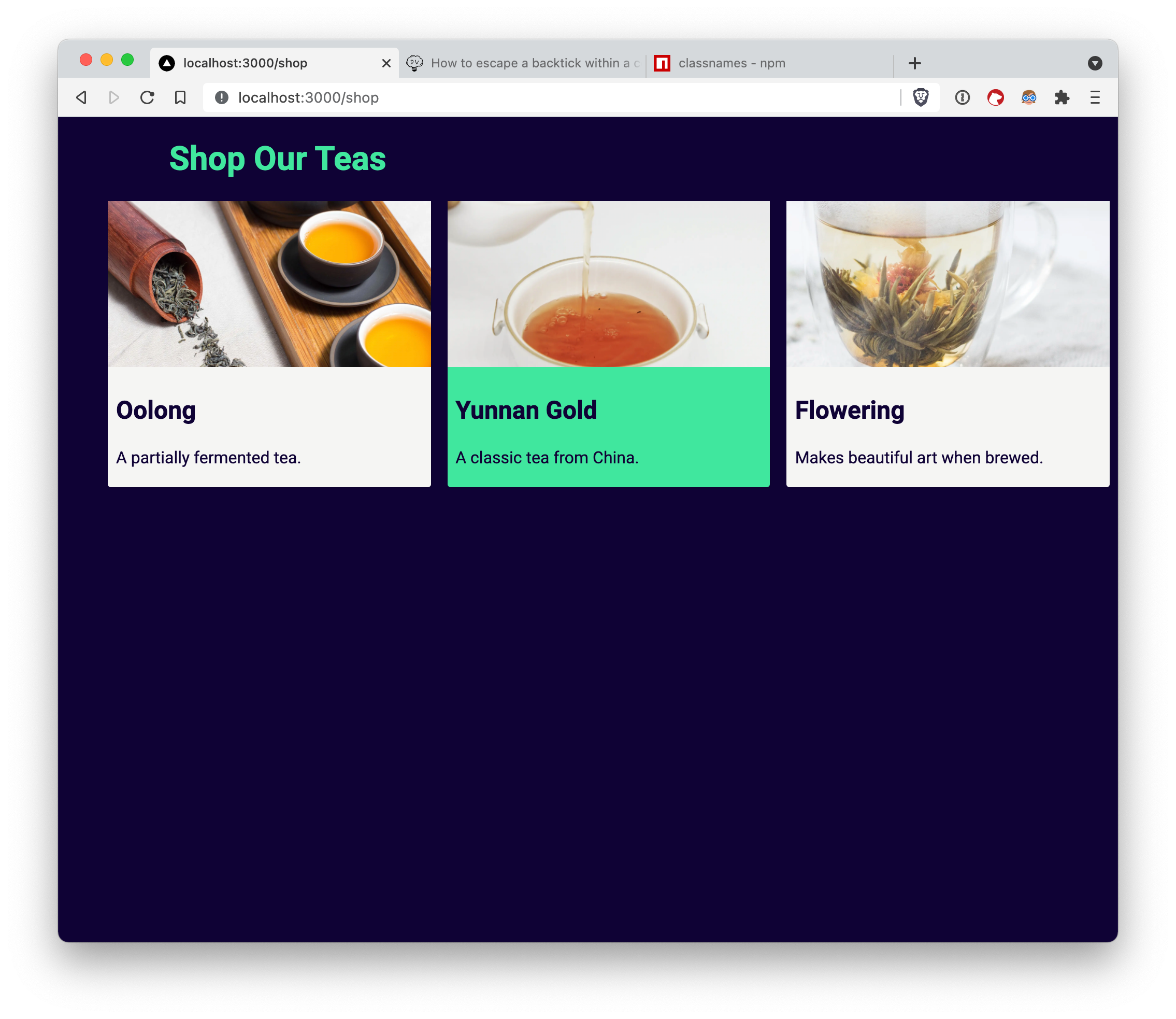
Making the cards a responsive grid pits local and global styles against each other. The grid logic could live inside the TeaList component, but a reusable utility class is more broadly useful. Create one in styles/utilities.css:
.grid {
  list-style: none;
  display: grid;
  grid-template-columns: repeat(auto-fill, minmax(var(--min-item-width, 30ch), 1fr));
  gap: var(--space-md);
}
Adding className="grid" provides an automatically responsive layout with the default minimum item width of 30ch, adjustable via the --min-item-width custom property.
Now suppose the goal is to blend this global utility with component-specific styling — for instance, giving every other card a green background to match the tea aesthetic. Create components/TeaList/TeaList.module.css:
.TeaList > :nth-child(even) {
  --color: var(--green);
}
The earlier --color variable on TeaListItem becomes useful here. CSS Modules allow descendant selectors across module boundaries, so local styles can affect child components. This leverages the CSS cascade instead of contorting it into JavaScript logic.
To apply both the global .grid and the local .TeaList, fetch the hashed class from the module and concatenate it. String interpolation works for one or two classes:
<ul role="list" className={`${style.TeaList} grid`}>For heavier class-mixing, the classnames library improves readability:
<ul role="list" className={classnames(style.TeaList, "grid")}>With that, the TeaList component consumes both global utilities and a local module without friction.
Balancing Local and Global Concerns
This entire tea shop has been styled with plain CSS with no Webpack configuration or third-party styling libraries. The patterns relied upon work directly in Next.js and map cleanly onto recommended CSS practices. The styling setup rests on four layers:
- Design tokens as CSS custom properties.
- Base global styles.
- Scriptable utility classes.
- Component-scoped CSS Modules.
As a project grows, the token and utility-class inventories expand, while anything too context-specific to qualify as a utility lands in a component CSS Module. This keeps concerns balanced between repeatability and locality, resulting in CSS that stays performant and straightforward to trace alongside the component tree.


