
From Multi-Column to Grid and Flexbox
Gap decorations take the column-rule property that has long existed in multi-column layout and make it apply to grid and flexbox. The feature adds a matching row-rule property so rules can run along both axes, and extends the syntax considerably beyond what multi-column allowed. Edge's web platform team at Microsoft led the design and standardization work; the implementation now ships across Chromium-based browsers.
Since early previews, properties have been renamed for clarity and new ones added in response to developer feedback during testing. The summary of those changes follows.
| Old | New | What this change means |
row-rule-outsetcolumn-rule-outset | row-rule-insetcolumn-rule-inset | “Outset” became “inset” and setting these properties now insets the rules inward from the decorations edges. |
No fine grain control of where row-rule-inset and column-rule-inset apply | New longhand properties:row-rule-inset-caprow-rule-inset-junction row-rule-inset-startrow-rule-inset-endand column-rule-inset-capcolumn-rule-inset-junction column-rule-inset-startcolumn-rule-inset-endfor fine-grain control. | You can now inset the outer ends (caps) and the intersections (junctions) independently. You can also inset the start and end of decorations independently. |
gap-rule-paint-order | rule-overlap | This property was renamed for clarity. It controls how decorations layer where row and column rules cross. |
| N/A | rule-visibility-items | This new property controls whether rules show next to empty areas in a container. |
Availability and Fallbacks
Gap decorations ship in Chrome and Edge from version 149, along with other Chromium-based browsers at matching versions. Other engine vendors have engaged in the standards discussions, so interoperability should arrive over time.
For teams adopting the feature early, the decision is a familiar one:
- Treating the decorations as a progressive enhancement means nothing breaks on browsers without support.
- Needing them outright means waiting on a polyfill currently in development.
Building Up a Page
The walkthrough expands the personal-site demo used in earlier articles, adding sections and exercising the newer properties.

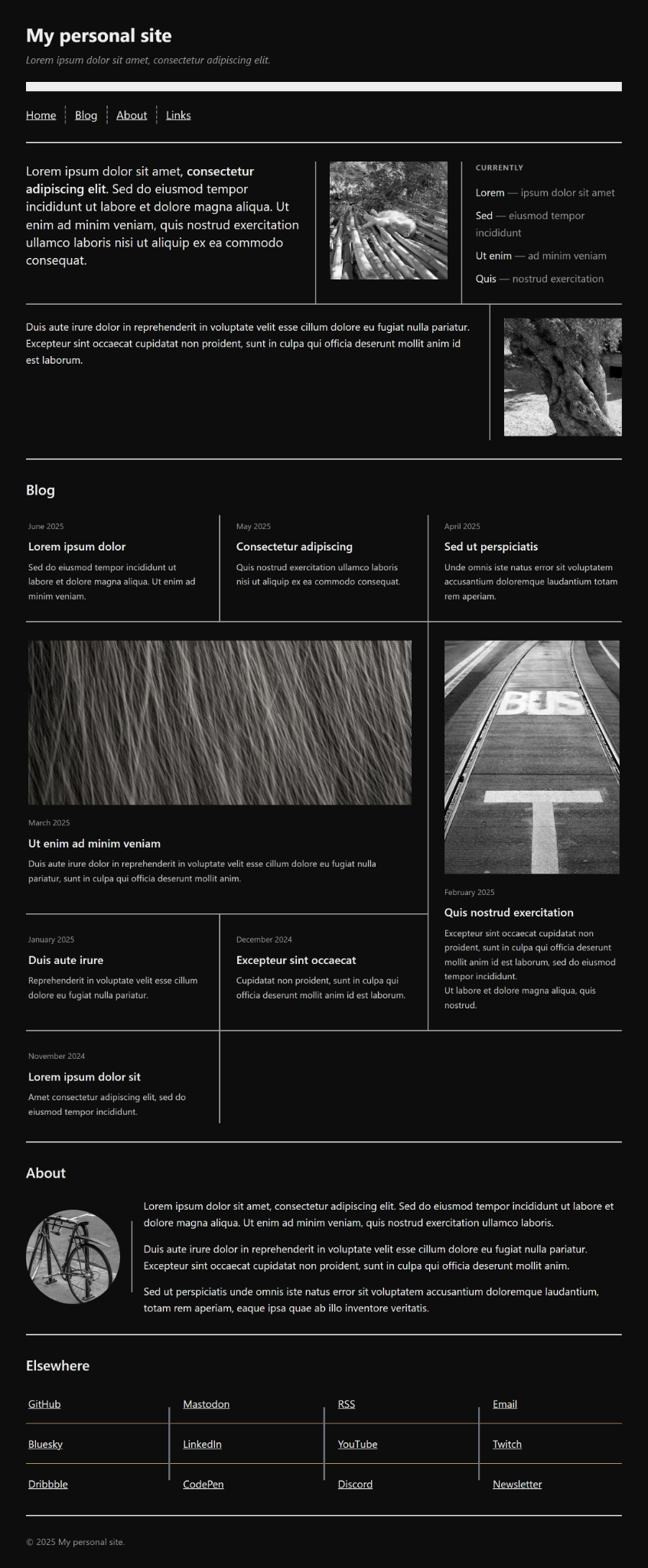
The starting markup is small:
<body>
  <header>
    <h1>My personal site</h1>
    <p class="tagline">...</p>
  </header>

  <nav>
    <ul>
      <li><a href="#home">Home</a></li>
      <!-- etc. –>
    </ul>
  </nav>

  <section id="home" class="home">
    <div class="greeting">
      <p class="lead">...</p>
    </div>
    <div class="photo">
      <img src="cat.jpg" alt="A sleeping cat.">
    </div>
    <aside class="now">
      <h3>Currently</h3>
      <ul>
        <li>Lorem <span>— ipsum dolor sit amet</span></li>
        <!-- etc. –>
      </ul>
    </aside>
    <div class="note">
      <p>...</p>
    </div>
    <div class="photo">
      <img src="tree.jpg" alt="An old olive tree trunk.">
    </div>
  </section>

  <section id="blog" class="blog">
    <h2>Blog</h2>
    <div class="posts">
      <article class="post">
        <span class="date">June 2025</span>
        <h3>Lorem ipsum dolor</h3>
        <p>...</p>
      </article>
      <!-- rest of articles –>
    </div>
  </section>

  <section id="about" class="about">
    <h2>About</h2>
    <div class="bio">
      <img class="avatar" src="bike.jpg" alt="A bicycle leaning against a post.">
      <div class="text">
        <p>...</p>
        <!-- etc. –>
      </div>
    </div>
  </section>

  <section id="links" class="links">
    <h2>Elsewhere</h2>
    <ul>
      <li><a href="#">GitHub</a></li>
      <!-- etc. –>
    </ul>
  </section>

  <footer>
    <p>© 2025 My personal site.</p>
  </footer>
</body>
The base CSS makes the page a single large grid, with row rules dividing sections, and turns the navigation into a flexbox whose gaps carry dashed column rules.
body {
  display: grid;
  gap: 4rem;
  margin: 2rem;
  row-rule:
    1rem solid #efefef,
    repeat(2, 2px solid #efefef);
}

nav ul {
  display: flex;
  flex-wrap: wrap;
  gap: 2rem;
  column-rule: 2px dashed #666;
}
Adapting Dividers with repeat(auto)
The body originally used repeat(2, 2px solid #efefef) to match a fixed three-section page. Replacing the hard-coded count with an auto repeater lets new sections be added without touching the rule:
body {
  /* ... */
  row-rule:
    1rem solid #efefef,
    repeat(auto, 2px solid #efefef);
}

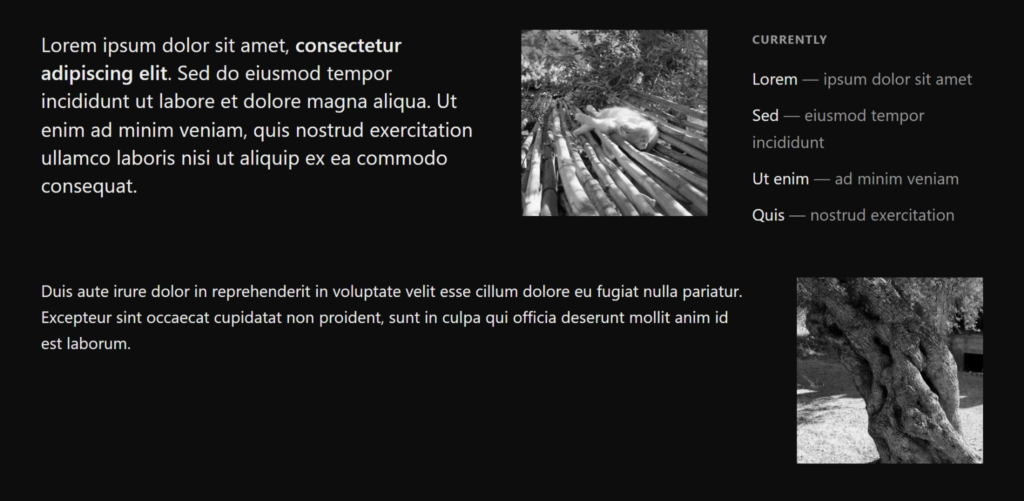
Flexbox Gaps in the Home Section
The home section is a wrapping flexbox of text and images, with child elements given differing flex-basis values:
.home {
  display: flex;
  flex-wrap: wrap;
  gap: 3rem;
}

.home > * {
  flex: 1 1 12.5rem;
}

.home .greeting {
  flex-basis: 26.25rem;
}

.home .note {
  flex-basis: 22.5rem;
}
Undecorated, it looks like this:
Adding both row-rule and column-rule brings in the decorations:
.home {
  /* ... */
  row-rule: 2px solid #999;
  column-rule: 2px solid #999;
}
Because both rules share a value, they collapse into the new rule shorthand as a single declaration:
.home {
  /* ... */
  rule: 2px solid #999;
}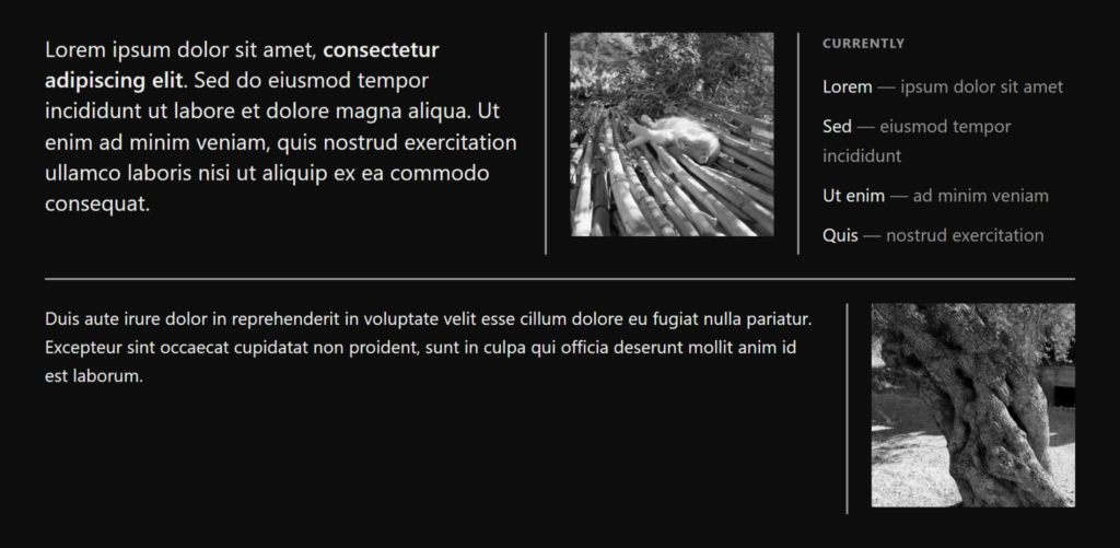
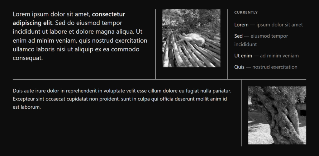
Column rules default to the full height of each flex line, and the 3rem gap leaves the two lines visually apart. The column-rule-inset property with the overlap-join value makes adjacent rules meet at their junctions while keeping the outer ends flush at 0:
.home {
  /* ... */
  column-rule-inset: overlap-join;
}
Spanning Items in the Blog Section
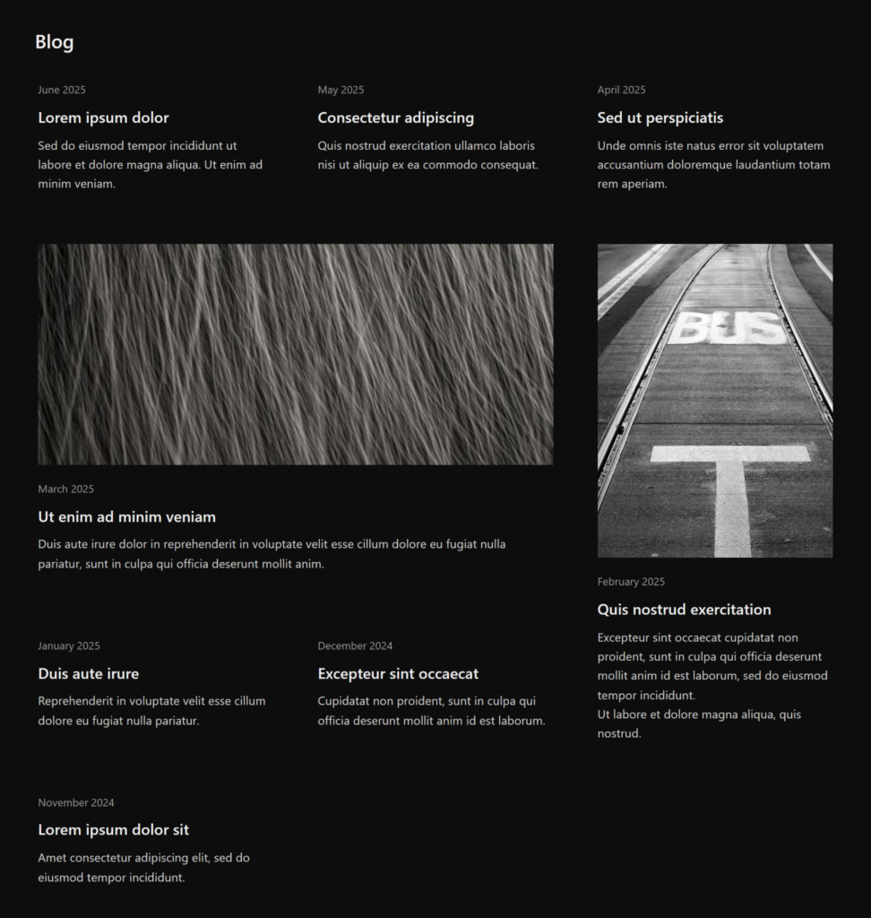
The blog section uses a grid so certain posts can span multiple columns or rows:
.posts {
  display: grid;
  grid-template-columns: repeat(3, 1fr);
  gap: 3rem;
}

.post.feature { grid-column: span 2; }

.post.tall { grid-row: span 2; }
Before any decoration:
Rules are then applied as in the home section:
.posts {
  /* ... */
  rule: 2px solid #999;
}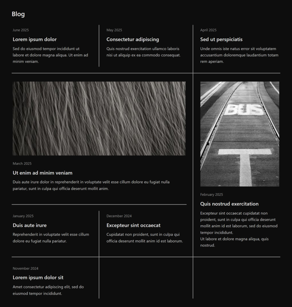
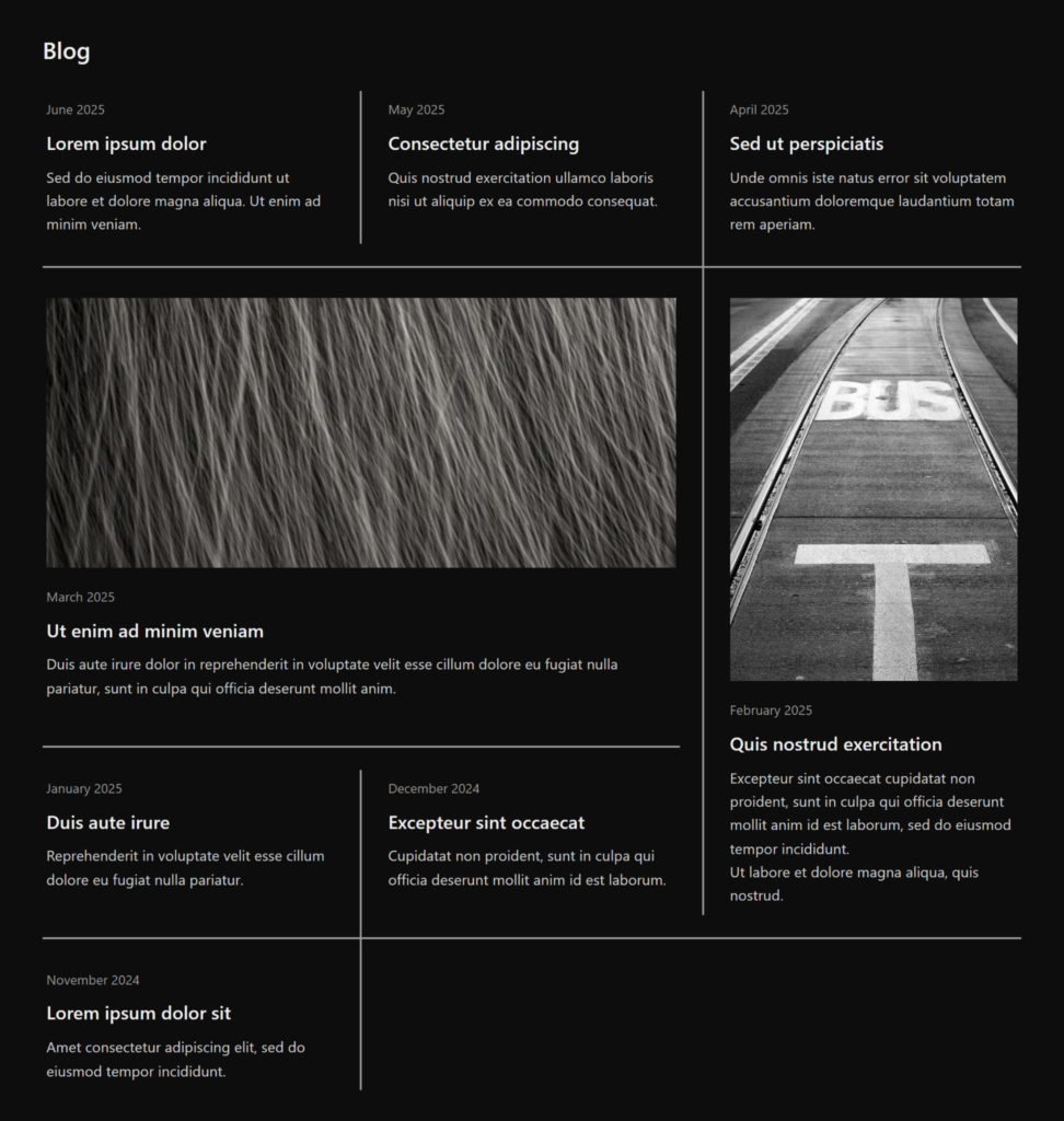
Lines beside empty grid cells are unwanted, and the new rule-visibility-items property removes them:
.posts {
  /* ... */
  rule-visibility-items: around;
}
With this value, a decoration is painted only when content exists on at least one side of the gap, so the space between two empty cells in the last row stays clean rather than showing a line dangling into nothing:
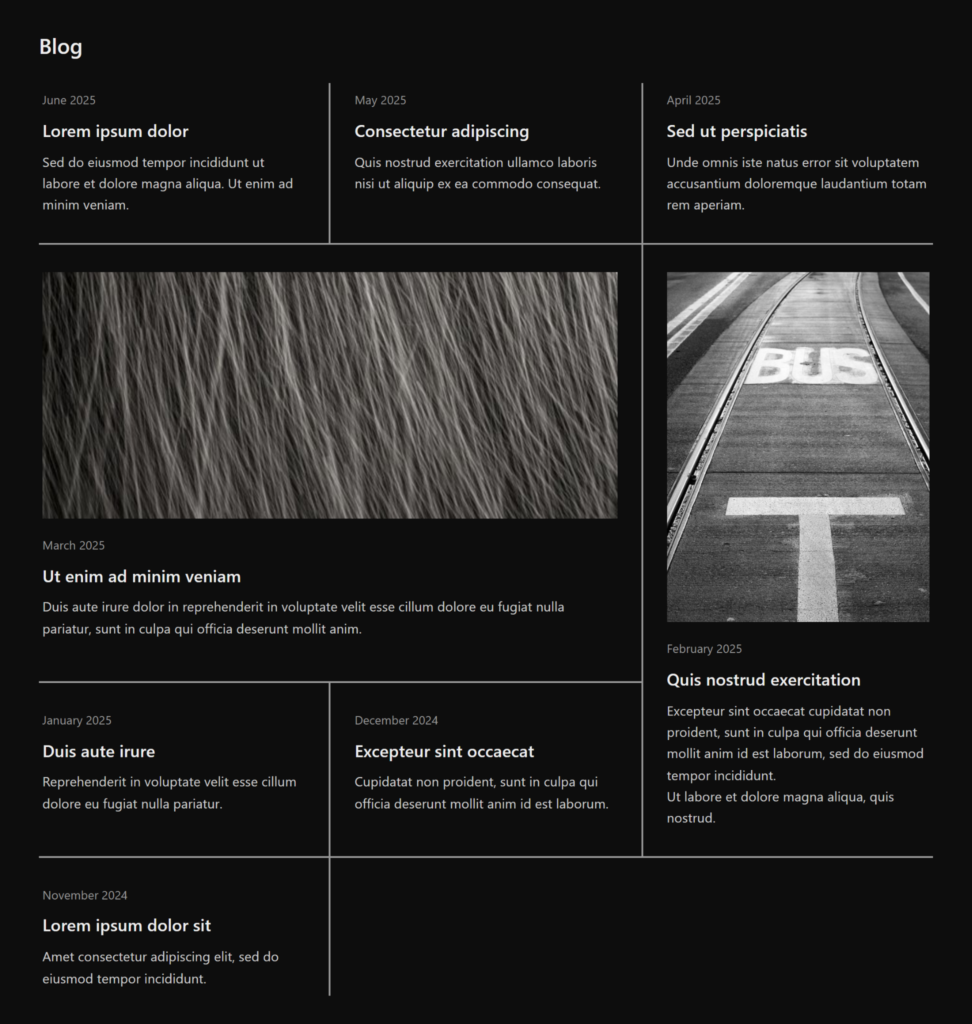
Joining the rules neatly across the grid again calls for overlap-join, here through rule-inset:
.posts {
  /* ... */
  rule-inset: overlap-join;
}
Shrinking Rules in the About Section
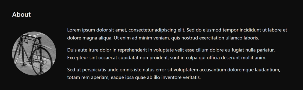
The About section places a circular photo beside bio text, separated by a line. A flexbox container puts the two side by side:
.bio {
  display: flex;
  align-items: center;
  gap: 2.5rem;
}
That yields a media-card arrangement common on personal sites:
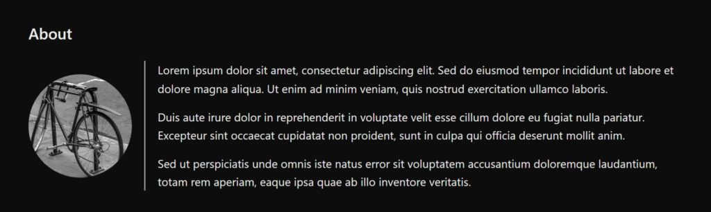
A decoration is then added:
.bio {
  /* ... */
  column-rule: 2px solid #999;
 }
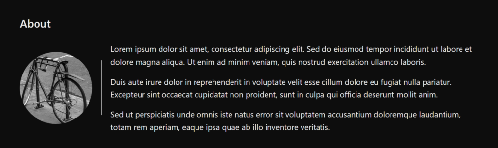
For extra breathing room, column-rule-inset shortens the separator:
.bio {
  /* ... */
  column-rule-inset: 2.5rem;
}
Layering and Capping Rules in the Links Section
A longer list of links goes into a grid:
.links ul {
  display: grid;
  grid-template-columns: repeat(4, 1fr);
  gap: 1.5rem 2.5rem;
}
This time the row and column rules are styled differently:
.links ul {
  /* ... */
  row-rule: 1px solid #c9a96a;
  column-rule: 3px solid #6a707a;
}
The thicker column rules paint behind the thinner row rules by default. The new rule-overlap property controls this, letting columns be painted over rows instead (or rows over columns):
.links ul {
  /* ... */
  rule-overlap: column-over-row;
}
Finally, shortening the column rules overall without splitting them per row is the job of column-rule-inset-cap, which governs the edges of decorations that are neither junctions nor intersections:
.links ul {
  /* ... */
  column-rule-inset-cap: 1.75rem;
}
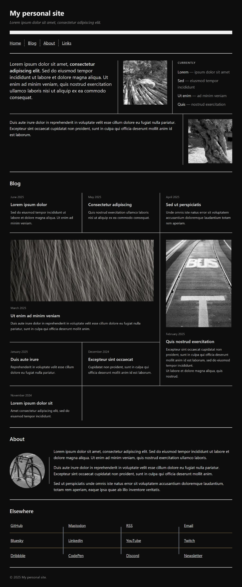
The Finished Page
The completed page is available as a live example with source code:
Trying It Out
The quickest way to experiment is the interactive playground, where every property can be adjusted with live results; additional demos are also available. Reference documentation is in development on MDN.
The feature exists through work across the Edge and Chrome teams and the CSS Working Group — in particular Javier Contreras Tenorio, Kevin Babbitt, Alison Maher, Ian Kilpatrick, and Patrick Brosset.




