

Custom functions arrive in CSS, behind a flag
CSS custom functions can already be tried in Chrome Canary behind an experimental flag. This is an incomplete prototype, so production support is still a question mark, but the feature is real today rather than a spec exercise. The specification is CSS Mixins Level 1.
The capability is broader than Sass-style mixins, which are essentially patterns that let you write less CSS. Functions in CSS carry a different set of semantics: parameterized values, default values and return values.
What a CSS function is
The spec describes custom functions as giving authors the same power as custom properties, only parameterized. A function is used wherever a custom property would be used, except that it computes its result from the arguments it receives.
The most basic form is the @function at-rule, with a name written as a <dashed-ident> followed by ().
@function --dashed-border() {
 /* ... */
}
Without arguments, a function behaves like a custom property. Adding arguments, also <dashed-ident>s inside the parentheses, is what makes it useful.
@function --dashed-border(--color) {
 /* ... */
}
The result descriptor supplies the return value computed from those arguments.
@function --dashed-border(--color) {
   result: 2px dashed var(--color);
}

div {
   border: --dashed-border(blue); /* 2px dashed blue */
}
Defaults and type checking
Arguments can carry default values by writing a colon (:) after the argument name, followed by the default.
@function --dashed-border(--color: red) {
   result: 2px dashed var(--color);
}

div {
  border: --dashed-border(); /* 2px dashed red */
}
Functions can also type-check both their arguments and their return values. That matters when interpolating values the way @property does, and it will matter more once inline conditionals land, since different calculations can then branch on the type of an argument.
Argument types are written as a syntax component: the type inside angle brackets, so <color> or <length>. Syntax multipliers apply as well, such as plus (+) to accept a space-separated list of that type.
@function --custom-spacing(--a <length>) { /* ... */ } /* e.g. 10px */
@function --custom-background(--b <color>) { /* ... */ } /* e.g. hsl(50%, 30% 50%) */
@function --custom-margin(--c <length>+) { /* ... */ } /* e.g. 10px 2rem 20px */
A return type is declared with the returns keyword followed by the syntax component.
@function --progression(--current, --total) returns <percentage> {
  result: calc(var(--current) / var(--total) * 100%);
}
There is one quirk in the type syntax: to accept more than one type via the | combinator, the types must be enclosed in a type() wrapper function.
@function --wideness(--d type(<number> | <percentage>)) { /* ... */ }List arguments
The spec allows list arguments by enclosing them in curly braces. The example below passes {1px, 7px, 2px} and computes a sum from the list maximum. This does not currently appear to work in Canary. Open questions remain about how lists behave, such as selecting a specific element from a list or constraining list length to a fixed number of items.
@function --max-plus-x(--list, --x) {
  result: calc(max(var(--list)) + var(--x));
}

div {
  width: --max-plus-x({ 1px, 7px, 2px }, 3px); /* 10px */
}
Return semantics follow the cascade
Early returns are not planned at all. This is not a prototype gap — it simply will not be allowed. If a function contains two result descriptors, one sitting behind @media or @supports and one at the end, the final result is what gets returned.
@function --suitable-font-size() {
  @media (width > 1000px) {
    result: 20px;
  }
  result: 16px; /* This always returns 16px */
}
The fix is to put the conditional result last. That reads oddly if you come from languages where returning ends execution, but it is deliberate: in CSS the C stands for cascade, and this ordering lets the conditional result override the earlier one. It is the CSS-consistent arrangement.
@function --suitable-font-size() {
  result: 16px;

  @media (width > 1000px) {
    result: 20px;
  }
}
Potential use cases
All examples here require Chrome Canary for now. A first basic helper sets fluid type:
@function --fluid-type(--font-min, --font-max) {
  result: clamp(var(--font-min), 4vw + 1rem, var(--font-max));
}

h2 {
  font-size: --fluid-type(24px, 36px);
}
Another helper computes width from an intrinsic container function, and demonstrates default arguments:
@function --intrinsic-container(--inline-margin: 1rem, --max-width: 60ch) {
  result: min(100% - var(--inline-margin), var(--max-width));
}
A second helper builds grid layouts:
@function --layout-sidebar(--sidebar-width: 10ch) {
  result: 1fr;

  @media (width > 640px) {
    result: fit-content(var(--sidebar-width)) minmax(min(50vw, 30ch), 1fr);
  }
}
These are the kind of snippets that tend to be copied from smolcss, and a function form would be far easier to carry around — most of the snippets there would work well as functions.
A further possibility is a function form of the --wideness helper used in a tan(atan2()) viewport-transition demo, where it produced the screen width as a decimal between 0 and 1. The shape of that property was: pass a lower and an upper bound in pixels and get back a 0 to 1 value depending on screen width — for a screen of 800px, wideness(400px, 1200px) returns 0.5 at the midpoint. That can now be written directly and used to move an element along its offset-path as the screen goes from 400px to 800px.
.marker {
  offset-path: path("M 5 5 m -4, 0 a 4,4 0 1,0 8,0 a 4,4 0 1,0 -8,0"); /* Circular Orbit */
  offset-distance: calc(--wideness(400, 800) * 100%); /* moves the element when the screen goes from 400px to 800px */
}
Gaps in the current prototype
Chrome's tracking issue for CSS functions lists what does not work yet. You currently cannot:
- use local variables (though these appear to work in testing)
- use recursive functions (they crash)
- use list arguments
- update a function and have the affected styles update
- use
@functionin cascade layers or via the CSS Object Model (CSSOM) - use Iverson bracket functions, so any
@mediaqueries or similar need helper custom properties (on:rootor similar)
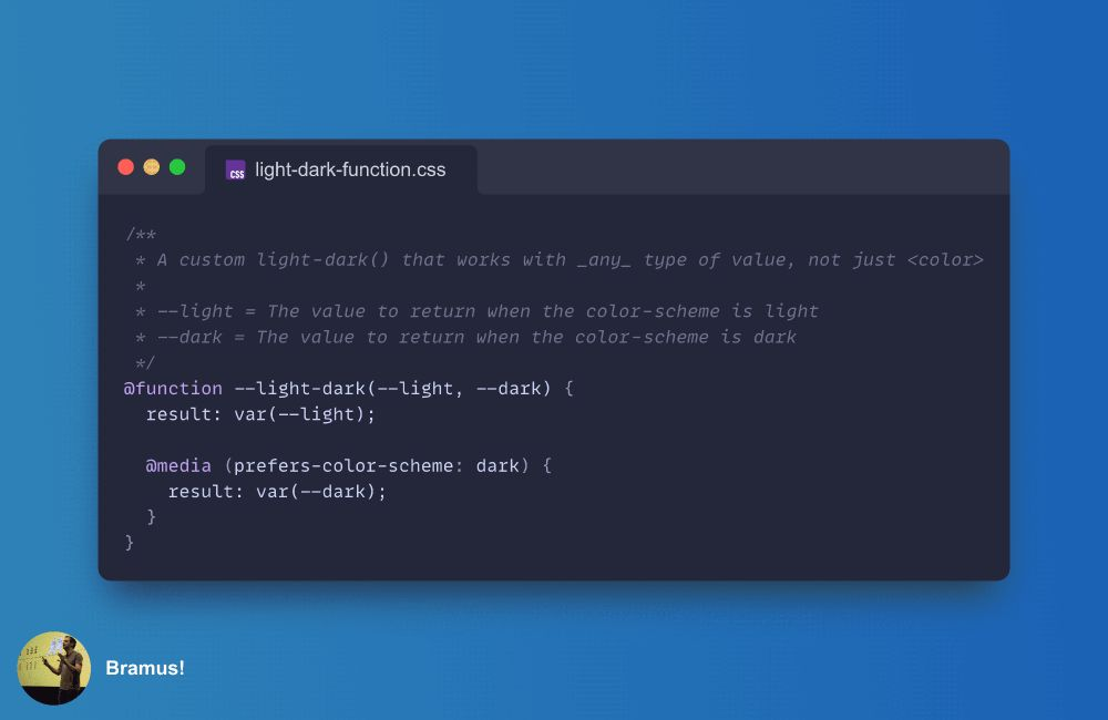
That last limitation means a return value behind @media or @supports is not usable as written in this spec snippet:
@function --suitable-font-size() {
  result: 16px;

  @media (width > 1000px) {
    result: 20px;
  }
}
In testing this now seems supported. If it does not work in your build, the workaround is a provisional custom property returned at the end.
@function --suitable-font-size() {
  --size: 16px;

  @media (width > 600px) {
    --size: 20px;
  }

  result: var(--size);
}
Mixins are a separate, later addition. The spec states that it currently defines only custom functions, which operate at the level of CSS values, and expects to define mixins afterwards — functions operating at the style-rule level.
Where this leaves CSS
The impact will be substantial, though not in the sense of changing how CSS is written day to day; no one will use functions to center a <div>. Their contribution is to clean up hack-like CSS and to open up mechanisms that were previously awkward to express. For now, changing a site's font with a function is quite enough.




