
The problem with unconstrained text
On very large screens, many sites simply let their content stretch edge-to-edge. The result is paragraph lines that run hundreds of characters wide, which is a genuine readability problem. Research has shown that comfortable reading hovers around 65 characters per line, with 45–85 seen as generally acceptable for roman-alphabet text. Beyond that, the eye fatigues and tracking the next line becomes a chore.
The standard fix is a centered, fixed-width column. You see it everywhere: news sites, documentation, blogs. It works well, but it introduces a second problem. Not every piece of content should be forced into that narrow lane. Images, videos, and embedded widgets often deserve to break free of the text column and span the full viewport. In publishing, this effect is called full-bleed, and it is surprisingly awkward to achieve with CSS alone.
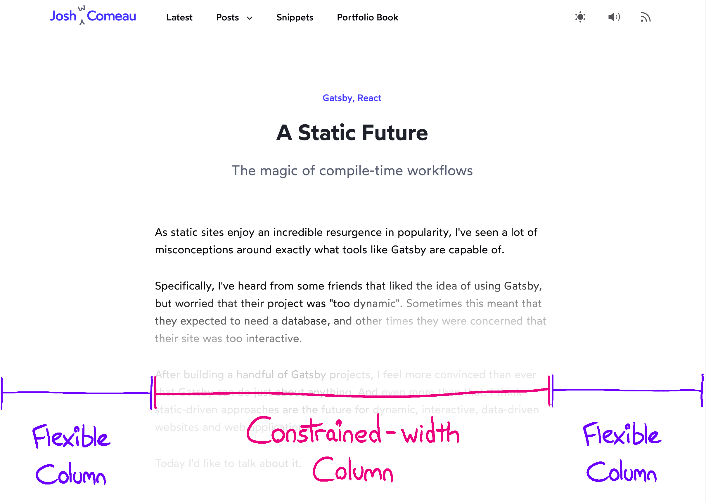
Full-bleed content has historically required negative-margin hacks or awkward wrappers. It turns out there’s a far more elegant solution built on CSS Grid.
A grid-based solution
Here is the complete set of styles and the markup they expect:
.wrapper {
  display: grid;
  grid-template-columns:
    1fr
    min(42rem, 100%)
    1fr;
}

.wrapper > * {
  grid-column: 2;
}

.full-bleed {
  width: 100%;
  grid-column: 1 / 4;
}
<main class="wrapper">
<h1>Some Heading</h1>
<p>Some content and stuff</p>
<img class="full-bleed" alt="cute meerkat" src="/meerkat.jpg" />
</main>While this looks dense, each piece is doing a simple job. The key is defining a three-column grid that lets most children occupy only the center column, while a dedicated class opts a child out of that constraint.
Defining the three-column grid
The container uses grid-template-columns to create three columns. The outer two are flexible, using the 1fr unit — similar in spirit to flex-grow. The center column is fixed in width, set here to 42rem, which in this example happens to be the width that yields a comfortable 65-character line for the chosen font metrics. You will need to adjust this value for your own typography.
The center column width is wrapped in min():
.wrapper {
  display: grid;
  grid-template-columns:
    1fr
    min(42rem, 100%)
    1fr;
}
That protects smaller screens. When the viewport can’t accommodate the full 42rem, the column clamps to 100% of the available space. If you’re using Sass, be warned: min is already a built-in helper in the preprocessor, so the native CSS function requires a workaround.
The practical result is a layout like this:
1fr | 42rem | 1fr
Assigning children to the center column
By default, grid children will fill the first available cell. The wildcard selector forces a different default:
.wrapper > * {
  grid-column: 2;
}
In CSS Grid, columns are 1-indexed. That second value, 2, refers to the middle column. The asterisk matches every direct child type. With each child assigned to that column, each one creates its own row, stacking naturally like the block elements they are.
Allowing full-bleed escapes
For the occasions where content should break the constraint, a dedicated class takes over:
.full-bleed {
  width: 100%;
  grid-column: 1 / 4;
}
The 1 / 4 syntax is a start/end reference. It tells the grid that this element should start at line 1 (the left edge) and extend to line 4 (the right edge). This spans all three columns without needing to count them explicitly as a group. The element leaves its center-column slot behind and becomes a thick visual band across the page.
This is the elegant part of the approach: each child of the container is its own row and gets to choose how much of that row it consumes. The normal default—the center column—comes from the wildcard rule, and the full-bleed case comes from the more specific class rule applied on top.
Handling small screens with padding
Once you tighten the viewport, you’ll want padding so text doesn’t butt against the display edges. There are two reasonable approaches.
The first uses the grid gap property. If you add a gap between the three columns, you must also shrink the fixed center column by that same amount. The positive side is clean semantics; the negative side is a harder-to-read grid-template-columns declaration.
.wrapper {
  --viewport-padding: 16px;
  display: grid;
  grid-template-columns:
    1fr
    min(42rem, calc(100% - var(--viewport-padding) * 2))
    1fr;
  gap: 0 var(--viewport-padding);
}
Alternatively, you can pad the container and cancel that padding on the full-bleed children with negative margins:
.wrapper {
  --viewport-padding: 16px;
  display: grid;
  grid-template-columns: 1fr min(42rem, 100%) 1fr;
  padding-inline: var(--viewport-padding);
}

.full-bleed {
  grid-column: 1 / -1;
  margin-inline: calc(var(--viewport-padding) * -1);
}
This is less sophisticated, but the resulting rule sets are easier to parse at a glance. That readability has real value when you return to the stylesheet months later. Either approach is valid, so pick the one that reads best for you.
The takeaway
Full-bleed content inside a readable, constrained column is a persistent layout goal on the web. Historical implementations relied on negative-margin hand-tweaking, which works but feels fragile. CSS Grid offers a structural alternative that assigns every child its own row and lets the child choose its horizontal reach. The technique requires no wrapper elements beyond the grid container itself, and each full-bleed item is controlled purely through a simple class declaration.


