

One-dimensional drag-and-drop: the problem space
Drag-and-drop is one of the most interactive—and least accessible—patterns on the web. Reordering bookmarks, uploading files, or playing a card game can be trivial with a mouse and nearly impossible without one. GitHub's Accessibility team treats drag-and-drop as a “high-risk pattern” for this reason: it frequently creates barriers, and the industry lacks solid solutions.
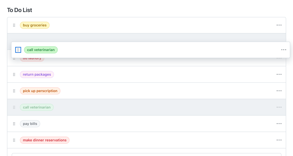
The team recently scoped an effort to make one kind of drag-and-drop accessible: moving items along a single axis. The work surfaced several distinct challenges, each requiring its own workaround.
Escaping screen reader navigation to capture arrow keys
The first hurdle was choosing a keyboard interaction model. Arrow keys felt natural for visual keyboard users. But screen readers use arrow keys for their own navigation—reading text, moving between table cells, and so on. When the team tested with screen reader users, arrow key presses performed standard screen reader navigation instead of moving the selected item.
To override those bindings, the team added role='application' to the drag-and-drop trigger. That role makes a screen reader treat the element and its contents as a standalone application, ceding control of key handling to the page.
A caveat: role='application' should almost never be used. It drastically changes how a screen reader operates. The team scoped it to the smallest possible element—the drag-and-drop trigger—and only added it to the DOM when a user activated drag-and-drop, removing it when the user completed or canceled the operation. Even with that care, the team emphasizes that daily screen reader users should be the judge of whether the approach is genuinely accessible.
Separating keyboard events from simulated mouse events
A second challenge emerged with NVDA. When an NVDA user activates a button with Enter or Space, the screen reader doesn't fire a onKeyDown event. It simulates onMouseDown and onMouseUp events instead. For a pattern where onMouseUp finalizes a drag, that meant keyboard-driven NVDA users could inadvertently finish an operation just by pressing Enter.
The solution was to separate keyboard from mouse handling using two elements:
- A Primer Icon button to handle keyboard interactions.
- An invisible overlay to capture mouse interactions.

Debouncing movement announcements
With keyboard operations working, the next issue surfaced during screen reader testing: announcing moves. The team, not being native screen reader users, moved items slowly and the aria-live announcements sounded fine. Real users, however, move items rapidly. In user testing with fast movements, announcements lagged or reported positions that were no longer current, disorienting users.
The fix was a 100ms debounce on move announcements, validated through user testing, plus aria-live='assertive' so that stale position announcements get interrupted by new ones.
export const debounceAnnouncement = debounce((announcement: string) => {
  announce(announcement, {assertive: true})
}, 100)
The team notes that aria-live='assertive' should be reserved for time-sensitive or critical notifications—it can disrupt ongoing announcements and should be tested heavily with screen reader users.
Teaching an unfamiliar pattern
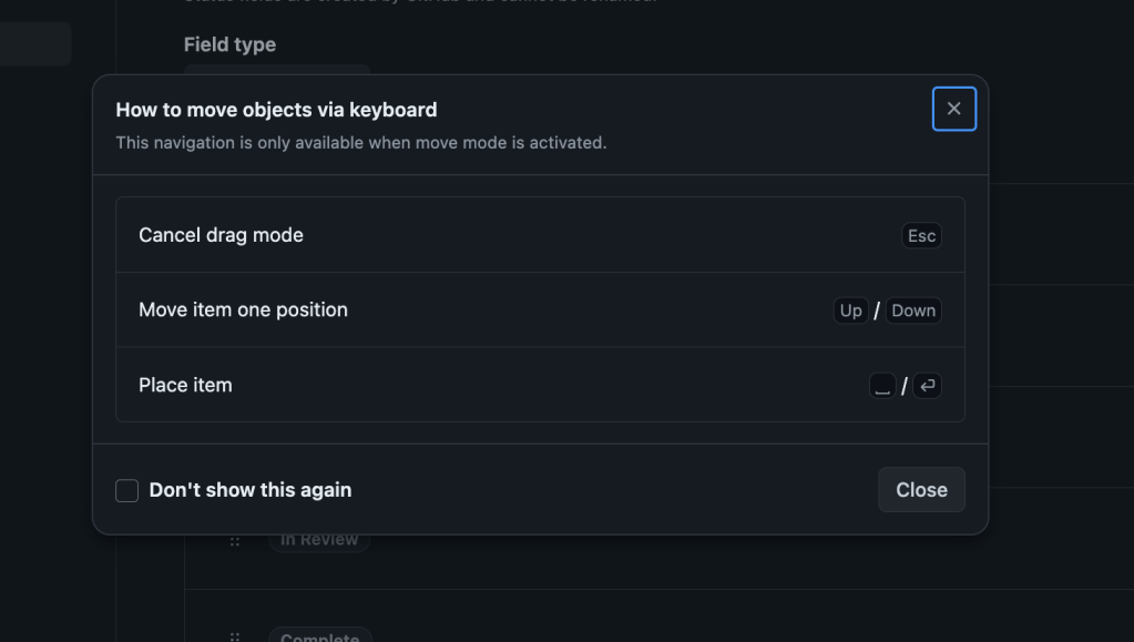
During testing, some users struggled simply because they'd never encountered a keyboard-accessible drag-and-drop before. The team wanted an instruction set that was easy to find but not a persistent distraction for users who already knew the interaction.
The solution was a dialog that opens when a user activates drag-and-drop via the keyboard, containing the instructions and a “don't show this again” checkbox for users who want to suppress it going forward.
Voice control and scrollable containers
Voice control assistive technology presented the last major obstacle. Dragging in a non-scrollable list was straightforward with voice control, but moving an item from the top of a scrollable list to the bottom was nearly impossible. Voice control displays numbered overlays for interactive elements; those numbers dynamically update as the user scrolls. Any scrolling during a drag-through-number-reference causes the item to be dropped.
The team supported two operational modes to address this. The traditional drag-and-drop remains one. The other is a move dialog: a form with two input fields, action and position. The action field specifies the direction, such as “move item before” or “move item after,” while position specifies where the item should land.
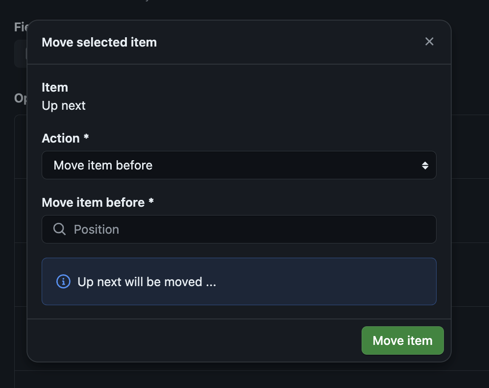
The dialog includes a live preview of where the item will go based on the input values, announced using aria-live, letting users review before committing. Notably, during testing, several non-voice-control users preferred the move dialog too—they felt more confident moving items with it. The accessibility feature ended up benefiting a broader audience than originally intended.
Building an accessible drag-and-drop pattern requires testing with real assistive technology users and designing for more than one input method. The team's journey shows the value of pairing well-scoped keyboard workarounds with an alternative interaction path like the move dialog.


