

Understanding Implicit Grid and Auto-Placement
The conventional path for building a layout begins with display: grid, followed by an explicit definition through grid-template-columns, grid-template-rows, or grid-template-areas, and finishes with manually placing items. That remains the recommended approach. There is, however, a second route: constructing grids without declaring them at all.
The CSS Grid specification draws the distinction clearly. Explicit grid tracks come from grid-template-rows, grid-template-columns, and grid-template-areas, and fix a set number of tracks. When an item is placed beyond those bounds, the container generates implicit tracks by adding implicit grid lines, which together form the implicit grid. In simpler terms, the browser manufactures extra rows and columns on demand.
Auto-Placement in Brief
Auto-placement works alongside the implicit grid: the browser positions items on its own, so explicit coordinates aren't needed for every item. The practical payoff is dynamic grids built with very few declarations.
A Sidebar That Appears Only When Needed
Consider an explicit grid designed for a single item—one column and one row on the main container. Introducing an aside element makes the container adapt to fit it automatically.
main {
  display: grid;
  grid-template-columns: 1fr;
}
To move the <aside> into a column beside the <section>:
aside {
  grid-column-start: 2;
}
No second column was ever declared on the <main> container, yet the browser created one. This is precisely the behavior described in the spec. A single <section> yields a single column; add an <aside> and a column is generated to hold it—useful for layouts that adapt to their contents.
Controlling Where the Extra Column Lands
The column can also be inserted at the beginning rather than the end:
aside {
  grid-column-end: -2;
}
Alternatively, grid-auto-flow: column sets implicit tracks to flow in a column direction. The <aside> then needs no grid-column-start to sit to the right of the <section>, and any future items also flow into their own implicit columns—ideal when the item count is unknown.
Placing the <aside> to the left is different: grid-column-end is still required there. Without it, the <aside> claims the explicit column, pushing the <section> into the implicit one.
With no placement specified, the <aside> takes the explicit column since it comes first in the DOM, while the <section> lands in the column the browser generates. Reassigning the <aside> outside the explicit grid resolves this:
aside {
  grid-column-end: -2;
}
Now source order no longer matters: the <section> becomes free to occupy the explicit column.
Building an Image Grid
Picture one large image with thumbnails beside or beneath it, in two configurations—and no grid definition at all. The entire starting rule is:
.grid img:first-child {
  grid-area: span 3 / span 3;
}
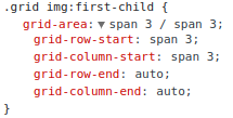
The grid-area shorthand bundles four longhands: grid-row-start, grid-row-end, grid-column-start, and grid-column-end. Though it is also the property used for named areas, here it serves the positional role:
.grid img:first-child {
  grid-area: span 3 / span 3;
}

/* ...is equivalent to: */
.grid img:first-child {
  grid-row-start: span 3;
  grid-column-start: span 3;
  grid-row-end: auto;
  grid-column-end: auto;
}
Expanding the shorthand in DevTools shows the same result:
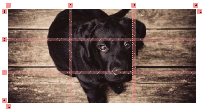
The first image must span three columns and three rows. Because no tracks were defined, the browser supplies them:
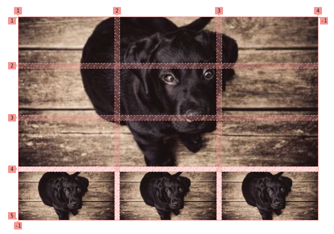
Having anchored the first image to a 3⨉3 area, subsequent images are placed automatically across those same three columns:
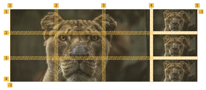
The first image occupies all three columns of the first row, so the remaining images flow into additional rows of three columns each, one image per column. The second configuration simply changes the flow with grid-auto-flow: column. That forces a fourth column into existence for the remaining images; with three rows, they stack down a single vertical column.
To keep the images neatly contained without overflow:
.grid {
  display: grid;
  grid-gap: 10px;
}

/* for the second grid configuration */
.horizontal {
  grid-auto-flow: column;
}

/* The large 3⨉3 image */
.grid img:first-child {
  grid-area: span 3 / span 3;
}

/* Help prevent stretched or distorted images */
img {
  width: 100%;
  height: 100%;
  object-fit: cover;
}
Expanding capacity means editing one value—the 3 in the large image's styles:
.grid img:first-child {
  grid-area: span 3 / span 3;
}
Changing it to 4 adds a fourth column:
.grid img:first-child {
  grid-area: span 4 / span 4;
}
Wrapping that value in a custom property makes future updates even simpler.
Grids Driven by Item Count
More elaborate layouts can let the number of elements dictate the configuration, accommodating anywhere from one to four items without awkward gaps. A lone element simply stretches to fill the single auto-generated row and column. With two elements, another implicit column appears via grid-column-start: 2. With three, the last child spans two columns through grid-column-start: span 2—but only as :last-child, since a fourth element must occupy just one column. That produces four configurations from two declarations:
.grid {
  display: grid;
}
.grid :nth-child(2) {
  grid-column-start: 2;
}
.grid :nth-child(3):last-child {
  grid-column-start: span 2;
}
A second variant works similarly: one and two elements need no rules; a third element that is also :last-child spans two columns; a fourth element is pinned to the second column.
.grid {
  display: grid;
}
.grid :nth-child(3):last-child {
  grid-column-start: span 2;
}
.grid :nth-child(4) {
  grid-column-start: 2;
}
The pattern is to issue targeted instructions keyed to element count using :nth-child, where a single instruction can reshape the whole layout. Sizing is the caveat—since items have no declared sizes, the browser sizes them by content, which may not match the intended result. Explicit sizing for every implicit track fixes this:
grid-auto-rows: 1fr;
grid-auto-columns: 1fr;
grid-auto-rows and grid-auto-columns set the size of implicit rows and columns respectively—that is, tracks left unsized by grid-template-rows or grid-template-columns.
A six-element example follows the same reasoning. When grid-auto-rows receives three values, those are a pattern for implicit rows, not a definition of three rows. One row takes the first value; two rows take the first and second; three rows take all three; a fourth row reuses the first, and so on. A hundred rows repeat 2fr 2fr 1fr all the way down. In this example, two rows end up equal and a third is made slightly smaller. Unlike grid-template-rows, grid-auto-rows sizes only rows created along the way.
Repeating Patterns with :nth-child
The familiar alternating layout—one wide column beside a narrow one, their positions swapping row by row—is hard to achieve without knowing the content volume. Auto-placement makes it manageable. The first step is determining after how many elements the pattern should repeat. Here it is every four:
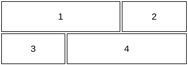
Define the grid and alternate elements with :nth-child:
.grid {
  display: grid;
  grid-auto-columns: 1fr; /* all the columns are equal */
  grid-auto-rows: 100px; /* all the rows equal to 100px */
}
.grid :nth-child(4n + 1) { /* ?? */ }
.grid :nth-child(4n + 2) { /* ?? */ }
.grid :nth-child(4n + 3) { /* ?? */ }
.grid :nth-child(4n + 4) { /* ?? */ }
Because repetition is every four elements, selectors take the form 4n + x with x running from 1 to 4:
4(0) + 1 = 1 = 1st element /* we start with n = 0 */
4(0) + 2 = 2 = 2nd element
4(0) + 3 = 3 = 3rd element
4(0) + 4 = 4 = 4th element
4(1) + 1 = 5 = 5th element /* our pattern repeat here at n = 1 */
4(1) + 2 = 6 = 6th element
4(1) + 3 = 7 = 7th element
4(1) + 4 = 8 = 8th element
4(2) + 1 = 9 = 9th element /* our pattern repeat again here at n = 2 */
etc.
The pattern then recurs on the fifth element, the ninth, and so on.
Each element gets one of four behaviors:
- The first spans two columns starting at column one (
grid-column: 1/span 2). - The second is placed in the third column (
grid-column-start: 3). - The third starts at the first column (
grid-column-start: 1). - The fourth spans two columns from the second (
grid-column: 2/span 2).
.grid {
  display: grid;
  grid-auto-columns: 1fr; /* all the columns are equal */
  grid-auto-rows: 100px; /* all the rows are equal to 100px */
}
.grid :nth-child(4n + 1) { grid-column: 1/span 2; }
.grid :nth-child(4n + 2) { grid-column-start: 3; }
.grid :nth-child(4n + 3) { grid-column-start: 1; }
.grid :nth-child(4n + 4) { grid-column: 2/span 2; }
From here, declarations can be trimmed, letting auto-placement do more of the work. This is the hardest part to internalize and takes practice. First, grid-column: 1/span 2 becomes plain grid-column: span 2, since the browser defaults the first item to column one. The third element's placement can also go:
.grid :nth-child(4n + 3) { grid-column-start: 1; }Once the first, second, and fourth items are placed, the third falls into the correct spot on its own:
.grid {
  display: grid;
  grid-auto-rows: 100px; /* all the rows are equal to 100px */
  grid-auto-columns: 1fr; /* all the columns are equal */
}
.grid :nth-child(4n + 1) { grid-column: span 2; }
.grid :nth-child(4n + 2) { grid-column-start: 3; }
.grid :nth-child(4n + 4) { grid-column: 2/span 2; }
Further reduction is possible here too:
.grid :nth-child(4n + 2) { grid-column-start: 3; }Placing the fourth element in column two while letting it span two columns forces an implicit third column into existence—three total, with none declared. The fourth element can't sit in the first row, which the two-column first item occupies, so it flows to the next row. That leaves one empty column in the first row and another in the second:
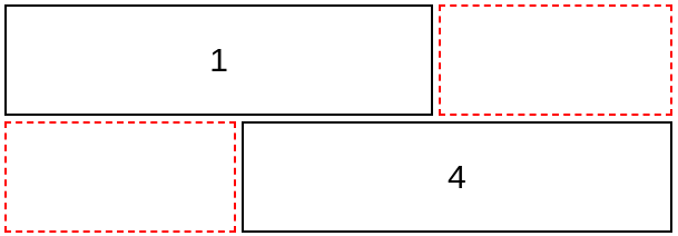
The second and third items fill those holes automatically, narrowing the code to:
.grid {
  display: grid;
  grid-auto-columns: 1fr; /* all the columns are equal */
  grid-auto-rows: 100px; /* all the rows are equal to 100px */
}
.grid :nth-child(4n + 1) { grid-column: span 2; }
.grid :nth-child(4n + 4) { grid-column: 2/span 2; }
Five declarations produce a flexible pattern. Those empty spots can just as well be handled with explicit columns—defining three grid columns and letting the first and fourth elements span two each:
.grid {
  display: grid;
  grid-template-columns: repeat(3, 1fr); /* all the columns are equal */
  grid-auto-rows: 100px; /* all the rows are equal to 100px */
}
.grid :nth-child(4n + 1),
.grid :nth-child(4n + 4) {
  grid-column: span 2;
}
That version is more intuitive and comes recommended. The implicit route, by contrast, asks you to keep track of the gaps CSS is quietly filling—and understanding it pays off in a firmer grasp of the grid algorithm.
A Pattern Repeating Every Six
Here the third and fourth elements each span two full rows. Placing just those two initially seems sufficient:
.grid {
  display: grid;
  grid-auto-columns: 1fr;
  grid-auto-rows: 100px;
}
.grid :nth-child(6n + 3) {
  grid-area: span 2/2; /* grid-row-start: span 2 && grid-column-start: 2 */
}
.grid :nth-child(6n + 4) {
  grid-area: span 2/1; /* grid-row-start: span 2 && grid-column-start: 1 */
}
It isn't. The second element must be pinned to the first column, or the grid drops it into the second:
.grid :nth-child(6n + 2) {
  grid-column: 1; /* grid-column-start: 1 */
}
The third element still needs to move to the top. Forcing it into the first row via grid-row looks tempting:
.grid :nth-child(6n + 3) {
  grid-area: 1/2/span 2;
    /* Equivalent to:
       grid-row-start: 1;
       grid-row-end: span 2;
       grid-column-start: 2
     */
}
That fails—every 6n + 3 element would land in the same area, jumbling the layout. The fix keeps the third element's original definition and adds grid-auto-flow: dense, whose packing algorithm fills earlier holes when smaller items turn up later, potentially reordering items visually. The default sparse algorithm only moves forward, never backtracking, keeping auto-placed items in order at the cost of unfilled holes.
The property isn't intuitive, but when placement misbehaves it's worth trying before rearranging configurations—it may solve the layout outright. It shouldn't be applied by default, though: the out-of-order effect can break the match between visual and source order, which matters for accessibility.
.grid {
  display: grid;
  grid-auto-columns: 1fr;
  grid-auto-flow: dense;
  grid-auto-rows: 100px;
}
.grid :nth-child(6n + 2) { grid-column: 1; }
.grid :nth-child(6n + 3) { grid-area: span 2/2; }
.grid :nth-child(6n + 4) { grid-row: span 2; }
In the next pattern, items in black are placed implicitly. The same result can be reached more than one way, including with grid-template-columns:
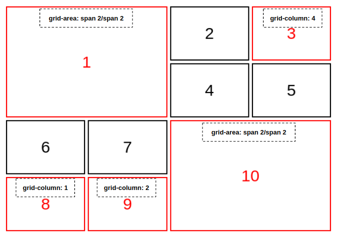
And a final pattern to practice on:
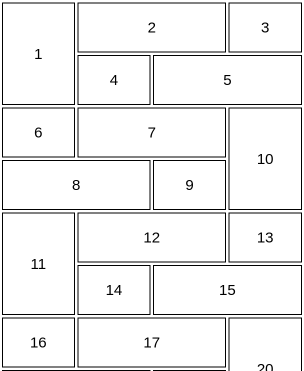
A solution exists for this one, but working it out first—even verbosely—is the point. Finding a working layout is what counts.
Related Reading
These techniques have been applied to a wide range of real-world questions about responsive item counts, 2×2 grids that fill available width when possible, repeating layouts with unknown item totals, alternating order on desktop only, image tiles, grids where row column counts vary, pairing items across two rows, complex auto layouts, stacking columns without flex, and layouts that change with element count.
CSS Grid has been available for years, yet a number of its tricks remain under-discussed—implicit grids and auto-placement among them. They can be challenging; the logic takes time to absorb, and auto-placement continues to demand effort. These methods aren't a replacement for the standard explicit approach. They're an exploration of alternatives that prove useful in specific situations.




