

Why Figma Changes the Handoff Game
Figma’s rise in popularity is easy to understand once you look at what developer handoff looked like before it existed. Design teams used to email static image exports, asset files, and even text documents with page copy. Developers rarely had access to full design files because design software licenses were expensive. Communication was scattered across email threads, project management tools, and meeting notes, and every design update meant resending everything to everyone involved.
Later tools like Zeplin and Invision improved the process by giving developers better access to typography, color, and measurement information. But designers still had to work in separate tools and keep them in sync with their main design files. Figma removes that friction entirely: it’s browser-based, cloud-synced, and has collaboration built in. Everyone always sees the latest version, and developers can open full design files without installing anything or paying for licenses.
If you want to follow along, you can use the Figma startup landing page dark file from the Figma community.
Getting Oriented in the Interface
When you’re added as a collaborator, you can open a file in the browser or download the desktop app (available for Windows and macOS). The desktop app is an Electron app — like Slack or VS Code — not a native application. Functionality is largely the same in both versions, though the desktop app supports local fonts out of the box. In the browser, you’ll need to install the Figma Font Helper first.
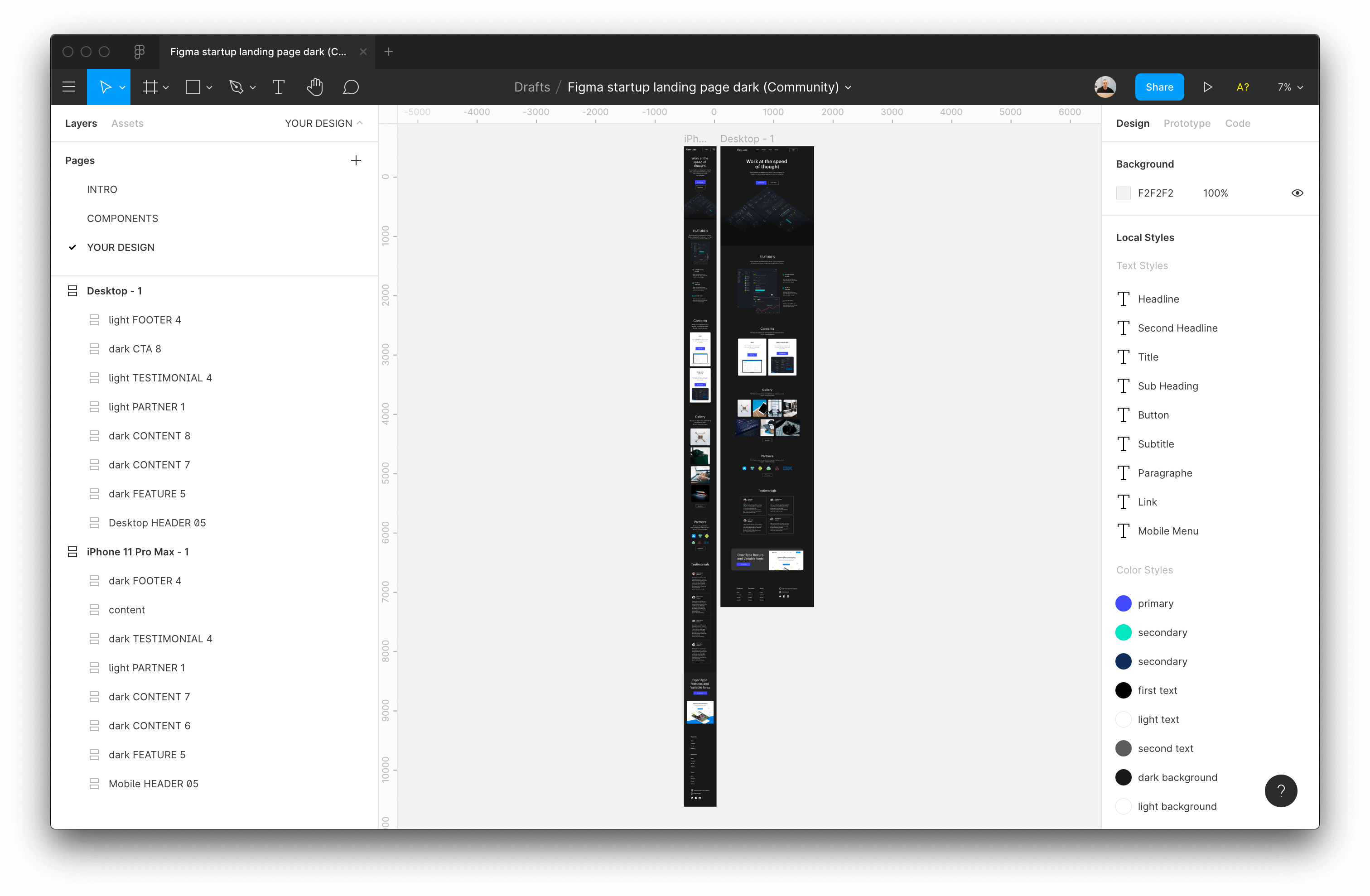
The Figma interface has three main areas:
- The large central canvas where designs live.
- The left sidebar with layers, assets, and pages for the file.
- The right sidebar with properties and information for selected elements.
Files can have multiple pages, each with its own canvas. Designers commonly separate pages by concern — a design system page, an icons page, and so on. Before diving into a file, check the page list to see if the designer organized assets that way. It can save you time when you’re hunting for shared components.
Moving Around the Canvas
When you open a file, Figma zooms to fit all frames in your viewport. Some shortcuts worth knowing:
- Zoom in/out: hold
Cmd(orCtrlon Windows) and scroll, or press+/-. - Pan horizontally: hold the spacebar and drag with your mouse.
- Zoom to a specific frame or element: select it and press
Shift+2. - Zoom to fit everything: press
Shift+1.
Don’t worry about memorizing these. Press Cmd + Shift + ? (or Ctrl + Shift + ? on Windows) to view the full list of shortcuts at any time.

Once you use a shortcut, it shows up in blue in the help panel, which makes it easy to track which ones you still need to learn.
Reading Project Styles
When you’re starting a new project, first check the project styles in the right sidebar. These give you a single place to find all typography, color, grid, and other styles used in the design.
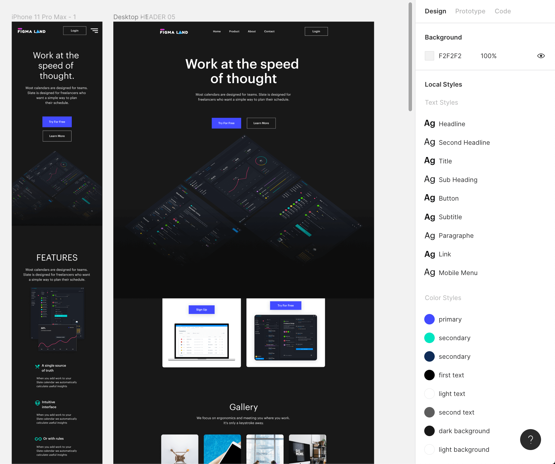
An important gotcha: the project styles only appear when no element is selected. Click on an empty area of the canvas or press Esc to deselect. Click the edit icon next to any style to see full details — useful for setting up your CSS variables and font stacks.
Selecting Layers
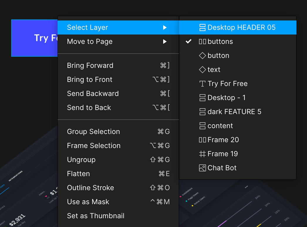
Selecting elements in Figma isn’t always as direct as clicking on what you see. Designs have deep nesting, and clicking an element selects only the top-level layer. To drill into specific layers:
- Hold
Cmd(orCtrl) and click to deep-select through layers. - Right-click an element to see a menu of all nested layers and choose the one you need.
- Double-click an element to move one nesting level deeper with each click.
Figma’s documentation on selecting layers and objects covers more advanced methods, but the techniques above cover most everyday use.
Once you’ve selected an element, switch to the Code tab in the right sidebar to view generated CSS for that element.
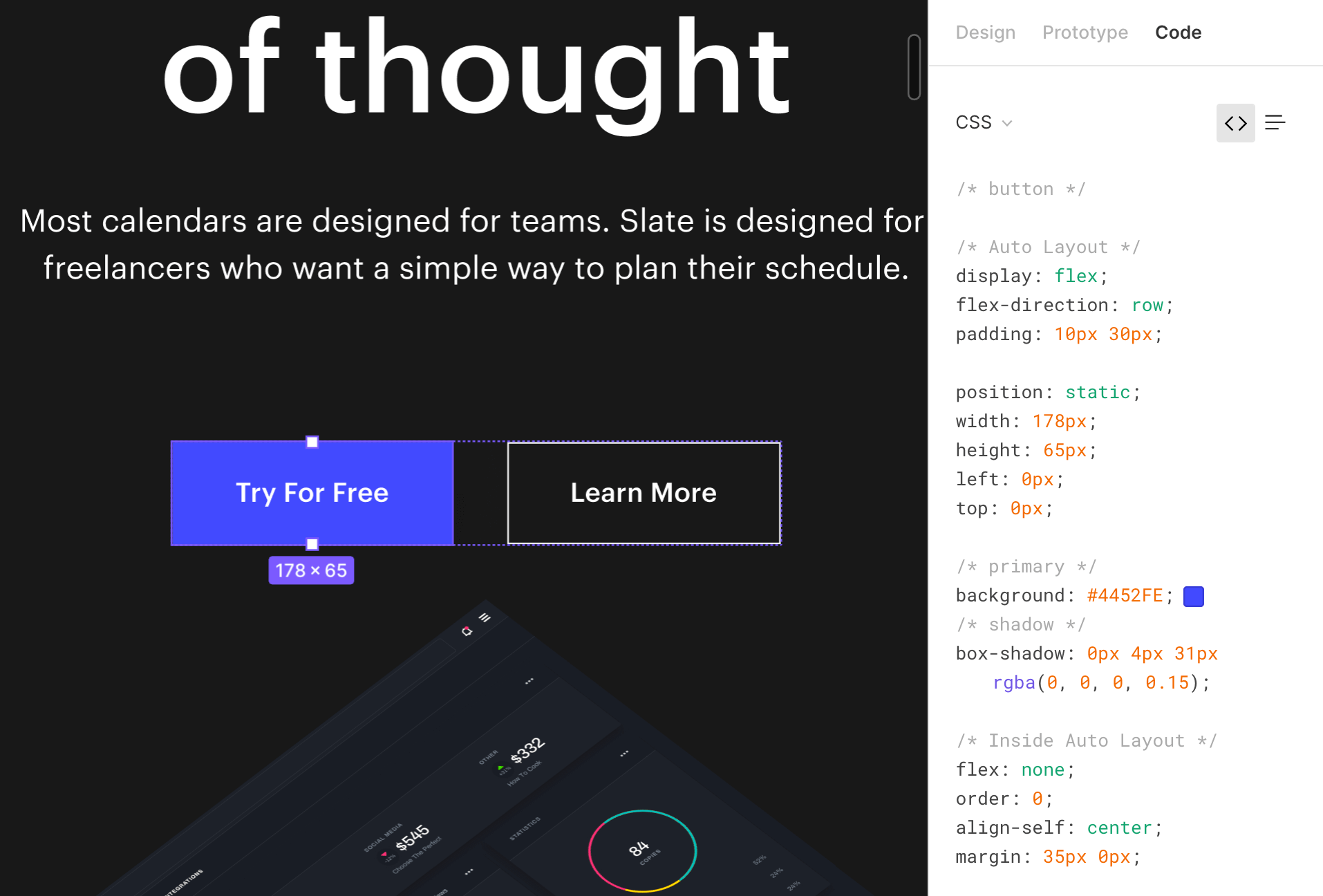
That CSS is automatically generated and not perfect — positioning values in particular can be misleading. Use it as a reference to pull colors, typography, and spacing rather than copying it wholesale into your project.
Measuring Distances
To check spacing between elements, select the element you want to measure from, hold Alt (or Option on Mac), and hover over the other element. A red line appears with the pixel distance marked. If the element you want to measure against is nested inside a group or frame, hold Cmd while hovering to deep-select it.
Exporting Assets
Since you have full access to the design file, you can export assets yourself instead of waiting for the designer to deliver them.
Marking an Element for Export
First, an element must be marked as exportable. Select the element and click the plus icon next to the Export heading in the right sidebar.

Export settings depend on file type. For images you can set a scale multiplier and choose the format (PNG, JPG, SVG, or PDF). The export uses the layer name as the filename, and you can add a suffix if needed. Click the export button to download.
Tip: For a quick copy, right-click an element, choose Copy/paste from the hover menu, and copy the image or SVG code directly — no export settings needed.
Bulk Exporting
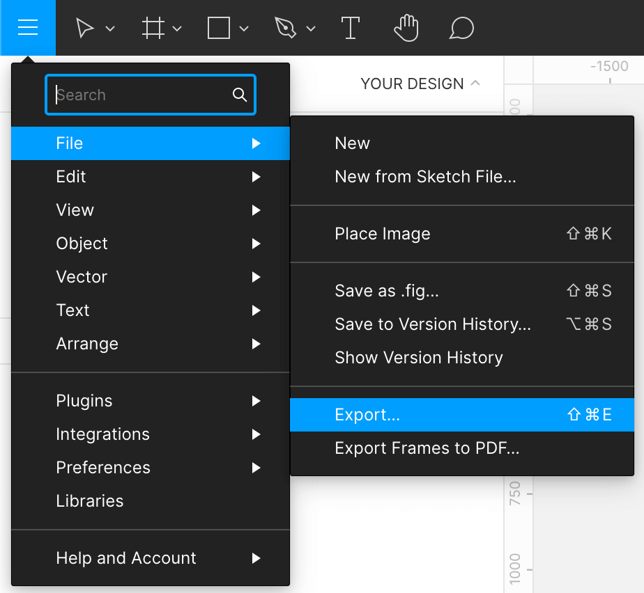
If you need everything at once, go to File > Export… (or press Shift + Cmd + E on Mac or Shift + Ctrl + E on Windows).
Figgy will list every element marked for export. You can review dimensions and file types, deselect anything you don’t need, and export everything in one pass. Hover over an item’s thumbnail to see the filename it will use on export. Clicking a thumbnail selects that element on the canvas, so you can fine-tune its export settings before exporting.
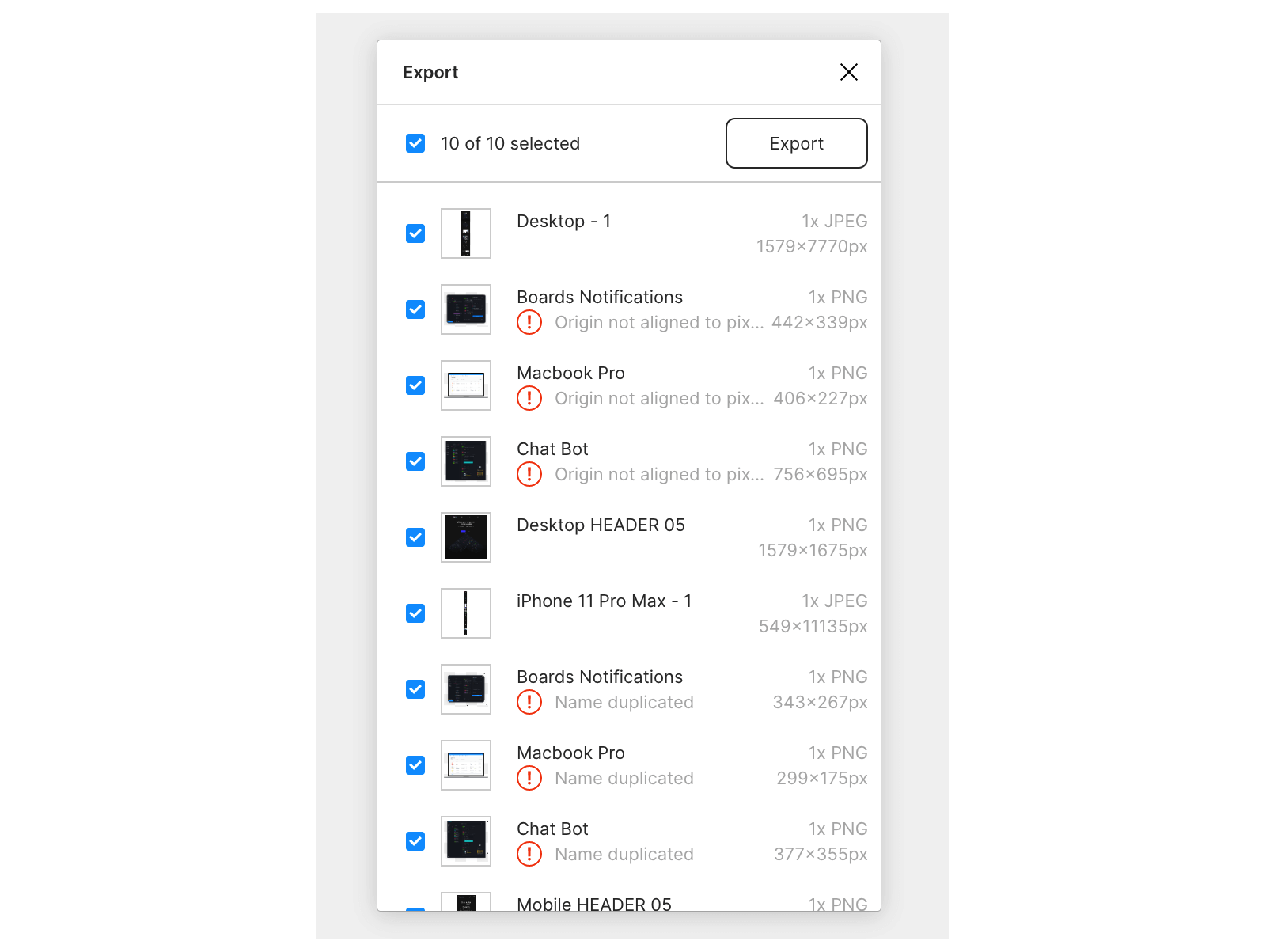
If a file has many exportable assets, use a slash (/) in layer names to group them. Figma will automatically sort those assets into subfolders when exporting.
Reading Prototype Animations
Figma can define a range of animations between screens and states: modal openings, menu transitions, drag gestures, and more. To preview these, click the play icon in the top-right corner to open Presentation view.
For animation details, select the Prototype tab in the right sidebar. The canvas will show blue arrows tracing the user flow. Click an arrow to see the animation configuration.
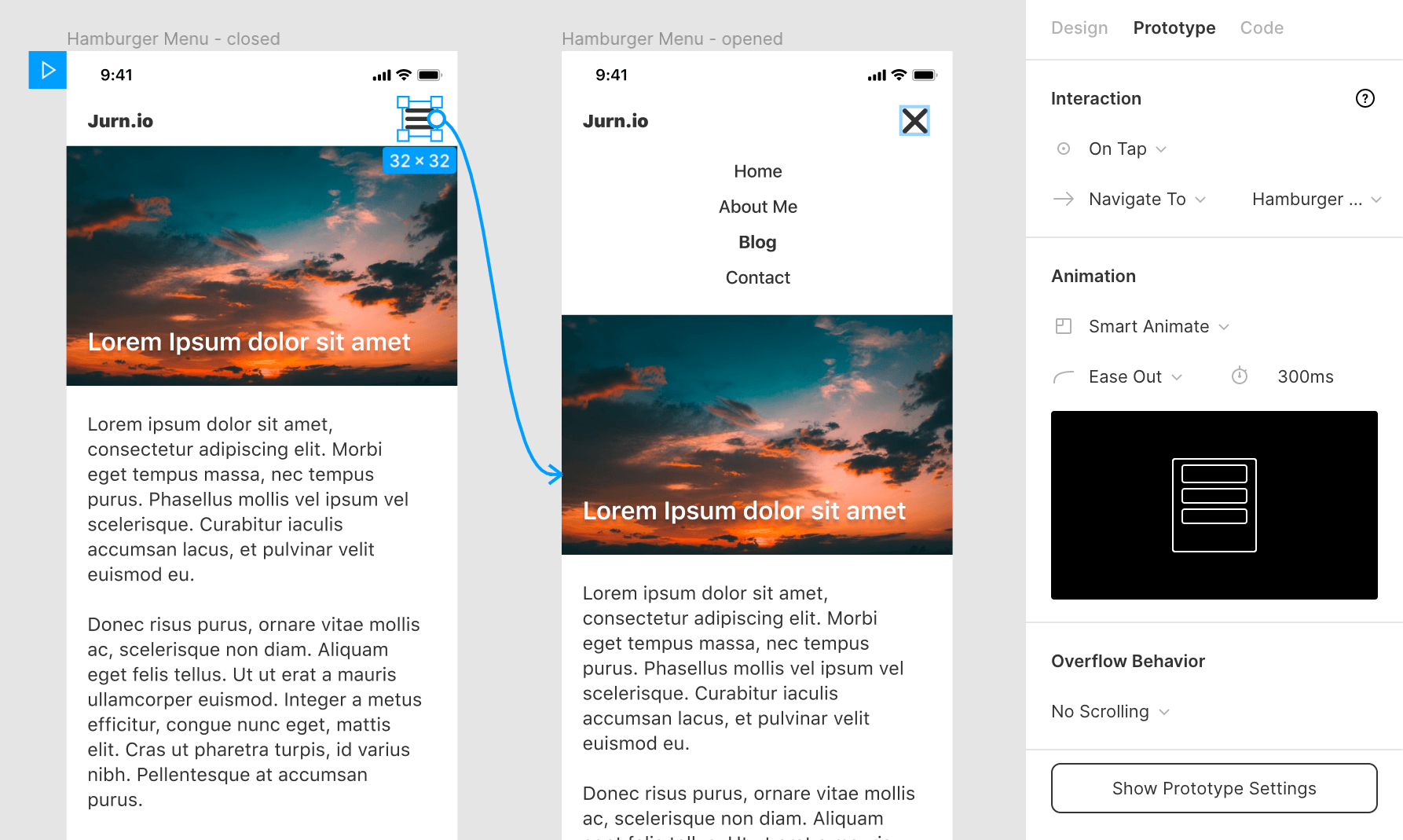
An animation is defined by three parts:
- Trigger — the interaction that starts it (like On Tap).
- Action — what happens when triggered (like Navigate To another screen).
- Transition — the animation timing and behavior (like Smart Animate, which interpolates between two states using an Ease Out function over 300ms).
You can recreate these animations in CSS with those details. Note that, unlike other element properties, animation specs don’t appear in the Code tab — you have to read them from the Prototype panel.
Commenting in the File
When something isn’t clear, use the comment tool by clicking the chat bubble icon in the toolbar or pressing the C key. Click anywhere in the design to drop a comment or question. Use the V key to switch back to the selection cursor.

Two things to keep in mind:
- Comments aren’t private — everyone with access to the file can see them.
- Posting a comment doesn’t notify the whole team. To make sure a specific person sees it, tag them with the @ symbol, like on Slack or Twitter.
Resolved issues can be marked as done, which grays out the comment so it no longer clutters the conversation.
Working With Text And Assets
When inspecting a text layer, Figma separates the technical details you need for implementation from the styling controls. Select the layer and switch to the Inspect tab in the right sidebar to see the font family, weight, and size. You can also copy the CSS snippet directly from the panel, which gives you the font shorthand, line height, letter spacing, and paragraph properties in one block — useful for quickly matching styles in your code.
For colors, the Inspect panel shows the fill in multiple formats. The default is hex, but you can click the value to cycle through RGB, HSL, and CSS variable formats. The color swatch also includes the opacity, and you can copy the color code to the clipboard with a single click. Similar controls exist for borders, shadows, and effects.
One thing to watch: Figma does not always use whole numbers for line-height or letter-spacing. When you copy the CSS, you might see values like 1.5 for line height or a pixel value for letter spacing. These map directly to CSS, but in some cases Figma outputs a line-height as a fixed pixel value rather than a unitless multiplier. Check which one you are getting, because a unitless value is safer for responsive text.
Measuring Layout And Spacing
The Inspect panel is your primary tool for spatial information. When you select a frame or an element, the panel shows its width, height, and x/y position relative to its parent. To measure the distance between two elements, select the Inspect mode, then click and drag between the layers in the canvas — Figma will show horizontal and vertical distances as labeled guides.
You can also inspect the padding and gap of auto-layout frames. In Inspect, these appear under the layout section as four padding values and a gap value per axis. The values are in pixels, and you can copy them into your CSS by switching the panel to the appropriate output mode.
Frames work differently in Figma than regular divs. A plain frame with absolutely-positioned children gives you exact pixel coordinates to inspect, but auto-layout frames recalc positions based on their children and constraints. For developers, the practical distinction is that auto-layout values translate more cleanly to flexbox or grid, while fixed frames produce values that are easier to mirror "pixel-perfect" in a static implementation.
Exporting Assets
To get images or icons out of Figma, right-click the layer and select Export, or look at the Export section in the right sidebar. You can set the format — PNG, JPG, SVG, or PDF — and the scale. For web work, you usually export SVG at 1x for icons and vector graphics, and PNG at 2x or 3x for raster images meant for retina screens.
Figma exports each selected layer individually. To export multiple assets, hold Shift to select several layers and then set the export options once. Figma will create a zip file for the batch export.
That said, do not treat Figma as the source of truth for every asset. Many production pipelines prefer assets exported from the design system repository or generated during the build, so format consistency and compression remain under your control.
Commenting And Collaboration
Figma's collaboration features work well as a living documentation layer for developers. A good design file has an often-updated "Dev" or "Handoff" page, with clear frame labels and a component library that reflects the current state of the product. That said, an unmaintained file can mislead more than it helps — so confirm with your designer that you are looking at the latest version or a published link.
The Shift + 0 shortcut zooms out to fit the whole file in view. Use this as a first step when you open a large file with many boards. From there, navigate the layer list on the left to find specific screens.
If a screen has changed since it was last reviewed, the file's version history contains a full snapshot of past states — helpful for checking what changed and when.

Where To Learn More
Figma’s own documentation is the best place to go deeper on any specific feature. It covers everything from component properties and variables to dev mode and plugin APIs, and it is kept current with the tool's releases.
For related perspectives on design-to-code workflows, see our other guides on the subject.


