Theme switching with CSS variables and localStorage
React's ecosystem offers many styling options, but most theming solutions are tied to a particular CSS strategy (CSS Modules, some form of CSS-in-JS) or to a specific framework such as Gatsby. What follows is a generic system that is quick to set up and easy for a team to adopt. It combines a CSS variable plus data attribute approach, as seen in a StackOverflow answer, with the useLocalStorage hook, dropping the latter's useRef-based hackiness in favor of stateful hook logic.
Scaffolding and cleanup
Start with a recent Node and npm install, then create the project from the command line:
npx create-react-app easy-react-themes --template typescriptThe --template typescript flag can be dropped if you prefer JavaScript; the only difference for this guide is .ts/.tsx versus .js/.jsx file extensions. Open the project in an editor and run the dev server with npm start:
cd easy-react-themes
code .

Then install the storage hook:
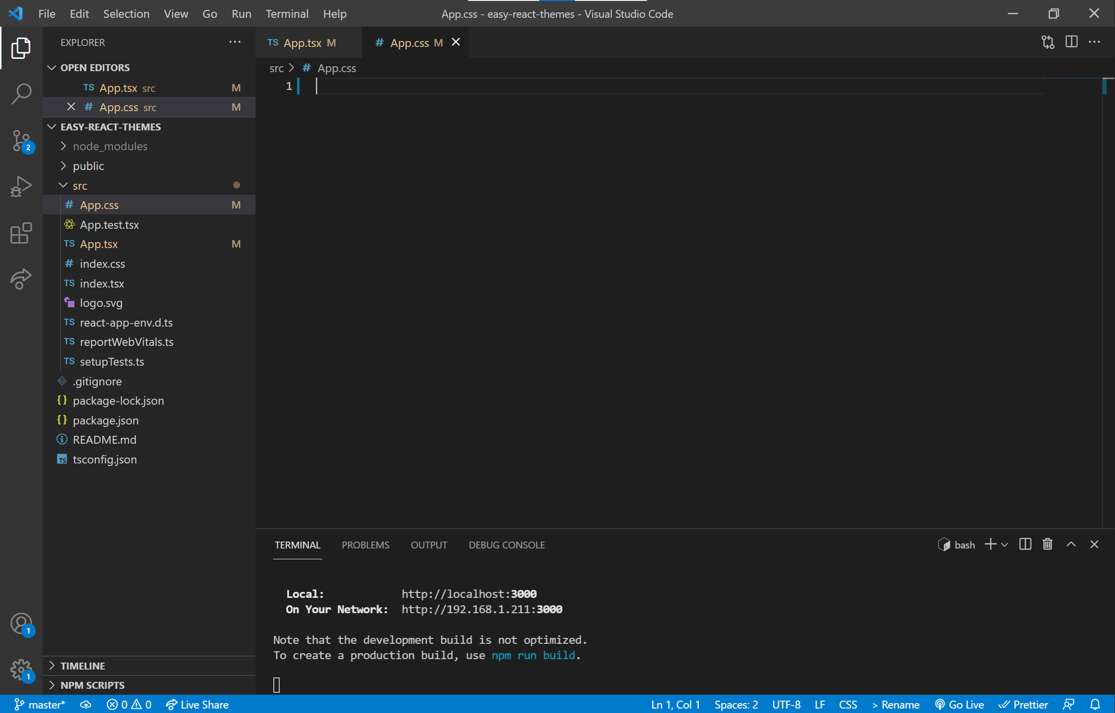
npm i use-local-storageIn App.tsx, remove the CRA boilerplate and clear out App.css entirely:


Defining the themes
All theme values live in index.css:
:root {
  --background: white;
  --text-primary: black;
  --text-secondary: royalblue;
  --accent: purple;
}
[data-theme='dark'] {
  --background: black;
  --text-primary: white;
  --text-secondary: grey;
  --accent: darkred;
}
CSS Custom Properties follow a --key: value pattern. A few colors are declared on :root, making them available anywhere in the project. The [data-theme='dark'] block then redefines those same variables. Because HTML and JSX accept arbitrary data-* attributes, the app's outermost <div> can carry a data-theme that toggles between light and dark. In the dark case, the CSS overrides the :root values, and every style that references those variables switches with them.
Wiring up state
useState or Redux would handle local or global state, but the choice should survive a user leaving and returning. Redux plus redux-persist is far more than this needs. The useLocalStorage hook persists values to localStorage while exposing them as React state. Import it at the top of App.tsx:
import useLocalStorage from 'use-local-storage'Then use it inside the component:
const defaultDark = window.matchMedia('(prefers-color-scheme: dark)').matches;
const [theme, setTheme] = useLocalStorage('theme', defaultDark ? 'dark' : 'light');
This checks the user's browser preference via matchMedia, then creates a stateful theme bound to localStorage along with a setTheme updater. If no entry exists, the hook writes theme: "light" by default, or theme: "dark" when the media query is true. Returning users keep their saved choice; new users get their browser setting respected. The "flash of wrong theme" concern does not apply here: the React app renders entirely client-side, so the initial HTML is a skeleton with a single <div>, and all real elements are generated by JavaScript after localStorage is read.
Next, add markup, a toggle button and a handler to the App component:
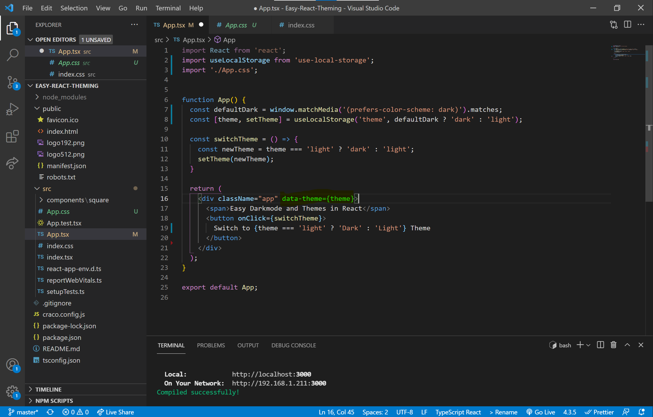
App.tsx fileThe critical line is data-theme={theme} on the top-level <div>. Changing theme decides whether the :root variables are overridden by the data-theme='dark' section of index.css.
Styling with the variables
Fill App.css with rules that consume the variables:
.App {
  color: var(--text-primary);
  background-color: var(--background);
  font-size: large;
  font-weight: bold;
  padding: 20px;
  height: calc(100vh - 40px);
  transition: all .5s;
}
button {
  color: var(--text-primary);
  background-color: var(--background);
  border: 2px var(--text-primary) solid;
  float: right;
  transition: all .5s;
}
The main <div>'s background and text, and the <button>'s background, text and outline, all reference the variables, so a theme change updates everything that depends on them. Both App and the <button> also get transition: all .5s for a smooth cross-theme fade.
Extending to components
To verify the system in a more realistic layout, create a /components folder inside /src, add a /square folder within it, and place Square.tsx and square.css there:
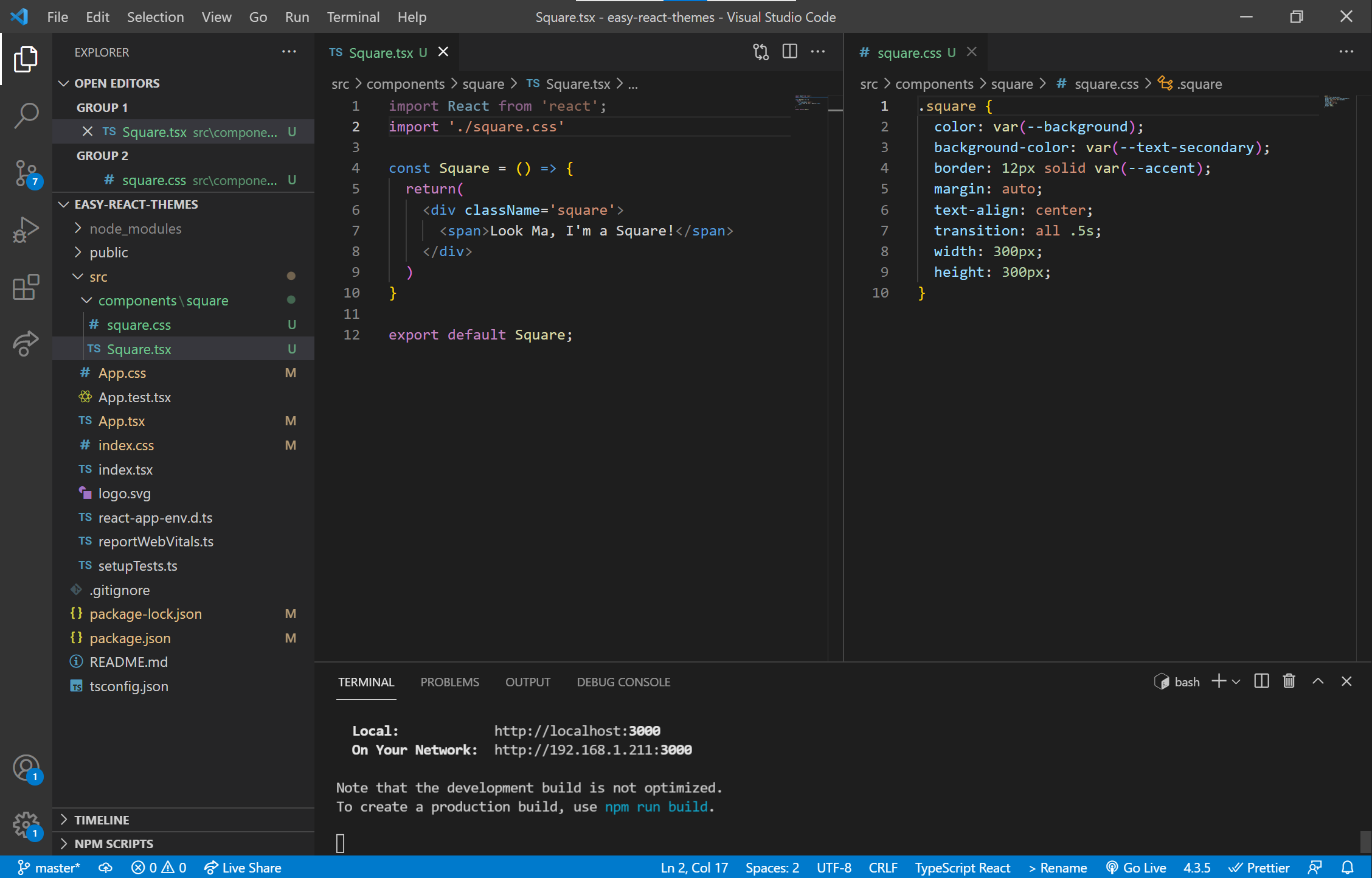
Import the component back into App.tsx:
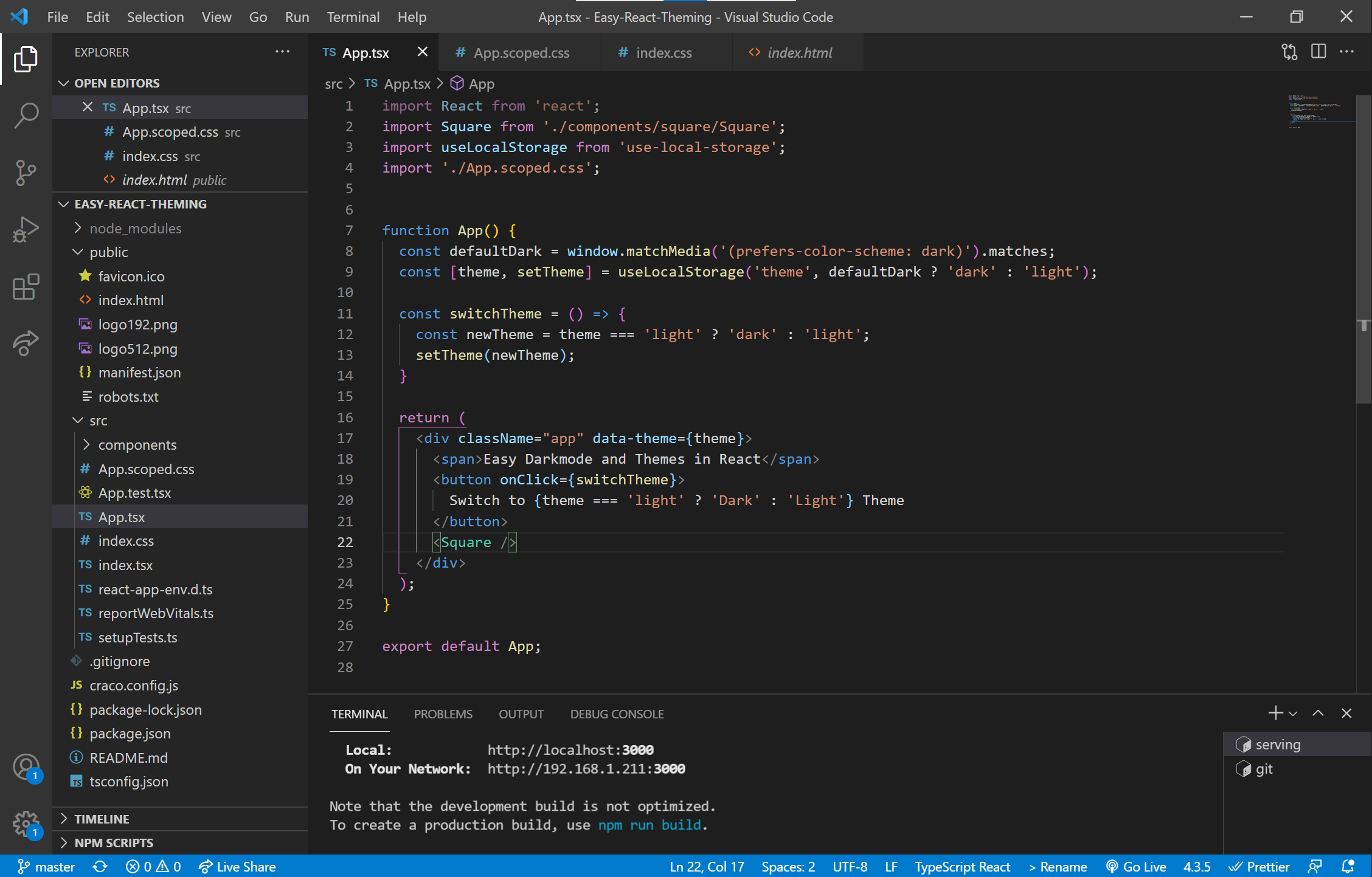
This example uses only a default light theme and one dark theme, but the same mechanism extends to any number of theme options—each one is just another data-theme block.
Bonus: pairing with React Scoped CSS
React Scoped CSS keeps a component's styles encapsulated, preventing name collisions and unintended inheritance. Compared with CSS Modules, previously the go-to for this job, it avoids mangled class names in the DOM; styles come back looking like a human wrote them, which makes debugging easier.
Setup, summarized from the React Scoped CSS repo, begins with installing and configuring Create React App Configuration Override (CRACO). CRACO overrides portions of the webpack config bundled into CRA; normally, adjusting webpack means ejecting, an irreversible operation that puts all dependency management in your hands, so avoid it unless you have a strong reason. Then install the package:
npm i craco-plugin-scoped-cssThe README uses yarn, but npm works the same. Rename CSS files by inserting .scoped before .css:
app.css -> app.scoped.cssUpdate the CSS import name in each component:
import './app.css'; -> import './app.scoped.css';Scoped CSS works much like the theme system: elements receive a data property such as data-v-46ef2374 when a scoped file is imported, and the file's rules are wrapped so they apply only to elements carrying that property. The one deliberate exception is the theme variables: they should stay global, so index.css is left unscoped. Every other file gets encapsulation, and the theming system keeps applying project-wide.




