
Cascade control: :where, :is and Custom Properties
Inheritance and the cascade reward discipline: leaning on them means writing less CSS. In practice styles arrive from many sources, and wrestling them into a structure often produces more rules rather than fewer. ITCSS, Harry Roberts' approach, orders generic styles, components and the rest by load sequence, and combined with BEM it remains a common way to organize stylesheets. Yet plain ITCSS+BEM still forces awkward workarounds — @importing a third-party component at one exact spot so nothing breaks, or reaching for !important. Newer CSS features remove much of that friction.
Zeroing specificity with :where
:where drops a selector's specificity to just above user-agent defaults, wherever and whenever the CSS loads — effectively zero weight. Generic components are the natural home for it. A <table> block written with :where:
:where(table) {
  background-color: tan;
}
Add competing table styles before it:
table {
  background-color: hotpink;
}

:where(table) {
  background-color: tan;
}
The background turns hotpink, even though the bare table selector appears earlier in the stylesheet. That property explains the adoption of :where in CSS resets.
:is and specificity inheritance
:is behaves almost oppositely: its specificity equals that of its most specific argument. The Selectors Level 4 spec puts it this way:
The specificity of the
:is()pseudo-class is replaced by the specificity of its most specific argument. Thus, a selector written with:is()does not necessarily have equivalent specificity to the equivalent selector written without:is().
Extending the example:
:is(table) {
  --tbl-bgc: orange;
}
table {
  --tbl-bgc: tan;
}
:where(table) {
  --tbl-bgc: hotpink;
  background-color: var(--tbl-bgc);
}
A <table class="c-tbl"> gets a tan background: :is carries the same weight as table, and table comes later. Changing the inner selector flips the result:
:is(table, .c-tbl) {
  --tbl-bgc: orange;
}
Now the background is orange, because :is takes on the weight of its heaviest argument, .c-tbl.
Building a configurable table
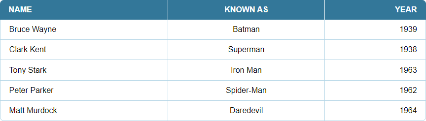
Start by wrapping .c-tbl in :where and giving the table rounded corners. Rounding means border-collapse: separate, since border-radius cannot apply to cells under border-collapse: collapse:
:where(.c-tbl) {
  border-collapse: separate;
  border-spacing: 0;
  table-layout: auto;
  width: 99.9%;
}
<thead> and <tbody> cells take different styles:
:where(.c-tbl thead th) {
  background-color: hsl(200, 60%, 40%);
  border-style: solid;
  border-block-start-width: 0;
  border-inline-end-width: 1px;
  border-block-end-width: 0;
  border-inline-start-width: 0;
  color: hsl(200, 60%, 99%);
  padding-block: 1.25ch;
  padding-inline: 2ch;
  text-transform: uppercase;
}
:where(.c-tbl tbody td) {
  background-color: #FFF;
  border-color: hsl(200, 60%, 80%);
  border-style: solid;
  border-block-start-width: 0;
  border-inline-end-width: 1px;
  border-block-end-width: 1px;
  border-inline-start-width: 0;
  padding-block: 1.25ch;
  padding-inline: 2ch;
}
Separated borders plus rounding call for extra rules for table borders and cell hover states:
:where(.c-tbl tr td:first-of-type) {
  border-inline-start-width: 1px;
}
:where(.c-tbl tr th:last-of-type) {
  border-inline-color: hsl(200, 60%, 40%);
}
:where(.c-tbl tr th:first-of-type) {
  border-inline-start-color: hsl(200, 60%, 40%);
}
:where(.c-tbl thead th:first-of-type) {
  border-start-start-radius: 0.5rem;
}
:where(.c-tbl thead th:last-of-type) {
  border-start-end-radius: 0.5rem;
}
:where(.c-tbl tbody tr:last-of-type td:first-of-type) {
  border-end-start-radius: 0.5rem;
}
:where(.c-tbl tr:last-of-type td:last-of-type) {
  border-end-end-radius: 0.5rem;
}
/* hover */
@media (hover: hover) {
  :where(.c-tbl) tr:hover td {
    background-color: hsl(200, 60%, 95%);
  }
}
Variations now come from injecting styles before or after the generic set — the specificity stripping in :where allows either — by overriding .c-tbl directly or adding a BEM modifier such as c-tbl--purple:
<table class="c-tbl c-tbl--purple">.c-tbl--purple th {
background-color: hsl(330, 50%, 40%)
}
.c-tbl--purple td {
border-color: hsl(330, 40%, 80%);
}
.c-tbl--purple tr th:last-of-type {
border-inline-color: hsl(330, 50%, 40%);
}
.c-tbl--purple tr th:first-of-type {
border-inline-start-color: hsl(330, 50%, 40%);
}Colors repeat, and changing border-radius or border-width would mean even more duplication. Move the configurable values into CSS custom properties, declared at the top of the component's scope — the table element itself.
Generic styles via a data attribute
Switch the markup so the table carries a data-component attribute as the styling hook:
<table id="table">Generic styles — everything a table needs regardless of color variation — live on that attribute; instance-specific styles use a regular class that sets custom properties consumed by the generic component:
[data-component="table"] {
  /* Styles needed for all table variations */
}
.c-tbl--purple {
  /* Styles for the purple variation */
}
Keeping generic styles in a data attribute frees the class naming: .BIGCORP__TABLE, .table-component or anything else works.
Inside the generic component each property points at a custom property. Properties that must reach child elements, like border-color, are set at the component's root:
:where([data-component="table"]) {
  /* These will will be used multiple times, and in other selectors */
  --tbl-hue: 200;
  --tbl-sat: 50%;
  --tbl-bdc: hsl(var(--tbl-hue), var(--tbl-sat), 80%);
}

/* Here, it's used on a child-node: */
:where([data-component="table"] td) {
  border-color: var(--tbl-bdc);
}
Other properties get either a static value or a custom property; custom properties need defaults so a table still renders without a variation class:
:where([data-component="table"]) {
  /* These are optional, with fallbacks */
  background-color: var(--tbl-bgc, transparent);
  border-collapse: var(--tbl-bdcl, separate);
}
The naming scheme is a component prefix plus an Emmet-style abbreviation — --tbl for the component, -bgc for background color, -bdcl for border-collapse, so --tbl-bgc. It applies only to component properties; global properties stay broadly named.
DevTools makes the parameters explorable: change --tbl-hue to shift the HSL hue, set --tbl-bdrs: 0 to drop the radius. This is also how you discover which parameters a component actually needs. Column alignment and width are controllable the same way:
:where[data-component="table"] tr > *:nth-of-type(1)) {
  text-align: var(--ca1, initial);
  width: var(--cw1, initial);
  /* repeat for column 2 and 3, or use a SCSS-loop ... */
}
Select the table in DevTools and add these to the element.styles selector:
element.style {
  --ca2: center; /* Align second column center */
  --ca3: right; /* Align third column right */
}
Instance styles then go in a regular class, .c-tbl (component-table, BEM style), added to the markup:
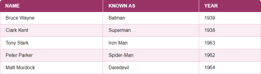
<table class="c-tbl" id="table">Altering just --tbl-hue recolors the table:
.c-tbl {
  --tbl-hue: 330;
}
No new CSS is written — one property is updated. A more complex selector can likewise change a single property, producing zebra striping:
.c-tbl tr:nth-child(even) td {
  --tbl-td-bgc: hsl(var(--tbl-hue), var(--tbl-sat), 95%);
}
Because the generic styles sit in :where, it does not matter where the variation class loads; specificity is gone and instance rules apply regardless of position.
Real parameters in the markup
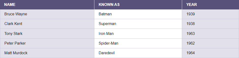
More substantial options — zebra-striped rows or columns, sticky header and column, hover effects on row, cell or column — could be BEM modifiers, but a second data attribute handles them more efficiently. Store parameters in data-param:
<table>An attribute selector matching one word in the list covers zebra rows:
[data-component="table"][data-param~="zebrarow"] tr:nth-child(even) td {
  --tbl-td-bgc: var(--tbl-zebra-bgc);
}
and zebra columns:
[data-component="table"][data-param~="zebracol"] td:nth-of-type(odd) {
  --tbl-td-bgc: var(--tbl-zebra-bgc);
}
Both a sticky header and a sticky first column:
[data-component="table"][data-param~="stickycol"] thead tr th:first-child,[data-component="table"][data-param~="stickycol"] tbody tr td:first-child {
  --tbl-td-bgc: var(--tbl-zebra-bgc);
  inset-inline-start: 0;
  position: sticky;
}
[data-component="table"][data-param~="stickyrow"] thead th {
  inset-block-start: -1px;
  position: sticky;
}
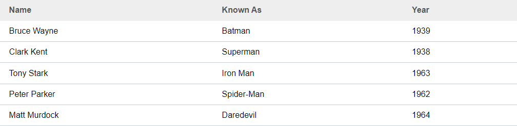
The demo's default light theme uses this markup:
.c-tbl--light {
  --tbl-bdrs: 0;
  --tbl-sat: 15%;
  --tbl-th-bgc: #eee;
  --tbl-th-bdc: #eee;
  --tbl-th-c: #555;
  --tbl-th-tt: normal;
}
with data-param set to noinlineborder, matching these styles:
[data-param~="noinlineborder"] thead tr > th {
  border-block-start-width: 0;
  border-inline-end-width: 0;
  border-block-end-width: var(--tbl-bdw);
  border-inline-start-width: 0;
}
Styling generic components through data attributes is a strong opinion, not a requirement; a BEM modifier class or another convention works equally well. The essential move is to embrace :where and :is and the cascade control they give, structuring CSS so each new variation costs as few new rules as possible.
Cascade Layers
The final tool is Cascade Layers, defined in CSS Cascading and Inheritance Level 5. At the time of writing it is experimental: available in Safari or Chrome with the #enable-cascade-layers flag enabled.

As Bramus Van Damme summarizes, layers sit in the cascade before selector specificity and order of appearance, so neither the specificity of CSS in other layers nor the order of loading those layers matters — useful for large teams and third-party CSS.
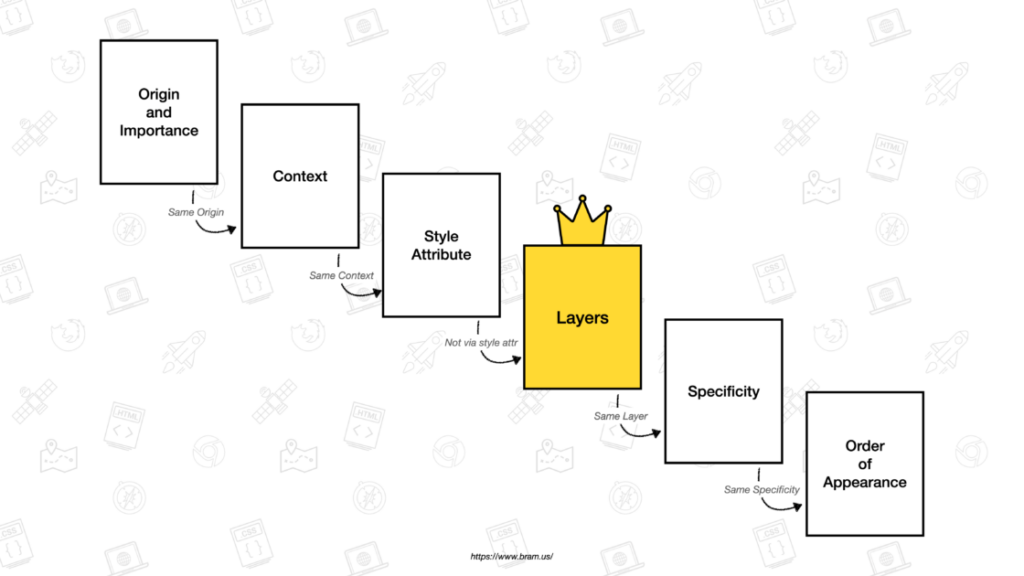
Layers make the ITCSS idea concrete: they declare at which point a stylesheet sits. A simplified version of that structure:
@layer generic, components;One line fixes the layer order — generic styles first, component-specific ones after. Loading generic styles much later than component styles:
@layer components {
  body {
    background-color: lightseagreen;
  }
}

/* MUCH, much later... */

@layer generic {
  body {
    background-color: tomato;
  }
}
The background-color is lightseagreen, since the components layer is ordered after generic; its styles win even when written first. It is another lever for arranging CSS logically instead of fighting specificity.




