
Why CSS Custom Properties Belong in Your React Toolbox
CSS-in-JS libraries give React developers a comfortable home for their styles, but they don't replace CSS itself — they're just a different vehicle for it. One of the most powerful modern additions to CSS is Custom Properties (often called CSS variables), and they solve problems that plain JavaScript simply cannot touch.
There are two ways this pays off. First, the ergonomics: you can drop the ceremony of importing constants or writing inline functions just to access a theme value. Second, and far more interesting, CSS variables unlock patterns that are impossible to replicate with a JS-only approach.
How CSS Variables Actually Work
CSS variables are not globals in the way many developers assume. They behave like any other CSS property — which is exactly what they are. When you declare --highlight-color on a paragraph selector, it is inherited by child elements just like font-size or color are:
<style> p { --highlight-color: yellow; } em { background: var(--highlight-color); }</style><p> This paragraph has some <em>emphasized text</em>!</p>
An <em> inside a heading will not pick up that variable, because it isn't descended from a paragraph where the variable was declared:
<style> p { --highlight-color: yellow; } em { background: var(--highlight-color); }</style><h1> This heading has some <em>emphasized text</em>!</h1>
When you do want global access — for a color theme, for instance — you hang the variables on the <html> element:
/*
  This variable will be available everywhere,
  because every element is a descendant of
  the HTML tag:
*/
html {
  --color-red: hsl(0deg 80% 50%);
  --color-blue: hsl(270deg 75% 60%);
}
Three rules distinguish custom properties:
- They must start with a double dash, which separates them from normal CSS properties.
- They can hold any value type — not just colors and pixel lengths.
- They accept a fallback via the
var()function, sovar(--primary-color, pink)resolves topinkwhen the variable is undefined.
Parting Ways with Imports and Themes
Assume you have a design-token file that exports plain JavaScript constants:
const COLORS = {
  text: 'black',
  background: 'white',
  primary: 'rebeccapurple',
};

const SIZES = [
  8,
  16,
  24,
  32,
  /* And so on */
];
In a typical React setup, components that need these tokens either import them directly or pull from a ThemeProvider:
import { COLORS } from '../constants';

const Button = styled.button`
  background: ${COLORS.primary};
`;
// components/App.js
import { ThemeProvider } from 'styled-components';
import { COLORS } from '../constants';
// This element wraps our entire application,
// to make the theme available via context.
const App = ({ children }) => {
return (
<ThemeProvider theme={{ colors: COLORS }}>
{children}
</ThemeProvider>
);
};
// Elsewhere…
const Button = styled.button`
background: ${(props) => props.theme.colors.primary};
`;Both paths vanish when CSS variables hold the same values. Using createGlobalStyle (which writes unscoped CSS, like a plain styles.css) you declare everything on the root node:
import { createGlobalStyle } from 'styled-components';

const GlobalStyles = createGlobalStyle`
  html {
    --color-text: black;
    --color-background: white;
    --color-primary: rebeccapurple;
  }
`;

const App = ({ children }) => {
  return (
    <>
      <GlobalStyles />
      {children}
    </>
  );
};
The components then reference the values directly:
const Button = styled.button`
  background: var(--color-primary);
`;
The win here is real but modest: no import paths to manage, no inline function calls. There is some loss in static typing — more on that later — but the tradeoff is easy to accept.
The Stronger Play: Reactive Values, Not Breakpoint Code
Here is where CSS variables stop being a convenience and start being a different way to think. Take a Button component:
import styled from 'styled-components';

const Button = styled.button`
  min-height: 32px;
  padding: 0 32px;
  border-radius: 16px;
  border: none;
  color: white;
  font-size: 1rem;
  font-weight: 600;
  text-shadow: 1px 1px 0px #3a00df;
  background: linear-gradient(170deg, #359eff 5%, #3a00df 95%);
`;

function App() {
  return (
    <Button width={60}>
      Hello World
    </Button>
  );
}

export default App;
Accessibility guidelines say interactive targets should be between 44px and 48px tall for touch, so the button needs to grow on mobile. A standard approach would use a media query with min-height (never height — the button must still grow if the user increases font size):
const Button = styled.button`
  /* Omitted other styles for brevity */
  min-height: 32px;

  @media (pointer: coarse) {
    min-height: 48px;
  }
`;
Note the media query: pointer: coarse. Width doesn't matter. What matters is whether the input is a mouse or a finger.
Now you remember TextInput (and every other tappable element) needs the same treatment. Without CSS variables, you store the breakpoint sizes in your theme and duplicate the media query across components:
const App = ({ children }) => {
  return (
    <ThemeProvider
      theme={{
        colors: COLORS,
        coarseTapHeight: 48,
        fineTapHeight: 32,
      }}
    >
      {children}
    </ThemeProvider>
  );
};
const Button = styled.button`
min-height: ${(props) => props.theme.fineTapHeight}px;
@media (pointer: coarse) {
min-height: ${(props) => props.theme.coarseTapHeight}px;
}
`;
const TextInput = styled.input`
min-height: ${(props) => props.theme.fineTapHeight}px;
@media (pointer: coarse) {
min-height: ${(props) => props.theme.coarseTapHeight}px;
}
`;That's a lot of responsive boilerplate to drag into each component.
With CSS variables, you reverse the flow. Declare a single variable that carries the right value depending on the pointer type, and let every component consume it:
const GlobalStyles = createGlobalStyle`
  html {
    --min-tap-target-height: 32px;

    @media (pointer: coarse) {
      --min-tap-target-height: 48px;
    }
  }
`;
const Button = styled.button`
min-height: var(--min-tap-target-height);
`;
const TextInput = styled.input`
min-height: var(--min-tap-target-height);
`;This pattern looks unusual at first, but it reflects a meaningful shift. The CSS properties within each component never change — min-height always points at --min-tap-target-height. Only the value is dynamic. The benefits accumulate quickly:
- One source of truth for breakpoint behavior. A wayward developer can no longer delete a component's media query independently and create inconsistency.
- Intent becomes visible in the name
min-tap-target-height. The CSS communicates why amin-heightis necessary. - It's more declarative. Components describe what they need, not how to respond to pointer type.
This also echoes the Principle of Least Knowledge: a component only knows about adjacent values, not about the whole breakpoint machinery.
The same trick works for a spacing scale. Instead of shipping one scale to every viewport:
const GlobalStyles = createGlobalStyle`
  html {
    --space-sm: 8px;
    --space-md: 16px;

    @media (min-width: 1024px) {
      --space-sm: 16px;
      --space-md: 32px;
    }
  }
`;

// Elsewhere...
const Paragraph = styled.p`
  padding: var(--space-sm);
`;
You set a different scale per breakpoint. Typography and spacing scale consistently without fiddling inside each component.
## Beyond Developer ExperienceThe above patterns simplify code. CSS variables also open doors that affect end users directly.
Animations That Were Never Possible
Certain CSS properties — like gradients — cannot be animated directly. Transitions and keyframes only work on the properties themselves. But if you apply the transition to a variable's value, you gain the ability to animate nearly anything:
A gradient button built this way demonstrates the technique. Instead of transitioning background, you transition a CSS variable that the background property consumes.
Dark Mode Without the Flash
Server-rendered apps generate HTML before the user's device is known. If the user prefers dark mode, a naive theme implementation will flash the light theme on load while the client rehydrates. CSS variables allow the theme decision to live in CSS itself, computed against the user's actual environment, eliminating that wrong-color flash.
Reading and Writing from JavaScript
Hardcoding theme values in a GlobalStyles component is straightforward:
const GlobalStyles = createGlobalStyle`
  html {
    --color-text: black;
    --color-background: white;
    --color-primary: rebeccapurple;
  }
`;
Occasionally you need those raw values in JS logic. You can keep a constants.js file to instantiate the theme and share the imports:
const GlobalStyles = createGlobalStyle`
  html {
    --color-text: ${COLORS.text};
    --color-background:  ${COLORS.background};
    --color-primary:  ${COLORS.primary};
  }
`;
Alternatively, make CSS the source of truth and read values at runtime:
// Get the value of a CSS variable:
getComputedStyle(document.documentElement)
  .getPropertyValue('--color-primary');

// Set the value of a CSS variable:
document.documentElement.style.setProperty(
  '--color-primary',
  someNewValue
);
Getting and setting variables from JS is an escape hatch — and you'll likely use it less often than you think. Even inline SVGs can consume CSS variables.
Honest Tradeoffs
Typing Is on You
The most significant loss is that your theme is no longer statically typed with TypeScript or Flow. In practice — having lived on both sides — the absence rarely bites. Typos in variable names are easy to spot and fix. Visual regression tools that run in CI catch rendered differences that a type system may never flag anyway.
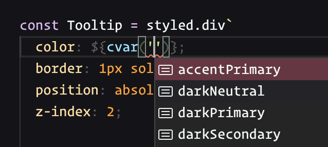
If type safety on the theme is a hard requirement, you can keep the CSS variables (and their types) in a JS object and interpolate them in:
Browser Support Is Solid, With One Caveat
Custom properties are supported comfortably across all major browsers. The case worth checking: animating CSS variables requires newer engine support. As of mid-2024, all major browsers except Firefox cover it, and Firefox support was expected in its next release.
Media Query Limits
Styled-components let you embed constants directly inside media query conditions:
const Ymca = styled.abbr`
  font-size: 1rem;

  @media (max-width: ${(p) => p.bp.desktop}) {
    font-size: 1.25rem;
  }
`;
That freedom does not exist with CSS variables — they cannot appear where a media query expects a value. There has been discussion around env() enabling user-defined environment variables to close this gap, but users have yet to receive that feature.
The tradeoffs are real, but the upside is substantial. CSS variables now anchor most modern CSS-in-JS setups, and the patterns they unlock — value-level reactivity, animation capabilities, and theme-aware resilience — reward the small paradigm shift they demand.
CSS Is Deceptively Complex—Here's How to Close the Gap
The frontend stack revolves around three pillars: HTML, CSS, and JS. Most developers who work with frameworks like React are comfortable with markup and logic, but CSS is a different story. It's not uncommon to meet engineers who have a solid grip on JavaScript yet feel lost when styling a layout.
That disconnect is understandable. CSS looks easy at the start, but it's genuinely hard to master. Writing styles is like looking at the surface of a deep system: behind the scenes, countless implicit rules and cascading behaviors shape how each declaration behaves. There are no error messages, no console logs, no debugger. You write a rule, and either the browser respects your intent or it doesn't. When it doesn't, the only move is to guess and test—throwing random properties at the element until something sticks.
That trial-and-error approach is exhausting, and it doesn't build intuition.
The fix is to understand how CSS actually works, not just memorize snippets. A stronger mental model of the language changes everything. Suddenly, you're not fighting the browser; you're predicting what it will do. Once you can reason about CSS the way you reason about JavaScript, you stay in flow and actually enjoy building the UI layer.
CSS is a deep subject, but you don't need to wade through generic tutorials. The right resources are built for people who already write JavaScript and want to level up their styling skills for real-world React or framework-based projects. A course designed around interactive exercises, practical projects, and a focus on building an accurate mental model can change how you approach every stylesheet.
If CSS has been your weak spot, it doesn't have to stay that way—especially when the rest of the stack feels natural. Master all three technologies and building web apps becomes a completely different experience.


