

Putting a single gradient to work
Gradient syntax escalates quickly, but a lone gradient can carry more than decoration. Using repeating-conic-gradient(), interpolating within HSL, and a few sizing tricks, one gradient handles patterns, grid lines, dashed rules, hover underlines, shapes, and border-image decorations.
Patterns from one repeating gradient
A checkerboard needs nothing more than the background shorthand:
background:
  repeating-conic-gradient(#000 0 25%, #fff 0 50%)
  0 / 100px 100px;
Spelled out without the shorthand:
background-image: repeating-conic-gradient(#000 0 25%, #fff 0 50%);
background-size: 100px 100px;
Two swappable colors and background-size control the square shapes. Halving the color stops from 25% to 12.5% and 50% to 25% yields a triangle-based pattern instead:
background:
  repeating-conic-gradient(#000 0 12.5%, #fff 0 25%)
  0 / 100px 100px;
More involved patterns lean on CSS variables to keep configuration in a few values, though the math then relies on trigonometric functions. Disabling repetition with no-repeat and declaring background-image without a background-size isolates the repeating tile so the individual gradient can be studied.
Turning a pattern into a grid
The pattern becomes flexible when variables set thickness and cell count:
.grid-lines {
  --n: 3; /* number of rows */
  --m: 5; /* number of columns */
  --s: 80px; /* control the size of the grid */
  --t: 2px; /* the thickness */

  width: calc(var(--m)*var(--s) + var(--t));
  height: calc(var(--n)*var(--s) + var(--t));
  background:
    conic-gradient(from 90deg at var(--t) var(--t), #0000 25%, #000 0)
      0 0/var(--s) var(--s);
}
Each repetition produces one horizontal and one vertical line; --s sets the gradient size, and a multiplier gives the wanted line count. The + var(--t) term exists because without it the right and bottom lines go missing — the gradient needs one more repetition, not at full size, so thickness is added to make room for it.
For a responsive column count, drop --m and define the width with round():
width: calc(round(down, 100%, var(--s)) + var(--t));Rather than multiplying, the browser is told to make the element full width and round to a multiple of --s, effectively finding the multiplier itself. A future alternative replaces 100% with auto via calc-size():
width: calc-size(auto, round(down, size, var(--s)) + var(--t));That syntax is early; testing requires a recent Chrome at the time of writing.
Dashed lines
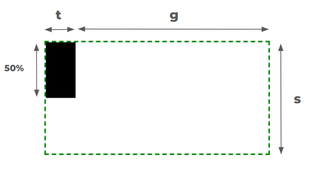
Vertical or horizontal dashed lines with full control follow the same single-gradient approach:
.dashed-lines {
  --t: 2px;  /* thickness of the lines */
  --g: 50px; /* gap between lines */
  --s: 12px; /* size of the dashes */

  background:
    conic-gradient(at var(--t) 50%, #0000 75%, #000 0)
    var(--g)/calc(var(--g) + var(--t)) var(--s);
}
The horizontal variant is left as an exercise, and a grid of dashed lines is possible too — though that one needs two gradients.
Full-spectrum color from one color value
Picking many rainbow stops and chaining them in a linear-gradient works poorly and means fussing with color stops. One color suffices:
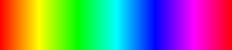
linear-gradient(90deg, red, yellow, green, /* etc. */, red);background: linear-gradient(90deg in hsl longer hue, red 0 100%);The in hsl part changes the interpolation color space. Declaring only the following produces red-to-red, red everywhere:
background: linear-gradient(90deg, red, red); /* or (90deg, red 0 100%) */background: linear-gradient(90deg in hsl, red, red);Adding in hsl keeps it visually red-to-red but interpolates in HSL instead of the default RGB. The interesting piece is longer hue. In HSL the hue channel is an angle, so the space reads as a circle where the angle positions the color:
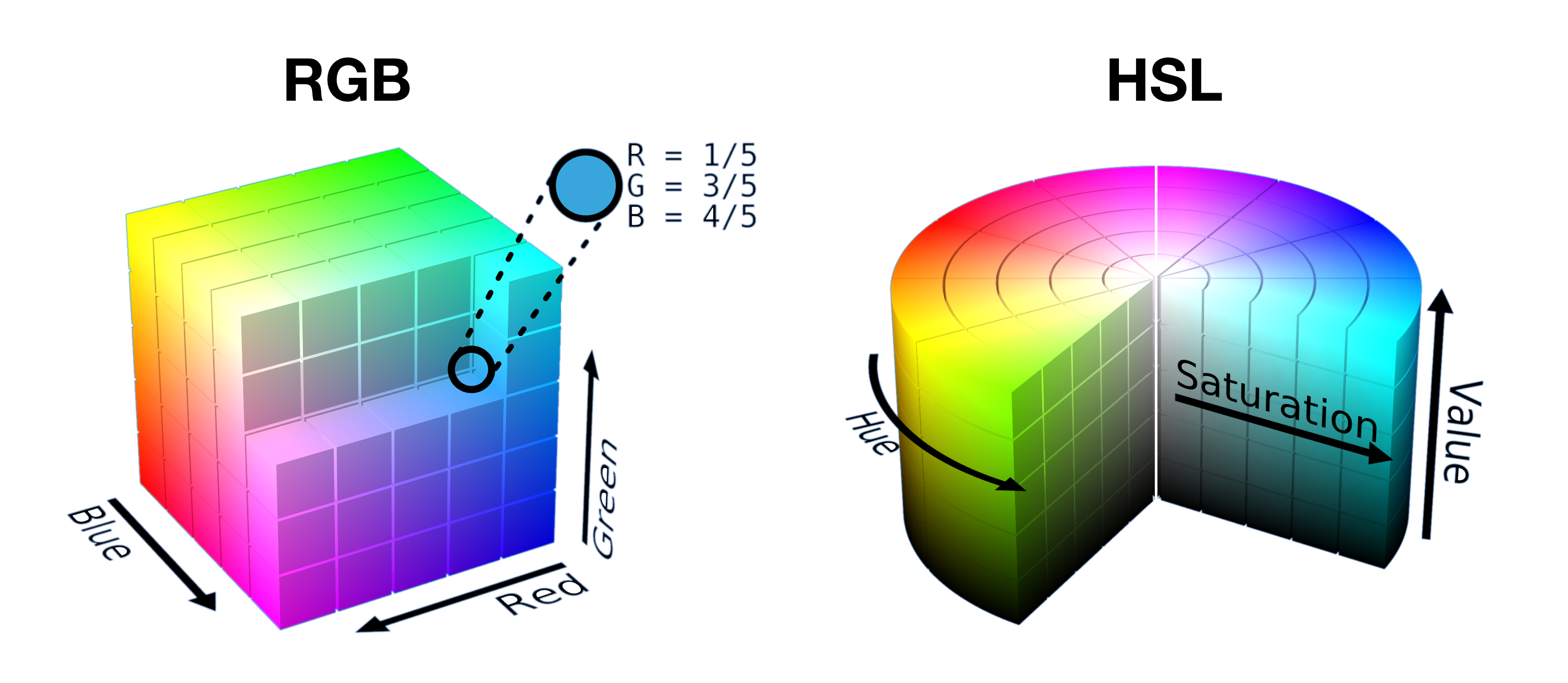
Two points on a circle can be connected by a short or a long path:
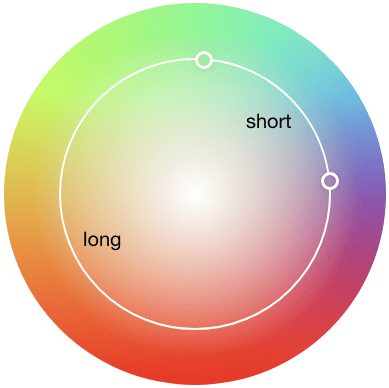
For the same point — red here — the short path contains only red, while the long path traverses every color on the way around. The same technique drives a color wheel via conic-gradient:
background: conic-gradient(in hsl longer hue,red 0 100%);Hover effects without pseudo-elements
Hover underlines and overlays often reach for pseudo-elements or extra markup, but one gradient does the job. A sliding underline:
h3 {
  background:
    linear-gradient(#1095c1 0 0) no-repeat
    var(--p,0) 100%/var(--p, 0) .1em;
  transition: 0.4s, background-position 0s;
}

h3:hover {
  --p: 100%;
}
The pseudo-element alternative is viable, but the gradient version is leaner CSS.
Shapes and border images
Shapes are the most rewarding use. Zig-zag borders, scooped corners, sparkles, and a plus sign all come from a single gradient with a small amount of code.
border-image is inherently limited to one gradient, which makes it a natural fit: gradient overlays, full-width backgrounds, heading dividers, and ribbons that once needed hacks, magic numbers, and workarounds. More detail lives in the author's Modern Guide for Making CSS Shapes, the CSS Shape collection, and the border-image write-up.
The goal is fluency, not restriction
Gradients are usually reached for to make, well, gradients, yet they can draw shapes and effects outright. Staying with one gradient is an exercise in understanding how they work — not a rule. Using more of them, and pushing each further, is what makes the CSS better.




