

Transitions in Vue and Nuxt
CSS transitions let you animate changes to property values over time, controlled by timing functions, duration, and delay. Browser support is broad, with only minor issues in Internet Explorer and Safari. Vue.js and Nuxt.js both make it straightforward to apply these transitions when elements enter or leave the DOM, or when navigating between routes.
Vue.js is an open-source JavaScript framework for building client-side and single-page applications. Nuxt.js builds on Vue to support server-side rendering, static site generation, and SPAs. If you're comfortable with Vue, Nuxt's transition system will feel familiar—both rely on the same CSS transition primitives.
This guide assumes basic familiarity with Vue.js or Nuxt.js. All code examples are available on GitHub.
Understanding CSS Transitions
A transition is a change from one state to another. In CSS, transitions animate changes between values of specific properties. The CSS transition property controls this behavior through several sub-properties.
The transition Sub-properties
The transition-property names the CSS property whose changes you want to animate:
.btn {
  width: 200px;
  height: 50px;
  transition-property: width;
  background-color: red;
  color: #fff;
  border: 0;
}
This alone does nothing. You also need transition-duration, which specifies how long the change takes. Without it (or with a value of 0s), the transition won't run:
.btn {
  width: 200px;
  transition-property: width;
  transition-duration: 2s;
  background-color: red;
  color: #fff;
  border: 0;
}
Here, an element with class btn has a width of 200px. The CSS tells the browser: watch for width changes and animate them over two seconds. An HTML button using this class might look like:
<!DOCTYPE html>
<html lang="en">
<head>
    <meta charset="UTF-8">
    <meta name="viewport" content="width=device-width, initial-scale=1.0">
    <title>CSS Transitions</title>
    <link rel="stylesheet" href="./assets/styles.css">
</head>
<body>
    <Section>
        <h1>Hi CSS Transitions</h1>
        <button class="btn">Hover on me to see a cool transition</button>
    </Section>
</body>
</html>
For the transition to trigger, the width must actually change—via browser dev tools, a CSS pseudo-class, or JavaScript. Using :hover:
// existing styles
.btn:hover {
  width: 300px;
}
Hovering over the button now gradually increases its width over the two-second duration.
Timing Functions
The transition-timing-function property controls the speed curve of the effect. Available values:
ease– starts slow, speeds up, then ends slow (default)linear– constant speed throughoutease-in– slow startease-out– slow endease-in-out– slow start and endcubic-bezier(n,n,n,n)– custom curve defined by four values
Adding ease-in to the button changes the speed at which width animates in versus how it returns to normal:
.btn {
  width: 200px;
  height: 50px;
  transition-property: width;
  transition-duration: 2s;
  transition-timing-function: ease-in;
  background-color: red;
  color: #fff;
  border: 0;
}
For more control, use cubic-bezier(n,n,n,n):
btn {
    width: 200px;
    height: 50px;
    transition-property: width;
    transition-duration: 2s;
    transition-timing-function: cubic-bezier(0.075, 0.82, 0.165, 1);
    background-color: red;
    color: #fff;
    border: 0;
}
The cubic-bezier value can be edited directly in browser dev tools. Clicking the highlighted control opens an interface where you can drag points and see the resulting speed curve in real time:
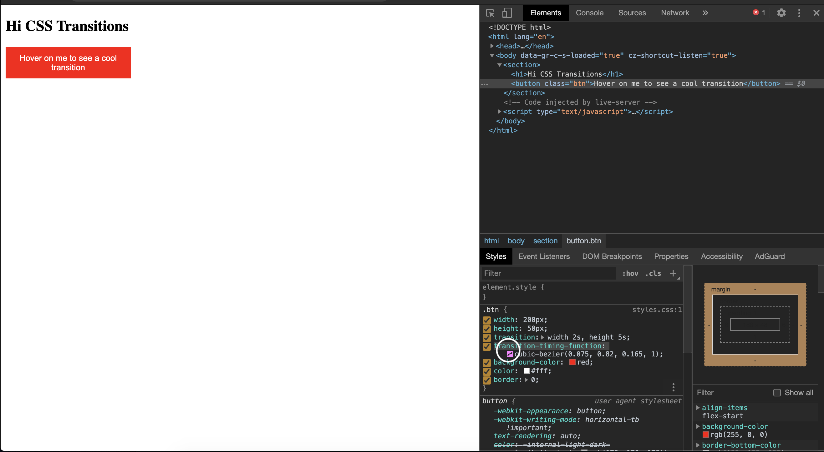
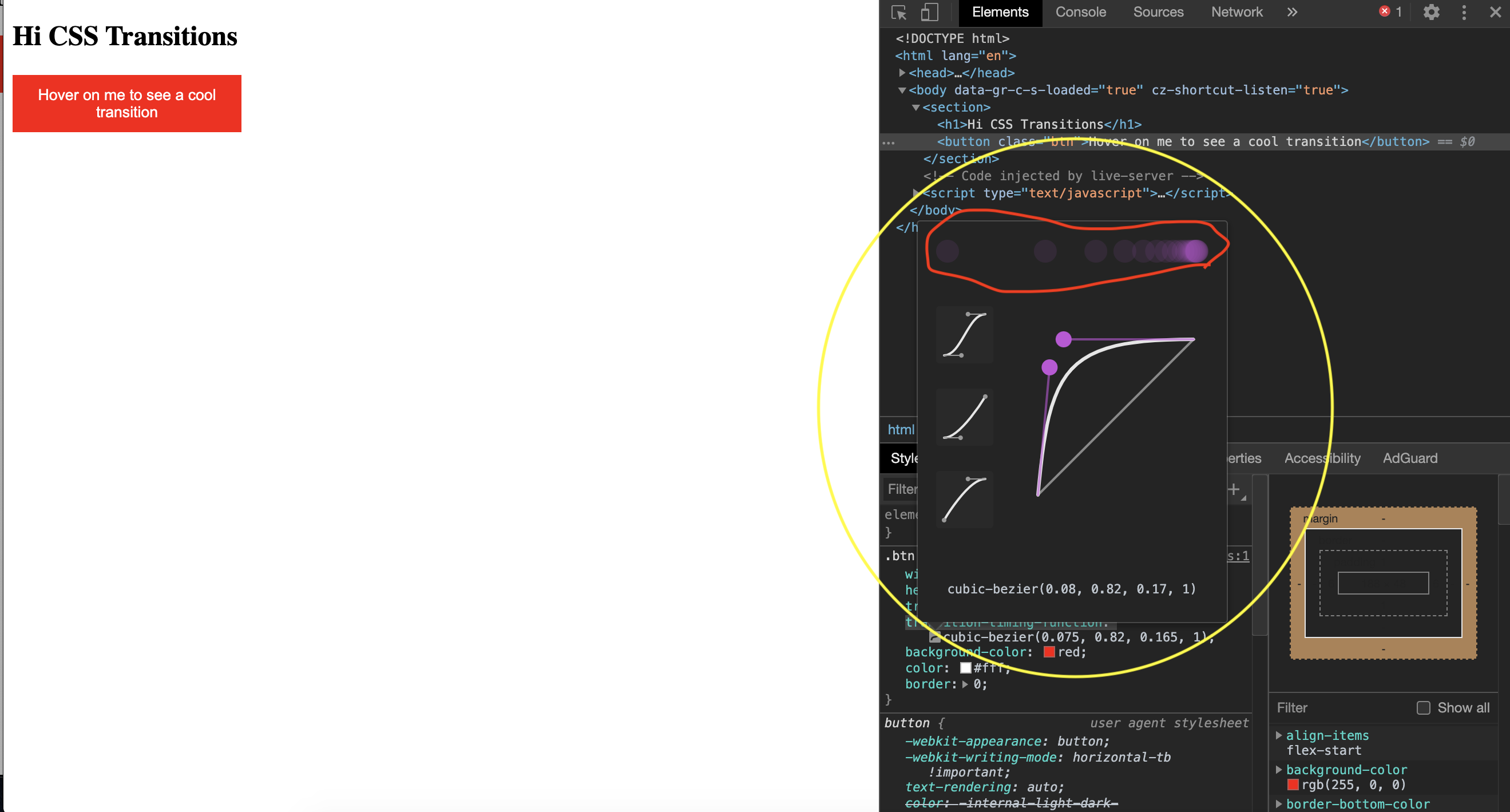
Moving the two control points updates the (n,n,n,n) values and shows a visual representation of the easing, which helps when you have a specific effect in mind.
Transition Delay
The transition-delay property sets how long to wait before the transition starts. This is distinct from transition-duration, which measures the effect's run time:
.btn {
  width: 200px;
  height: 50px;
  transition-property: width;
  transition-duration: 2s;
  transition-timing-function: cubic-bezier(0.075, 0.82, 0.165, 1);
  transition-delay: 5s;
  background-color: red;
  color: #fff;
  border: 0;
}
In the browser, you'll notice a pause before the width begins changing—that's the delay in action.
The Shorthand transition Property
Writing each sub-property individually gets verbose. The shorthand transition accepts them all in order:
{
  transition: a b c d;
}
Where a is transition-property, b is transition-duration, c is transition-timing-function, and d is transition-delay. The existing example can be rewritten as:
// from
.btn {
  width: 200px;
  height: 50px;
  transition-property: width;
  transition-duration: 2s;
  transition-timing-function: cubic-bezier(0.075, 0.82, 0.165, 1);
  transition-delay: 1s;
  background-color: red;
  color: #fff;
  border: 0;
}

// to
.btn {
  width: 200px;
  height: 50px;
  transition: width 2s cubic-bezier(0.075, 0.82, 0.165, 1) 1s;
  background-color: red;
  color: #fff;
  border: 0;
}
This produces the same effect as the longhand version.
Individual Element Transitions In Vue
Vue provides a built-in transition component that you wrap around a single element or component. It works in four scenarios: conditional rendering via v-if, conditional display via v-show, dynamic components, and component root nodes.
Consider a simple page that toggles between two paragraphs with a button:
<template>
  <div>
    <p v-if="show">Now you see me!</p>
    <p v-else>Now you don't!</p>
    <button @click="show = !show">click me</button>
  </div>
</template>
<script>
export default {
 data() {
   return {
     show: true
   }
 }
}
</script>
<style>
</style>
After importing this into App.vue, the visible text changes instantly when the button is clicked:
<template>
  <div id="app">
    <Index />
  </div>
</template>
<script>
import Index from "./components/index.vue";
export default {
  name: 'App',
  components: {
    Index
  }
}
</script>


To animate this switch, wrap both paragraphs in the transition component. The component accepts a name prop, which maps to the CSS classes Vue will look for:
<template>
  <div>
    <transition name="fade">
      <p v-if="show">Now you see me!</p>
      <p v-else>Now you don't!</p>
    </transition>
    <button @click="show = !show">click me</button>
  </div>
</template>
One requirement: when transitioning between two elements of the same tag, each must have a unique key attribute for the transition to trigger:
<template>
  <div>
    <transition name="fade">
      <p v-if="show" key="visible">Now you see me!</p>
      <p v-else key="notVisible">Now you don't!</p>
    </transition>
    <button @click="show = !show">click me</button>
  </div>
</template>
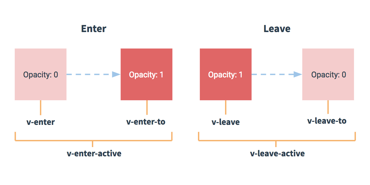
Vue applies six transition classes to elements inside transition, each corresponding to a state in the enter/leave cycle. The name prop is prefixed to these class names, replacing the default v prefix.
Enter States
The v-enter class defines the starting state for an element entering. It is applied the moment a condition like v-if becomes true, just before the element is rendered, and removed right after insertion. With a name of fade, this becomes fade-enter:
<style>
p {
  color: green;
}

.fade-enter{
  color: red;
  transform: translateY(20px);
}
</style>
On its own, v-enter produces little or no visible animation. You also need v-enter-active, which represents the entire entering phase. This class is added just before the element becomes visible and is removed when the transition finishes. It is where the CSS transition property lives, along with its duration, timing function, and delay:
.fade-enter-active {
  transition: transform .3s cubic-bezier(1.0, 0.5, 0.8, 1.0), color .5s cubic-bezier(1.0, 0.5, 0.8, 1.0);
}
With both classes in place, clicking the button animates the color and vertical position of the incoming text. The departing element, however, still vanishes abruptly because no leave transition is defined yet.
Leave States
The v-leave-active class covers the full period during which an element goes from visible to hidden. It is attached when the leave triggers and removed when the transition ends. Like its enter counterpart, it holds the CSS transition rules:
.fade-leave-active {
  transition: transform 1s cubic-bezier(1.0, 0.5, 0.8, 1.0), color 1s cubic-bezier(1.0, 0.5, 0.8, 1.0);
}
Without an accompanying v-leave-to class, the element waits roughly 2 seconds before disappearing — Vue is expecting the final leave class to finish the job. The v-leave-to class marks the end state of the leave transition. It is added a frame after the leave starts and removed when the animation completes:
.fade-leave-to {
  transform: translateX(100px);
  color: cyan;
}
The visual result is that leaving elements slide to the right while their color shifts.
The following diagram summarizes the full enter and leave lifecycle:
Controlling Transition Order
The default behavior renders enter and leave transitions simultaneously, which can feel abrupt. The mode prop on the transition component changes the sequencing:
in-out— the new element transitions in first, then the current element leaves.out-in— the current element leaves first, then the new element enters.
<template>
  <div>
    <transition name="fade" appear mode="out-in">
      <p v-if="show" key="visible">Now you see me!</p>
      <p v-else key="notVisible">Now you don't!</p>
    </transition>
    <button @click="transitionMe">click me</button>
  </div>
</template>
Adding mode="out-in" makes the paragraphs swap cleanly, one leaving completely before the next enters. Switching the mode value reverses the order of operations.
Animating Lists With transition-group
The transition component renders only one element at a time. Using it with a v-for list produces a console error:
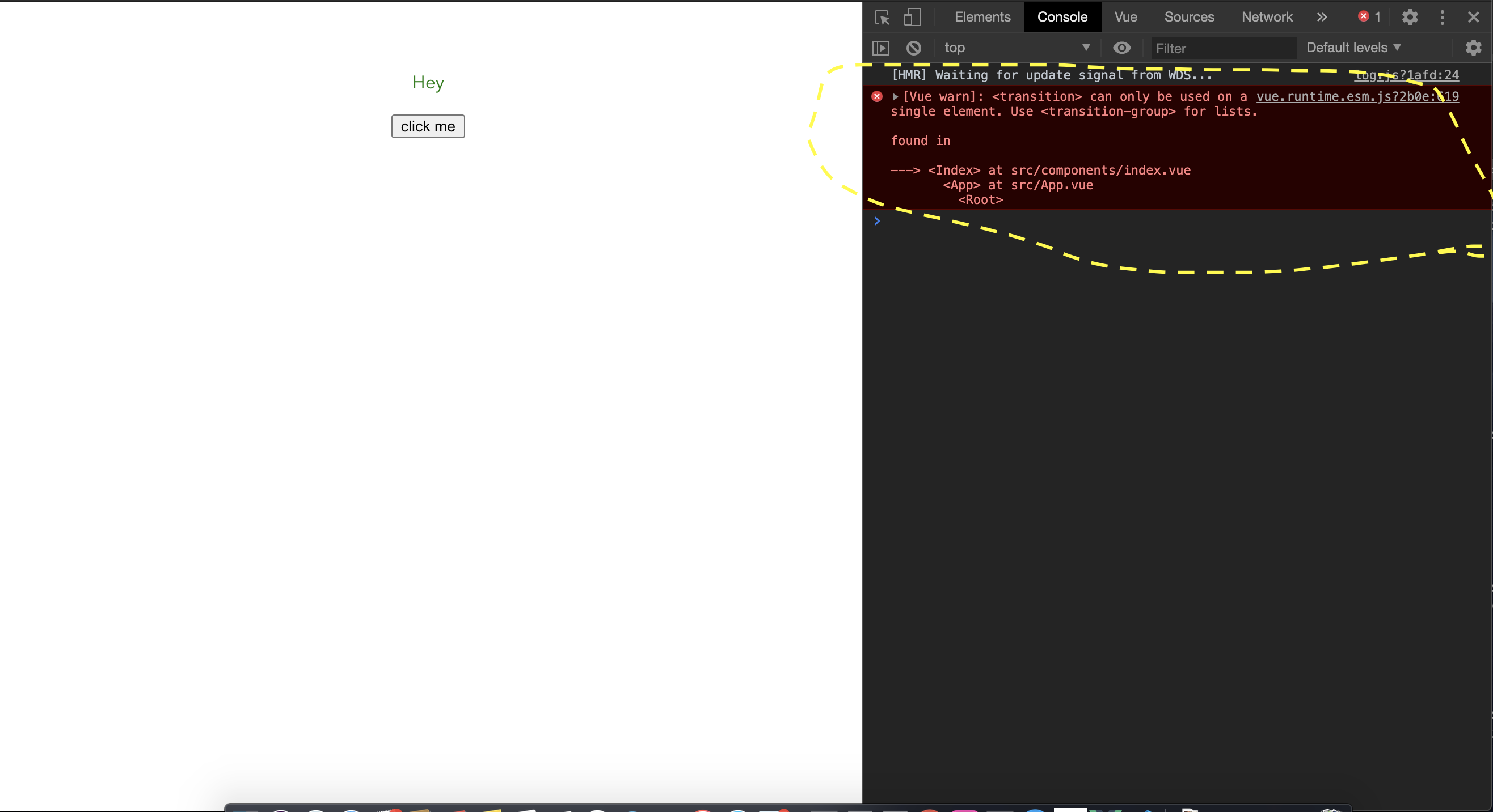
For multiple simultaneous elements, Vue provides transition-group. Key differences from transition:
- Every child element must carry a unique
keyattribute. - The
modeprop is unnecessary since several elements render concurrently. - A
spanis the default rendered tag, overridable via thetagprop.
Here is a list page rendering an array of users:
    <template>
  <div>
    <h1>List/Group Transition</h1>
    <ul>
      <li v-for="user in users" :key="user.id">
        {{user.name}}
        <button>Remove</button>
      </li>
    </ul>
  </div>
</template>
<script>
export default {
  data() {
    return {
      users: [
        {
          name: "Vuejs",
          id: 1
        },
        {
          name: "Vuex",
          id: 2
        },
        {
          name: "Router",
          id: 3
        }
      ]
    };
  }
};
</script>
<style>
</style>
Import this component into App.vue to display it:
<template>
  <div id="app">
    <Index />
    <listTransition />
  </div>
</template>
<script>
import Index from "./components/index.vue";
import listTransition from "./components/listTransition.vue";
export default {
  name: "App",
  components: {
    Index,
    listTransition
  }
};
</script>
Instead of wrapping the list in a ul tag, the transition-group sits in its place, with ul passed as the tag prop:
<template>
  <div>
    <h1>List/Group Transition</h1>
    <transition-group name="slide-fade" tag='ul'>
      <li v-for="user in users" :key="user.id">
        {{user.name}}
        <button>Remove</button>
      </li>
    </transition-group>
  </div>
</template>
<script>
export default {
  data() {
    return {
      users: [
        {
          name: "Vuejs",
          id: 1
        },
        {
          name: "Vuex",
          id: 2
        },
        {
          name: "Router",
          id: 3
        }
      ]
    };
  }
};
</script>
<style>
.slide-fade-enter-active {
  transition: transform 0.3s cubic-bezier(1, 0.5, 0.8, 1),
    color 0.5s cubic-bezier(1, 0.5, 0.8, 1);
}
.slide-fade-leave-active {
  transition: transform 1s cubic-bezier(1, 0.5, 0.8, 1),
    color 1s cubic-bezier(1, 0.5, 0.8, 1);
}
.slide-fade-enter {
  color: mediumblue;
  transform: translateY(20px);
}
.slide-fade-leave-to {
  transform: translateX(100px);
  color: cyan;
}
</style>
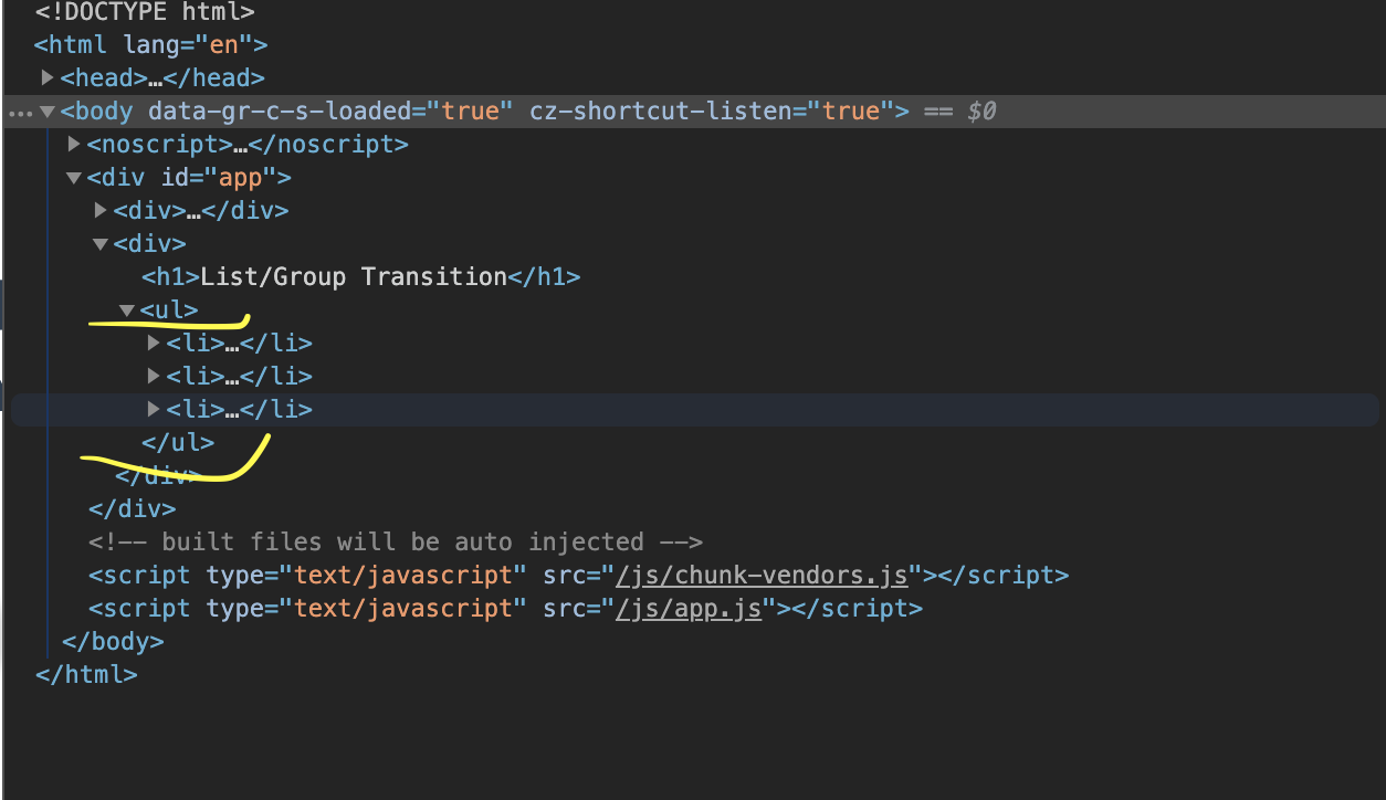
Inspecting the rendered output in developer tools confirms that the list is enclosed in the ul element specified in the tag prop:
With a name prop of slide-fade, the styles must follow that naming convention. Add a click handler to each user's button that calls removeUser with the user's id. The method filters that user out of the array and updates the component's data:
<template>
  <div>
    <h1>List/Group Transition</h1>
    <transition-group name="slide-fade" tag="ul">
      <li v-for="user in users" :key="user.id">
        {{user.name}}
        <button @click="removeUser(user.id)">Remove</button>
      </li>
    </transition-group>
  </div>
</template>
<script>
export default {
  // ...
  methods: {
    removeUser(id) {
      let users = this.users.filter(user => user.id !== id);
      this.users = users;
    }
  }
};
</script>
When a button is clicked, the corresponding user fades and slides out of the list smoothly.
Page and Layout Transitions in Nuxt
Nuxt.js handles transitions differently than plain Vue. Instead of manually wrapping components in a <transition>, Nuxt injects the component automatically. You only need to configure the transition behavior per page, globally, or per layout.
Per-Page Transitions
For a single page, add a transition property to the component’s <script> section. This can be a string, a function, or an object. The object accepts standard options including name, mode, and css. If no name is supplied, Nuxt falls back to the default page class prefix.
In the example below, transition.vue defines a fade-out-in animation for navigation to this route:
<template>
  <div>
    <p>
      Lorem ipsum dolor sit amet consectetur adipisicing elit. Labore libero
      odio, asperiores debitis harum ipsa neque cum nulla incidunt explicabo ut
      eaque placeat qui, quis voluptas. Aut necessitatibus aliquam veritatis.
    </p>
    <nuxt-link to="/">home</nuxt-link>
  </div>
</template>
<script>
export default {
  transition: {
    name: "fade",
    mode: "out-in"
  },
  data() {
    return {
      show: true
    };
  }
};
</script>
<style>
p {
  color: green;
}
.fade-enter-active {
  transition: transform 0.3s cubic-bezier(1, 0.5, 0.8, 1),
    color 0.5s cubic-bezier(1, 0.5, 0.8, 1);
}
.fade-leave-active {
  transition: transform 1s cubic-bezier(1, 0.5, 0.8, 1),
    color 1s cubic-bezier(1, 0.5, 0.8, 1);
}
.fade-enter {
  color: mediumblue;
  transform: translateY(20px);
}
.fade-leave-to {
  transform: translateX(100px);
  color: cyan;
}
</style>
The template holds placeholder "lorem ipsum" content. The transition object sets name: "fade" and mode: "out-in", and the accompanying style block defines the CSS rules. Importantly, this transition only fires during client-side navigation—entering /transition directly in the URL will not trigger it. Adding a link from index.vue makes the effect visible:
<template>
  <div class="container">
    <div>
      // ..
      <nuxt-link to="/transition">next page</nuxt-link>
    </div>
  </div>
</template>
Clicking between the two routes produces a sliding transition on entry and exit.
Global pageTransition
A per-page config doesn’t scale when you want the same behavior everywhere. The pageTransition option in nuxt.config.js provides a global default.
In the following configuration, a custom stylesheet is loaded and transition settings are centralized:
export default {
    // ...
    /*
     ** Global CSS
     */
    css: [
        '~/assets/transition.css'
    ],
    pageTransition: {
        name: "fade",
        mode: "out-in"
    },
}
The linked CSS file (transition.css) holds the class-based rules for the transition:
.fade-enter-active {
    transition: transform 0.3s cubic-bezier(1, 0.5, 0.8, 1), color 0.5s cubic-bezier(1, 0.5, 0.8, 1);
}
.fade-leave-active {
    transition: transform 1s cubic-bezier(1, 1, 1, 1), color 1s cubic-bezier(1, 0.5, 0.8, 1);
}
.fade-enter {
    color: mediumblue;
    transform: translateY(20px);
}
.fade-leave-to {
    transform: translate3d(-500px, -300px 400px);
    color: cyan;
}
Once this is set, you can remove the transition config from transition.vue and still get the desired effect across all pages.
Layout-Based Transitions
layoutTransition works like pageTransition but keys off the layout rather than the page. The default transition name is layout. Configuring it in nuxt.config.js is similar:
export default {
    // ...
    /*
     ** Global CSS
     */
    css: [
        '~/assets/transition.css'
    ],
    layoutTransition: {
        name: "fade",
        mode: "out-in"
    },
}
For this to work, the transition name fade must match the layout’s name. Creating a layout file named newLayout.vue shows how this binding works:
<template>
  <!-- Your template -->
  <div>
    <h1>new layout</h1>
  </div>
</template>
<script>
export default {
  layout: "blog"
  // page component definitions
};
</script>
Where to Go Next
This covers CSS transitions and their application in Vue and Nuxt. Vue’s docs also detail related techniques worth exploring:
Further references include the MDN and W3Schools guides on CSS transitions, the Vue and Nuxt transition documentation, and a community write-up on page and layout transitions in Nuxt.



