

Conditional styles: the push for if()
Developers have wanted a way to apply styles based on a custom property value without reaching for JavaScript since custom properties reached reliable support around 2016. Early workarounds include Roman Komarov's "Conditions for CSS Variables" from that year and Ana Tudor's one-declaration switching technique; Lea Verou, a CSSWG member, compares the various approaches in her article "Inline conditionals in CSS, now?"
Style Queries can do the job today, but they carry a limitation beyond their browser support: the queried container itself cannot be styled, so the HTML needs an extra wrapper element in addition to the style query.
<div class="news-container" style="--variant: info">
  <p>Here is some good <strong>news</strong></p>
</div>
.news-container {
container-name: news-container;
}
@container news-container style(--variant: info) {
p {
color: blue;
border: 1px solid blue;
}
}What if() would look like
An if() function has been under discussion since 2018. On June 13 of this year — six years later — the CSSWG resolved to begin work on it. The draft is only just starting, and the feature is not expected in a browser for at least two years, per Lea's unofficial estimate; reliable production use will take longer still. For comparison, the CSS variables working draft began in 2012 and only saw wide browser support in 2016.
The syntax will likely borrow the ternary operator familiar from JavaScript and other languages:
if(a ? b : c)Here a is the custom property being checked and b and c are the conditional return values. Style checks would use an inline style(--my-property: value):
.forecast {
  background-color: if(style(--weather: clouds) ? var(--clouds-color): var(--default-color));
}
CSS doesn't use ?, and : means something else elsewhere in the language, but this is the form most people know, and it allows conditional chaining:
.forecast {
  background-color: if(
    style(--weather: clouds) ? var(--clouds-color):
    style(--weather: sunny) ? var(--sunny-color);
    style( --weather: rain) ? var(--rain-color): var(--default-color)
  );
}
Possible later additions
These likely won't make the initial release but show where if() could go:
- Other inline conditionals. Beyond
style(), an inlinemedia()query could test media features and an inlinesupport()query could test whether a user agent supports a given property.
.my-element {
  width: if(media(width > 1200px) ? var(--size-l): var(--size-m));
}- Conditionals inside other functions. Future drafts may allow ternaries within other functions without wrapping them in
if(), much as calculations can skipcalc()when insideclamp()orround().
Cross-document view transitions
The View Transition API arrived last year and allows seamless transitions between pages and states using vanilla HTML and CSS plus a little JavaScript — no components, frameworks or animation libraries. The first implementation was based on an experimental function defined by Chrome and covered only transitions between two states (single-page view transitions), not multi-page view transitions, the case developers most want.
The CSS View Transitions Module Level 2 fills that gap with out-of-the-box transitions between pages. It removes the need for a framework: instead of, say, React with a routing library, plain CSS and JavaScript suffice. There are complexity levels where the API may fall short, but for the many cases where page transitions are all that's wanted, it avoids the performance cost of adding a framework.
Opting in and snapshotting
Transitions fire on navigation between same-origin pages — clicking a link, submitting a form, or using the back and forward buttons. A search between same-origin pages, by contrast, won't trigger one. Both the departing and arriving pages must opt in with the @view-transition at-rule and the navigation property set to auto:
@view-transition {
  navigation: auto;
}
Once both pages opt in, the browser snapshots each and smoothly fades the "before" page into the "after" page. The effect is driven by a tree of pseudo-elements that persist through the transition and use CSS animations. Snapshots of elements sharing a unique view-transition-name are grouped, and the whole set is held in the ::view-transition pseudo-element, which acts like the :root of page transitions and groups all parts under one default animation:
::view-transition
├─ ::view-transition-group(name)
│  └─ ::view-transition-image-pair(name)
│     ├─ ::view-transition-old(name)
│     └─ ::view-transition-new(name)
├─ ::view-transition-group(name)
│  └─ ::view-transition-image-pair(name)
│     ├─ ::view-transition-old(name)
│     └─ ::view-transition-new(name)
└─ /* and so one... */
Each transition lives in a ::view-transition-group, which holds a ::view-transition-image-pair made of the old and new snapshots. A page can have any number of groups, each with such a pair. Selecting through ::view-transition lets one animation target every transition at once; for example, a sliding effect between the old and new snapshots:
@keyframes slide-from-right {
  from {
    transform: translateX(100vw);
  }
}

@keyframes slide-to-left {
  to {
    transform: translateX(-100vw);
  }
}

::view-transition-old(root) {
  animation: 300ms ease-in both slide-to-left;
}

::view-transition-new(root) {
  animation: 300ms ease-out both slide-from-right;
}
That slides the entire old page out to the left while the entire new page slides in from the right. The view-transition-name property lets specific elements skip that treatment: naming an element takes its snapshot into a separate ::view-transition-group, so it persists between pages while the rest moves from the old snapshot to the new one.
nav {
  view-transition-name: navigation;

  /*
    ::view-transition
    ├─ ::view-transition-group(navigation)
    │  └─ ::view-transition-image-pair(navigation)
    │     ├─ ::view-transition-old(navigation)
    │     └─ ::view-transition-new(navigation)
    └─ other groups...
  */
}
A live demo is available. At the time of writing, browser support is limited to Chromium browsers (Chrome, Edge, Opera). Looking further ahead, elements with different view-transition-name values could share a view-transition-class to style their animations in one place, and transitions can be customized with JavaScript to check which URL the page is transitioning from and animate accordingly.
Anchor positioning
Positioning one element relative to another looks like a no-brainer but in practice means juggling inset properties (top, bottom, left, right) with a series of magic numbers. A small tooltip that appears at the left of a hovered element might look like this in HTML:
<p class="text">
  Hover for a surprise
  <span class="tooltip">Surprise! I'm a tooltip</span>
</p>
…and, with current approaches, in CSS:
.text {
  position: relative;
}

.tooltip {
  position: absolute;
  display: none;

  /* vertical center */
  top: 50%;
  transform: translateY(-50%);

  /* move to the left */
  right: 100%;
  margin-right: 15px; */
}

.text:hover .tooltip {
  display: block;
}
Editing positioning and inset values isn't the end of the world, but it feels like there should be a simpler way. Such a tooltip is also fragile: if the screen is too small or the element too far left, the tooltip hides or overflows the screen edge.
Anchors and targets
CSS Anchor Positioning provides a more declarative model with two roles: an element acting as the anchor, and a target anchored to it. The anchor is created with the new anchor-name property, here applied to slightly changed markup:
<p>
  <span class="anchor">Hover for a surprise</span>
  <span class="tooltip">Surprise! I'm a tooltip</span>
</p>
The property takes a unique value, dashed-indent, much like a custom property:
.anchor {
  anchor-name: --tooltip;
}
The .tooltip is then tied to the anchor with the position-anchor property, under either fixed or absolute positioning:
.toolip {
  position: fixed;
  position-anchor: --tooltip;
}
At this point the tooltip sits on top of the anchor. The easiest way to move it is the new inset-area property. Picture the anchor at the center of a 3×3 grid; the tooltip is placed by giving it a row and a column:
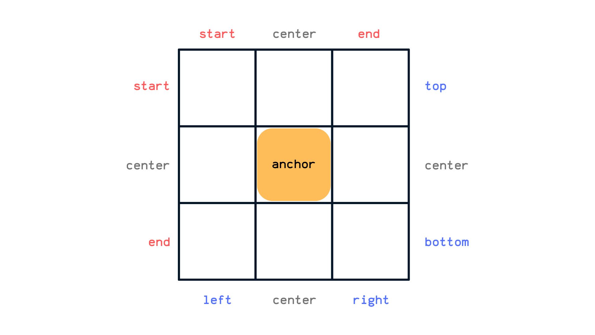
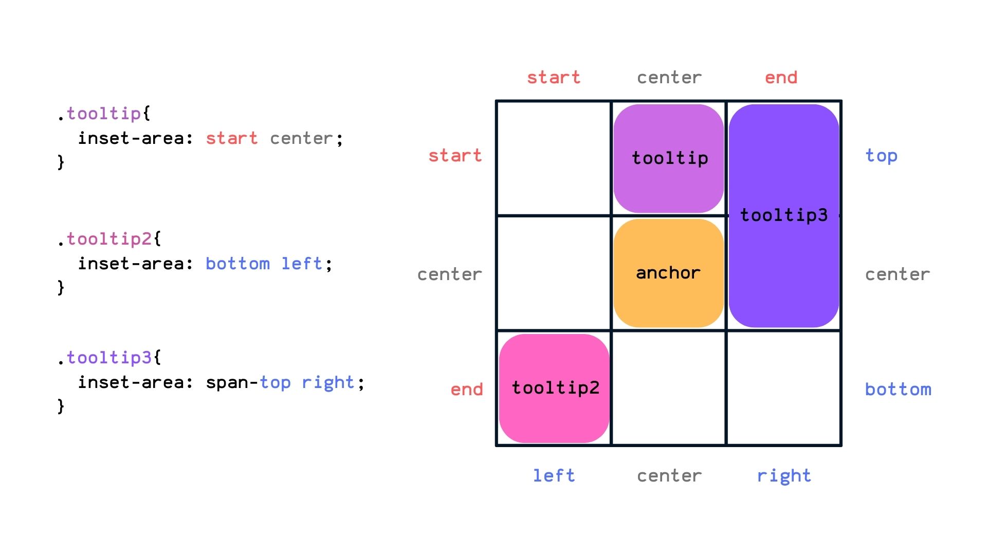
The property takes two values for the tooltip's row and column. It accepts physical values (left, right, top, bottom), logical values tied to the user's writing mode (start, end), and a shared center value. It also takes coordinate values such as x-start and y-end; all of these represent a region in the 3×3 grid.
.toolip {
  /* physical values */
  inset-area: top right;

  /* logical values */
  inset-area: start end;

  /* mix-n-match values! */
  inset-area: top end;
}
To span two grid regions, use a span- prefix — span-top places the tooltip across the top and center regions. Spanning an entire direction uses span-all:
Handling overflow with fallbacks
Overflow is handled with the position-try-options property in combination with an inset-area() function — note that inset-area the property and inset-area() the function are distinct. The property accepts a comma-separated list of fallback positions; each inset-area() function holds the same values the property accepts. When the tooltip goes off-screen, the next declared position is tried, and so on down the list:
.toolip {
  inset-area: top left;
  position-try-options: inset-area(top), inset-area(top right);
}
This takes some time to absorb. CSSWG member Miriam Suzanne discussed and experimented with anchor positioning alongside James Stuckey Weber in a video worth watching; Geoff Graham took notes on it for a shorter summary. Two further pieces are left out here for brevity: the anchor() function, which returns the computed position of an anchor's edge for finer control over a tooltip's inset properties, and the @try-position at-rule for defining custom positions to use with position-try-options.
A specification takes many hands
Not everything under active discussion made this roundup — masonry, for one. Specifications are not settled in one or two meetings; they come from the combined work of many authors, developers and user agents, on features we use today and others we will use later.
The interests of those doing the work are not always those of the trending conversation. if() dominates social media, but CSSWG member Emilio Cobos pointed out that letter-spacing is essentially flawed, with no simple fix compatible with both its CSS definition and its use in browsers — a subject that also touches on how turning normal properties into shorthands can be dangerous to a codebase. Details that look trivial are analyzed carefully and openly. Those interested in following or joining the work have several sources:




