

This is the second entry in a series of CSS-only sliders. The first covered a circular rotation; this one flips through a stack of Polaroid-style images. The markup is identical to the circular slider, and the CSS is close enough that the decorative border and box-shadow that give the images their Polaroid look are left as an exercise. The real work happens in the animation.
Stacking images as a grid
The HTML is the same as before:
<div class="gallery">
  <img src="" alt="">
  <img src="" alt="">
  <img src="" alt="">
  <img src="" alt="">
</div>
All the images are stacked by making the parent .gallery container a grid:
.gallery  {
  display: grid;
  width: 220px; /* controls the size */
}
.gallery > img {
  grid-area: 1 / 1;
  width: 100%;
  aspect-ratio: 1;
  object-fit: cover;
  border: 10px solid #f2f2f2;
  box-shadow: 0 0 4px #0007;
}
The stacking-order trick
Every image starts at z-index: 2, which places the last image at the top of the pile. The animation takes that top image, slides it right until the next image is revealed, drops its z-index, and slides it back into the deck — where, now sitting below the others, it remains at the bottom.
Applied across the whole stack with :nth-child(), the cycle is:
- Slide the last image (
N); imageN - 1becomes visible. - Slide image
N - 1; imageN - 2becomes visible. - Continue in the same order down to the first image.
- Slide the first image; image
Nis visible again.
That cycle is what makes the slider infinite without duplicating any images.
Timeline and keyframes
As in the circular slider, there is a single animation and per-image delays control sequencing. Starting with three images to keep the math visible: with a 6s duration and the first image beginning at 0s, the second starts at -2s and the third at -4s.

The animation has three phases: slide right, slide left, and hold still. The hold-until-the-end phase consumes two-thirds of the timeline (2*100%/3), leaving one-third to share between the two slide phases — 100%/6 each.
.gallery > img:nth-child(2) { animation-delay: -2s; } /* -1 * 6s / 3 */
.gallery > img:nth-child(3) { animation-delay: -4s; } /* -2 * 6s / 3 */
The keyframes look like this:
@keyframes slide {
  0%     { transform: translateX(0%); }
  16.67% { transform: translateX(120%); }
  33.34% { transform: translateX(0%); }
  100%   { transform: translateX(0%); }
}
The 120% translate is arbitrary but must exceed 100% so the image clears the rest of the pile with a little extra room.
The z-index must change after the image has slid off the deck but before it slides back — a near-instant step at that boundary, which is expressed here as two states at 16.66% and 16.67%:
@keyframes slide {
  0%     { transform: translateX(0%);   z-index: 2; }
  16.66% { transform: translateX(120%); z-index: 2; }
  16.67% { transform: translateX(120%); z-index: 1; } /* we update the z-order here */
  33.34% { transform: translateX(0%);   z-index: 1; }
  100%   { transform: translateX(0% );  z-index: 1; }
}
Why the stacking order breaks
Run that and the sliding works, but the pile order scrambles: the second image returns to the top before the third has finished blinking on top of it. The assumption that all images start at z-index: 2 is wrong. During the quiet phase, the z-index is actually 1. Sliding the third image and moving it from 2 down to 1 leaves it on top, because among equal z-index values the last in source order wins. Each subsequent image then jumps to the top as its animation restarts at z-index: 2.
Our eyes 👀 --> 3rd (2) | 2nd (2) | 1st (2)Our eyes 👀 --> 2nd (2) | 1st (2) | 3rd (1)Our eyes 👀 --> 1st (2) | 3rd (1) | 2nd (1)Our eyes 👀 --> 3rd (1) | 2nd (1) | 1st (1)Our eyes 👀 --> 3rd (2) | 2nd (1) | 1st (1)Our eyes 👀 --> 3rd (1) | 2nd (1) | 1st (1)Our eyes 👀 --> 2nd (2) | 3rd (1) | 1st (1)Our eyes 👀 --> 3rd (1) | 2nd (1) | 1st (1)Our eyes 👀 --> 1st(2) | 3rd (1) | 2nd (1)Correcting the reset
The fix is to reset the z-index earlier: bring the second image back to 2 two-thirds of the way through, before the first image slides away. Both then share the same value, but the third image stays on top because it comes later in the DOM — until it slides and drops to 1, landing under the pile.
Our eyes 👀 --> 3rd (2) | 2nd (1) | 1st (1)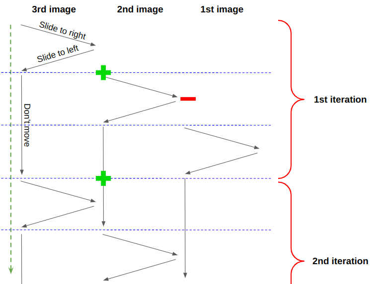
@keyframes slide {
  0%     { transform: translateX(0%);   z-index: 2; }
  16.66% { transform: translateX(120%); z-index: 2; }
  16.67% { transform: translateX(120%); z-index: 1; } /* we update the z-order here */
  33.34% { transform: translateX(0%);   z-index: 1; }
  66.33% { transform: translateX(0%);   z-index: 1; }
  66.34% { transform: translateX(0%);   z-index: 2; } /* and also here */
  100%   { transform: translateX(0%);   z-index: 2; }
}
A special case for the last image
One case remains: the transition from the first image back to the last in the DOM order. Because the last image outranks every other image in source order, it jumps on top before the first image slides. The fix is a dedicated keyframe animation applied only to the last image that resets its z-index 5/6 of the way through rather than two-thirds — after the first image has left the pile, so the jump is never seen.
Our eyes 👀 --> 1st (2) | 3rd (1) | 2nd (1)@keyframes slide-last {
0% { transform: translateX(0%); z-index: 2;}
16.66% { transform: translateX(120%); z-index: 2; }
16.67% { transform: translateX(120%); z-index: 1; } /* we update the z-order here */
33.34% { transform: translateX(0%); z-index: 1; }
83.33% { transform: translateX(0%); z-index: 1; }
83.34% { transform: translateX(0%); z-index: 2; } /* and also here */
100% { transform: translateX(0%); z-index: 2; }
}.gallery > img {
animation: slide 6s infinite;
}
.gallery > img:last-child {
animation-name: slide-last;
}
.gallery > img:nth-child(2) { animation-delay: -2s; }
.gallery > img:nth-child(3) { animation-delay: -4s; }
@keyframes slide {
0% { transform: translateX(0%); z-index: 2; }
16.66% { transform: translateX(120%); z-index: 2; }
16.67% { transform: translateX(120%); z-index: 1; }
33.34% { transform: translateX(0%); z-index: 1; }
66.33% { transform: translateX(0%); z-index: 1; }
66.34% { transform: translateX(0%); z-index: 2; }
100% { transform: translateX(0%); z-index: 2; }
}
@keyframes slide-last {
0% { transform: translateX(0%); z-index: 2; }
16.66% { transform: translateX(120%); z-index: 2; }
16.67% { transform: translateX(120%); z-index: 1; }
33.34% { transform: translateX(0%); z-index: 1; }
83.33% { transform: translateX(0%); z-index: 1; }
83.34% { transform: translateX(0%); z-index: 2; }
100% { transform: translateX(0%); z-index: 2; }
}Scaling and optimizing for N images
The animation splits cleanly into two: one for the sliding transform, and one for the z-index steps using steps(1), which forces an abrupt change rather than the smooth interpolation used for motion.
.gallery > img {
  z-index: 2;
  animation:
    slide 6s infinite,
    z-order 6s infinite steps(1);
}
.gallery > img:last-child {
  animation-name: slide, z-order-last;
}
.gallery > img:nth-child(2) { animation-delay: -2s; }
.gallery > img:nth-child(3) { animation-delay: -4s; }

@keyframes slide {
  16.67% { transform: translateX(120%); }
  33.33% { transform: translateX(0%); }
}
@keyframes z-order {
  16.67%,
  33.33% { z-index: 1; }
  66.33% { z-index: 2; }
}
@keyframes z-order-last {
  16.67%,
  33.33% { z-index: 1; }
  83.33% { z-index: 2; }
}
@for $i from 2 to ($n + 1) {
.gallery > img:nth-child(#{$i}) {
animation-delay: calc(#{(1 - $i)/$n}*6s);
}
}Two things have to scale with N: the delays and the keyframe percentages. Since N images each slide once per animation, the slide-right and slide-left phases are 100%/N each, the image fully clears the pile at (100%/N)/2, and it returns at 100%/N. The hold phase occupies the remaining time taken by the other N - 1 images, so it matches (N - 1) times the slide phases.

@keyframes slide {
  16.67% { transform: translateX(120%); }
  33.33% { transform: translateX(0%); }
}
@keyframes slide {
#{50/$n}% { transform: translateX(120%); }
#{100/$n}% { transform: translateX(0%); }
}With N set to 3, this yields 16.67% and 33.33% for three images, preserving the earlier behavior.
@keyframes z-order {
  #{50/$n}%,
  #{100/$n}% { z-index: 1; }
  66.33% { z-index: 2; }
}
The reset point at 66.33% also has to be computed. It happens at 100% - 100%/N — the moment the next image begins to slide — and for the last-image animation it moves a bit later still, so it fires only after the first image has left the pile:
@keyframes z-order {
  #{50/$n}%,
  #{100/$n}% { z-index: 1; }
  #{100 - 100/$n}% { z-index: 2; }
}
@keyframes z-order-last {
#{50/$n}%,
#{100/$n}% { z-index: 1; }
#{100 - 50/$n}% { z-index: 2; }
}Rotation and final notes
With five images in place, a small random rotation makes the stack look more like scattered Polaroids. Appending rotate(var(--r)) to the transform, with a random angle assigned to --r inside the loop, is enough.
@for $i from 1 to ($n + 1) {
  .gallery > img:nth-child(#{$i}) {
    --r: #{(-20 + random(40))*1deg}; /* a random angle between -20deg and 20deg */
  }
}
The rotation causes occasional glitches where an image briefly appears at the back of the stack, but it does not affect how the sequence works. As with the circular slider, there is no image duplication and no JavaScript: the cycling emerges entirely from z-index and animation timing.




