

The same markup from the first installment still applies: a container holding a list of images.
<div class="gallery">
  <img src="..." alt="...">
  <img src="..." alt="...">
  <img src="..." alt="...">
  <img src="..." alt="...">
  <!-- as many times as we want -->
</div>
Nesting an image inside the grid
The grids explored earlier were conventional symmetrical arrangements dressed up with masked shapes. A more interesting option is to nest a fifth image at the center of a 2×2 layout. Start with four images in two rows and two columns:
.gallery {
  --s: 200px; /* controls the image size */
  --g: 10px; /* controls the gap between images */

  display: grid;
  gap: var(--g);
  grid-template-columns: repeat(2, auto);
}
.gallery > img {
  width: var(--s);
  aspect-ratio: 1;
  object-fit: cover;
}
Space for the nested image comes from clipping the corner of each surrounding image at a 90deg angle. A conic-gradient mask (the angled cut-out technique from the earlier article on cutting corners) handles this, and it fits better than clip-path here: every image shares one configuration, and only a rotation stored in the --_a variable differs. The mask cuts from the inside rather than the outside edges.
.gallery > img {
   mask: conic-gradient(from var(--_a), #0000 90deg, #000 0);
}
.gallery > img:nth-child(1) { --_a: 90deg; }
.gallery > img:nth-child(2) { --_a: 180deg; }
.gallery > img:nth-child(3) { --_a: 0deg; }
.gallery > img:nth-child(4) { --_a:-90deg; }
Add a fifth image element to the HTML:
<div class="gallery">
  <img src="..." alt="...">
  <img src="..." alt="...">
  <img src="..." alt="...">
  <img src="..." alt="...">
  <img src="..." alt="...">
</div>
Then position it absolutely. The inset property places it centrally in a single declaration — with the image size held in --s and the container at 100%, the distance from each edge is (100% - var(--s))/2.

The nested image also gets clip-path, which exists purely to keep the gap consistent. Without it, the spacing around the fifth image would not match the spacing between the others.
Cutting a border into the top image instead would be simpler and background-matching borders are a reasonable choice when the background is known. But transparency here is real rather than simulated, so the component works regardless of the environment it sits in.
Switching to a circular cut-out
Making the nested image a circle takes only border-radius. The surrounding images need a circular cut-out in return, and this time a radial-gradient() replaces the conic gradient for the smooth rounded version.
.gallery > img {
  mask:
    radial-gradient(farthest-side at var(--_a),
      #0000 calc(50% + var(--g)/2), #000 calc(51% + var(--g)/2));
}
.gallery > img:nth-child(1) { --_a: calc(100% + var(--g)/2) calc(100% + var(--g)/2); }
.gallery > img:nth-child(2) { --_a: calc(0%   - var(--g)/2) calc(100% + var(--g)/2); }
.gallery > img:nth-child(3) { --_a: calc(100% + var(--g)/2) calc(0%   - var(--g)/2); }
.gallery > img:nth-child(4) { --_a: calc(0%   - var(--g)/2) calc(0%   - var(--g)/2); }
The configuration is identical to the previous example; only the center point moves per image. The code also accounts for the gap so that all the centers land on the grid’s midpoint and the combined cut-outs form a continuous circle.

Animating the cut-out on hover
On hover, the nested image grows and everything else follows. Scaling the image is simple, but gradients cannot normally be animated. The workaround is a font-size hack: the gradient includes 1em, and since em tracks the parent’s font-size, changing the .gallery font-size from 0 to a value animates the gradient, enlarging the cut-out in step with the growing image.
mask:
    radial-gradient(farthest-side at var(--_a),
      #0000 calc(50% + var(--g)/2 + 1em), #000 calc(51% + var(--g)/2 + 1em));
.gallery {
--s: 200px; /* controls the image size */
--g: 10px; /* controls the gaps between images */
font-size: 0; /* initially we have 1em = 0 */
transition: .5s;
}
/* we increase the cut-out by 1em */
.gallery > img {
mask:
radial-gradient(farthest-side at var(--_a),
#0000 calc(50% + var(--g)/2 + 1em), #000 calc(51% + var(--g)/2 + 1em));
}
/* we increase the size by 2em */
.gallery > img:nth-child(5) {
width: calc(var(--s) + 2em);
}
/* on hover 1em = S/5 */
.gallery:hover {
font-size: calc(var(--s) / 5);
}Custom properties registered with @property can solve this same problem, though browser support was still incomplete at the time of writing. The font-size technique comes from @SelenIT2, found while working through a Twitter challenge.
A rhombus variant keeps the same structure; only the gradient math changes — dissection is left as an exercise.
A circular grid that expands on hover
Combining these techniques across the whole grid produces circular images where the hovered one expands to cover the rest. Since the structure is unchanged, the focus is the shape and the hover effect. The circle() function of clip-path does the clipping:

Each image moves its circle center to 70% 70%:
.gallery > img:hover {
  --_c: 50%; /* same as "50% at 50% 50%" */
}
.gallery > img:nth-child(1) {
  clip-path: circle(var(--_c, 55% at 70% 70%));
}
.gallery > img:nth-child(2) {
  clip-path: circle(var(--_c, 55% at 30% 70%));
}
.gallery > img:nth-child(3) {
  clip-path: circle(var(--_c, 55% at 70% 30%));
}
.gallery > img:nth-child(4) {
  clip-path: circle(var(--_c, 55% at 30% 30%));
}
The clip-path values sit as fallbacks inside var(), so hovering only needs a new value for the --_c variable. With circle(), the center defaults to 50% 50%, which is why 50% alone suffices instead of 50% at 50% 50%. On hover the image scales up to the full grid size, and a higher z-index puts it on top of the stacking context.
.gallery {
  --s: 200px; /* controls the image size */
  --g: 8px;   /* controls the gap between images */

  display: grid;
  grid: auto-flow var(--s) / repeat(2, var(--s));
  gap: var(--g);
}

.gallery > img {
  width: 100%;
  aspect-ratio: 1;
  cursor: pointer;
  z-index: 0;
  transition: .25s, z-index 0s .25s;
}
.gallery > img:hover {
  --_c: 50%; /* change the center point on hover */
  width: calc(200% + var(--g));
  z-index: 1;
  transition: .4s, z-index 0s;
}

.gallery > img:nth-child(1){
  clip-path: circle(var(--_c, 55% at 70% 70%));
  place-self: start;
}
.gallery > img:nth-child(2){
  clip-path: circle(var(--_c, 55% at 30% 70%));
  place-self: start end;
}
.gallery > img:nth-child(3){
  clip-path: circle(var(--_c, 55% at 70% 30%));
  place-self: end start;
}
.gallery > img:nth-child(4){
  clip-path: circle(var(--_c, 55% at 30% 30%));
  place-self: end;
}
What's going on with
place-self, and why does each image get a different value?
The same problem showed up with the puzzle-piece grid in part one: enlarged images overflowed their cells in the wrong direction. Enlarging here means:
- the first image overflows the bottom-right edge (the default),
- the second overflows bottom-left,
- the third overflows top-right, and
- the fourth overflows top-left.
place-self — shorthand for justify-self and align-self, with a single value applying to both axes — puts each one in the right place.

Expanding panels, now with shapes
The zoom effect from the earlier grid-zooming article had a special case: classic expanding panels with a single row in a full-width container. That case pairs well with shapes. With one row, the --n and --m variables for row and column counts are no longer needed; grid-auto-flow: column generates columns as images are added, and the container gets a fixed height at full width by default.
Clip the images into a slanted shape:
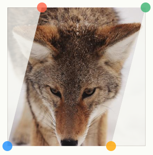
clip-path: polygon(S 0%, 100% 0%, (100% - S) 100%, 0% 100%);Each image still sits fully inside its cell, leaving too much space between them. The fix is min-width: calc(100% + var(--s)), with the new --s variable controlling the shape, so the images overlap.

The first and last images then need attention: the first loses the slant on its left side and the last on its right, each with its own clip-path, and their overflow must be corrected too — right-side overflow for the first image, left-side for the last.
.gallery > img:first-child {
  min-width: calc(100% + var(--s)/2);
  place-self: start;
  clip-path: polygon(0 0,100% 0,calc(100% - var(--s)) 100%,0 100%);
}
.gallery > img:last-child {
  min-width: calc(100% + var(--s)/2);
  place-self: end;
  clip-path: polygon(var(--s) 0,100% 0,100% 100%,0 100%);
}
The result expands as needed: any number of images works, and one value controls the shape. A flexbox implementation of the same layout is also possible, since this is a single row of elements.
Zig-zags and rounded sides
Replacing clip-path with mask turns the slanted panels into a zig-zag, using the zig-zag border technique and generator from the masks article. The delicate part is alignment: every :nth-child(odd) image needs an offset, held in --_p, which falls back to 0% and equals --_s on the odd ones.
.gallery > img {
  mask:
    conic-gradient(from -135deg at right, #0000, #000 1deg 89deg, #0000 90deg)
      100% calc(50% + var(--_p, 0%))/51% calc(2*var(--s)) repeat-y,
    conic-gradient(from   45deg at left,  #0000, #000 1deg 89deg, #0000 90deg)
      0%   calc(50% + var(--_p, 0%))/51% calc(2*var(--s)) repeat-y;
}
/* we add an offset to the odd elements */
.gallery > img:nth-child(odd) {
  --_p: var(--s);
}
.gallery > img:first-child {
  mask:
    conic-gradient(from -135deg at right, #0000, #000 1deg 89deg, #0000 90deg)
      0 calc(50% + var(--_p, 0%))/100% calc(2*var(--s));
}
.gallery > img:last-child {
  mask:
    conic-gradient(from 45deg at left, #0000, #000 1deg 89deg, #0000 90deg)
      0 calc(50% + var(--_p, 0%)) /100% calc(2*var(--s));
}
As before, the first and last images take a different mask — zig-zag on the right of the first, on the left of the last.
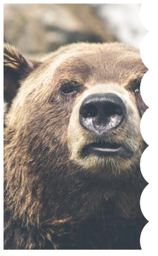
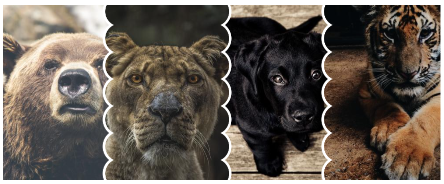
Rounded sides reuse the same structure, masks and overlap logic, with no new tricks. The difference is that odd and even images need different masks rather than an offset. The two:
mask:
  linear-gradient(-90deg,#0000 calc(2*var(--s)),#000 0) var(--s),
  radial-gradient(var(--s),#000 98%,#0000) 50% / calc(2*var(--s)) calc(1.8*var(--s)) space repeat;
mask:
  radial-gradient(calc(var(--s) + var(--g)) at calc(var(--s) + var(--g)) 50%,#0000 98% ,#000)
  calc(50% - var(--s) - var(--g)) / 100% calc(1.8*var(--s))
The second mask was adjusted to include the gap, --g, creating the space between images. The first image always gets the same mask to straighten its left edge:
.gallery > img:first-child {
  mask:
    radial-gradient(calc(var(--s) + var(--g)) at right, #0000 98%, #000) 50% / 100% calc(1.8 * var(--s));
}
The last image depends on its position, so odd and even are handled separately:
.gallery > img:last-child:nth-child(even) {
  mask:
    linear-gradient(to right,#0000 var(--s),#000 0),
    radial-gradient(var(--s),#000 98%,#0000) left / calc(2*var(--s)) calc(1.8*var(--s)) repeat-y
}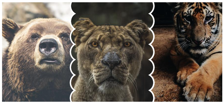
.gallery > img:last-child:nth-child(odd) {
  mask:
    radial-gradient(calc(var(--s) + var(--g)) at left,#0000 98%,#000) 50% / 100% calc(1.8*var(--s))
}
The recurring ingredients
Three layouts, but the recipe never changes:
- the structure of the zoom effect,
- a mask or clip-path that draws the shape,
- a separate configuration for odd elements when a clean overlap requires it,
- a dedicated configuration for the first and last image so the shape appears on one side only.
Across every layout, the HTML stays untouched beyond the number of images — just a list.
As a final example, a hover-driven "versus" between two anime characters shows what the same pieces can do; building something similar is a good exercise.




