
Generators for the CSS Toolbelt
CSS generators have become an essential part of modern frontend workflows, saving time on everything from shadows to color scales. Temani Afif's collection of 10 generators is a strong starting point, covering tooltips, ribbon shapes, waves, starbursts, gradients, and clipped corners. Afif has documented the techniques behind these tools in articles he's written for Smashing Magazine, making it easy to understand how the generated code works.

Layered Shadows Without the Guesswork
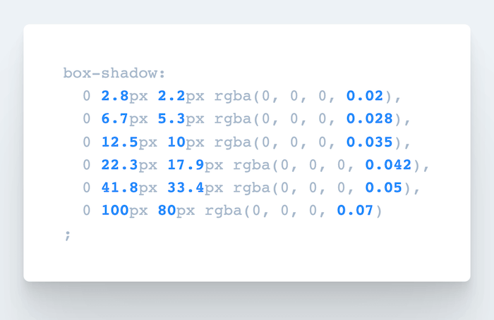
Writing smooth, layered box-shadow values by hand is tedious. SmoothShadow solves that problem by letting you design the effect visually with individual easing curves for alpha, offset, and blur. The tool was inspired by Tobias Ahlin Bjerrome's article on layered shadows and was built by Philipp Brumm, who also released it as a Figma plugin.

Going Beyond Basic Border-Radius
Most developers reach for simple values like 8px or 16px when setting border-radius, but eight-value syntax can produce organic, curved shapes. The fancy-border-radius generator from 9elements visualizes how overlapping ellipses combine into a final shape. It's also available as a CLI tool for local use.
Easing Curves and Keyframe Timelines
When an animation feels off, the culprit is often the easing curve. Lea Verou's cubic-bezier tool lets you preview and compare animations, slow them down, and adjust curves visually before copying out the CSS.
For more complex work, Keyframes.app offers a visual timeline editor that works like video-editing software. You can add steps, adjust sizing and position, apply transforms and color changes, then export the result as CSS. For debugging existing animations, the Animation panel in Chrome and its Firefox equivalent remain the go-to tools.
Easing Gradients for Smoother Transitions
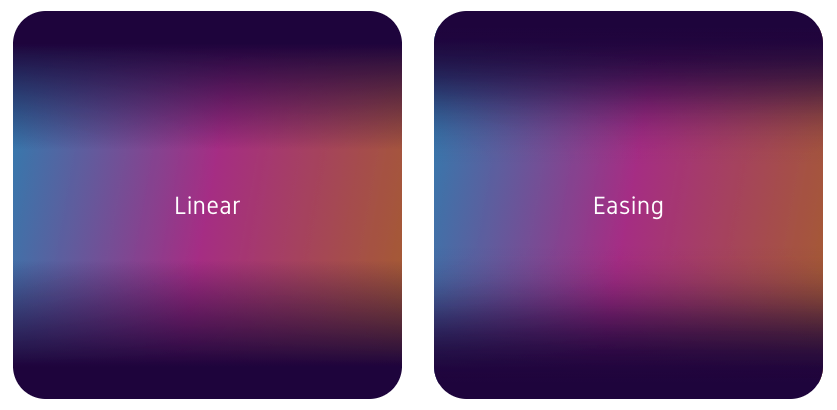
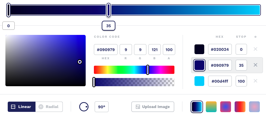
Standard linear gradients transition evenly from one color to the next, but that creates hard edges at the start and end points. Andreas Larsen's Easing Gradients Editor applies easing functions to color stops for a smoother result. The editor includes a color picker, though it doesn't yet accept HEX values directly. Versions are available as a Sketch plugin and a PostCSS plugin.
Color Palettes for Data Visualization
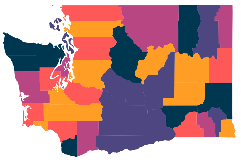
Charts and maps come with their own color requirements: the palette needs colors that remain visually equidistant so users can tell categories apart at a glance. The LearnUI Data Color Picker builds such palettes — it's easier to distinguish yellow from orange than two similar blues. You select the number of colors, the background (light or dark), and the scale type: default, single hue, or divergent. Export options include hex values and SVG for use in Sketch, Figma, or Adobe XD.
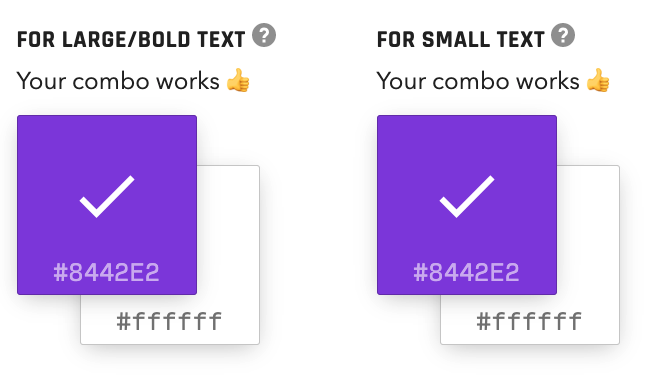
LearnUI also offers an accessible color generator and a gradient generator with configurable types, interpolation, angle, and easing.
A Festival of Small Frontend Utilities
Omatsuri — Japanese for "festival" — collects open-source browser tools for routine tasks. The site by Vitaly Rtishchev and Vlad Shilov includes a triangle generator, color shades and gradient generators, page dividers, an SVG compressor, an SVG → JSX converter, a fake data generator, CSS cursors, and keyboard event codes. The full source code is available on GitHub.
Contrast Overlays Made Simple
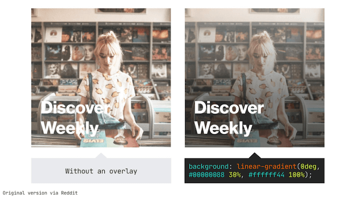
Text over background images often suffers from poor readability. A common fix is a translucent linear-gradient overlay, but setting the right opacity typically requires trial and error. The Optimal Overlay Finder removes the guesswork: upload an image, enter the text, choose overlay and text colors, and the tool returns both a preview and the optimal opacity value.
Color Picking in OKLCH
The oklch() color function works within the P3 color space and offers advantages over rgb() and hsl(). But its "chroma" component is less intuitive than lightness or hue. The OKLCH Color Picker & Converter from the Evil Martians team clarifies the model through interactive visualizations that map the boundaries of the color space.

Palette and Gradient Workhorses
Coolors.co remains a practical palette generator with a few notable extras: palettes built from photos, color blindness testing, and fine-grained controls for hue, saturation, brightness, and temperature. It also features trending palettes, a gradient maker between two colors, and CSS export. The tool ships as an iOS app, an Adobe add-on, and a Chrome extension.
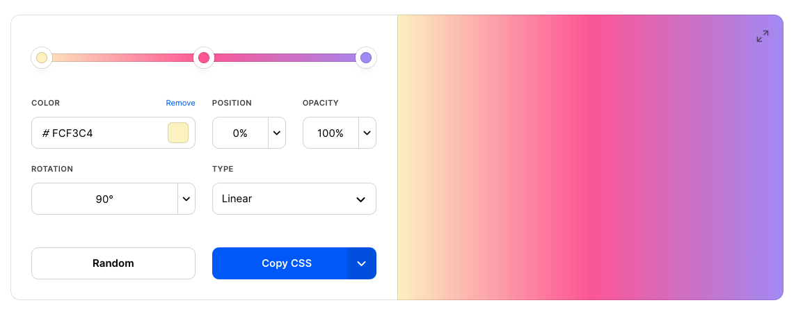
For gradient specialists, CSSGradient.io covers linear and radial gradients, color shades, and gradient backgrounds. Gradient Generator produces 1-to-40 stepped gradients from two chosen colors, with hex, HSL, and RGB values available on click-to-copy.
Automated Gradient Composition
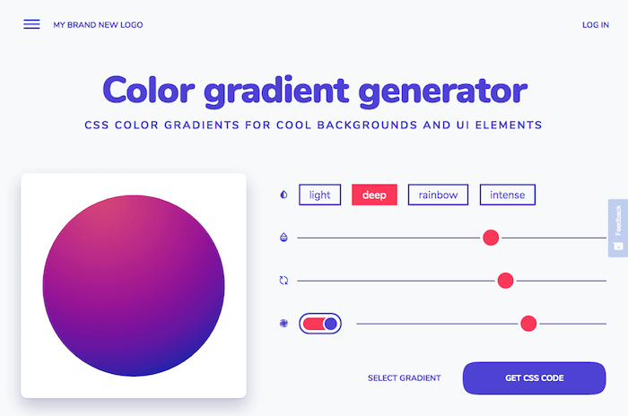
Color harmony takes practice, and deadlines don't always allow for experimentation. The color gradient generator from My Brand New Logo applies gradient algorithms to a color you select, producing balanced palettes in four styles that range from subtle to a mother-of-pearl effect. Adjustments happen via sliders, and the result can be exported directly as CSS.
Scaling Typography Systematically
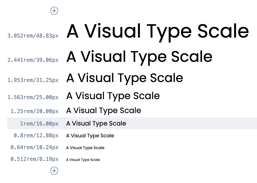
Typography systems benefit from established proportional scales that handle everything from captions to marketing headlines Type-Scale by Jeremy Church provides eight pre-defined scales — from Major Third up to Perfect Fifth — plus custom ratio support. Settings cover line-height, body weight, and preview text; output appears as CSS or goes straight to CodePen for a type specimen. Tim Brown's ModularScale.com remains a solid older alternative.
Another option, the Typographic Scale Calculator by Jean-Lou Desire, takes a modular scale approach with three inputs: the initial term, the increment ratio, and the number of sizes. Modeled after musical scales, this method produces intermediate values that fit discrete use cases like side notes or large blockquotes.
Getting Type Sizes on the Grid
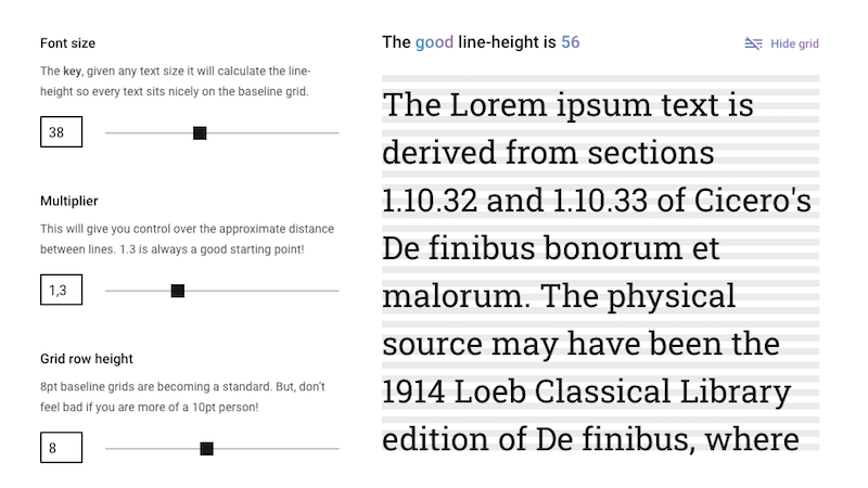
When a type scale meets a baseline grid, one question always comes up: what line height belongs to each size? Fran Pérez’s Good Line-Height calculator handles the math with three inputs: font size, a multiplier controlling spacing between lines, and the grid row height. From those, it produces line heights that keep text aligned to the baseline at any size.
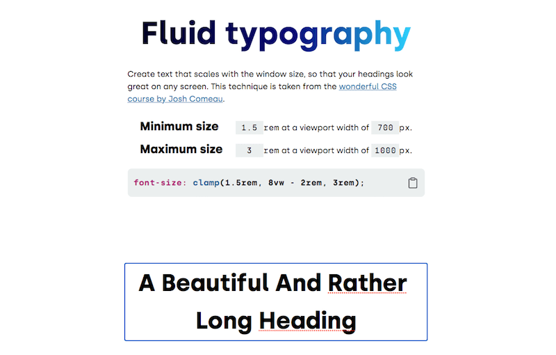
For fluid type, clamp() lets a font size scale with the viewport while staying inside min and max bounds. Erik André Jakobsen’s Fluid Typography tool takes minimum and maximum font sizes plus viewport widths and returns both the clamp() rule and a live demo on a real heading. Maxime Roudier’s generator follows the same idea but adds a font-family picker and a slider for adjusting the range instead of typed-in values.
clamp() rule to make your headings fluid. (Large preview)Matching Fallback Fonts, Trimming Caps
Layout shift during webfont loading is less jarring when the fallback font closely matches the real one. Monica Dinculescu’s font-style-matcher compares x-heights and widths, and f-mods accomplish similar tuning with newer CSS properties. But many fonts ship with their own margins and leading, so even a close match can move the whole page.
Capsize takes a different route: it trims the space above capital letters and below the baseline, then sets font-size so cap height lands on a multiple of your grid. Keeping the same line-height across fallback and webfont, the tool produces “magic numbers” that make the swap seamless.
Selectors for Sibling Counts
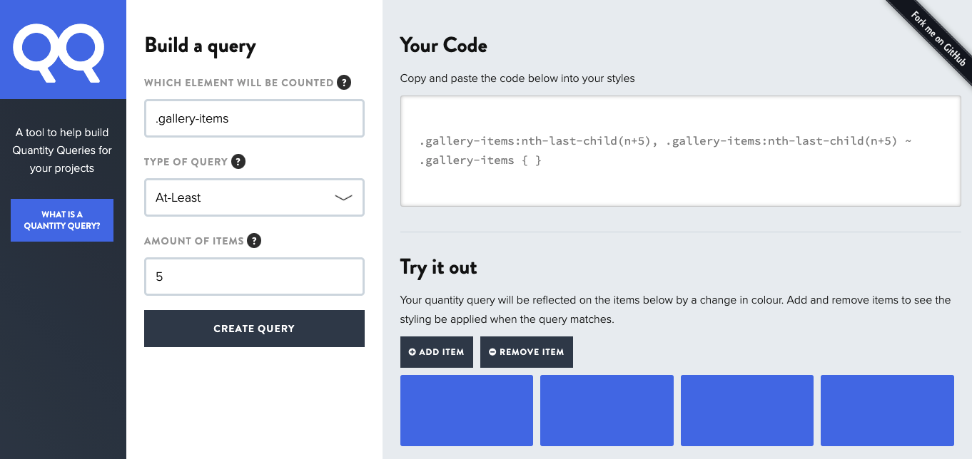
Sometimes a layout has to react to how many items are inside a container — three items on one row, six stretched across two, ten as a plain card list. Grid and Flexbox solve many of these cases, but a complex count-based layout can demand a complex selector. Drew Minns’ Quantity Queries generator builds selectors that apply styles when an element has at least five siblings, at most ten, or somewhere between three and five. Because the output is rarely self-explanatory, the generated code deserves a comment describing exactly what it targets.
Shapes, Clipping, and Filters
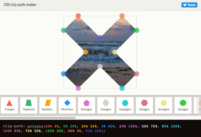
With clip-path, an element can be clipped to a circle, polygon, or SVG shape. Bennett Feely’s Clippy works visually: choose a shape and demo background, drag the points to reshape it, and the color-coded CSS updates in real time. If you want to see clip-path in action before using the tool, Mikael Ainalem’s pop-out effect is a good demonstration.
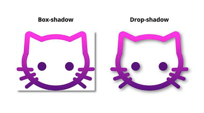
The drop-shadow filter, despite excellent browser support, is often overlooked. As Michelle Barker explains in her post, it accepts x-offset, y-offset, blur radius, and color like box-shadow, but the key difference is that the shadow follows the non-transparent pixels of the image rather than the element’s bounding box. That makes it the right choice for transparent PNGs, SVG logos, or clipped shapes. Mads Stoumann’s CSS Filter Editor lets you test all supported filters (with presets) and generates the CSS as you go. For blend modes, Rick Metzger’s Duotone Generator previews foreground and background blends with controls for zoom, spacing, blur, and opacity, then outputs HTML and CSS.
Grids, From Simple to Compound
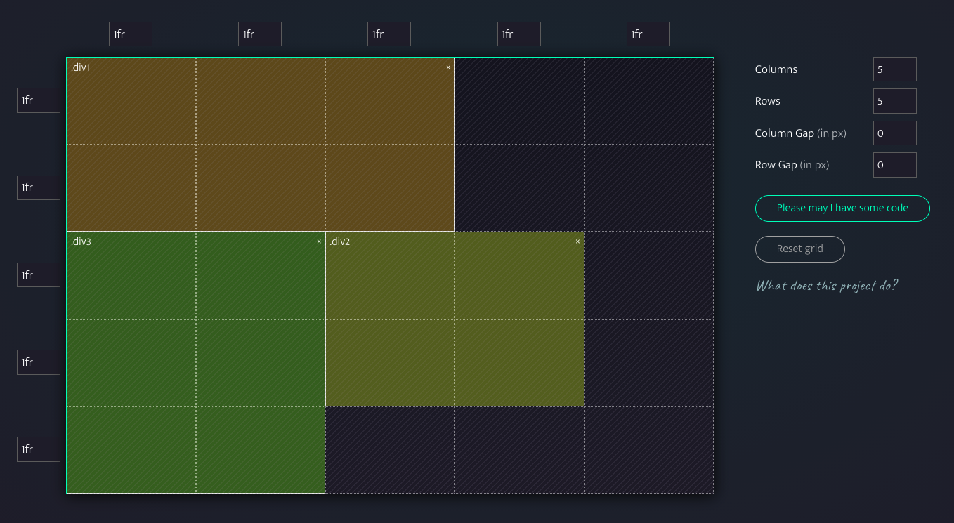
Several generators cover basic CSS Grid setups: Sarah Drasner’s CSS Grid Generator, Drew Minns’ Griddy, Ali Alaa’s CSS Grid Cheat Sheet Generator, and LenioLabs’ LayoutIt all take grid definitions, gaps, and container placement, producing CSS immediately. For Flexbox guidance, Flexbox Patterns offers plenty of examples.
For layouts that can be done in one line, Una Kravets’ 1-Line Layouts collects ten CSS techniques, from centering through the classic Holy Grail layout, the “Deconstructed Pancake,” clamp() sizing, and aspect ratio handling. Each entry has a demo, a CodePen, and browser support notes, and Kravets walks through every technique in an accompanying video.
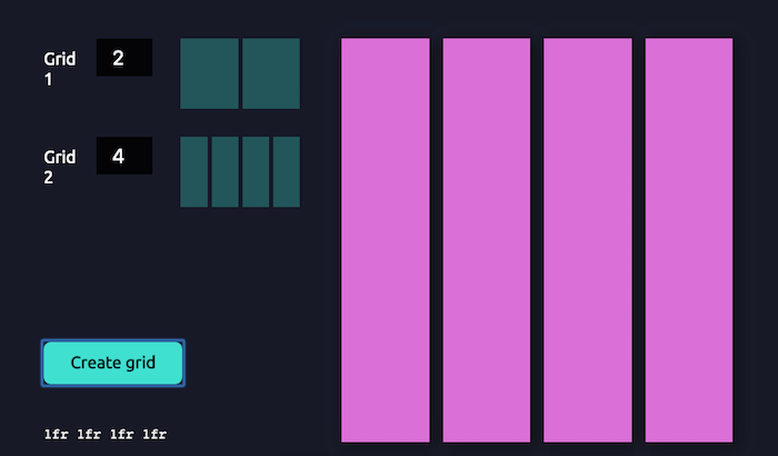
Compound grids — two or more grids (column, modular, symmetrical, or asymmetrical, potentially overlapping) — open up a lot of design room but take time to draw manually. Michelle Barker’s compound grid generator merges two grids once you enter the column count for each. For print work needing modular or manuscript grids, the Modular Grid Calculator walks through setting those up in InDesign.
Placeholders and Heroes
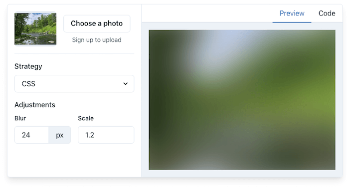
An image placeholder can do a lot for perceived performance while a real image loads. Joe Bell’s Plaiceholder is a set of Node.js helpers that produces lightweight, blurred placeholders in several formats: CSS (the recommended option), SVG, Base64, Blurhash, plus an experimental Blurhash-to-CSS variant.
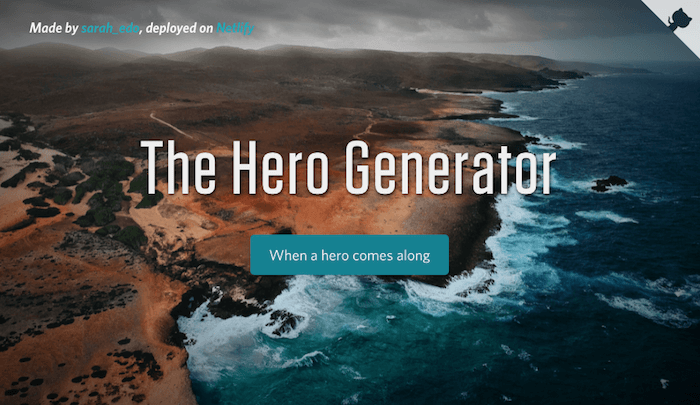
Sarah Drasner’s Hero Generator eliminates the repetitive work of building responsive hero sections. It controls gradient type and reduction, title spacing, and button colors (including hover states and radius), then hands you copy-ready code.
Maps, Motion, and 3D
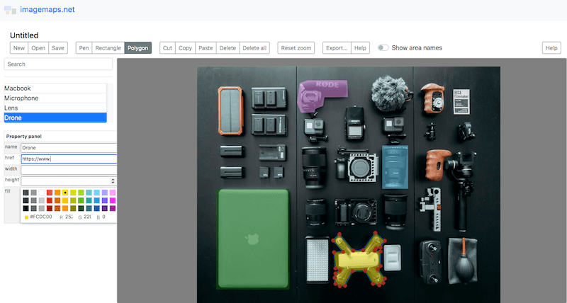
Image maps turn parts of a picture into clickable links, but defining coordinates by hand is fiddly. The imagemaps.net interface lets you upload an image, draw clickable regions with pen, rectangle, or polygon tools, then name each region, attach a link, and fine-tune color, height, and width. The Export button gives you ready-to-paste HTML map markup or React code.
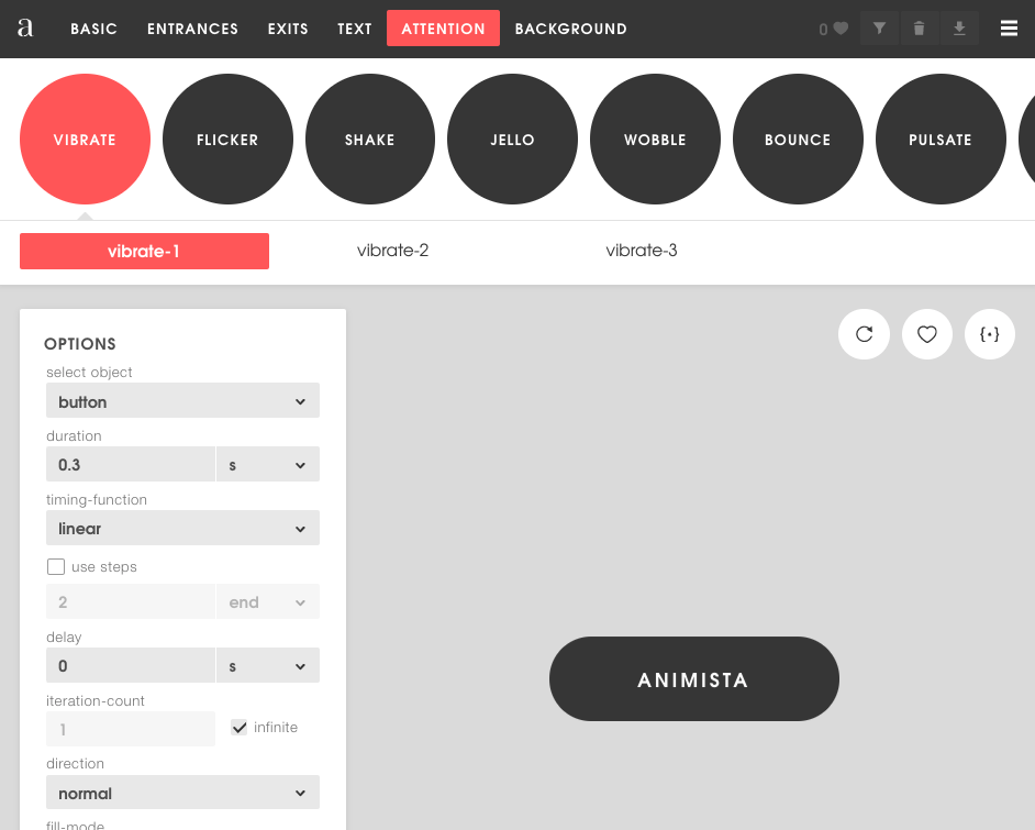
For CSS animations and transitions, Animista is a library of presets covering entrances, exits, text highlights, button actions, and background effects, with CSS output (including Autoprefixer-generated code) ready for each choice.
Hover and loading animations are the remit of CSS Wand, while Ladda offers buttons with built-in loading states and Epic Spinners brings spiners with Vue.js integration. If a playful hover is more the goal, Josh Comeau’s Boop! is a whimsical option — though you should scale with pseudo-elements and respect reduced-motion preferences for users who ask for them.
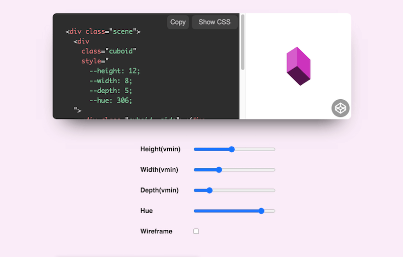
Jhey Tompkins has made a name with 3D CSS experiments, including a helicopter that reacts to the mouse. The underlying technique is a responsive CSS cuboid controlled by scoped custom properties. His 3D CSS Cuboid Generator exposes sliders for height, width, depth, and hue, instantly producing the code needed to start building, twisting, or sliding your own 3D shapes.
CSS Doodles Generator
For something more playful, css-doodle is a web component by Yuan Chuan that generates patterns and artworks directly from CSS. The component works by creating a grid of div elements and applying CSS rules to them, with a range of utility functions and shorthand properties included for experimentation. The project’s source code is available on GitHub.
A One-Stop Collection of Web Helpers
If you’re looking to round out your toolkit, Tiny Helpers gathers a wide assortment of utilities in a single place. Maintained by Stefan Judis, the collection covers everything from APIs, accessibility, and color tools to fonts, performance, regex, SVG, and Unicode resources.
Beyond that curated index, developers frequently share their own favorites on social platforms. Worth checking out are the Twitter thread by Josh W. Comeau and one from Stefan Judis himself. Between these sources, you’ll likely find a solution that fits whatever repetitive or time-consuming task you’ve been trying to streamline.
Final Thoughts
The number of available resources is effectively endless. The tools highlighted here should help you avoid some of the more routine demands of front-end work, letting you spend more time on the actual design and build process.
For more CSS tooling roundups, you may also want to look at:
Further Reading
- Building The SSG I’ve Always Wanted: An 11ty, Vite And JAM Sandwich
- Modern CSS Layouts: You Might Not Need A Framework For That
- Best Of Pro Scheduler Libraries
- Sustainable Design Toolkits And Frameworks