Registered properties as the state backbone
The elevator's state lives in CSS custom properties, but the values only animate because they are declared with @property. Unlike a plain custom property, which the browser treats as an opaque string, a registered property carries a type, an initial value, and interpolable in-between frames.
@property --current-floor {
  syntax: "<integer>";
  initial-value: 1;
  inherits: true;
}

@property --previous {
  syntax: "<number>";
  initial-value: 1;
  inherits: true;
}

@property --relative-speed {
  syntax: "<number>";
  initial-value: 4;
  inherits: true;
}

@property --direction {
  syntax: "<integer>";
  initial-value: 0;
  inherits: true;
}
With typed variables in place, the stylesheet can compare the current floor against the previous one, derive a travel speed, and feed animations and transitions from those numbers. Unregistered, the elevator would jump between floors with no transition at all.
Radio inputs drive the machine
Each floor is a radio input, and the selection is read with :has() to determine which floor button is active:
<input type="radio" id="floor1" name="floor" value="1" checked>
<input type="radio" id="floor2" name="floor" value="2">
<input type="radio" id="floor3" name="floor" value="3">
<input type="radio" id="floor4" name="floor" value="4">
.elevator-system:has(#floor1:checked) {
--current-floor: 1;
--previous: var(--current-floor);
}
.elevator-system:has(#floor2:checked) {
--current-floor: 2;
--previous: var(--current-floor);
}Picking a radio button is therefore the only trigger the system needs: the checked state kicks off the calculations and transitions that move the car.
Position, timing, and direction from math
Vertical movement is a transform: translateY(...) computed from --current-floor:
.elevator {
  transform: translateY(calc((1 - var(--current-floor)) * var(--floor-height)));
  transition: transform calc(var(--relative-speed) * 1s);
}
Travel time scales with distance traveled, so a multi-floor trip takes longer than a one-floor hop (floor 1 to 4 animates longer than floor 2 to 3). Two derived values do the work:
--abs: calc(abs(var(--current-floor) - var(--previous)));
--relative-speed: calc(1 + var(--abs));--absis the absolute number of floors to cover.--relative-speedslows the animation as the trip gets longer.
Direction follows from the same comparison, clamped into a three-value signal:
--direction: clamp(-1, calc(var(--current-floor) - var(--previous)), 1);

.arrow {
  scale: calc(var(--direction) * 2);
  opacity: abs(var(--direction));
  transition: all 0.15s ease-in-out;
}clamp()confines the output to-1and1.1is upward travel,-1downward, and0means the car is stationary.- That value scales the arrow, flipping it and adjusting opacity to match.
Faking memory with a delayed copy
CSS has no native way to retain a prior value. The workaround is a short delay on --previous:
.elevator-system {
  transition: --previous calc(var(--delay) * 1s);
  --delay: 1;
}
During the delay, --previous trails --current-floor, which is exactly what makes the direction and speed math possible mid-animation. When the delay elapses, --previous catches up. It is an approximation of a state transition rather than a real one, but it is enough to drive the visuals.
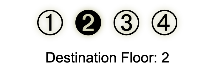
Counters and circled floor glyphs
Floor numbers are rendered through CSS counters, with a custom counter style built on Unicode circled digits:
#floor-display:before {
  counter-reset: display var(--current-floor);
  content: counter(display, top-display);
}
@counter-style top-display {
system: cyclic;
symbols: "\278A" "\2781" "\2782" "\2783";
suffix: "";
}The characters \278A through \2783 produce ➊, ➋, ➌, ➃, so the indicator shows a stylized symbol instead of a bare digit. The technique generalizes to any display where a number should carry symbolic or visual weight.
Announcing floors to assistive tech
CSS cannot rewrite DOM text, but it can inject screenreader-visible content via ::before and counter():
<div class="sr-only" aria-live="polite" id="floor-announcer"></div>#floor-announcer::before {
counter-reset: floor var(--current-floor);
content: "Now on floor " counter(floor);
}The generated element gets an .sr-only class so it is hidden visually but still exposed to assistive technology:
.sr-only {
  position: absolute;
  width: 1px;
  height: 1px;
  overflow: hidden;
  clip: rect(0, 0, 0, 0);
  white-space: nowrap;
}
Where the pattern pays off
The approach is not limited to a novelty elevator. The same state-tracking mechanics fit JavaScript-free interactive prototypes, live progress indicators in forms, game UIs with inventory or status logic, and logic puzzles or teaching tools. They are particularly relevant for static apps and environments with restricted scripting, such as email or certain CMS widgets.




