
Container queries let a component react to its own container's size rather than the viewport's, which is the core difference from media queries. Declaring a container requires the container-type property:
container-type: inline-sizeestablishes an inline-size query container, triggered by changes to the inline axis (typically width).container-type: sizeestablishes a size query container, triggered by changes to both the inline and block axes.container-type: normalmeans the element is not a query container — the default.
The second argument is the optional container-name, giving the container an identifier so query rules can target it specifically:
.card {
  container: card / inline-size;
}
Here container is the shorthand for container-name / container-type.
On the consuming side, @container behaves like @media but evaluates against the nearest ancestor query container. The rule below matches when the container named card is 30rem wide or broader:
@container card (min-width: 30rem) {
  ...styles
}
Unlike media queries, @container always needs a unit — bare min-width: 30 will not match. Percentage cq units for length are:
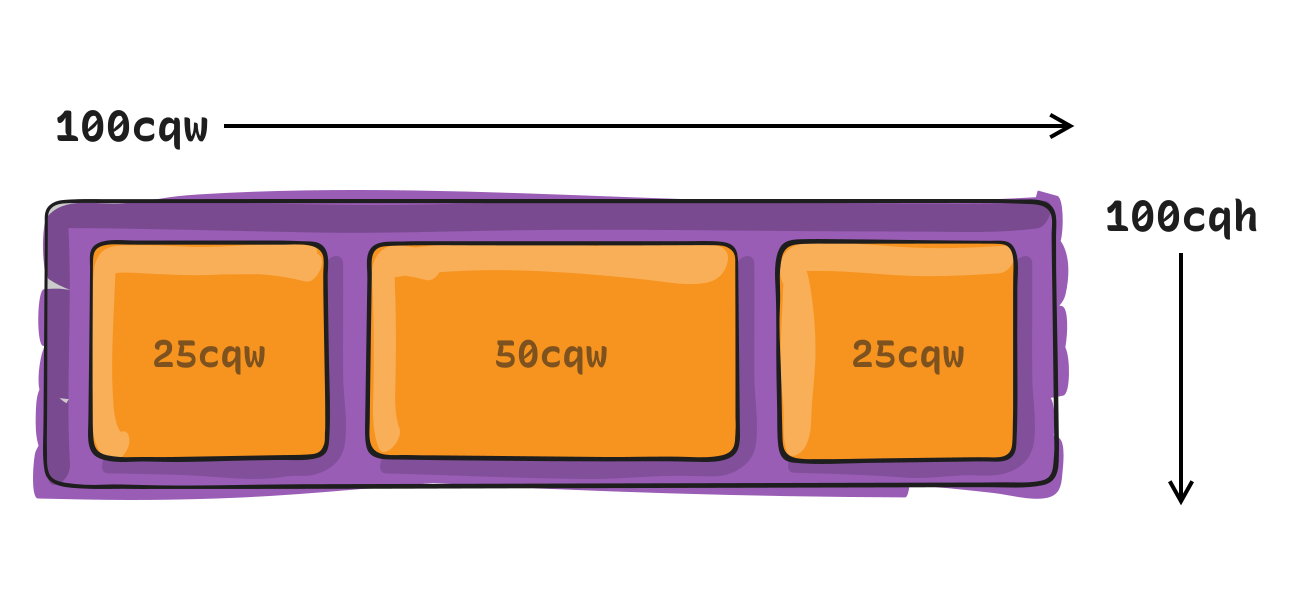
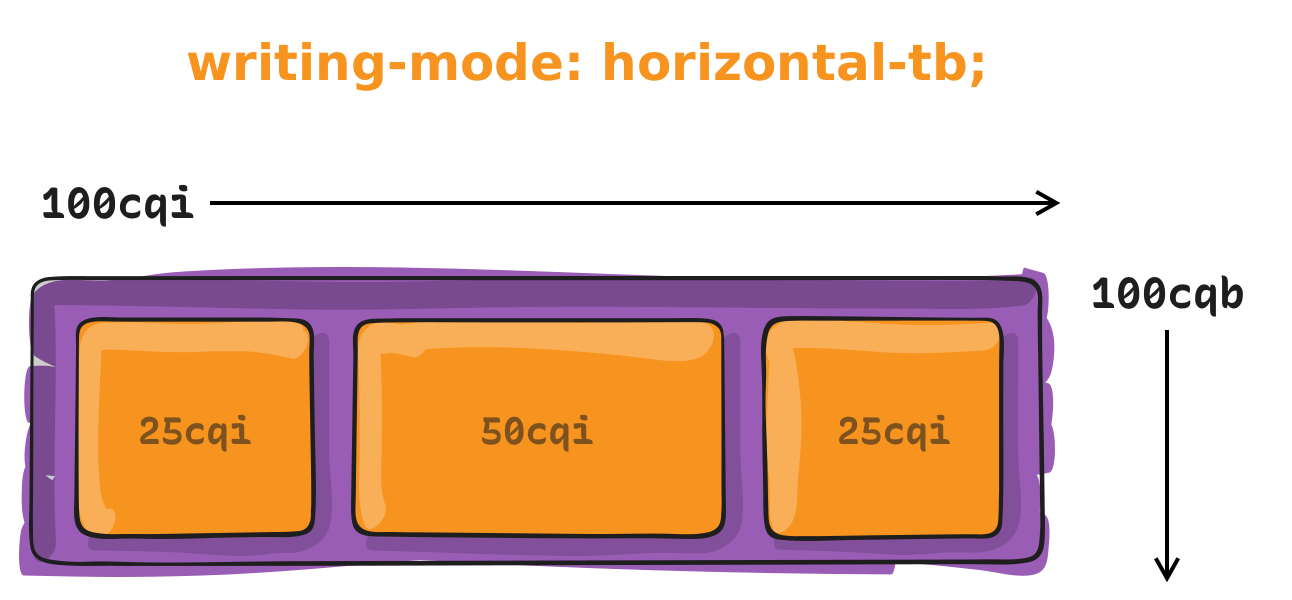
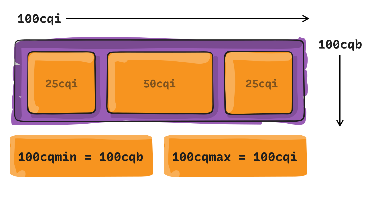
cqw— 1% of a query container's widthcqh— 1% of a query container's heightcqi— 1% of a query container's inline sizecqb— 1% of a query container's block sizecqmin— the smaller value ofcqiorcqbcqmax— the larger value ofcqiorcqb
The dvw unit, based on viewport size, can still be used for font size:
.card__content h1 {
  font-size: clamp(2rem, 3dvw, 3rem);
}
Container queries shift the sizing reference point from the viewport to an element's own container, which makes a component's styles both predictable and portable: drop the component into another project and it behaves the same way. The mechanism also adds length units that size elements relative to their container.
Registering and Querying Containers
An element becomes a queryable container through three related properties:
container-nameregisters an element as a container that passes styles to other elements based on its size and styles.container-typeregisters an element as a container that can apply styles to other elements once conditions are met.containeris a shorthand combining the two.
.cards {
  container-name: card-grid;
  container-type: inline-size;

  /* Shorthand */
  container: card-grid / inline-size;
}
The example above registers a container called card-grid, queryable by inline-size — the container's width in a horizontal writing mode, since inline is a logical property. In a vertical writing mode, inline would refer to height instead.
Registration caveats
container-nameis optional. An unnamed container matches any container query that does not target a named container, so it may satisfy multiple conditions.container-typeis required to query a container bysizeorinline-size.sizerefers to whichever of the inline or block direction is larger;inline-sizemeans width in the default horizontal writing mode.container-typedefaults tonormal: every element is already a style container by default and can be queried only by its applied styles — for instance, itsbackground-colorvalue.- A container cannot style itself. "You cannot style what you query" — sizing the container can change the
background-colorof elements inside it, not the container's own. - A container cannot be sized by its content; it must be sized explicitly in a flex or grid layout.
Writing a query
@container my-container (width > 60ch) {
  article {
    flex-direction: row;
  }
}
The @container at-rule marks a container query rather than an @media one. my-container names the container declared via container-name. The article selector targets items inside the container — direct children or deeper descendants — applying styles to them when the condition matches.
Query caveats
- The container name is optional; leave it out and any registered container matches when conditions are met.
- A container's
widthis queryable whencontainer-typeissizeorinline-size:sizecan querywidthorheight, whileinline-sizerefers only towidth. - Any length can be queried —
aspect-ratio,block-size(height), and orientation such asportraitandlandscape, not just width. - Range syntax is supported:
>,<,=,>=, and<=. - Queries can be chained with the logical keywords
and,or, andnot.
Property Reference
container-name
container-name: none | <custom-ident>+;Its initial value is none. Values are none (the default, which simply sets the property's initial behavior) or a <custom-ident> name — any identifier except reserved words such as default, none, at, no, and or. Names are not quoted.
container-type
container-type: normal | size | inline-size;Its initial value is normal. The keyword values are:
normal— a container queryable by style rather than size; all elements qualify without declaring anything.size— queryable by size in either the inline or block direction.inline-size— queryable by inline size, equivalent towidthin horizontal writing mode and likely the most common choice for responsive designs.
container
container: <'container-name'> [ / <'container-type'> ]?If <'container-type'> is omitted from the shorthand, it resets to its initial value of normal, defining a style container rather than a size container. The initial value is none / normal.
All three properties apply to all elements, do not inherit, accept no percentages, and are not animatable; canonical order follows the grammar. container-name computes to none or an ordered list of identifiers, while container-type computes as specified by keyword.
Container Length Units
The spec introduces length units that work off container dimensions rather than the viewport.
Width and height units
| Unit | Name | Equivalent to… |
|---|---|---|
cqw | Container query width | 1% of the queried container’s width |
cqh | Container query height | 1% of the queried container’s height |
Logical direction units
| Unit | Name | Equivalent to… |
|---|---|---|
cqi | Container query inline size | 1% of the queried container’s inline size, which is its width in a horizontal writing mode. |
cqb | Container query block size | 1% of the queried container’s inline size, which is its height in a horizontal writing mode. |
Minimum and maximum units
| Unit | Name | Equivalent to… |
|---|---|---|
cqmin | Container query minimum size | The value of cqi or cqb, whichever is smaller. |
cqmax | Container query maximum size | The value of cqi or cqb, whichever is larger. |
Style Queries
Style queries ask not about a container's size but about its CSS styles, enabling conditional styling of the form if these styles match here, apply those styles there.
At the time of writing, CSS Container Style Queries are an experimental feature: browsers support them only behind feature flags, and they can evaluate only CSS custom properties (variables).
Registration is essentially unnecessary
article {
  container-name: card;
}
No container-type declaration appears above because every element is already a container — comparable to how every element is position: static by default. You would only declare container-type when you want a size query instead of a style query. Note that the property in this sample reads container-name, used solely to pick a specific container by name in a query; otherwise registration can be skipped entirely.
Syntax and variables
@container style(--bg-color: #000) {
  p { color: #fff; }
}
The example queries any matching container, since all elements are style containers by default. The shape resembles a media query — @container in place of @media — and a style() function holds the condition, distinguishing a style query from a size query (there is no counterpart size() function). Here the check is whether the custom property --bg-color equals black (#000); when it does, paragraph text becomes white (#fff). Custom properties are central to how these conditions are written:
.card-wrapper {
  --bg-color: #000;
}
.card {
  @container style(--bg-color: #000) {
    /* Custom CSS */
  }
}
@container style(--featured: true) {
article {
grid-column: 1 / -1;
}
@container style(--theme: dark) {
article {
--bg-color: #000;
--text: #fff;
}
}
}Style queries can also be nested within one another.
Specification and Support
Container queries are defined in the CSS Containment Module Level 5 specification, currently an Editor's Draft.
Size queries enjoy good support. Style queries are the gap.
- Chrome 105 — August 30, 2022
- Safari 16 — September 12, 2022
- Firefox 110 — February 14, 2023
Demonstrations
Examples generally illustrate applying styles when a container meets a condition. For the most complete collection, check out Ahmad Shadeed's Container Queries Lab. A few representative patterns:
- Card component: changes layout according to the available space in its container.
- Call-to-action panel: a newsletter-style signup panel whose layout changes three times based on container space — drop it into any project and it responds correctly, because it measures its space rather than the viewport.
- Stepper component: shows steps horizontally in wide containers and stacks them vertically when the container gets small.
- Icon button: displays an icon at the right edge when it fits beside the label; otherwise becomes a square tile stacking the icon above the label. Its
border-radiususes container units —4cqi, or 4% of the container's inline size — so edges round as the button grows. - Pagination: shows links to individual pages when space allows, and otherwise hides them in favor of two buttons for older and newer content.