

Why color spaces matter in CSS
Color remains one of the most influential elements in web design, yet it is also one of the hardest to get right. CSS has expanded significantly over the years, giving developers a variety of ways to define color, each with its own nuances. The core question is not just which syntax to use, but which color space your colors actually reside in.
Color spaces define how colors are organized within a given device—monitors, printers, and other display technologies each have their own gamuts. For the web, the primary spaces are sRGB, CIELAB, and Oklab. sRGB has been the standard since 1996 and is most familiar to developers, yet it cannot represent all colors that modern screens can display. Newer spaces like CIELAB and Oklab, by contrast, offer a wider gamut that can capture more vibrant color ranges, recovering worlds of color that sRGB simply misses.
The sRGB space and its functions
Within sRGB, there are three main ways to define color in CSS: rgb(), hsl(), and hwb(). Each has its own syntax and purpose, and all are widely supported—and widely used—across the web today.
The rgb() function

rgb() takes three values—r, g, and b—representing redness, greenness, and blueness. All three are non-negative, ranging from 0 to 255, and an optional alpha value (for opacity) can be added after a forward slash. The alpha value ranges from 0 (or 0%) for fully transparent to 1 (or 100%) for fully opaque.
.element {
  color: rgb(245 123 151);
}
There are two allowed syntaxes. The legacy syntax separates the three color values with commas. The modern syntax uses spaces, with the optional alpha appearing after a slash. The two formats cannot be mixed—use one consistently.
.element {
  color: rgb(245 123 151 / 20%);
}
/* This would not work */
.element {
color: rgb(225, 245, 200 / 0.5);
}
/* Neither will this */
.element {
color: rgb(225 245 200, 0.5);
}
/* Or this */
.element {
color: rgb(225, 245 200 / 0.5);
}/* Valid (Modern syntax) */
.element {
color: rgb(245 245 255 / 0.5);
}
/* Valid (Legacy syntax) */
.element {
color: rgb(245, 245, 255, 0.5);
}The rgba() legacy
rgba() was originally distinct from rgb() because it added alpha support. But nowadays that is no longer the case. rgb() syntax now fully supports transparent colors via the forward slash, and also accepts the old comma-based legacy syntax. Functionally, the two are identical.
Both the space-separated format with a slash, and the comma-separated legacy without a slash, are supported for rgba(). But the W3C itself considers rgba(), like hsla(), something of a CSS mistake—one whose original purpose has been absorbed by rgb().
.element {
  color: rgba(100, 50, 0, 0.5);
}

.element {
  color: rgba(100 50 0 / 0.5);
}
/* This works */
.element-1 {
color: rgba(250 30 45 / 0.8);
}
/* And this works too, so why not just use this? */
.element-2 {
color: rgb(250 30 45 / 0.8);
}When writing colors, stick to rgb() with the modern syntax.
Hexadecimal notation

Hex color codes are just a shorter way of expressing rgb() values. A hex color starts with a hash token (#), followed by hex digits that go from 0 to 9 and then a through f for 10–15. Hex values are case-insensitive, so uppercase and lowercase letters do not change the result.
CSS defines four valid hex lengths:
- 3-digit: Shorthand for the 6-digit notation, each digit representing a red, green, and blue channel, respectively. Each is duplicated in translation, so this yields only
4,096colors total, versus over17 millionin the 6-digit form.
.element {
  color: #abc;
}
.element {
color: #abc; /* Equals #AABBCC */
}- 4-digit: Equivalent to the 3-digit notation, but includes an alpha channel digit that is also duplicated. The value
0maps to00, or completely transparent;fmaps toff, for fully opaque.
.element {
  color: #abcd; /* Same as #AABBCCDD */
}- 6-digit: The standard six-character pair system. The first pair,
RR, is for red, the secondGGfor green, and the thirdBBfor blue. Each pair ranges from00toff, which corresponds to 0–255 inrgb().
.element {
  color: #abcdef;
}- 8-digit: Complete color control in sRGB. The 6-digit pairs appear first, and a fourth pair (
AA) carries the alpha value between00(transparent) andff(opaque).
.element {
  color: #faded101;
}
The hsl() function

Both hsl() and rgb() live in sRGB, but hsl() spaces are often considered more intuitive. The three values are h for hue, s for saturation, and l for lightness. Hue corresponds to a direction on the color wheel, expressed between 0deg and 360deg. Saturation ranges from 0 to 100 (or percent signage), and lightness is the amount of white or black present.
An interesting quality of the hue angle is that it can be taken out of its normal range—such as using negative angles or values above 360deg—and the color will still circle back correctly to the intended value. This works well for animated color rotation and for deriving complementary colors by adding 180deg.
/* Current color */
.element {
  color: hsl(120deg 40 60 / 0.8);
}

/* Complementary color */
.element {
  color: hsl(300deg 40 60 / 0.8);
}
As with rgb(), legacy and modern formats are supported but should not be mixed.
/* This would not work */
.element {
  color: hsl(130deg, 50, 20 / 0.5);
}

/* Neither will this */
.element {
  color: hsl(130deg 50 20, 0.5);
}

/* Or this */
.element {
  color: hsl(130deg 50, 20 / 0.5);
}
/* Valid (Modern syntax)  */
.element {
  color: hsl(130deg 50 20 / 0.5);
}

/* Valid (Modern syntax)  */
.element {
  color: hsl(130deg, 50, 20, 0.5);
}
The hsla() legacy
The story of hsla() parallels the history of rgba(). It added alpha support before hsl() itself could, but it is now redundant. Both syntaxes accept transparency exactly the same way, so the shorter hsl() is the better choice for less typing and clearer code.
.element {
  color: hsla(120deg, 100%, 50%, 0.5);
}

.element {
  color: hsla(120deg 100% 50% / 0.5);
}
/* This works */
.element-1 {
color: hsla(120deg 80 90 / 0.8);
}
/* And this works too, so why not just use this? */
.element-2 {
color: hsl(120deg 80 90 / 0.8);
}The hwb() function

hwb() takes hue along with two other values: one for whiteness (w) and another for blackness (b), with an optional alpha component after a forward slash.
.element {
  color: hwb(80deg 20 50 / 0.5);
}his the hue angle, as inhsl(), taking values within0–360deg.wis the degree of whiteness from0to100%.bis blackness, same range asw(0–100%).ais the alpha value, from0to1or0%to100%.
Adoption of hwb() has so far been low, but it is perfectly valid CSS, so choosing it is largely a matter of preference.
Named colors
Also rooted in sRGB are the named color keywords, spanning 147 hardcoded values defined in the CSS Color Modules Level 4 specification. A handful of names—white, blue, and red—are widespread, but more exotic names are sometimes avoided because the connection between those labels and the true expected color can be unintuitive.
Wider Gamuts: lab() and lch()
Moving beyond the traditional sRGB gamut, the CIELAB color space offers a significantly wider range of colors, more closely aligned with human vision. CSS exposes this space through two functions: lab() and lch().

The lab() function defines a color using lightness and two color-opponent axes.
.element {
    color: lab(50 20 20 / 0.9);
}l: Lightness, from0or0%(black) to100or100%(white).a: The green-red axis, from-125(green) to125(red). Percentages map0%to-125and100%to125.b: The blue-yellow axis, from-125(blue) to125(yellow).alpha: Opacity, on a scale from0.0/0%to1.0/100%.
The CSS
lab()color function’saandbvalues are actually unbounded. Meaning they don’t technically have an upper or lower limit. But, at practice, those are their limits according to the spec.
A related function, lch(), uses the same color space but is often considered more intuitive. It replaces Cartesian coordinates with cylindrical ones.

.element {
    color: lch(10 30 300deg);
}l: Lightness, identical in meaning and range tolab().c: Chroma (a measure of color intensity), ranging from0to150.h: Hue angle, from0/0degto360/360deg.alpha: Opacity, from0.0/0%to1.0/100%.
The CSS
lch()color function’s chroma (c) value is actually unbounded. Meaning it doesn’t technically have an upper or lower limit. But, in practice, the chroma values above are the limits according to the spec.
Perceptual Uniformity: OKLab and Its Functions
To address shortcomings in CIELAB—particularly around perceptual uniformity, where color transitions can appear to have jarring shifts—Björn Ottosson developed the OKLab color space. The goal is to make a gradient's visual change feel smooth and consistent across all hues, which is a known issue with functions like rgb(). The CSS oklab() and oklch() functions provide access to this space, which also opens up a larger range of colors than sRGB.
The oklab() function
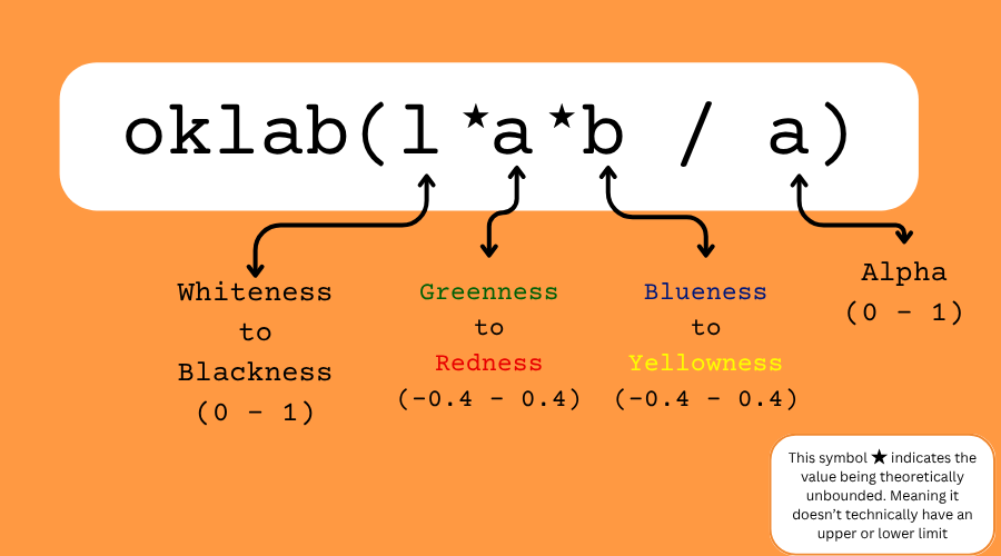
Similar to lab(), the oklab() function uses lightness, an a axis, a b axis, and an alpha channel. However, the numeric scales are different, so it's important not to mix them up.
.element {
  color: oklab(30% 20% 10% / 0.9);
}l: Lightness, ranging from0(black) to1.0or100%(white). In practice, the value is often capped around0.1.a: Green-red axis, operating on a scale from-0.4(green) to0.4(red).b: Blue-yellow axis, also on a scale from-0.4(blue) to0.4(yellow).alpha: Opacity, from0.0to1.0.
The CSS
oklab()color function’saandbvalues are actually unbounded. Meaning they don’t technically have an upper or lower limit. But, theoretically, those are the limits for the values according to the spec.
The oklch() function

The oklch() function adopts the cylindrical model from lch() but within the OKLab color space, resolving perceptual uniformity issues found in its predecessor.
.element {
  color: oklch(40% 20% 100deg / 0.7);
}l: Lightness, with a range of0.0(black) to1.0or100%(white).c: Chroma, generally from0up to0.4(it doesn't theoretically exceed0.5).h: Hue angle, from0/0degto360/360deg.alpha: Opacity, from0.0/0%to1.0/100%.
The CSS
oklch()color function’s chroma (c) value is actually unbounded. Meaning it doesn’t technically have an upper or lower limit. But, theoretically, the chroma values above are the limits according to the spec.
The Universal color() Function

While each previous function is tied to a single color space, the color() function can tap into nine different spaces in one go. This makes it a versatile tool for accessing colors with a wider gamut or specific color profiles.
Its signature requires several parameters:
- The first parameter is the
color spaceidentifier. Valid options aresrgb,srgb-linear,display-p3,a98-rgb,prophoto-rgb,rec2020,xyz,xyz-d50, andxyz-d65. - The next three values (
c1,c2, andc3) are the coordinates for that specific color space, typically on a scale of0.0to1.0. - The final value is the alpha channel for opacity.
Blending with color-mix()

For creating new colors, the color-mix() function is a powerful method that blends two colors—which can be from any color function—within a specified color space.
.element {
  color-mix(in oklab, hsl(40 20 60) 80%, red 20%);
}
This function accepts two types of arguments:
- The
in colorspaceparameter determines the interpolation method. This list of supported spaces includessrgb,srgb-linear,display-p3,a98-rgb,prophoto-rgb,rec2020,lab,oklab,xyz,xyz-d50,xyz-d65,hsl,hwb,lch, andoklch. - Two colors, each with a percentage weight (from
0%to100%), are then provided to be mixed.
Relative Color Syntax

A useful feature across all CSS color functions is the relative color syntax. This allows you to derive a new color from an existing origin-color by extracting its values, converting them to the target function's space, and then optionally modifying them.
.element{
  color-function(from origin-color c1 c2 c3 / alpha)
}
The syntax is structured like this:
from: A required keyword indicating the start of the origin color.origin-color: This can be any color value, including another relative color.c1,c2,c3: These map to the color channels of the function you are writing, but they reference the values from the origin color.alpha: The opacity, which can be inherited from the origin color or set explicitly.
For instance, converting from rgb() to lab() looks like this:
.element {
  color: lab(from rgb(255 210 01 / 0.5) l a b / a);
}
Similarly, you can use it to shift into oklch():
.element {
    color: oklch(from rgb(255 210 01 / 0.5) 50% 20% h / a);
}
In that example, even though the l and c values are explicitly set, the h and alpha values are read directly from the origin color.
You can even use mathematical functions within the channel calculations:
.element {
  color: oklch(from rgb(255 210 01 / 0.5) calc(50% + var(--a)) calc(20% + var(--b)) h / a);
}
This syntax is different from the color() function. In relative syntax, you point to the color with from <color> and then write out the channels using the specific keywords from the function you are in.
.element {
  color: color(from origin-color colorspace c1 c2 c3 / alpha);
}
Finally, note that the color-mix() function doesn't directly support using relative color keywords, though you can use relative colors inside the arguments it's mixing.
Where color values are used
Color values appear across a wide range of CSS properties, from typography and backgrounds to SVG presentation attributes. Below is a rundown of the non-deprecated properties that accept color.
UI and form controls
accent-color— Sets the accent color for UI controls, including checkboxes, radio buttons, and other form elements.caret-color— Specifies the color of the text input cursor (caret).
Backgrounds and borders
background-color— Applies a solid color as the background of an element.border-color— Shorthand for setting the color of all four borders.outline-color— Sets the color of an element’s outline.
Text and decorations
color— Sets the foreground color of text and text decorations.text-decoration-color— Sets the color of text decoration lines such as underlines.text-emphasis-color— Specifies the color of emphasis marks on text.text-shadow— Applies shadow effects to text, including color.
Shadows and layout
box-shadow— Adds shadows to elements to create the illusion of depth. The property accepts several arguments, one of which sets the shadow color.column-rule-color— Sets the color of the line between columns in a multi-column layout. This property cannot act alone; you must first setcolumnsandcolumn-rule-style.
SVG and filter effects
fill— Sets the color of the SVG shape.stroke— Defines the color of the outline of<svg>.flood-color— Specifies the flood color used by<feFlood>and<feDropShadow>elements inside<filter>for<svg>. This CSS property should not be confused with the HTML attribute of the same name. If this CSS property is applied, it overrides theflood-colorattribute.lighting-color— Specifies the color of the lighting source for<feDiffuseLighting>and<feSpecularLighting>elements inside<filter>for<svg>.stop-color— Specifies the color of gradient stops for<stop>tags in<svg>.
For quick reference, the CSS-Tricks almanac maintains complete documentation on each of these properties, including syntax and browser support.


