

Anchor positioning in brief
Before anchor positioning, placing a tooltip or popover over another element meant taking the tooltip out of static positioning and nudging it into place with inset or transform values. That placement breaks down once the user scrolls, zooms or triggers animations: the element can overflow the screen or land somewhere awkward. The old remedy was JavaScript bounds-checking, with corrections also written in JavaScript.
CSS Anchor Positioning replaces that with a declarative interface: you state which sides connect, and CSS attaches the elements. It also accepts fallback positions, so a tooltip can sit above its anchor and flip beneath it when there is no room above.
Browser uptake has been unusually quick. The first draft landed in June 2023, and Chrome 125 shipped the feature a year later. CSS variables, by comparison, had a first draft in 2012 and waited four years for broad support. The coverage below covers attaching targets to anchors, positioning them, and fallbacks for custom position and size.
Quick reference
/* Define an anchor element */
.anchor {
  anchor-name: --my-anchor;
}
/* Anchor a target element */
.target {
position: absolute;
position-anchor: --my-anchor;
}/* Position a target element */
.target {
position-area: start end;
}Terminology and prerequisites
Anchor positioning puts elements on the page relative to one another. Two names carry the whole guide:
- Anchor: the reference element that other elements are positioned against.
- Target: an absolutely positioned element placed relative to one or more anchors. The spec usually calls it just an “absolutely positioned element.”
In the code examples, picture two sibling <div> elements.
<div class="anchor">anchor</div>
<div class="target">target</div>
Because the target is absolutely positioned, two concepts matter throughout:
- Containing block: the box that contains an absolute element — the viewport, or the nearest ancestor whose
positionis notstatic, or one affected by certain values of properties such ascontainorfilter. - Inset-modified containing block (IMCB): inset properties (
top,right,bottom,leftand so on) shrink the containing block an absolute element is sized and positioned into, producing a new box called the IMCB. Bothposition-areaandposition-try-orderdepend on it.
Pairing a target with an anchor
Two properties establish the relationship: anchor-name declares the anchor, and position-anchor links the target to it.
Naming the anchor
Elements are not anchors by default; you have to say so, and naming one is the usual route:
anchor-name: none | <dashed-ident>#The name must be a <dashed-ident> — a custom name beginning with two dashes, as in --my-anchor or --MyAnchor.
.anchor {
  anchor-name: --my-anchor;
}
That gives you an anchor element, which needs something anchored to it. That is the target, configured through position-anchor.
Attaching the target
Setting position-anchor on an absolutely positioned element attaches it to the anchor whose name matches. The value is a valid <anchor-element>, so naming a second element as the anchor is enough to set the target:
position-anchor: auto | <anchor-element>.target {
position: absolute;
position-anchor: --my-anchor;
}If no valid anchor element is found, the remaining anchor properties and functions are ignored.
Placing the target relative to the anchor
With the pair established, positioning uses two properties: position-area chooses which side of the anchor the target occupies, and position-visibility decides when the target hides for lack of room.
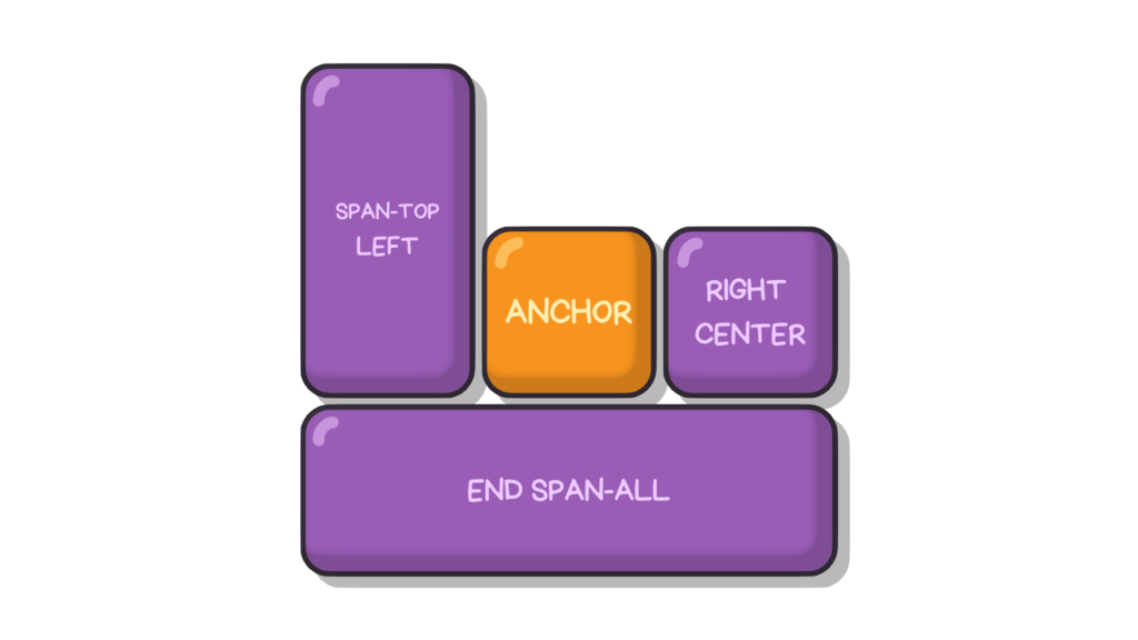
The 3×3 grid of position-area
position-area is the simplest positioning route. It imagines a 3×3 grid around the anchor and lets you place the target in one or more of the grid's regions.
position-area: auto | <position-area>Values can be logical (start and end, which depend on writing mode), physical (top, left, right, bottom), or the shared value center. The chosen region becomes the target's IMCB.
.target {
  position-area: top right;
  /* or */
  position-area: start end;
}
Logical values follow the containing block's writing mode; prefix them with self to position relative to the target's own writing mode instead.
.target {
  position-area: self-start self-end;
}
center applies on either axis.
.target {
  position-area: center right;
  /* or */
  position-area: start center;
}
To stretch a target over two adjacent regions, prefix any non-center value with span-, one row or column at a time.
.target {
  position-area: span-top left;
  /* or */
  position-area: span-start start;
}
To stretch across three adjacent regions, use span-all.
.target {
  position-area: bottom span-all;
  /* or */
  position-area: end span-all;
}
Physical values have no strict order: position-area: top left and position-area: left top are identical. Logical values are not interchangeable — position-area: start end is the opposite of position-area: end start. Prefixing a logical value with the desired axis (y-, x-, inline- or block-) makes the two orderings equivalent.
.target {
  position-area: inline-end block-start;
  /* or */
  position-area: y-start x-end;
}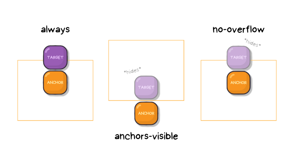
position-visibility
This property sets the conditions under which the target is hidden from the viewport.
position-visibility: always | anchors-visible | no-overflowalways: the target displays regardless of its anchors or any overflow.no-overflow: if the target still overflows its containing block after position fallbacks have been applied, it is strongly hidden.anchors-visible: if the anchor — not the target — has fully overflowed its containing block or is completely covered by other elements, the target is strongly hidden.
position-visibility: always | anchors-visible | no-overflowRecovering from overflow with fallbacks
Having positioned the target against its anchor, you can tell it what to do when it runs out of space. position-visibility is the blunt instrument — hide. Two other properties take more control: position-try-fallbacks tries other sides of the anchor, and position-try-order dictates the order in which those repositions are attempted.
The position-try shorthand sets both at once; the constituent properties come first.
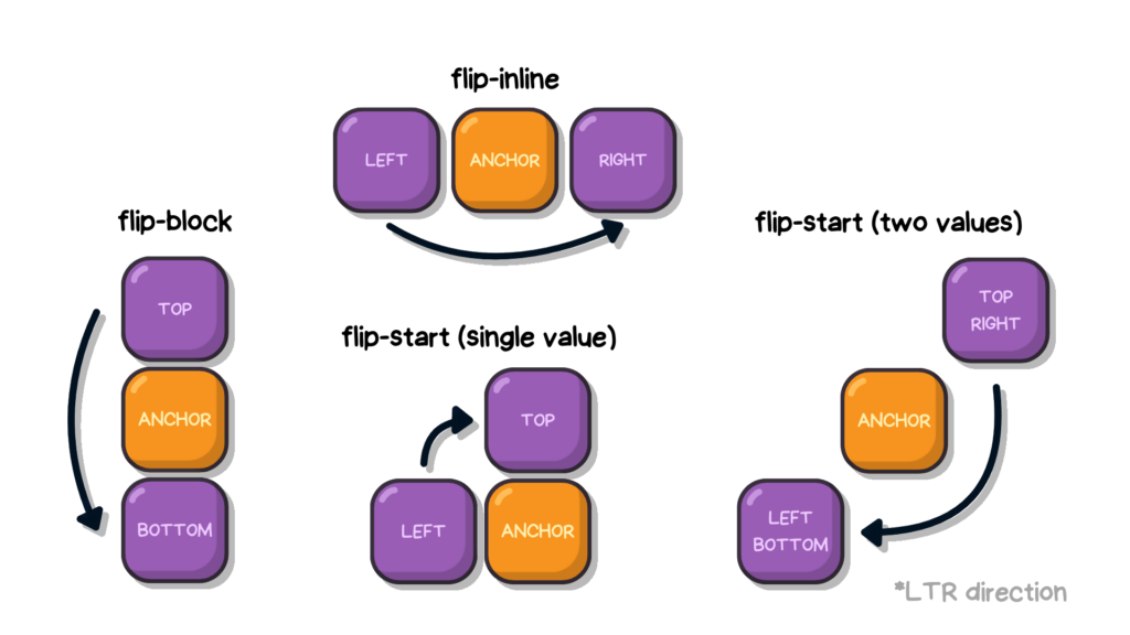
Listing options with position-try-fallbacks
The property takes a comma-separated list of position fallbacks that are tried when the target overflows the available space in its containing block. Each value is attempted in turn until one fits or the list runs dry.
position-try-fallbacks: none | [ [<dashed-ident> || <try-tactic>] | <'inset-area'> ]#none: leaves the options list empty.<dashed-ident>: adds a custom@position-tryfallback of that name to the list; if no matching rule exists, the value is ignored.<try-tactic>: builds an options list by flipping the target's current position along one of three axes, each a keyword, combinable for cumulative effect.flip-blockswaps values on the block axis.flip-inlineswaps values on the inline axis.flip-startswaps values diagonally.
<dashed-ident> || <try-tactic>:combines a custom@try-optionwith a<try-tactic>into one position fallback; tactics can still be combined to sum their effects.<"position-area">: usesposition-areasyntax to move the anchor to a new position.
.target {
  position-try-fallbacks:
    --my-custom-position,
    --my-custom-position flip-inline,
    bottom left;
}
Choosing by space with position-try-order
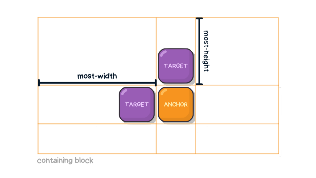
This property picks a new position from the fallbacks defined in position-try-fallbacks based on which gives the target the most room, with the rest of the options reordered behind it, largest available space first.
position-try-order: normal | most-width | most-height | most-block-size | most-inline-size“More space” is measured per fallback: the browser computes the target's IMCB size, then selects whichever value yields the widest or tallest IMCB according to the chosen keyword:
most-widthmost-heightmost-block-sizemost-inline-size
.target {
  position-try-fallbacks: --custom-position, flip-start;
  position-try-order: most-width;
}
The position-try shorthand
position-try folds the two previous properties into one declaration, taking the order first and the fallback list second.
position-try: < "position-try-order" >? < "position-try-fallbacks" >;The combined rule therefore looks like this:
.target {
  position-try: most-width --my-custom-position, flip-inline, bottom left;
}
Fallbacks defined with @position-try
Fallback keywords are not the only option for recovery when a target runs out of room: the @position-try at-rule groups a set of positioning and sizing properties into a named custom fallback that position-try-fallbacks can then reference.
Consider a target placed at the anchor's top-right edge with position-area:
.target {
  position: absolute;
  position-area: top right;
  width: 100px;
}
The target is sized at 100px, so on some screens it may no longer fit at that edge. Declaring fallbacks lets it search for an edge with more available space:
.target {
  position: absolute;
  position-area: top right;
  position-try-fallbacks: top left;
  position-try-order: most-width;
  width: 100px;
}
The two declarations can be collapsed into the position-try shorthand:
.target {
  position: absolute;
  position-area: top right;
  position-try: most-width, flip-inline, bottom left;
  width: 100px;
}
With this setup the target starts at the anchor's top-right corner at 100px, then, when space runs out, repositions to whichever candidate offers the most inline size — flip-inline (the anchor's top-left corner) or the bottom-left corner.
A custom fallback adds re-sizing to the re-positioning. If 100px is simply too wide at every candidate edge and 50px is needed instead, @position-try can express both changes:
@position-try --my-custom-position {
  position-area: top left;
  width: 50px;
}
--my-custom-position now exists as a custom position usable in the position-try shorthand, replacing flip-inline because it is its equivalent of top left:
@position-try --my-custom-position {
  position-area: top left;
  width: 50px;
}

.target {
  position: absolute;
  position-area: top right;
  position-try: most-width, --my-custom-position, bottom left;
  width: 100px;
}
The target's width therefore drops from 100px to 50px when it repositions to the anchor's top-right edge, giving the layout a better chance of fitting in either state.
Positioning with the anchor() function
anchor() can be read as a shortcut that specifies the anchor element, the side of it the target attaches to, and the target's size in one declaration. It also makes it possible to attach a single target to more than one anchor. The formal syntax accepts up to three arguments:
anchor( <anchor-element>? && <anchor-side>, <length-percentage>? )The function is only valid on inset-related properties, such as top, left or inset-block-end:
.target {
  top: anchor(--my-anchor bottom);
  left: anchor(--my-anchor end, 50%);
}
The arguments break down as follows:
<anchor-element>: names the anchor to attach to. Omitting it falls back to the implicit anchor set byposition-anchor; with no implicit anchor present, the function resolves to its fallback, and otherwise the declaration is invalid and ignored.<anchor-side>: selects the side of the anchor the target is positioned against. Options include physical keywords (top,left,bottom,right), logical side keywords (inside,outside), logical direction keywords tied to the writing mode (start,end,self-start,self-end), andcenter. It resolves to the<length>of the chosen side. A<percentage>may also be given, measured betweenstart(0%) andend(100%), with values below0%and above100%allowed.<length-percentage>: optional. It re-sizes the target when there is no valid anchor or position, placing the target at a fixed value relative to its containing block.
Behaviour by argument type
Physical arguments ignore the user's writing mode. Here the target's right and bottom insets are pinned to the anchor's top and left sides, effectively landing the target at the anchor's top-left corner:
.target {
  bottom: anchor(top);
  right: anchor(left);
}
Logical side keywords depend on the inset property they appear in: inside resolves to the same side as that property, outside to the opposite side.
.target {
  left: anchor(outside);
  /* is the same as */
  left: anchor(right);

  top: anchor(inside);
  /* is the same as */
  top: anchor(top);
}
Logical direction keywords depend on two things:
- The writing mode, either that of the containing block (
start,end) or the target's own (self-start,self-end). - The inset property, whose axis they follow.
In a left-to-right horizontal writing mode, physical inset properties behave like this:
.target {
  left: anchor(start);
  /* is the same as */
  left: anchor(left);

  top: anchor(end);
  /* is the same as */
  top: anchor(bottom);
}
In a right-to-left writing mode, the equivalent shifts to:
.target {
  left: anchor(start);
  /* is the same as */
  left: anchor(right);

  top: anchor(end);
  /* is the same as */
  top: anchor(bottom);
}
To keep this manageable, pair logical arguments with logical inset properties so the writing mode is respected throughout:
.target {
  inset-inline-start: anchor(end);
  inset-block-start: anchor(end);
}
Percentages position the target between the start (0%) and end (100%) sides; because they follow the writing mode, logical inset properties are the better match. Values outside that range are accepted — -100% moves the target toward the start, 200% toward the end.
.target {
  inset-inline-start: anchor(100%);
  /* is the same as */
  inset-inline-start: anchor(end);

  inset-block-end: anchor(0%);
  /* is the same as */
  inset-block-end: anchor(start);
}
The center keyword is equivalent to 50% and is unaffected by direction, so it works with either physical or logical inset properties.
.target {
  position: absolute;
  position-anchor: --my-anchor;

  left: anchor(center);
  bottom: anchor(top);
}
Sizing from the anchor with anchor-size()
anchor-size() sizes the target relative to the anchor's size, which helps targets scale together with their anchors in responsive layouts where elements shift, resize or overflow their container. It takes a side of the anchor and resolves to the corresponding <length> — the anchor's width, height, inline-size or block-size:
anchor-size( [ <anchor-element> || <anchor-size> ]? , <length-percentage>? )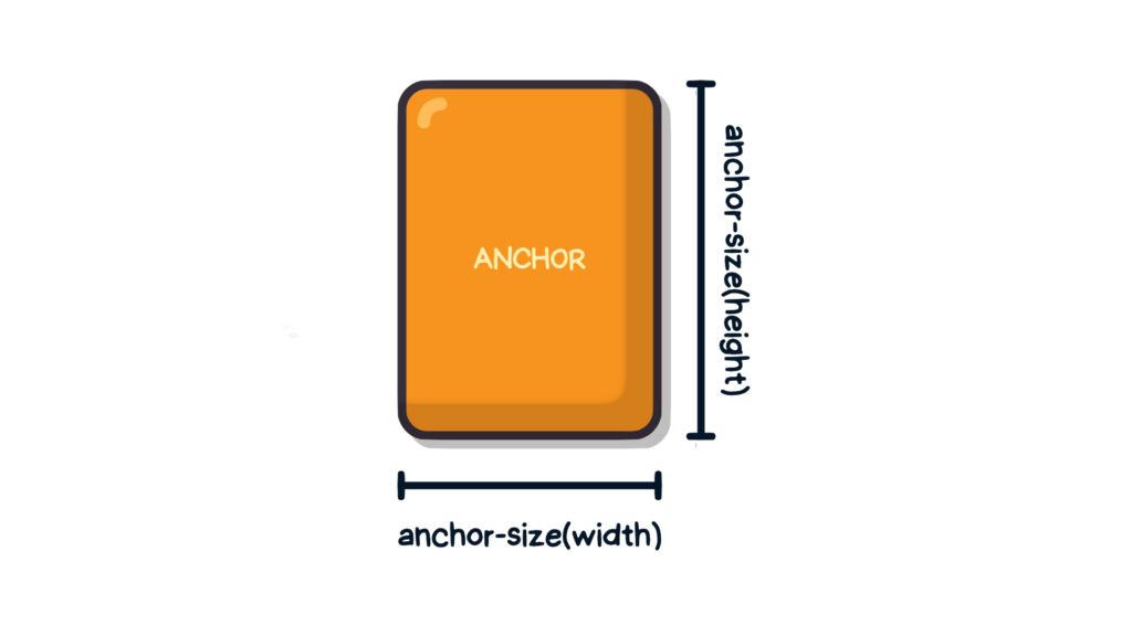
Its arguments are:
<anchor-size>: the side of the anchor element to measure.<length-percentage>: optional fallback used when the target has no valid anchor or size, returning a fixed value relative to its containing block.
Declaring it on width, height, or both sizes the target from the anchor:
.target {
  width: anchor-size(width, 20%); /* uses default anchor */`
  height: anchor-size(--other-anchor inline-size, 100px);
}
One target, several anchors
Because anchor() is restricted to inset-based properties, it can be declared on more than one inset property at once — something the anchor positioning properties cannot do. That is what allows a target to be attached to multiple anchors.
In the earlier example, the same anchor named --my-anchor was applied to both top and left:
.target {
  top: anchor(--my-anchor bottom);
  left: anchor(--my-anchor end, 50%);
}
Nothing requires both declarations to point at the same anchor; different anchors can drive each inset:
.anchor-1 { anchor-name: --anchor-1; }
.anchor-2 { anchor-name: --anchor-2; }
.anchor-3 { anchor-name: --anchor-3; }
.anchor-4 { anchor-name: --anchor-4; }

.target {
  position: absolute;
  inset-block-start: anchor(--anchor-1);
  inset-inline-end: anchor(--anchor-2);
  inset-block-end: anchor(--anchor-3);
  inset-inline-start: anchor(--anchor-4);
}
Or more concisely:
.anchor-1 { anchor-name: --anchor-1; }
.anchor-2 { anchor-name: --anchor-2; }
.anchor-3 { anchor-name: --anchor-3; }
.anchor-4 { anchor-name: --anchor-4; }

.target {
  position: absolute;
  inset: anchor(--anchor-1) anchor(--anchor-2) anchor(--anchor-3) anchor(--anchor-4);
}
In the accompanying demo, a target is attached to two registered <textarea> anchors, each absolutely positioned in an opposite page corner. Dragging a textarea to resize it stretches the target between the two anchors like a tug-of-war. At the time of writing the demo is supported only in Chrome.
Accessibility implications
Anchor positioning suits tooltips, info boxes and popovers, but it also covers purely decorative use, so it does not necessarily establish any semantic relationship between the two elements. Non-visual devices such as screen readers are then left without guidance on how to interpret two apparently unrelated elements.
Take a .tooltip target anchored to an .anchor element:
<div class="anchor">anchor</div>
<div class="toolip">toolip</div>
.anchor {
anchor-name: --my-anchor;
}
.toolip {
position: absolute;
position-anchor: --my-anchor;
position-area: top;
}A DOM-level connection is needed so assistive technologies share a context for the pair. The usual guidance on ARIA applies — avoid it unless there is no other semantic route — but this is a case where an ARIA attribute is warranted. Without one, a screen reader encounters two adjacent elements with no stated relationship; the corresponding attribute fixes that:
<div class="anchor" aria-describedby="tooltipInfo">anchor</div>
<div class="toolip" role="tooltip" id="tooltipInfo">toolip</div>
The elements are then linked both visually and semantically.
Browser support
Support data below comes from Caniuse, which carries further detail. A version number means the feature is supported from that version onward.
Desktop
| Chrome | Firefox | IE | Edge | Safari |
|---|---|---|---|---|
| 160 | 163 | No | 156 | 27 |
Mobile / Tablet
| Android Chrome | Android Firefox | Android | iOS Safari |
|---|---|---|---|
| 157 | 160 | 157 | 27.0 |
Where implementations diverge from the spec
Anchor positioning shipped in Chromium-based browsers while the Editor's Draft was still being edited, so some shipped behavior has since been redefined. The list below covers the renamed and removed features as of Chrome 129+, plus cases where browsers currently do not match the specification.
Renamed and removed features
The inset-area property is now position-area (#10209); the old name remains supported through Chrome 131.
.target {
  /* from */
  inset-area: top right;

  /* to */
  position-area: top right;
}
position-try-options became position-try-fallbacks (#10395).
.target {
  /* from */
  position-try-options: flip-block, --smaller-target;

  /* to */
  position-try-fallbacks: flip-block, --smaller-target;
}
The inset-area() wrapper function no longer exists for position-try-fallbacks (#10320) — the values are written directly, without the wrapper.
.target {
  /* from */
  position-try-options: inset-area(top left);

  /* to */
  position-try-fallbacks: top left;
}
Centering a target from its anchor's center previously required a convoluted expression:
.target {
  --center: anchor(--x 50%);
  --half-distance: min(abs(0% - var(--center)), abs(100% - var(--center)));

  left: calc(var(--center) - var(--half-distance));
  right: calc(var(--center) - var(--half-distance));
}
The CSS Working Group resolved to add an anchor(center) argument (#8979) so that calculation no longer has to be written by hand.
.target {
  left: anchor(center);
}
Known bugs
Per the specification, position-area has no effect when an element has no default anchor. That rule is not enforced in practice (#10500): the following code still centers .element inside its container, at least in Chrome (demo by Afif13).
.container {
  position: relative;
}

.element {
  position: absolute;
  position-area: center;
  margin: auto;
}
position-visibility shows a second mismatch. The spec sets its initial value to anchors-visible, so a target hides when its anchor is off-screen or scrolled away, but browsers default to always instead. Chrome's implementation uses always as the initial value and does not reflect the spec, while the spec's choice is intentional (#10425).




