

Bringing accessible advanced search to GitHub's UI
GitHub's interface relies heavily on search inputs that narrow results through filters — for instance, finding only open discussions you've created in a repository. While this pattern seems straightforward, the existing implementation presented accessibility challenges that called for a more deliberate design. GitHub's Accessibility Team worked with designers and feature teams to create the QueryBuilder, a reusable component engineered for these complex search scenarios. The effort is part of a broader initiative to eventually open source the component so other developers can adopt the same accessible pattern.
The collaboration spanned several phases: defining product requirements alongside designers, iterating on the experience and intended behaviors, building a proof of concept to resolve tricky implementation details, and conducting expert accessibility reviews throughout. The result was an MVP now live on GitHub.com Discussion landing pages, built in partnership with the Primer design system team and the GitHub Discussions team.
Beyond a typical autocomplete
At its core, QueryBuilder lets users enter a query and receive a dynamic list of suggestions. But the component needed to handle more than a basic text box with dropdown options:
- Visually styled input that indicates whether typed content is valid.

- When a suggestion is selected, it must either navigate elsewhere (a "Jump to" action) or append text to the input (an "Autocomplete" action).
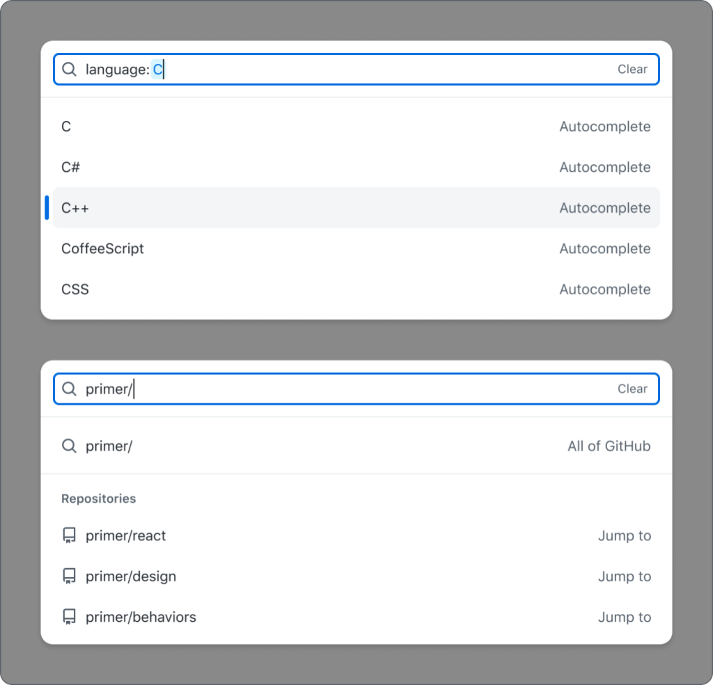
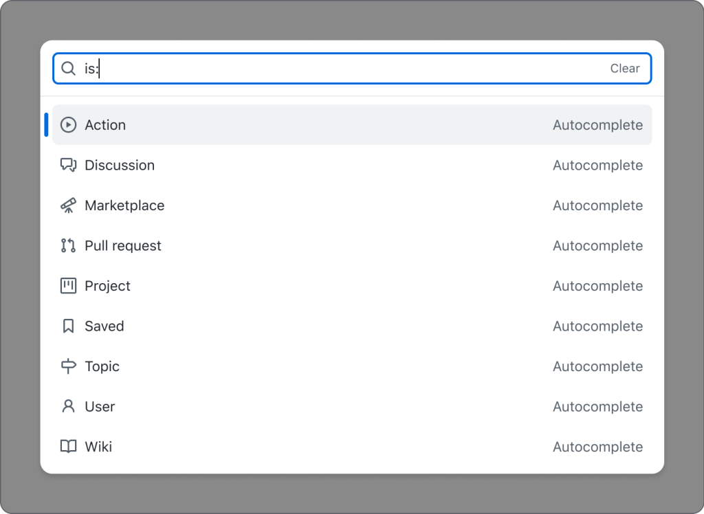
- Suggestions shift based on the user's current input.
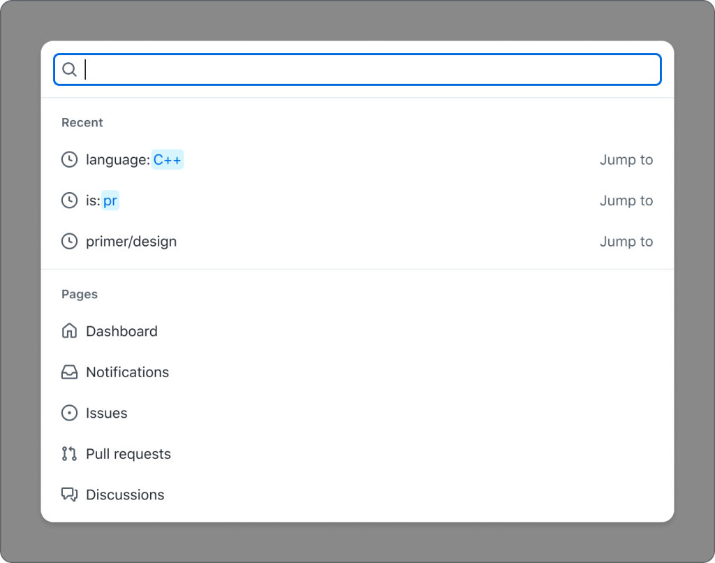
- Within the suggestion list, items are presented in visual groups.
These requirements complicate what might otherwise be solved with a simple search-as-you-type pattern. Here's how QueryBuilder addresses each one accessibly.
An accessible shell: the combobox pattern
The component follows the W3C's Combobox pattern, which provides the expected keyboard and screen reader interactions for an input that filters a listbox of options.
Solving the styled input problem
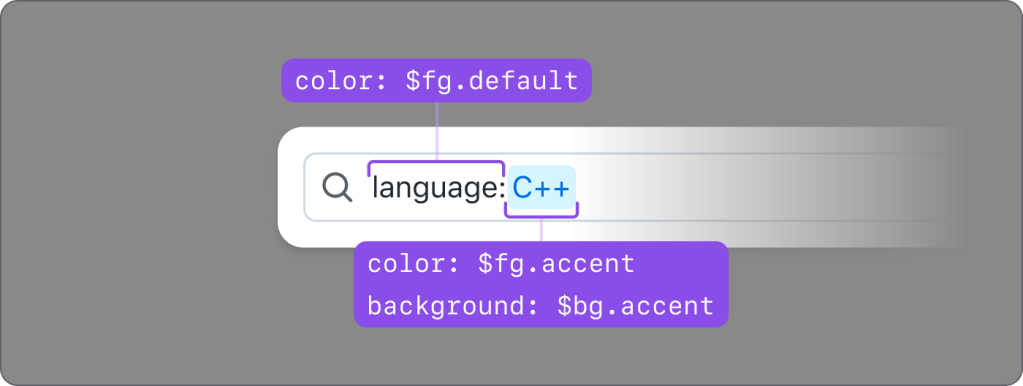
HTML inputs don't support per-character styling without resorting to contenteditable, which brings its own accessibility problems — it disrupts standard keyboard cursor movement and has inconsistent ARIA support across browsers. QueryBuilder instead layers a styled <div aria-hidden="true"> containing <span> elements behind the actual <input>. The input's real text is set to color: transparent, which allows the styled duplicate text to show through while preserving native focus, cursor behavior, and typing. The team verified the alignment at high browser zoom levels so the display holds up visually.
There was an attempt to convey the styled formatting to screen reader users via live-region announcements as the cursor moved through text, but testing revealed overly chatty and unreliable feedback. Given internationalization complexity, that path was dropped in favor of a simpler solution.
Options that do different things
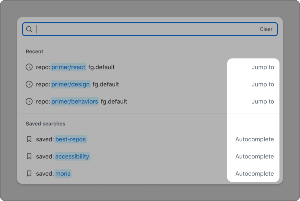
In the standard combobox pattern, selecting an option always appends its value to the input. QueryBuilder adds a second behavior: some options act as links taking the user elsewhere. Options that append trigger no extra screen reader feedback, since that's the expected behavior of a listbox option. Options with navigation behavior get an aria-label that spells out the action — for example, aria-label="README.md, primer/react, jump to this file". The visible text also shows the action type, keeping sighted and screen reader users equally informed.
Grouping without breaking semantics
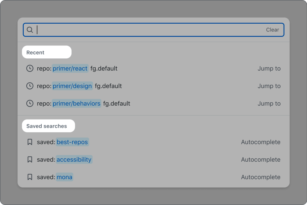
Each group gets a visual header — which serves sighted users but is kept invisible to assistive technology via role="presentation". For screen reader users, the same grouping context comes through the aria-label on each item, which appends the item's group type (for instance, "primer/react, jump to this repository" clarifies that the option belongs to the "repository" group). Putting that group type at the end of the label lets screen reader users scan through option names more quickly, and because it begins with the visible text, voice recognition users stay aligned.
Announcing result states
Screen reader users receive no default indication of how many suggestions are rendered or whether they've cleared the field. QueryBuilder addresses this with an aria-live region that reports when suggestion counts change or the optional clear button is used, then returns focus to the input.
During implementation, the team discovered a quirk in live regions: if a query is edited without changing the result count (e.g., typing "zzz" then "zzzz", both returning zero results), the screen reader would stay silent since the aria-live text hadn't altered. The fix: append or remove a character when the live message matches its predecessor, triggering the announcement without making the extra space audible.
Current status and near-term plans
The component is running on repositories enabled for GitHub Discussions and will roll out to other parts of the UI, including a global search experience. It's built as a Web Component so the same core logic can plug into Primer ViewComponents and Primer React when it's open sourced — letting other teams stand up an advanced, custom search field without redoing the accessibility groundwork. In the meantime, GitHub continues expanding the component's reach and acting on user feedback. More on GitHub's accessibility work is available at accessibility.github.com.


