

Contrast As A System, Not A Fix
Contrast problems rarely come from a single bad color choice. They come from colors working against each other across an entire interface. The solution, then, is to treat contrast as a system-level concern rather than a per-component patch job. CSS custom properties make this practical today, even while newer CSS color functions like color-contrast() remain behind browser flags.
You do not need to maintain two entirely separate designs to deliver a high-contrast experience. What you need is a thoughtful color strategy: define your primary palette, then define high-contrast variants of those same colors, ready to swap in when needed. If your brand colors are inherently low-contrast — a common objection — the answer is not to abandon them but to create alternative versions for contexts where they fail. A low-contrast logo can live inside an SVG and be recolored by CSS; a high-contrast palette can sit alongside the brand palette without replacing it.
Replacing Colors In One Place
The benefit of custom properties is that they give you a centralized switchboard for every color on the page. Set your initial values in :root, then let individual components reference those variables rather than hardcoded hex values. When the time comes to increase contrast, you only need to update the variables — every component that uses them follows along.
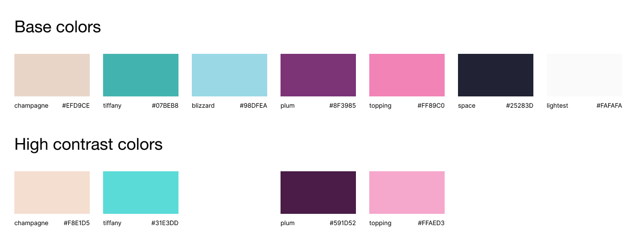
That approach works when you have planned ahead. But many projects are already built with the colors they have. The same custom property technique can be applied retroactively: assign your current colors to variables, then layer a prefers-contrast media query on top to override them. The media query has support in all evergreen browsers.
A practical caveat before relying on this media query: many users with low-vision needs do not know these system settings exist. So prefers-contrast is a valuable progressive enhancement for users who have found the contrast options built into Windows and macOS — not a substitute for testing with real users who struggle with low contrast.
Auditing Where The Contrast Breaks
Before changing anything, use the tools baked into Chrome DevTools to see where you actually have problems. The styles panel shows a contrast indicator when you click on a color value, including the ratio against double-A and triple-A thresholds, plus a suggested color that meets the target. A visual slider shows how far you are from compliance.
For a broader look, open the CSS Overview panel (DevTools menu, then More tools > CSS Overview). Its Colors tab lists current contrast issues across the entire page in one pass.
See the Pen [The cupcake factory [forked]](https://codepen.io/smashingmag/pen/poZrmqm) by utilitybend.
Emulating the prefers-contrast media query is just as straightforward. Open the rendering drawer with cmd+Shift+p in DevTools, type “rendering,” and select it. From there, set “Emulate CSS media feature prefers-contrast” to “more.” The emulation survives page refreshes, so you can iterate on color changes without re-enabling the setting.
Once the emulation is active, add the media query to your root stylesheet and start darkening the colors that are failing. Take it one variable at a time and check the DevTools contrast readout after each change. For critical UI such as navigation and primary calls to action, push past the double-A threshold toward triple-A. The suggested color swatch in DevTools can get you quickly to a target ratio; you can then copy that hex value back into your custom properties.
When elements are inside containers, a color chosen for the surrounding element does not always suit the text inside it. That kind of failure requires targeted overrides on the specific component, not a change to the global variable.
Color Is Not Enough
Increasing contrast ratios is only half of the work. Interfaces that rely on color alone to communicate state will still fail users. An active navigation item distinguished purely by a darker shade, or a card that signals clickability only through a hover color change, is not accessible regardless of contrast score.
Pair your color changes with non-color indicators. A text decoration on an active link, for instance, is a clear and simple solution. If underlines feel too plain, an arrow or similar glyph placed before the active element accomplishes the same thing. The choice is yours — the requirement is that state changes be visible without color perception.
After adjusting colors and indicators, run through the visual deficiency simulations available in the DevTools rendering tab. Simulating conditions like achromatopsia can reveal whether your high-contrast palette holds up under more severe color perception loss. These checks are not a final stamp of approval, but they catch problems early and cheaply. Combined with a few deliberate variable swaps, they turn a low-contrast design into one that respects both the brand and the people trying to read it.
Why Media Queries Aren’t the Answer
Relying on prefers-contrast or other media queries to handle contrast is a tempting shortcut, but it’s fundamentally limited. You can never know whether a user has enabled a high-contrast setting, or whether they’re browsing with a specific visual impairment like achromatopsia. Media queries only catch a fraction of real-world scenarios, so they should never be the foundation of an accessible design. Instead, a well-structured system of CSS custom properties that defaults to strong contrast will serve far more users without requiring any special detection.
That said, media queries aren’t useless. They can be a useful tool for edge cases where you need to override a particular theme or layout. The key is to treat them as an enhancement rather than a dependency. If your design already maintains legible contrast by default, a media query is just a bonus layer of polish for those who explicitly request it.
Best Practices for Contrast-Driven Systems
The safest approach is to start with a design that has good contrast baked in from the beginning. In practice, this often means the high-contrast version of a UI ends up looking better than the low-contrast one — it’s harder to make a low-contrast palette that still feels intentional and brand-appropriate. But there are legitimate cases where muted colors fit a brand’s identity, and in those situations, a custom property system makes it trivial to swap to a more accessible palette without a full redesign.
- Define all color tokens as CSS custom properties so you can swap entire themes in one place.
- Set your default values to meet at least WCAG AA contrast ratios for body text and UI components.
- Use media queries only for explicit user settings, not as your primary accessibility mechanism.
- Test with both simulated and real contrast configurations to see how your tokens behave.
CSS evolves quickly, and new capabilities keep arriving. No matter what tools you adopt next, the core principle stays the same: if your color system already adds value for users with contrast issues, you’re improving the web for everyone. Building contrast into your design tokens from day one is a simple, future-proof way to make that happen.
For a complete working example, you can inspect the full demo on CodePen.


