Trigonometry lands in CSS
sin() and cos() are available in the latest Firefox and Safari releases, with tan() and other trigonometry functions still in the pipeline. The pair is a natural fit for placing content around a circle — historically the job of a Sass mixin. This walkthrough uses them to position the characters of a clock face, and then reuses the same math for a couple of other shapes.
Markup and container setup
The starting point is a <time> element carrying a datetime attribute, with one child element per hour label:
<div class="clock">
  <div class="clock-face">
    <time datetime="12:00">12</time>
    <time datetime="1:00">1</time>
    <time datetime="2:00">2</time>
    <time datetime="3:00">3</time>
    <time datetime="4:00">4</time>
    <time datetime="5:00">5</time>
    <time datetime="6:00">6</time>
    <time datetime="7:00">7</time>
    <time datetime="8:00">8</time>
    <time datetime="9:00">9</time>
    <time datetime="10:00">10</time>
    <time datetime="11:00">11</time>
  </div>
</div>
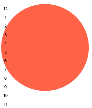
Basic styles on .clock-face establish the shape and a background color. The container's width is stored in a custom property so it can be reused later:
.clock {
  --_ow: clamp(5rem, 60vw, 40rem);
  --_w: 88cqi;
  aspect-ratio: 1;
  background-color: tomato;
  border-radius: 50%;
  container-type: inline;
  display: grid;
  height: var(--_ow);
  place-content: center;
  position: relative;
  width: var(--_ow);
}
A second variable, --_r, holds the circle's radius — half the width. Deriving it with calc() means it follows any change to --_w automatically:
.clock {
  --_w: 300px;
  --_r: calc(var(--_w) / 2);
  /* rest of styles */
}
Computing label coordinates
A full circle is 360 degrees, and twelve labels sit every 30 degrees (360 / 12). In mathematical terms a circle starts at 3 o'clock, so noon is minus 90 degrees from that, or 270 degrees (360 - 90). Each label's angle goes into the --_d variable, incremented by 30 degrees per element:
.clock time:nth-child(1) { --_d: 270deg; }
.clock time:nth-child(2) { --_d: 300deg; }
.clock time:nth-child(3) { --_d: 330deg; }
.clock time:nth-child(4) { --_d: 0deg; }
.clock time:nth-child(5) { --_d: 30deg; }
.clock time:nth-child(6) { --_d: 60deg; }
.clock time:nth-child(7) { --_d: 90deg; }
.clock time:nth-child(8) { --_d: 120deg; }
.clock time:nth-child(9) { --_d: 150deg; }
.clock time:nth-child(10) { --_d: 180deg; }
.clock time:nth-child(11) { --_d: 210deg; }
.clock time:nth-child(12) { --_d: 240deg; }
The X coordinate follows radius + (radius * cos(degree)):
--_x: calc(var(--_r) + (var(--_r) * cos(var(--_d))));The Y coordinate follows radius + (radius * sin(degree)):
--_y: calc(var(--_r) + (var(--_r) * sin(var(--_d))));Each label is absolutely positioned and placed using those two values. A --_sz variable is introduced here to hold the labels' width and height, which matters in the next step:
.clock-face time {
  --_x: calc(var(--_r) + (var(--_r) * cos(var(--_d))));
  --_y: calc(var(--_r) + (var(--_r) * sin(var(--_d))));
  --_sz: 12cqi;
  display: grid;
  height: var(--_sz);
  left: var(--_x);
  place-content: center;
  position: absolute;
  top: var(--_y);
  width: var(--_sz);
}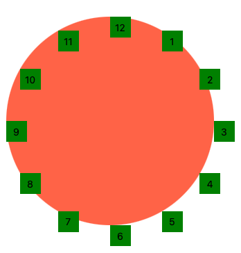
At this point each label's top-left corner sits on the correct spot of the circle, so the radius used for positioning must be reduced. Subtracting the label size (--_sz) from the circle size (--_w) before deriving the radius fixes the alignment:
--_r: calc((var(--_w) - var(--_sz)) / 2);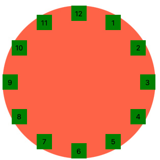
From there, color changes are all that's needed for a more refined look:
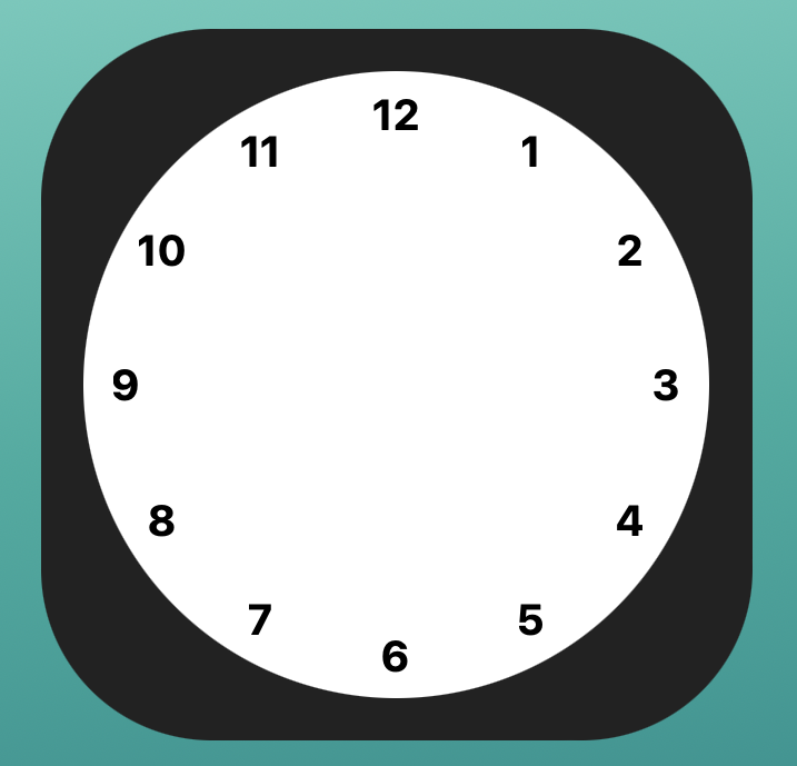
Adding the hands with a single animation
The clock needs arms for hours, minutes, and seconds. Three extra elements go into the markup:
<div class="clock">
  <!-- after <time>-tags -->
  <span class="arm seconds"></span>
  <span class="arm minutes"></span>
  <span class="arm hours"></span>
  <span class="arm center"></span>
</div>
The three arms share common styles — mostly absolute positioning and placement:
.arm {
  background-color: var(--_abg);
  border-radius: calc(var(--_aw) * 2);
  display: block;
  height: var(--_ah);
  left: calc((var(--_w) - var(--_aw)) / 2);
  position: absolute;
  top: calc((var(--_w) / 2) - var(--_ah));
  transform: rotate(0deg);
  transform-origin: bottom;
  width: var(--_aw);
}
All three also share a single animation, and differ only in how long one full turn takes:
@keyframes turn {
  to {
    transform: rotate(1turn);
  }
}
Hour and minute durations
A full turn takes 12 hours for the hours arm. Since animation-duration accepts only milliseconds and seconds, that is 43,200 seconds (60 seconds * 60 minutes * 12 hours):
animation: turn 43200s infinite;The minutes arm completes a turn in 1 hour, but the movement should be stepped rather than linear so each tick is staggered. That requires 60 steps, one per minute:
animation: turn 3600s steps(60, end) infinite;The seconds arm works the same way with a 60-second duration:
animation: turn 60s steps(60, end) infinite;The properties defined in the shared styles are then overridden per arm:
.seconds {
  --_abg: hsl(0, 5%, 40%);
  --_ah: 145px;
  --_aw: 2px;
  animation: turn 60s steps(60, end) infinite;
}
.minutes {
  --_abg: #333;
  --_ah: 145px;
  --_aw: 6px;
  animation: turn 3600s steps(60, end) infinite;
}
.hours {
  --_abg: #333;
  --_ah: 110px;
  --_aw: 6px;
  animation: turn 43200s linear infinite;
}
Starting at the current time
A small amount of JavaScript lets the clock open at the real time. The clock face gets id="app", and two custom properties are set on it that carry a negative animation-delay:
const time = new Date();
const hour = -3600 * (time.getHours() % 12);
const mins = -60 * time.getMinutes();
app.style.setProperty('--_dm', `${mins}s`);
app.style.setProperty('--_dh', `${(hour+mins)}s`);
Because getHours() returns a 24-hour value, the remainder operator converts it to the 12-hour format. The CSS side needs the animation-delay applied as well:
.minutes {
  animation-delay: var(--_dm, 0s);
  /* other styles */
}

.hours {
  animation-delay: var(--_dh, 0s);
  /* other styles */
}
Fallback for older browsers
Browsers without sin() and cos() can be handled with CSS @supports, reusing the properties already defined:
@supports not (left: calc(1px * cos(45deg))) {
  time {
    left: 50% !important;
    top: 50% !important;
    transform: translate(-50%,-50%) rotate(var(--_d)) translate(var(--_r)) rotate(calc(-1*var(--_d)))
  }
}
Same technique, other shapes
Swapping the <time> elements for <img> and adjusting the width (--_w) and radius (--_r) values turns the clock into a circular image gallery.
The layout math also supports patterns unrelated to timepieces — for instance a ring of dots modeled on a poster design. For that, an unordered list is the right markup, since the dots follow no particular order, and the list items don't need to be written by hand:
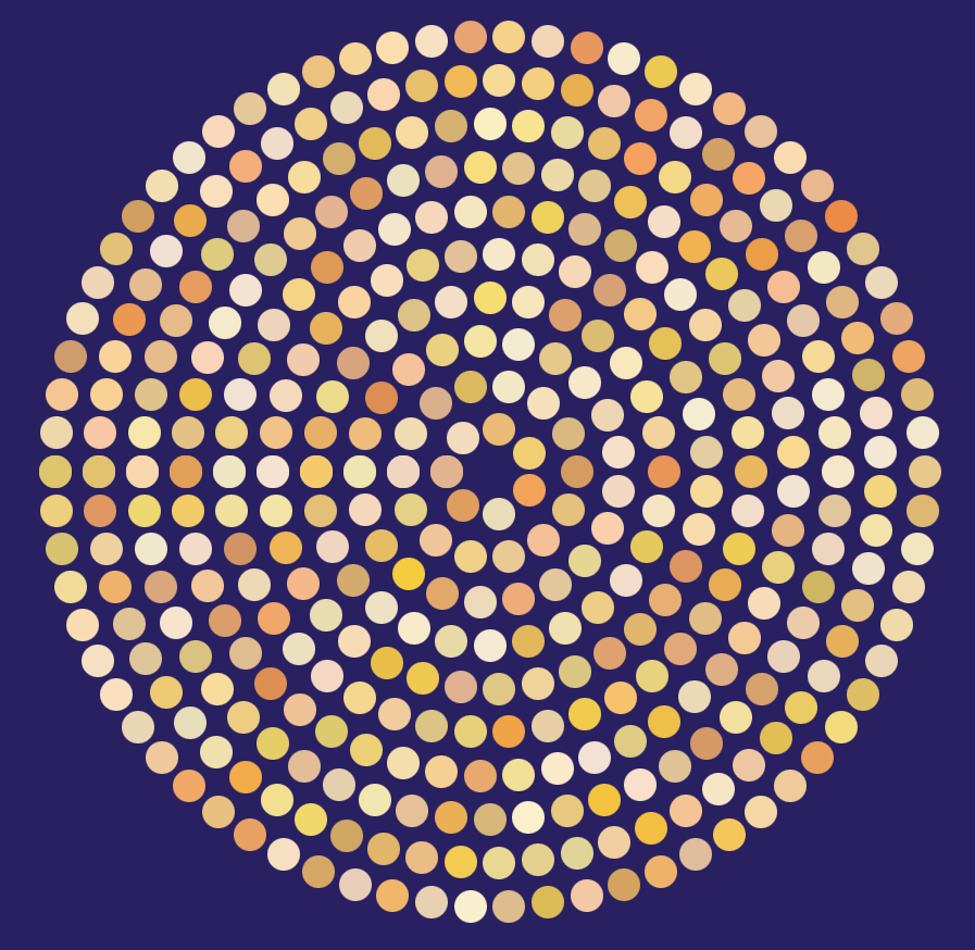
Range inputs, wrapped in a <form> and observed via the input event, act as controls:
<form id="controls">
  <fieldset>
    <label>Number of rings
      <input type="range" min="2" max="12" value="10" id="rings" />
    </label>
    <label>Dots per ring
      <input type="range" min="5" max="12" value="7" id="dots" />
    </label>
    <label>Spread
      <input type="range" min="10" max="40" value="40" id="spread" />
    </label>
  </fieldset>
</form>
Handling "input" rebuilds the <li> elements, applying the same --_d degree variable to each and reusing --_r. Each dot also gets a varied HSL color, stored in a new --_bgc variable:
const update = () => {
  let s = "";
  for (let i = 1; i <= rings.valueAsNumber; i++) {
    const r = spread.valueAsNumber * i;
    const theta = coords(dots.valueAsNumber * i);
    for (let j = 0; j < theta.length; j++) {
      s += `<li style="--_d:${theta[j]};--_r:${r}px;--_bgc:hsl(${random(
        50,
        25
      )},${random(90, 50)}%,${random(90, 60)}%)"></li>`;
    }
  }
  app.innerHTML = s;
}
The random() helper picks a value within a defined range:
const random = (max, min = 0, f = true) => f ? Math.floor(Math.random() * (max - min) + min) : Math.random() * max;JavaScript only renders the markup; once it exists, sin() and cos() take over the placement.
Outlook
Positioning elements around a circle is a deliberately simple demonstration of what trigonometry functions can do. Their broader value is replacing old workarounds, and more complex, creative uses are likely once Chrome and Edge pick up support.




