
The Modern Way to Tame Image Aspect Ratios in CSS
Keeping images consistently sized across a row of cards is a classic CSS headache. Historically, developers either pre-cropped images, exchanged inline img elements for background-image-carrying divs, or relied on the notorious padding-bottom trick (where 9/16 = 56.26% became a familiar arithmetic chore).
Two modern CSS properties — object-fit and aspect-ratio — now offer a much cleaner way to control image dimensions while preserving the semantic value of a real img tag. Here’s how to pair them with gradient effects for a fully responsive component.
Establishing the Card Foundation
Start with semantic HTML for the card layout, using an unordered list as the container for the card components:
<ul class="card-wrapper">
  <li class="card">
    <img src="" alt="">
    <h3>A Super Wonderful Headline</h3>
    <p>Lorem ipsum sit dolor amit</p>
  </li>
  <!-- additional cards -->
</ul>
Next, apply baseline card styles. These handle the visual chrome: a card background and border, typographic treatment for the h3, and the essential image rules to get things off the ground.
.card {
  background-color: #fff;
  border-radius: 0.5rem;
  box-shadow: 0.05rem 0.1rem 0.3rem -0.03rem rgba(0, 0, 0, 0.45);
  padding-bottom: 1rem;
}

.card > :last-child {
  margin-bottom: 0;
}

.card h3 {
  margin-top: 1rem;
  font-size: 1.25rem;
}

img {
  border-radius: 0.5rem 0.5rem 0 0;
  width: 100%;
}

img ~ * {
  margin-left: 1rem;
  margin-right: 1rem;
}
The general sibling combinator (~) applies horizontal margins to elements following the img, ensuring the image sits flush against the card’s edges while the text blocks are inset.
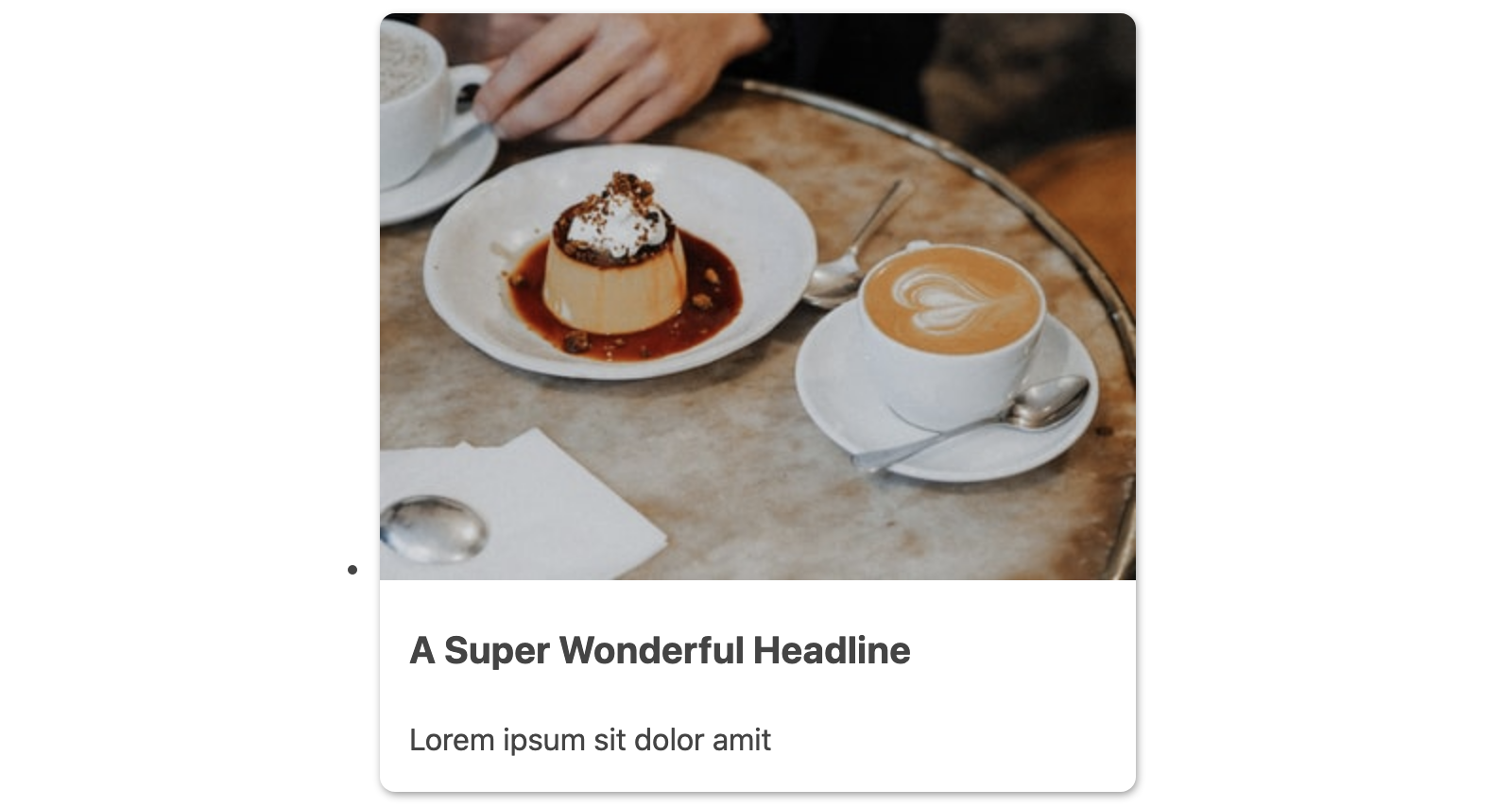
The card wrapper uses CSS Grid for a responsive multi-column layout with minimal effort.
.card-wrapper {
  list-style: none;
  padding: 0;
  margin: 0;
  display: grid;
  grid-template-columns: repeat(auto-fit, minmax(30ch, 1fr));
  grid-gap: 1.5rem;
}
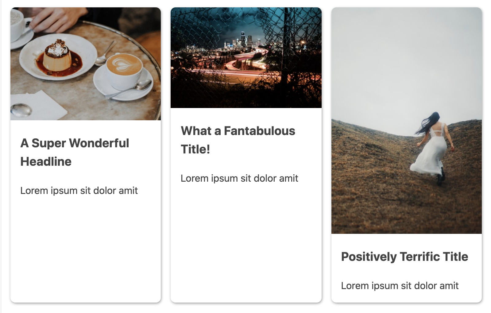
With images of varying natural dimensions, these baseline rules are insufficient. The cards render with uneven image heights — exactly the kind of visual inconsistency these properties are meant to eliminate.
Constraining Images With object-fit
The object-fit property gives the img element the same container behavior that made background-size: cover so popular — but without removing the image from the document flow semantically.
Pairing object-fit: cover with a height value does the bulk of the work. A solid approach uses the max() function so the height never collapses too far on small viewports or under high browser zoom:
img {
  /* ...existing styles */
  object-fit: cover;
  height: max(10rem, 30vh);
}
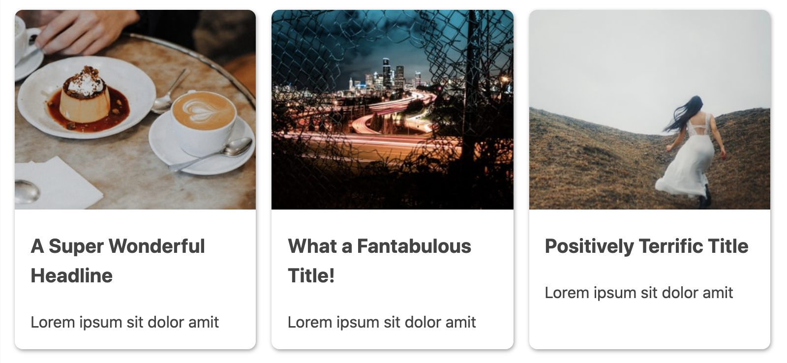
With this applied, every card image displays at a uniform height regardless of its natural dimensions:
Locking It Down With aspect-ratio
The drawback of using only object-fit with a fixed height is that the ratio is in constant flux as the container resizes. In Chromium browsers, the newer aspect-ratio property eliminates the need for dimension hints altogether. Define the ratio, and the image scales predictably with its container:
img {
  border-radius: 0.5rem 0.5rem 0 0;
  width: 100%;
  object-fit: cover;
  aspect-ratio: 4/3;
}
A 4/3 ratio suits the card context well, though square (1/1) or widescreen (16/9) are equally viable depending on your content.
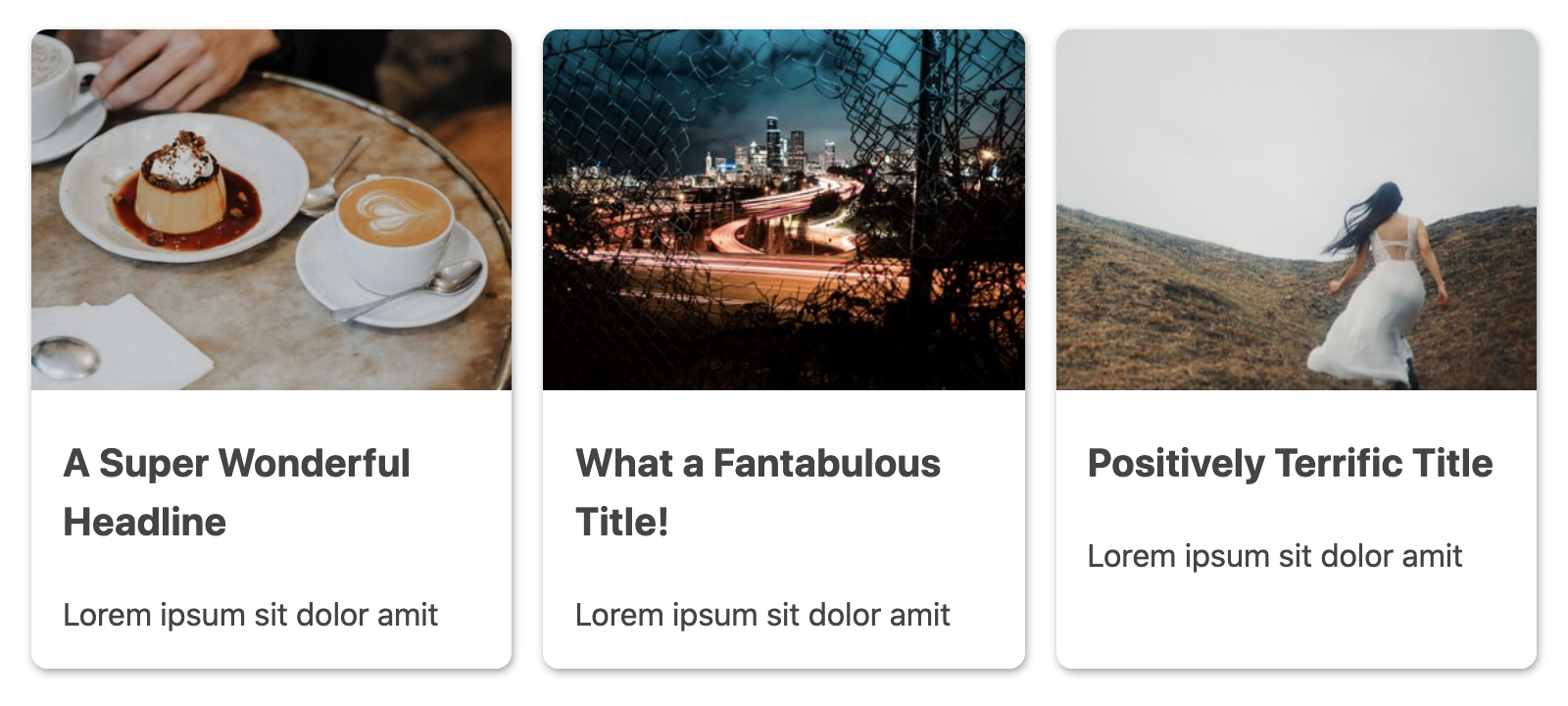
With aspect-ratio, the ratio stays locked as elements grow and shrink; with only object-fit and a fixed height, the effective image ratio changes continuously, making consistent presentation predictable only at one viewport size.
Adding a Responsive Gradient Fade
To create a feathered transition from the image into the card content, define the gradient colors as a CSS custom property. The last color in the gradient should match the card background — with a white card, that’s white — so the transition looks seamless rather than painted-over.
.card {
  --card-gradient: #5E9AD9, #E271AD;

  background-image: linear-gradient(
    var(--card-gradient),
    white max(9.5rem, 27vh)
  );
  /* ...existing styles */
}
The killer feature here is the use of the max() function inside the gradient definition. This lets the gradient’s transition point scale responsively with the container, matching the image height as the layout reflows across breakpoints.
The overlay blend mode, controlled by mix-blend-mode, lets the image’s mid-tones blend with the gradient behind it, producing that atmospheric color wash:
img {
  /* ...existing styles */
  mix-blend-mode: overlay;
}
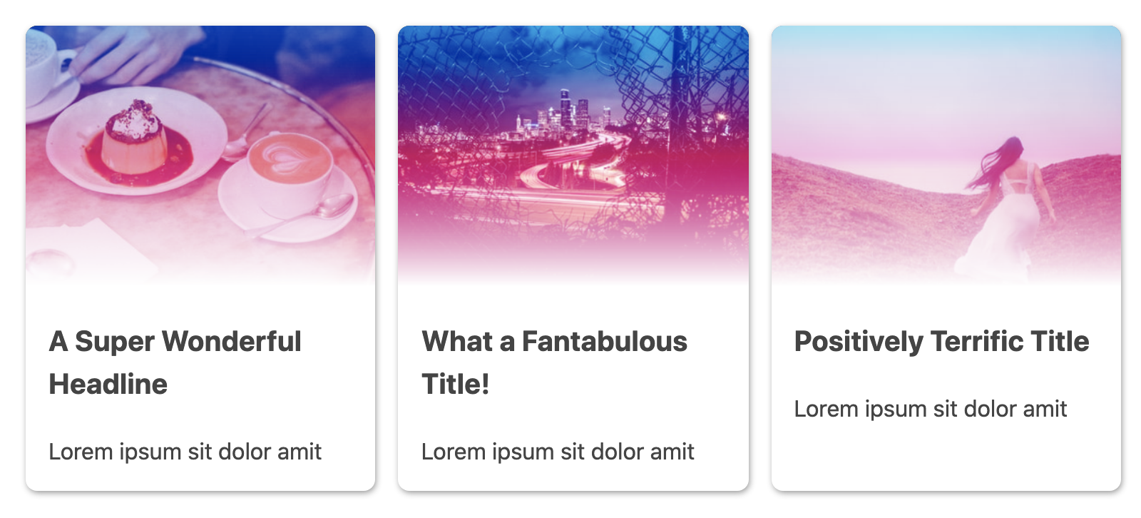
Because the image container relies on aspect-ratio alone, container resizing shifts where the image ends. Adding a max-height constraint using the same max() function keeps the gradient transition adjacent to the image’s bottom edge.
img {
  /* ...existing styles */
  max-height: max(10rem, 30vh);
}
One caveat: applying a max-height alters aspect-ratio behavior. The exact ratio is then only used when sufficient vertical space exists; beyond that constraint, max-height takes over. Image sizing remains consistent and responsive, but expect to fine-tune values for your specific component.
A Darker Direction: multiply and grayscale()
The overlay blend looks great for a fade-to-white effect. To shift to a more dramatic aesthetic, swap in multiply as the blend mode and update the gradient palette:
.card {
  --card-gradient: tomato, orange;
  --card-blend-mode: multiply;
}

img {
  /* ...existing styles */
  mix-blend-mode: var(--card-blend-mode);
}
Note: making the blend mode value a custom property is purely for tidiness — a smarter way to manage design-token-level changes.
multiply darkens the mid-tones while preserving pure whites and blacks, which removes the fade and produces a hard cutoff at the image’s bottom edge:
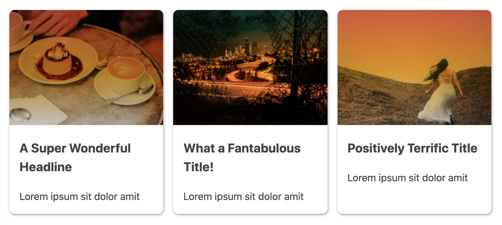
To let the gradient be the only source of color in the component, add the grayscale() filter to completely neutralize the image’s internal hues:
img {
  /* ...existing styles */
  filter: grayscale(100);
}
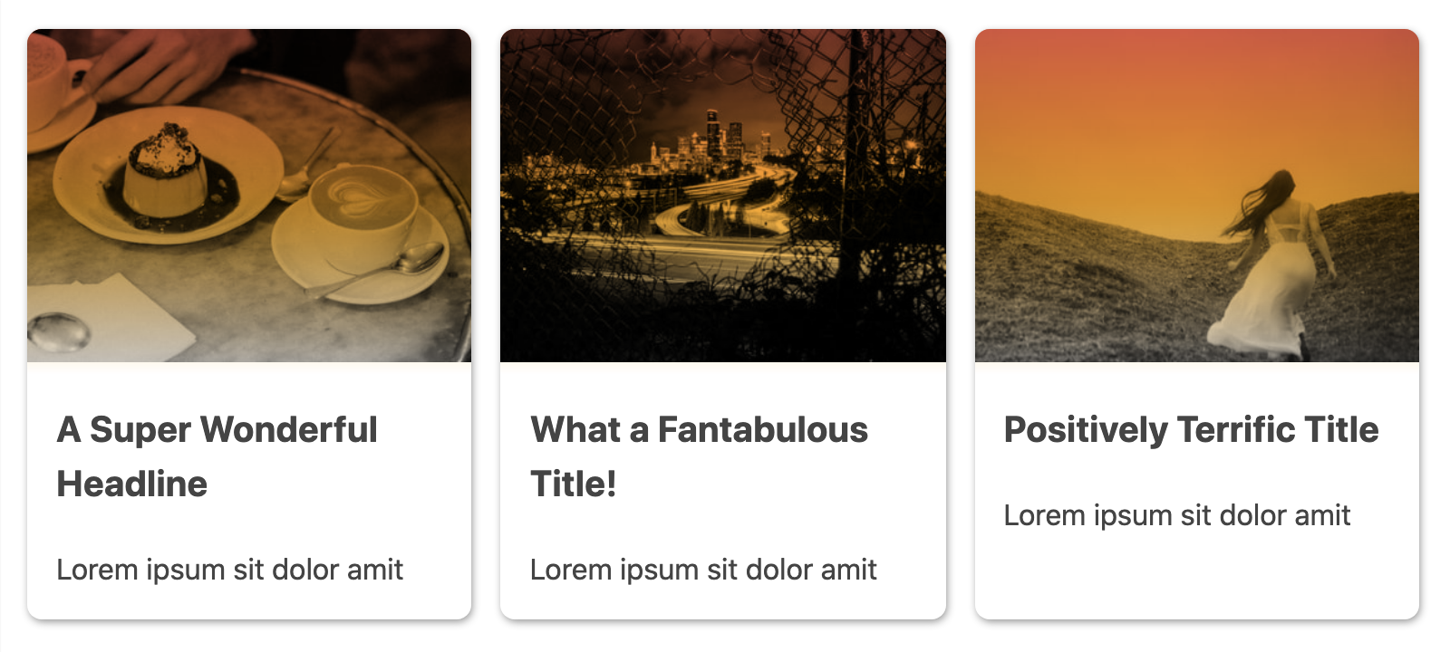
The Resilience of Progressive Enhancement
aspect-ratio is currently limited to current Chromium browsers. However, because object-fit has deep support in all major browsers, any layout using aspect-ratio can depend on a graceful degradation path. The result in browsers without aspect-ratio is still predictable, if not perfectly uniform:
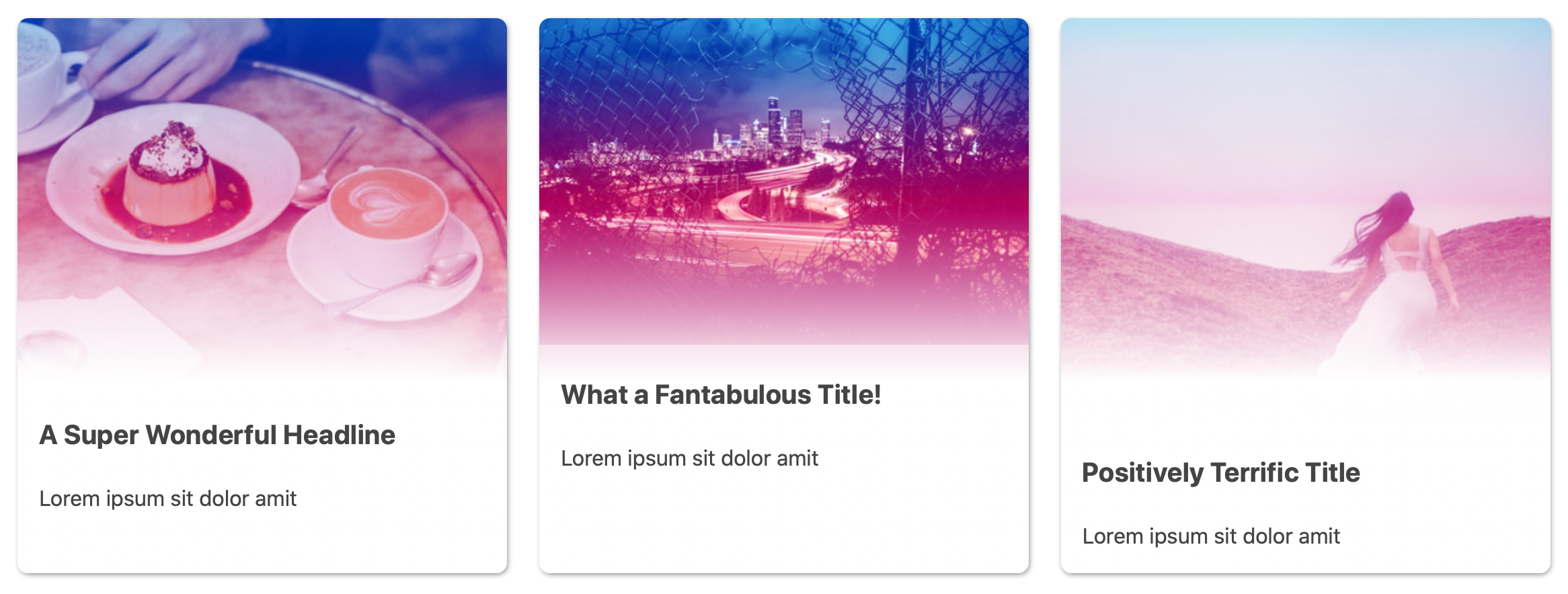
In these cases, the image height is capped by the declared max-height but natural image proportions retain some variance. You can compensate with a tailored max-height value or the max() function to introduce responsive behavior for the less-capable browsers.
Adding Interactivity With :focus-within
Because the gradient stops live in a CSS custom property (--card-gradient), changing the look of a card under different interaction states is straightforward. We only need to override that one variable.
To make the cards accessible and interactive, first wrap the heading text in a real link:
<h3><a href="">A Super Wonderful Headline</a></h3>
Then target that link with :focus-within alongside :hover. This combination covers mouse, keyboard, and touch interactions. In the updated rule, reassign --card-gradient so a single color takes over most of the image area, while keeping a softer edge — hence the slightly smaller max() values for the new stops. If the values matched the original white stops, the transition would create an artificial straight line across the image:
.card:focus-within,
.card:hover {
  --card-gradient: #24a9d5 max(8.5rem, 20vh);
}
One caveat: gradient stops and color stops are not reliably animatable yet, though CSS Houdini should improve that in time.
The Performance Trade-Off
During prototyping, a zoom effect using transform: scale() on the image seemed promising. However, when mixed with mix-blend-mode, browsers would not consistently repaint the image, causing visible flickering. CSS-only effects are powerful, but they are not always free. Always check the actual rendering performance of your chosen animation and blending techniques before shipping them.
Putting It All Together
The combination of aspect-ratio, object-fit, and gradient functions like max() unlocks several responsive image effects without JavaScript. The key is testing them not just across browsers — which still varies — but also across viewports and container sizes to make sure the effects hold up wherever they are rendered.
The final CodePen with all the techniques discussed is embedded below:



