

Angular 9 schematics are code generators that produce components and patterns from predetermined templates, and both Angular Material and ng2-charts expose them for dashboard work. Angular Material ships schematics for navigation, tables, address books, trees and dashboards, while ng2-charts provides schematics for chart components. The worked example here is an admin panel for an online leather-goods store tracking revenue, order value, order counts, returning customers, product sales, traffic sources, sessions over time and weekly sales.
Project Setup
You need the Angular CLI; installation instructions live at cli.angular.io. Without an existing project, generate one:
ng new store-admin-panelRoutes must be configured. When starting from a new app, answer yes to the prompt about adding an Angular Routing module.
Add Angular Material first:
ng add @angular/materialChoose a theme from the subsequent prompts. You will then be asked whether to include Angular Material typography styles and browser animations; neither is required, so answering no is fine.
ng2-charts depends on charts.js, so install both, then register the charts module.
npm install ng2-charts --savenpm install chart.js --saveimport { ChartsModule } from 'ng2-charts';
@NgModule({
imports: [
…
ChartsModule,
…
]
})The schematics do not ship with ng2-charts by default, so install them as a dev dependency:
npm install --save-dev ng2-charts-schematicsNavigation And Dashboard Scaffolding
Users need a way to move between the admin panel's pages. A nav component named nav is generated by an Angular Material schematic:
ng generate @angular/material:navigation navUse the routerLink directive for the remaining routes, and set the toolbar page name according to the active route.
// nav.component.ts
...
menuItems = ['dashboard', ’sales', 'orders', 'customers', 'products'];
<!--nav.component.html-->
...
<mat-nav-list>
<a *ngFor="let item of menuItems" mat-list-item [routerLink]="'/'+item"> {{item | titlecase}} </a>
...The component is displayed by adding it to app.component.html:
<!--app.component.html-->
<app-nav></app-nav>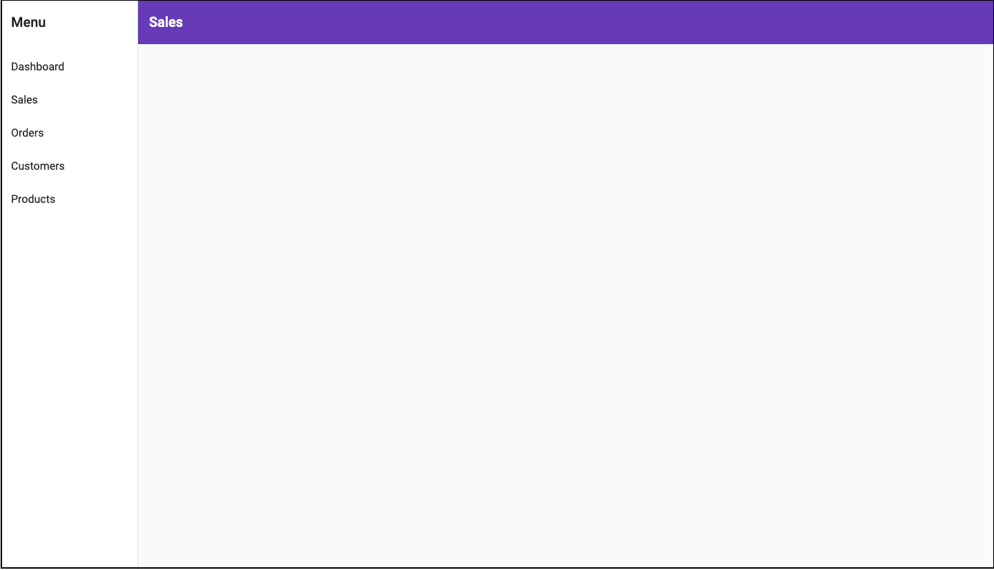
Because the nav shares the screen with other components, it needs a router-outlet for switching between them. In nav.component.html, immediately after the closing </mat-toolbar>, replace the <!-- Add Content Here --> comment with <router-outlet></router-outlet>.
<!--nav.component.html-->
<mat-sidenav-container>
   ...
   <mat-sidenav-content>
     <mat-toolbar>
       ...
     </mat-toolbar>
     <router-outlet></router-outlet>
   </mat-sidenav-content>
 </mat-sidenav-container>
Later screenshots omit the nav so the dashboard is easier to see; if you follow along, it still appears in the browser with the dashboard nested inside it.
The Responsive Layout
Generating the layout itself is a matter of running the @angular/material:dashboard schematic with your chosen name — in this case dash:
ng generate @angular/material:dashboard dashRegister a route so the dashboard renders inside the nav:
// app-routing.module.ts
import { DashComponent } from './dash/dash.component';

const routes: Routes = [{ path: 'dashboard', component: DashComponent }];

@NgModule({
  imports: [RouterModule.forRoot(routes)],
  exports: [RouterModule]
})
Run npm start and open localhost:4200/dashboard:
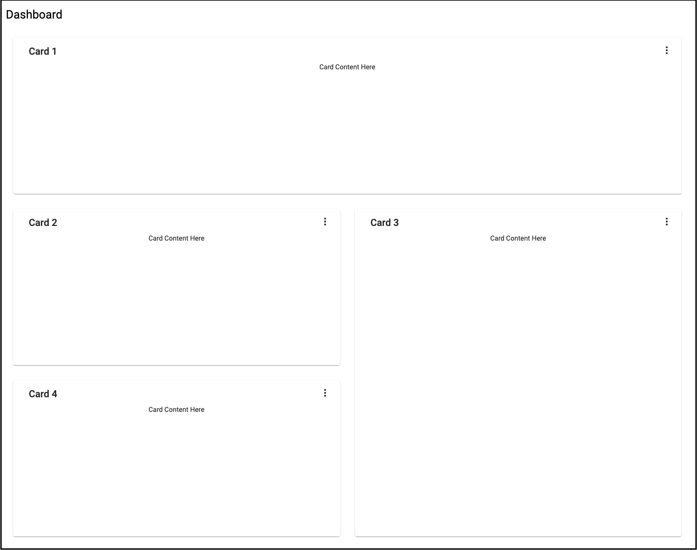
The generated template puts four cards on a responsive grid styled by the Angular Material CDK's Layout package. Its BreakpointObserver utility evaluates media queries and adjusts the UI, and although 14 breakpoint states are available, the generated component only handles Breakpoints.Handset matches versus everything else.
// dashboard.component.js
...
cards = this.breakpointObserver.observe(Breakpoints.Handset).pipe(
    map(({ matches }) => {
      if (matches) {
        ...
      }
      ...
    })
  );
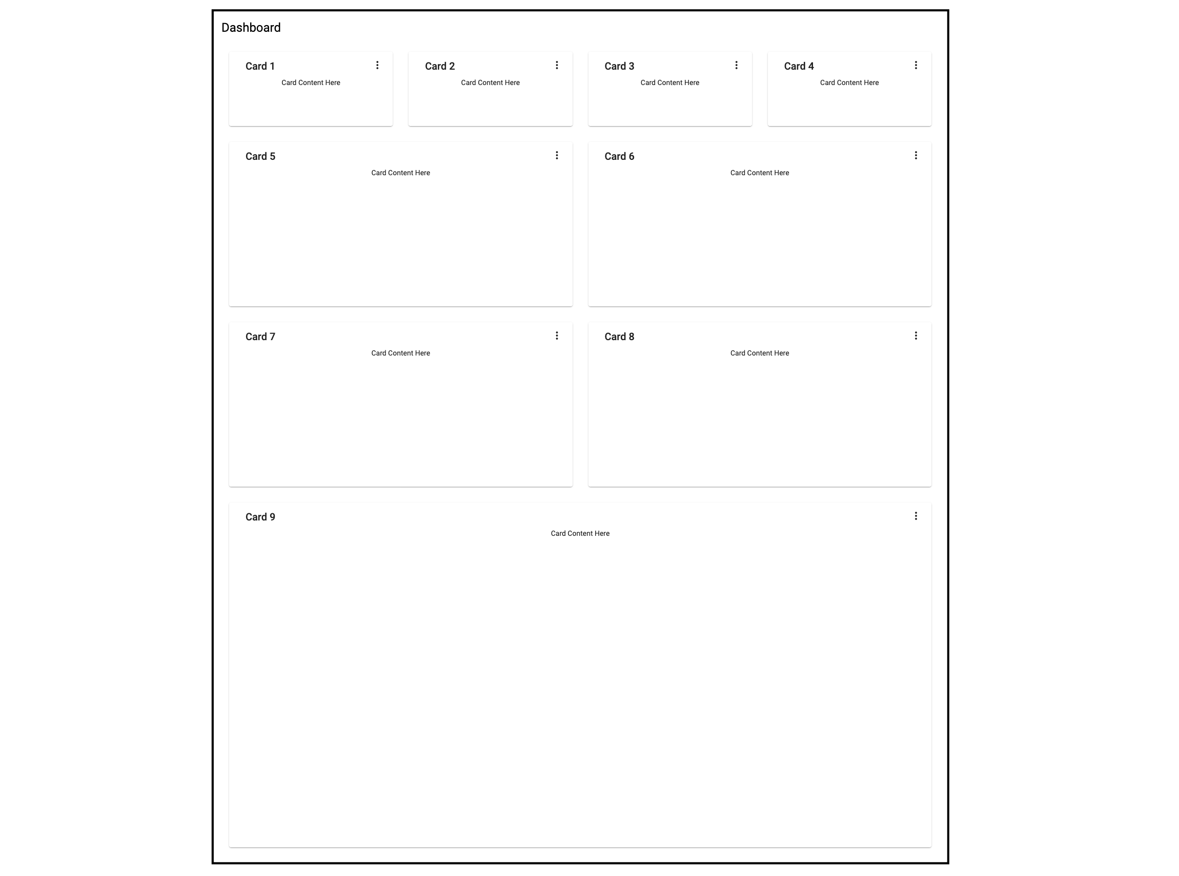
The finished dashboard needs nine cards: four summary cards, four charts and a table. Where Breakpoints.Handset and Breakpoints.Tablet match, the grid is one column wide, with the summary cards spanning one row, the charts two rows, and the table four rows. Where those breakpoints do not match, the grid is four columns wide, with each summary card occupying one row and one column, each chart two rows and two columns, and the table four rows and four columns.
The table follows the same data flow as the charts: pull the records in ngOnInit from a service, then rewire the generated data source to consume that service. Inject OrderService in the OrdersTableComponent constructor, update the MatTable type assertion of the table view child, and adjust the displayed-columns list to match an order interface. The total length of available items feeds the length property of <mat-paginator>.
// orders-table.component.ts
import { OrderService } from '../orders.service';
import { Order } from '../order';
...
export class OrdersTableComponent implements AfterViewInit, OnInit {
...
 @ViewChild(MatTable) table: MatTable;
 dataLength: number;

 displayedColumns = [
   "id",
   "date",
   "name",
   "status",
   "orderTotal",
   "paymentMode",
 ];
...
constructor(private orderService: OrderService){}

ngOnInit() {
 this.datasource = new OrdersTableDataSource(this.orderService);
 this.orderService.getOrderCount().subscribe({
   next: orderCount => {
    this.dataLength = orderCount;
   },
   ...
 });
}
...
}
OrdersTableDataSource then needs the OrderService passed into its constructor, along with changes to its connect and destroy methods. connect wires the data source to the table and refreshes it whenever the returned stream — here an observable of an orders array — emits. A dataMutations constant merges the initial load, pagination and sort events into a single stream; because pagination and sorting are server-side, the offset and page size from the paginator, plus the active sort field and direction, go to getOrders on the service. disconnect closes connections opened in connect and releases the resources they hold.
// orders-table.datasource.ts
...
export class OrdersTableDataSource extends DataSource<Order> {
 paginator: MatPaginator;
 sort: MatSort;

 constructor(private orderService: OrderService) {
   super();
 }

 connect(): Observable<Order[]> {
   const dataMutations = [
     of('Initial load'),
     this.paginator.page,
     this.sort.sortChange
   ];

   return merge(...dataMutations).pipe(mergeMap(() => {
     return this.orderService.getOrders(
       this.paginator.pageIndex * this.paginator.pageSize,
       this.paginator.pageSize,
       this.sort.active,
       this.sort.direction
     );
   }));
 }

 disconnect() {}
}
In the template, add the new columns and bind <mat-paginator>'s length to dataLength. Render the status column with a <mat-chip> element for clearer visualization, which requires importing MatChipsModule into AppModule.
<!-- orders-table.component.html -->
<div class="mat-elevation-z8">
 <table mat-table class="full-width-table" matSort aria-label="Elements">
   <!-- Id Column -->
   <ng-container matColumnDef="id">
     <th mat-header-cell *matHeaderCellDef mat-sort-header>Id</th>
     <td mat-cell *matCellDef="let row">{{row.id}}</td>
   </ng-container>

   <!-- Date Column -->
   <ng-container matColumnDef="date">
     <th mat-header-cell *matHeaderCellDef mat-sort-header>Date</th>
     <td mat-cell *matCellDef="let row">{{row.date | date }}</td>
   </ng-container>

   <!-- Name Column -->
   <ng-container matColumnDef="name">
     <th mat-header-cell *matHeaderCellDef mat-sort-header>Name</th>
     <td mat-cell *matCellDef="let row">{{row.name}}</td>
   </ng-container>

   <!-- Order Total Column -->
   <ng-container matColumnDef="orderTotal">
     <th mat-header-cell *matHeaderCellDef mat-sort-header>Order Total</th>
     <td mat-cell *matCellDef="let row">{{row.orderTotal | currency}}</td>
   </ng-container>

   <!-- Payment Mode Column -->
   <ng-container matColumnDef="paymentMode">
     <th mat-header-cell *matHeaderCellDef mat-sort-header>Payment Mode</th>
     <td mat-cell *matCellDef="let row">{{row.paymentMode}}</td>
   </ng-container>

   <!-- Status Column -->
   <ng-container matColumnDef="status">
     <th mat-header-cell *matHeaderCellDef mat-sort-header>Status</th>
     <td mat-cell *matCellDef="let row">
       <mat-chip-list>
         <mat-chip color="{{ row.status == 'delivered' ? 'primary' : ( row.status == ’shipped' ? 'accent' : 'warn' ) }}" selected>
           {{row.status}}
         </mat-chip>
       </mat-chip-list>
     </td>
   </ng-container>

   <tr mat-header-row *matHeaderRowDef="displayedColumns"></tr>
   <tr mat-row *matRowDef="let row; columns: displayedColumns;"></tr>
 </table>

 <mat-paginator #paginator [length]="dataLength" [pageIndex]="0" [pageSize]="5" [pageSizeOptions]="[5, 10, 15, 20]">
 </mat-paginator>
</div>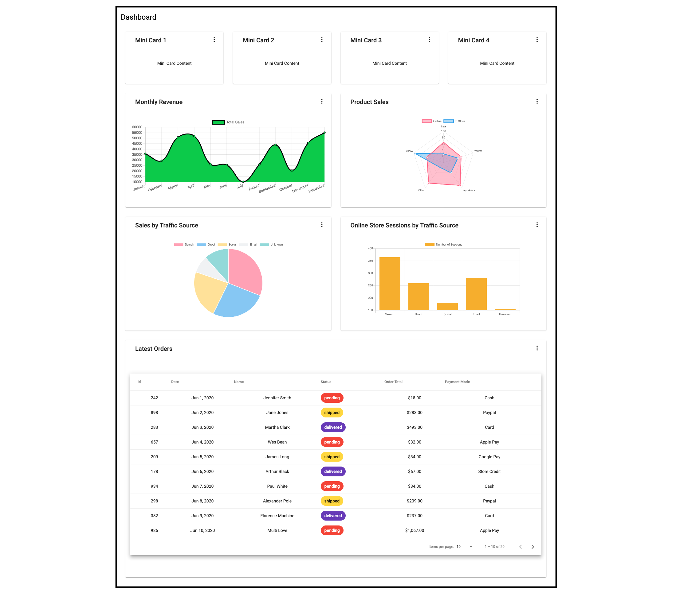
Mini cards for the summary row
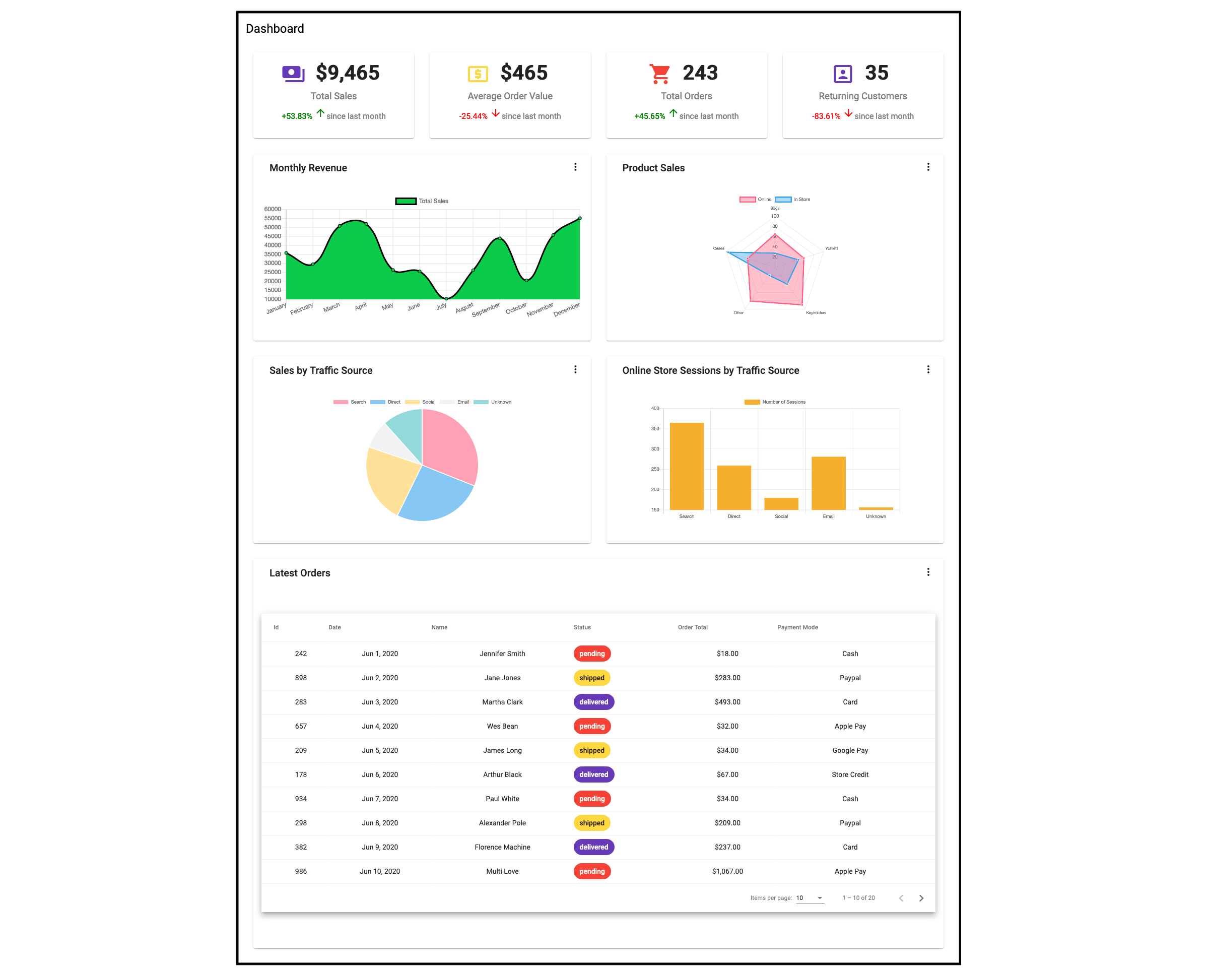
Four small cards across the top complete the dashboard. Summary cards like these suit short facts that don't warrant a full chart or table — in this example total sales, average order value, total orders, and returning customers for the day. These are example values; the cards can hold anything, or be dropped entirely. Unlike navigation, layout, charts and tables, mini cards have no schematic, so they must be created manually:
ng g c mini-card -m app --style cssThe component takes eight input properties. Data reaches it by injecting the relevant service into the DashComponent constructor and assigning the result to a component property — StoreSummaryService into miniCardData here:
// dash.component.ts
export class DashComponent implements OnInit{
...
 miniCardData: StoreSummary[];

 constructor(private breakpointObserver: BreakpointObserver, private summaryService: StoreSummaryService) {}

 ngOnInit() {
   this.summaryService.getStoreSummary().subscribe({
     next: summaryData => {
       this.miniCardData = summaryData;
     }
   });
 }
}
Placing the mini cards in the dash component and feeding them service data looks like this:
<!--dash.component.html-->
...

<!--Mini Cards-->
   <mat-grid-tile *ngFor="let mc of miniCardData" [colspan]="( cardLayout | async )?.miniCard.cols"
     [rowspan]="( cardLayout | async )?.miniCard.rows">
     <app-mini-card [title]="mc.title" [textValue]="mc.textValue" [value]="mc.value" [color]="mc.color" [percentValue]="mc.percentValue"></app-mini-card>
   </mat-grid-tile>

...
The finished dashboard
The dashboard component template ends up containing:
<!-- dashboard.component.html -->
<div class="grid-container">
 <h1 class="mat-h1">Dashboard</h1>
 <mat-grid-list cols="{{ ( cardLayout | async )?.columns }}" rowHeight="200px">
   <!--Mini Cards-->
   <mat-grid-tile *ngFor="let mc of miniCardData" [colspan]="( cardLayout | async )?.miniCard.cols"
     [rowspan]="( cardLayout | async )?.miniCard.rows">
     <app-mini-card [icon]="mc.icon" [title]="mc.title" [value]="mc.value" [color]="mc.color" [isIncrease]="mc.isIncrease" duration="since last month" [percentValue]="mc.percentValue" [isCurrency]="mc. isCurrency"></app-mini-card>
   </mat-grid-tile>
   <!--Charts-->
   <mat-grid-tile [colspan]="( cardLayout | async )?.chart.cols" [rowspan]="( cardLayout | async )?.chart.rows">
     <app-card title="Monthly Revenue">
       <app-annual-sale-chart></app-annual-sale-chart>
     </app-card>
   </mat-grid-tile>
   <mat-grid-tile [colspan]="( cardLayout | async )?.chart.cols" [rowspan]="( cardLayout | async )?.chart.rows">
     <app-card title="Product Sales">
       <app-product-sales-chart></app-product-sales-chart>
     </app-card>
   </mat-grid-tile>
   <mat-grid-tile [colspan]="( cardLayout | async )?.chart.cols" [rowspan]="( cardLayout | async )?.chart.rows">
     <app-card title="Sales by Traffic Source">
       <app-sales-traffic-chart></app-sales-traffic-chart>
     </app-card>
   </mat-grid-tile>
   <mat-grid-tile [colspan]="( cardLayout | async )?.chart.cols" [rowspan]="( cardLayout | async )?.chart.rows">
     <app-card title="Online Store Sessions by Traffic Source">
       <app-store-sessions-chart></app-store-sessions-chart>
     </app-card>
   </mat-grid-tile>
   <!--Table-->
   <mat-grid-tile [colspan]="( cardLayout | async )?.table.cols" [rowspan]="( cardLayout | async )?.table.rows">
     <app-card title="Latest Orders">
       <app-orders-table></app-orders-table>
     </app-card>
   </mat-grid-tile>
 </mat-grid-list>
</div>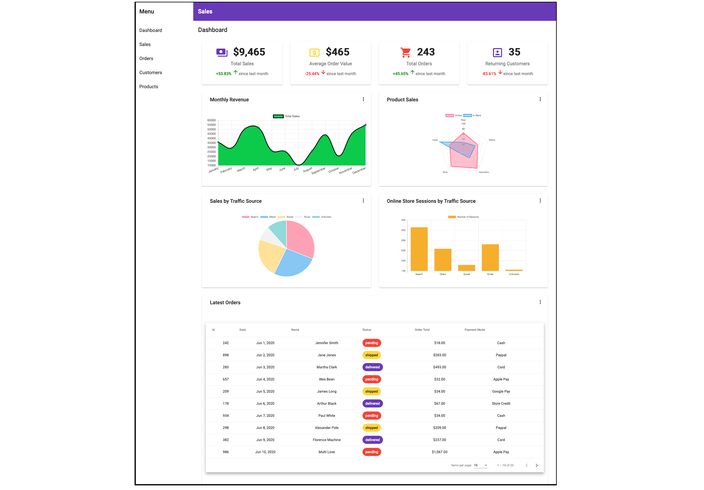
Takeaways
Dashboards take real planning and effort to build. Angular Material and ng2-charts schematics reduce that effort: a single command generates a fully formed component, so a working dashboard comes together quickly and the remaining time goes into data services and their integration with dashboard components.
More on the available schematics: material.angular.io for Angular Material, and the ng2-charts site for ng2-charts.
Further Reading
- Recovering Deleted Files From Your Git Working Tree
- New CSS Viewport Units Do Not Solve The Classic Scrollbar Problem
- Things I Wish I Had Known About Angular When I Started
- Pricing Projects As A Freelancer Or Agency Owner



