

Styling Options In Next.js: How They Fit Together
Next.js presents itself as a framework that gets out of your way, but like any opinionated tool, it has its own conventions. Styling is one area where those conventions matter: the framework supports everything from global stylesheets to CSS-in-JS, but each option plugs into Next's APIs differently. Understanding those integration points is the difference between a smooth setup and a debugging session.
This guide walks through the main styling methods available in Next.js by applying each one to a small Bookshelf demo. You'll see how each approach — Global CSS, SASS/SCSS, CSS Modules, Styled Components, Styled JSX, and Emotion — connects to the Next.js runtime. A demo repository is available with all the components and style files already scaffolded, so you can follow along without starting from scratch.
Prerequisites: Next.js Files You Should Know
Before applying styles, it helps to understand a few Next.js conventions that control how styles are loaded:
_app.js— A custom component in thepagesfolder that Next.js uses to initialize pages. This is where global stylesheets belong._document.js— A custom component that augments the application's<html>and<body>tags. Required because pages don't define surrounding document markup..babelrc— When present, Next.js treats this file as the single source of truth for internal Babel configuration, allowing you to extend it.
If you add _app.js while the dev server is running, restart it for the change to take effect.
Creating a new app is straightforward with create-next-app: install it globally, generate a project called styling-in-next, and run the dev server. The demo repo already contains a components directory and a styles folder with subfolders for each styling method, so you can inspect how each file is organized.
Global CSS: Resets And Normalization
Global styles cover the classic use case of resetting or normalizing CSS so all browsers start from a consistent baseline. Next.js restricts global stylesheet imports to pages/_app.js, which makes sense: if the styles apply everywhere regardless of where they're imported, keeping a single import location avoids surprises.
The demo updates styles/global/globals.css with a Minimal CSS Reset and then imports that file in pages/_app.js:
// pages/_app.js
import "../styles/global/globals.css";

function MyApp({Component, pageProps}) {
  return <Component {...pageProps} />;
}

export default MyApp;
At this stage, the visual changes are subtle — mainly font and spacing adjustments from normalization. The important point is that the import location is fixed: global styles only belong in _app.js.
SASS And SCSS: Preprocessor Support
Next.js also supports SASS with either .sass or .scss extensions, but it requires installing the Sass package first. Like global CSS, SASS stylesheets are imported in pages/_app.js.
The demo styles the first two books with SASS:
styles/scss/bookshelf.scsshandles the overall bookshelf layout.styles/sass/bookone.sassandstyles/sass/booktwo.sassdefine the individual book styles using indentation-based syntax.
Importing all three files in _app.js applies the styles globally. A note for editors: because .sass relies on indentation, a dedicated VSCode extension can simplify formatting and syntax highlighting.
CSS Modules: Component-Scoped Styles
CSS Modules is built into Next.js and activated by naming style files with the .module.css extension. The same works with SASS/SCSS via .module.sass or .module.scss. No extra packages or configuration are needed.
To demo this, the components/BookThree.js component pulls in styles/modules/BookThree.module.css. Class names are accessed like JavaScript property accessors:
// components/BookThree.js
import BookThreeStyles from "../styles/modules/BookThree.module.css";

export default function BookThree() {
  return (
    <div className={BookThreeStyles["book-three"]}>
      <div className="book-info">
        <p className="title">the revolt of the public</p>
        <p className="author">Martin Gurri</p>
      </div>
    </div>
  );
}
Here BookThreeStyles is the imported object, and the bracket notation pulls the specific class defined in the module file. If the selector is referenced correctly, the third book gets its styling.
Emotion: CSS-in-JS With Styled Components
Emotion is a CSS-in-JS library that lets you define styles with JavaScript. Styling the components/BookFour.js component requires installing several packages: @emotion/core, @emotion/styled, emotion, and emotion-server.
The demo defines a styled component in styles/emotion/StyledBookFour.js. After importing styled from @emotion/styled, you call it as styled.div and export the result:
// styles/emotion/StyledBookFour.js
import styled from "@emotion/styled";

export const StyledBookFour = styled.div`
  color: white;
  width: 38px;
  height: 400px;
  margin-left: 20px;
  margin-right: 10px;
  background-color: #2faad2;
  transform: rotate(4deg);
`;
The exported StyledBookFour component is then imported into BookFour.js and used like any other React component:
// components/BookFour.js
import {StyledBookFour} from "../styles/emotion/StyledBookFour";

export default function BookFour() {
  return (
    <StyledBookFour className="book-four">
      <div className="book-info">
        <p className="title">the man died</p>
        <p className="author">wole soyinka</p>
      </div>
    </StyledBookFour>
  );
}
This is what makes Emotion (and similar CSS-in-JS approaches) different from the previous options — the styling lives in the JavaScript layer and can use props, themes, or other runtime values if you need them.
Styled JSX: Zero-Config Component CSS
Styled JSX is Vercel's answer to component-level CSS and requires no extra setup — it ships with Next.js. The components/BookFive.js component demonstrates the internal mode, which uses the jsx prop to scope styles locally:
// components/BookFive.js
export default function BookFive() {
  return (
    <div className="book-five">
      <div className="book-info">
        <p className="title">there was a country</p>
        <p className="author">Chinua Achebe</p>
      </div>
      <style jsx>{`
        .book-five {
          color: #fff;
          width: 106px;
          height: 448px;
          margin-right: 23px;
          background-color: #000;
          transform: rotate(4deg);
        }
      `}</style>
    </div>
  );
}
Passing jsx to the <style/> component means the CSS inside is scoped to <BookFive/> only. Write the selector as you normally would, and the framework handles the rest.
Choosing Between The Options
The choice between these methods isn't about which is objectively better — it's about where you want your styles to live and how much configuration you're willing to manage. Global CSS and SASS are straightforward but manual. CSS Modules give you scoping for free with zero dependencies. Styled JSX offers similar isolation with the least moving parts. Emotion and other CSS-in-JS libraries add runtime power at the cost of extra packages and a Babel presence in your project.
The demo shows all these approaches coexisting in a single app, which is exactly the point: Next.js doesn't force a single styling philosophy. It supports several, and knowing how each one plugs into _app.js, _document.js, and component files is what makes them usable.
Styled-Components: Configuration Matters
Styled-components is another CSS-in-JS solution that, like Emotion, lets you author styles in JavaScript. Unlike global styles or CSS Modules, however, getting it running in Next.js requires a few explicit setup steps.
Start by installing babel-plugin-styled-components alongside styled-components itself.
yarn add babel-plugin-styled-components styled-componentsNext, you need two configuration files at the root and in the pages directory: a .babelrc file and a pages/_document.js file. The before/after comparison shows exactly where each file goes.
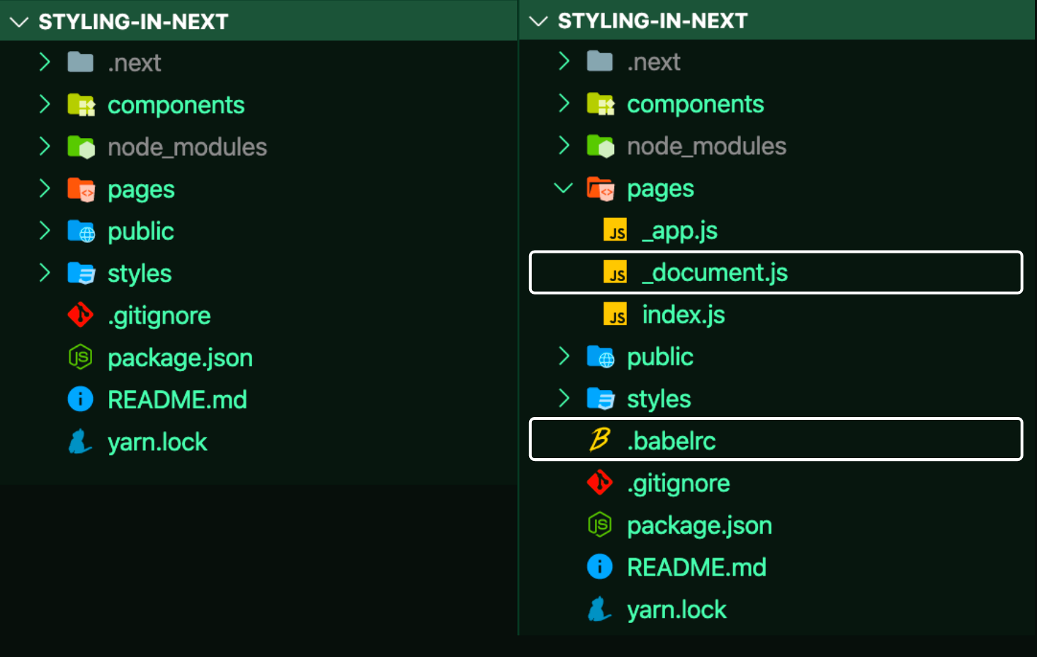 _.document.js and
 .babelrc">_document.js and .babelrc. (Large preview)The .babelrc must include the next/babel preset and enable the styled-components plugin with server-side rendering (ssr) turned on.
// .babelrc
{
  "presets": ["next/babel"],
  "plugins": [
    [
      "styled-components",
      {
        "ssr": true
      }
    ]
  ]
}
The pages/_document.js file is equally important. Its purpose is to inject the server-side rendered styles into the <head>. This snippet is mandatory for styled-components to function with Next.js. There is almost nothing to customize here; you can copy the logic directly from the styled-components documentation for Next.js.
// pages/_document.js
import Document from "next/document";
import {ServerStyleSheet} from "styled-components";

export default class MyDocument extends Document {
  static async getInitialProps(ctx) {
    const sheet = new ServerStyleSheet();
    const originalRenderPage = ctx.renderPage;

    try {
      ctx.renderPage = () =>
        originalRenderPage({
          enhanceApp: (App) => (props) =>
            sheet.collectStyles(<App {...props} />),
        });

      const initialProps = await Document.getInitialProps(ctx);
      return {
        ...initialProps,
        styles: (
          <>
            {initialProps.styles}
            {sheet.getStyleElement()}
          </>
        ),
      };
    } finally {
      sheet.seal();
    }
  }
}
With both files in place, you can start using styled-components. Update styles/styled-components/StyledBookSix.js to define your styled component. Here, styled is the internal utility that converts JavaScript-styled definitions into actual CSS. The resulting <StyledBookSix/> component behaves like any other React component.
// styles/StyledBookSix.js
import styled from "styled-components";

const StyledBookSix = styled.div`
  color: #fff;
  width: 106px;
  height: 448px;
  margin-right: 23px;
  background-color: rebeccapurple;
`;

export default StyledBookSix;
For a deeper dive, see the guide on using styled-components in React.
Finally, import styles/styled-components/StyledBookSix.js into components/BookSix.js and use the imported <StyledBookSix/> in place of the plain markup.
// components/BookSix.js
import StyledBookSix from "../styles/styled-components/StyledBookSix";

export default function BookSix() {
  return (
    <StyledBookSix className="book-six">
      <div className="book-info">
        <p className="title">purple hibiscus</p>
        <p className="author">chimamanda ngozi adichie</p>
      </div>
    </StyledBookSix>
  );
}
After completing these steps, the sixth book should be styled, and the Bookshelf will be complete.

The full, working code is available in the project's GitHub repository.
Wrapping Up
In practice, global styles and styled-components often cover most styling needs in Next.js projects. Each method has its trade-offs, and the right choice depends on your specific requirements. No matter which pattern you pick, remember it all compiles down to standard CSS in the end.
For learning how to set up any of these methods with Next.js, the official documentation is the most reliable starting point. The project repositories also serve as excellent references, but keep in mind that configuration details can change without much fanfare, so it's worth checking for updates.
- Tailwind CSS
- CSS Modules
- Less
- Stylus
- Tailwind CSS with Emotion
- Styletron
- Glamor
- CXS
- Aphrodite
- Fela
- Styled-JSX



