

Storybook as a Component Testing Tool
Storybook is a UI explorer that helps developers test components during development. Instead of switching between browser and code to verify how a component behaves with different props, Storybook provides a live playground where each component state is rendered in isolation. It is particularly useful for building component libraries and documenting UI states, since you can change props, inspect loading states, and test other defined behaviors without modifying the component itself. Before continuing, you should have a working knowledge of React and NPM.
Anatomy of a Story
A story is just an exported function that renders a particular visual state of a component. Stories live in files with a .stories.js extension. A basic story looks like this:
import React from 'react';
import Sample from './x';

export default {
    title: 'Sample story',
    component: Sample
}

export function Story(){
    return (
        <Sample data="sample data" />
    )
}
The key difference from typical React component code is the accompanying default export, which configures the story's title and the target component. Everything else follows the usual React patterns.
Setting Up a Project
To get started, create a new React application and install Storybook:
# Scaffold a new application.
npx create-react-app table-component

# Navigate into the newly created folder.
cd table-component

# Initialise storybook.
npx -p @storybook/cli sb init
Verify the installation by launching both the app and Storybook in separate terminals:
yarn startyarn storybookYou will see the React app on one screen and the Storybook explorer on the other. After installation, delete the default stories that are placed in the src/stories folder.
Your First Story
To understand how stories work, you can write a simple one without needing the React dev server running. First, create a components folder inside src and add a Hello.js file:
import React from 'react';

export default function Hello({name}) {
  return (
    <p>Hello {name}!, this is a simple hello world component</p>
  )
}
This component accepts a name prop. Next, create the corresponding story in src/stories/Hello.stories.js. Start by importing React and the component:
import React from 'react';
import Hello from '../components/Hello.js';
Then set up the default export with the story title and component reference:
export default {
  title: 'Hello Story',
  component: Hello
}
Finally, export your first story function:
export function HelloJoe() {
  return (
    <Hello name="Jo Doe" />
  )
}
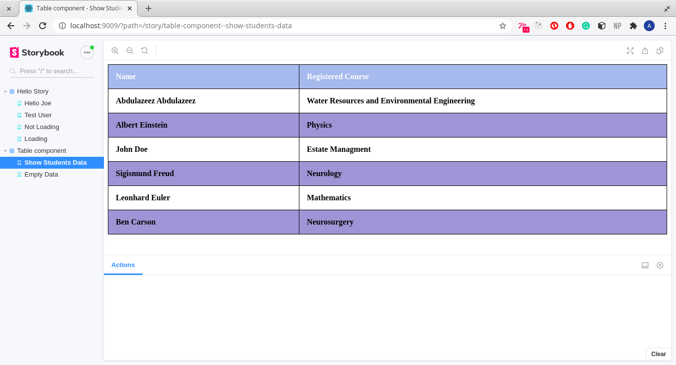
Here, HelloJoe is the story name and its body renders the Hello component with the name set to "Jo Doe". This is equivalent to how you would render the component elsewhere. In the Storybook explorer, the story appears under the title you defined:
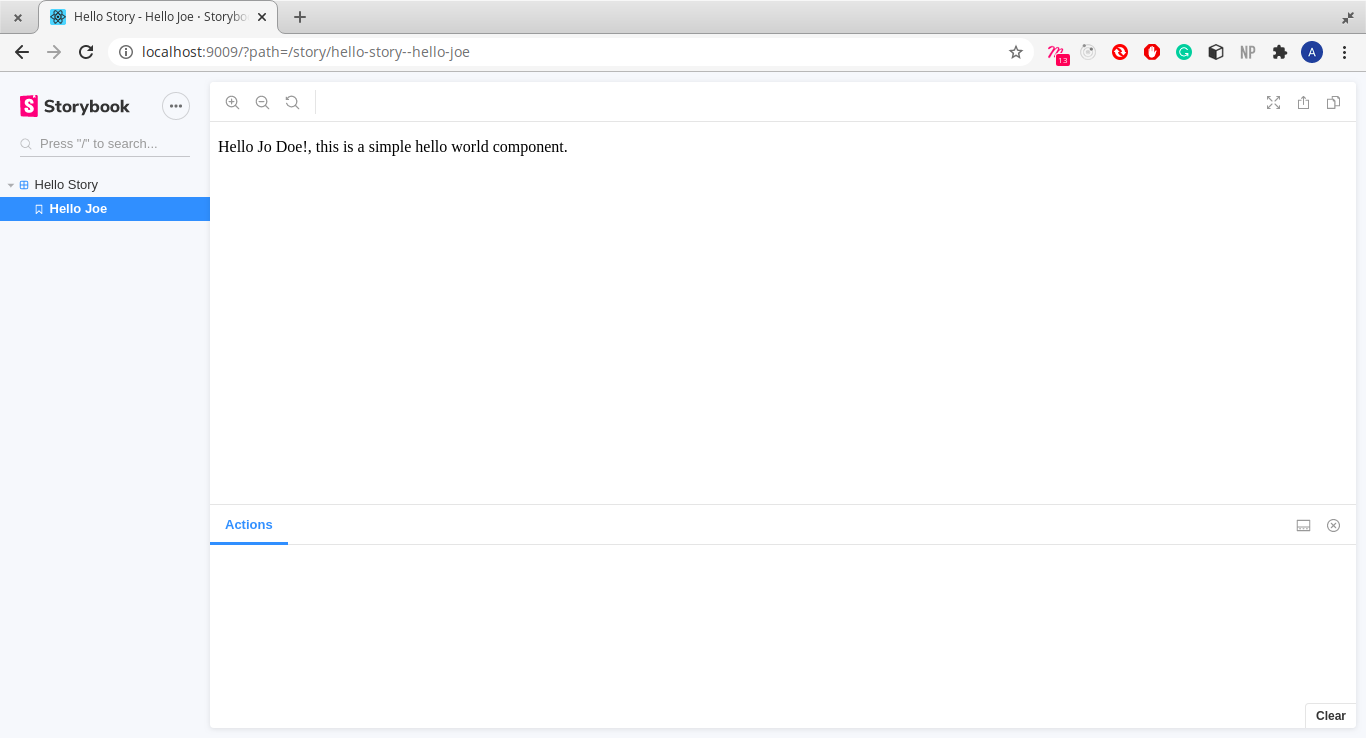
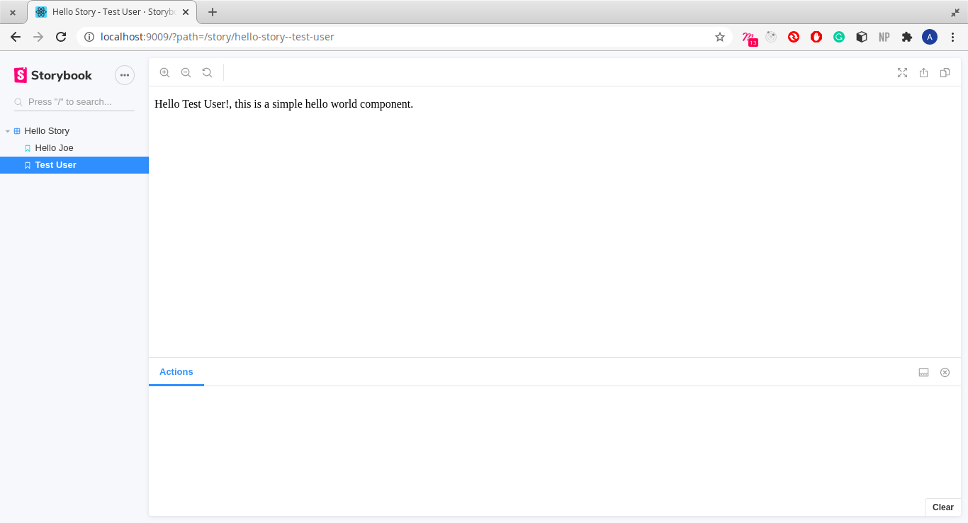
Any additional stories you export with the same title will be listed underneath it. Add another case:
export function TestUser() {
    return (
        <Hello name="Test User" />
    )
}
To demonstrate conditional rendering, add a new component in the same Hello.js file:
function IsLoading({condition}) {
    if (condition) {
        return (
            <p> Currently Loading </p>
        )
    return (
        <p> Here’s your content </p>
    )
}
Now write a story for it in Hello.stories.js:
import Hello, { IsLoading } from '../components/Hello';

export function NotLoading() {
    return (
        <IsLoading loading={false}/>
    )
}

export function Loading() {
    return (
        <IsLoading loading={true} />
    )
}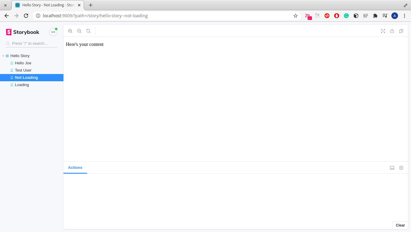
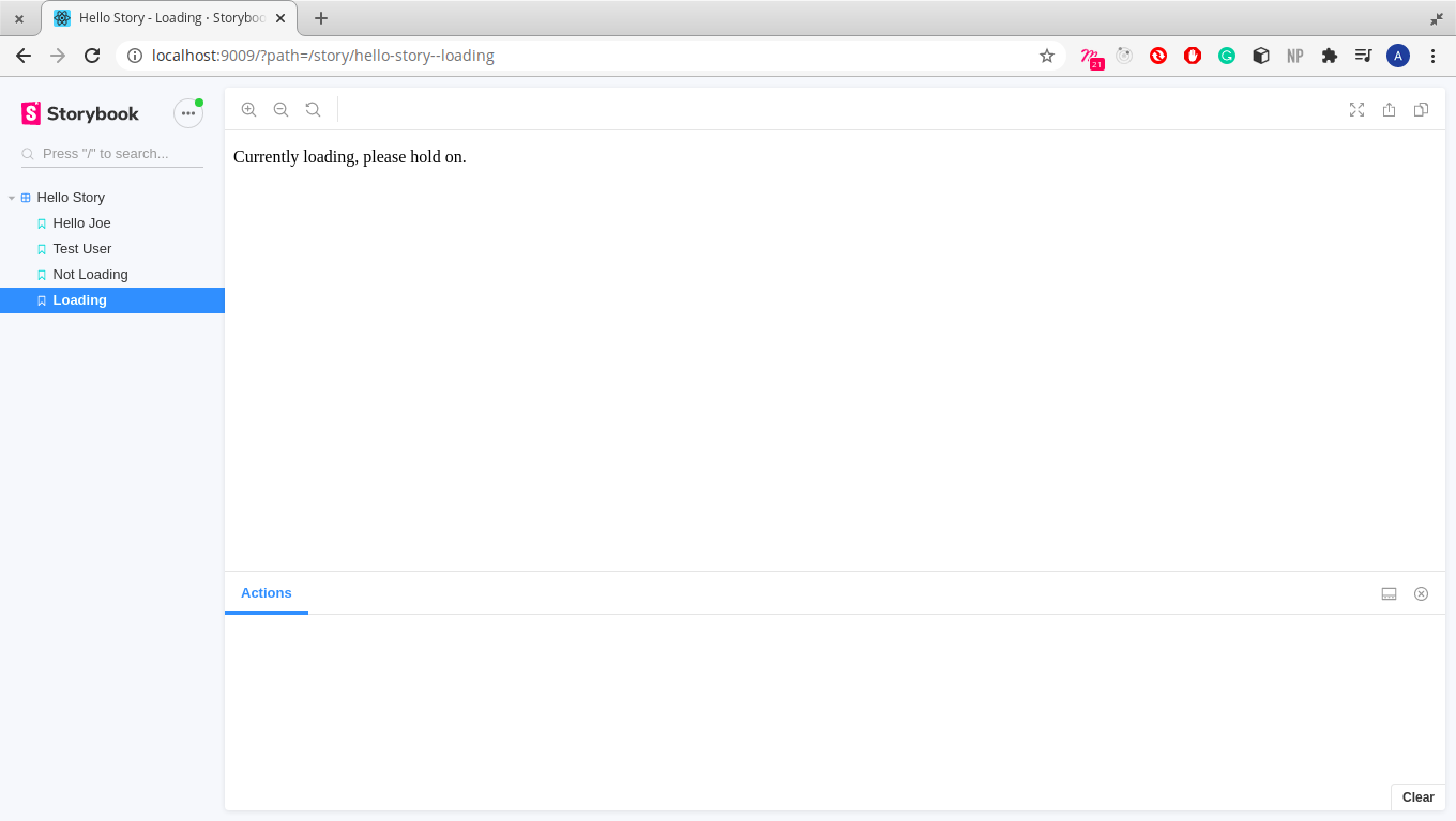
Each story shows a distinct render, confirming that Storybook handles prop-driven variants cleanly.
Building a Table Component
With the basics covered, you can build a more useful component: a table that displays student data. Start by creating Table.js in the src/component folder. The table accepts a data prop, which is an array of objects representing students and their courses.
import React from 'react';

function Table({data}) {
    return ()
}

export default Table
In the render method, define the table structure:
<table>
    <thead>
        <tr>
            <th>Name</th>
            <th>Registered Course</th>
        </tr>
    </thead>
    <tbody>
    {data}
    </tbody>
</table>
Since objects are not valid children in React, you need a helper component to render each row. Define RenderTableData right after Table:
function RenderTableData({data}){
    return (
        <>
            {data.map(student => (
                <tr>
                    <td>{student.name}</td>
                    <td>{student.course}</td>
                </tr>
            ))}
        </>
    )
}
The helper maps over the data array and renders the records as individual table cells. Then update the table body to use it, with a fallback message when there is no data:
{data}{data
?
<RenderTableData data={data} />
:
<tr>
<td>No student data available</td>
<td>No student data available</td>
</tr>
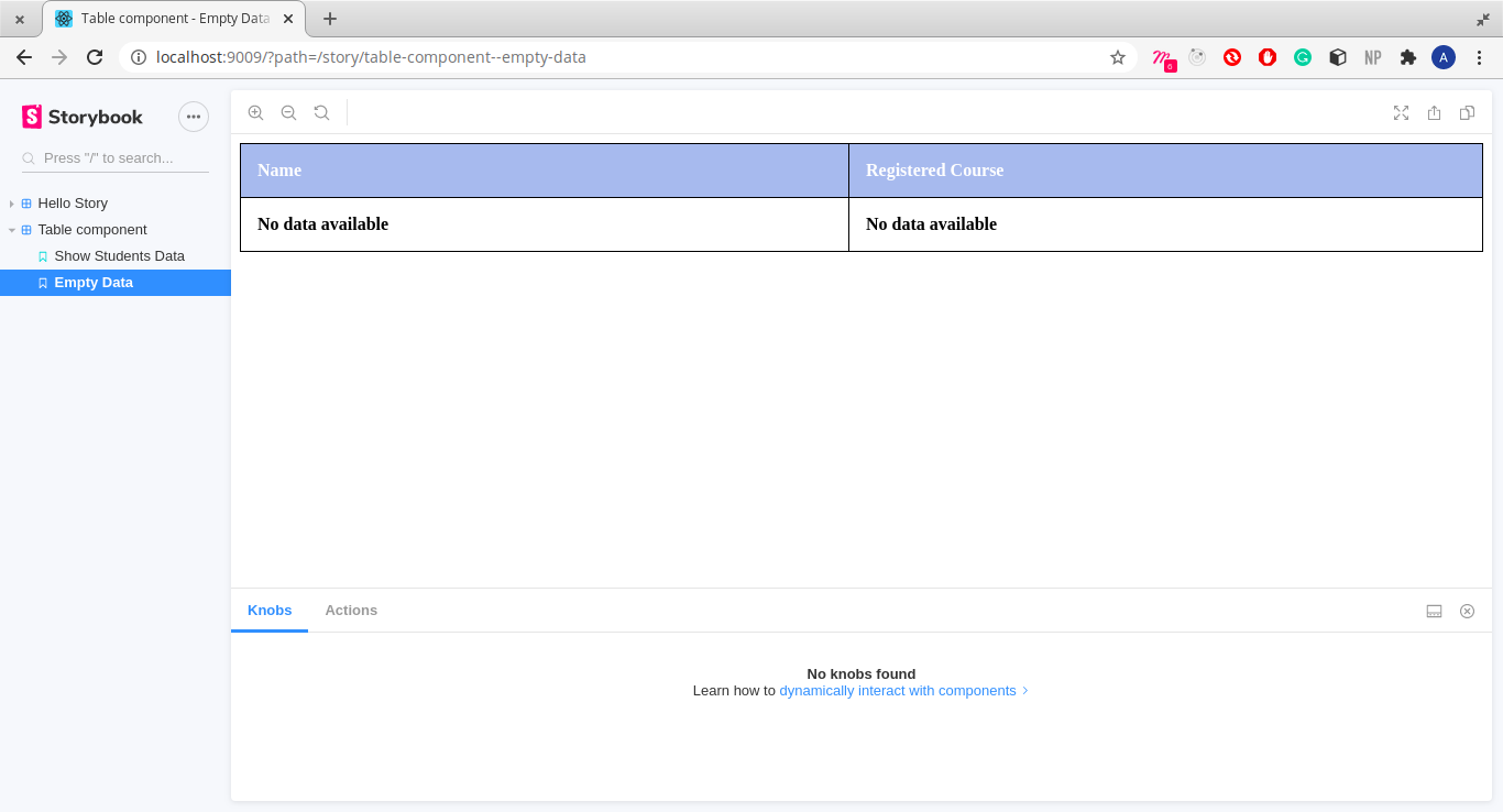
}If the array is populated, the student data is rendered; otherwise, the table shows "No student data available". To finish the component, add a stylesheet named style.css in the components folder and import it:
body{
    font-weight: bold;
}
table {
    border-collapse: collapse;
    width: 100%;
}
table, th, td {
    border: 1px solid rgb(0, 0, 0);
    text-align: left;
}
tr:nth-child(even){
    background-color: rgb(151, 162, 211);
    color: black;
}
th {
    background-color: rgba(158, 191, 235, 0.925);
    color: white;
}
th, td {
    padding: 15px;
}
import './style.css'
Writing Stories for the Table
Create Table.stories.js in the stories folder to test both outcomes. Start with the imports and a default export:
import React from 'react';
import Table from '../components/Table';

export default {
    title: 'Table component',
    component: Table
}
Define some dummy data:
const data = [
    {name: 'Abdulazeez Abdulazeez', course: 'Water Resources and Environmental Engineering'},
    {name: 'Albert Einstein', course: 'Physics'},
    {name: 'John Doe', course: 'Estate Managment'},
    {name: 'Sigismund Freud', course: 'Neurology'},
    {name: 'Leonhard Euler', course: 'Mathematics'},
    {name: 'Ben Carson', course: 'Neurosurgery'}
]
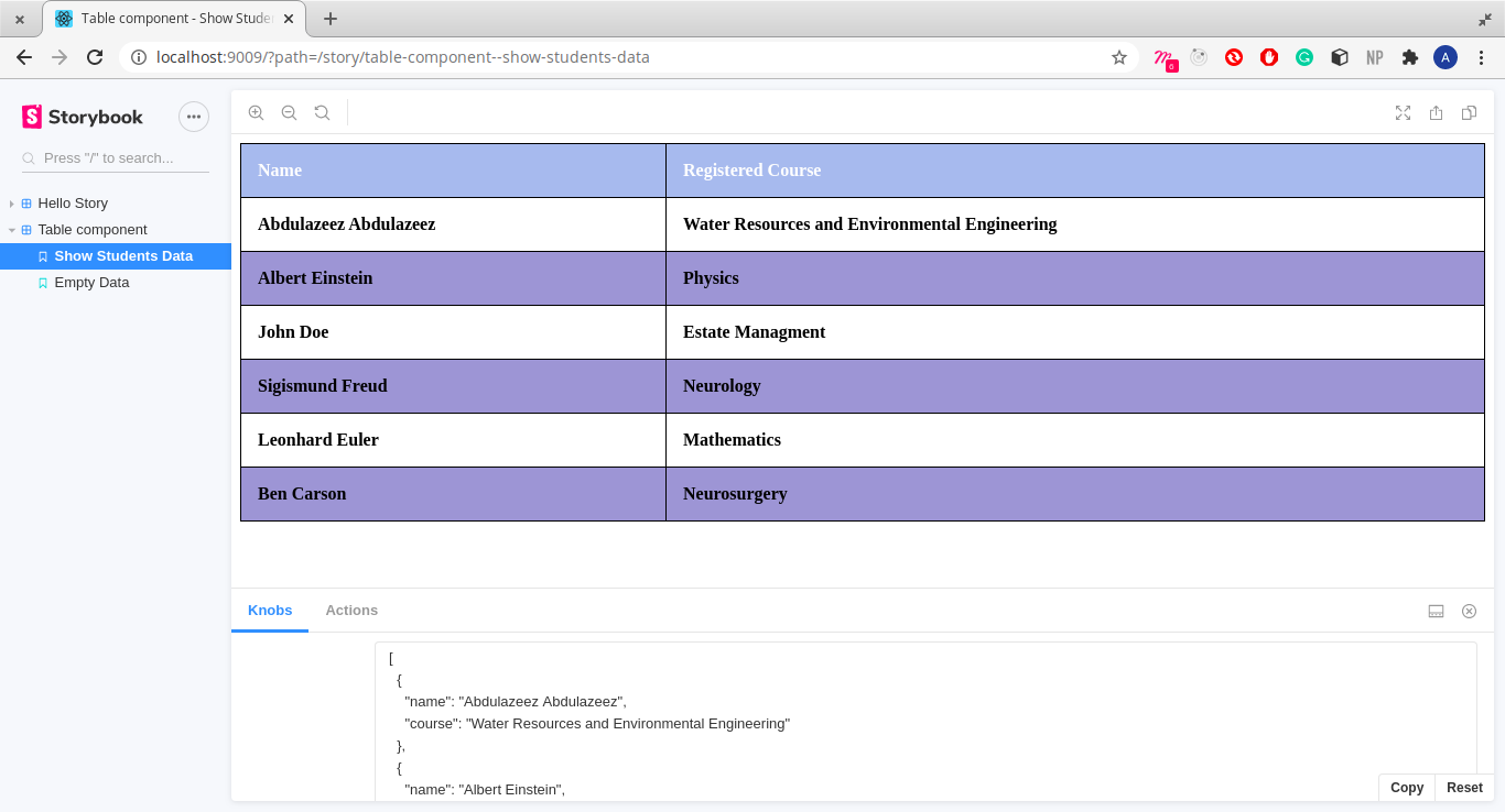
The first story, ShowStudentsData, passes that data to the table:
export function ShowStudentsData() {
    return (
        <Table data={data} />
    )
}
The second story, EmptyData, leaves the data array empty so you can verify the fallback message:
export function EmptyData(){
    return (
        <Table />
    )
}
Working with Addons
Storybook can be extended with addons—optional packages that add extra functionality to your stories. Some addons are provided by default, but you can also install or build your own. A common category is decorator addons, which wrap a story with extra rendering logic.
"A decorator is a way to wrap a story in extra 'rendering' functionality. Many addons define decorators in order to augment your stories with extra rendering or gather details about how your story is rendered." — Storybook docs
Using the Knobs Addon
The knobs addon is a decorator that lets you alter component props directly in the Storybook interface, without touching the source code. This saves you from manually editing story files every time a value changes.
Install the addon as a separate package:
yarn add -D @storybook/addon-knobsRestart your Storybook instance. Then register the addon in .storybook/main.js under the addons array:
module.exports = {
    stories: ['../src/**/*.stories.js'],
    addons: [
        '@storybook/preset-create-react-app',
        '@storybook/addon-actions',
        '@storybook/addon-links',
        '@storybook/addon-knobs' // Add the knobs addon.
    ],
};
In your table story, import the object decorator from the knobs package. You use object because the student data is an object.
import { withKnobs, object } from '@storybook/addon-knobs';Add the decoration in the default export:
decorators: [withKnobs]export default {
title: 'Table component',
component: Table,
decorators: [withKnobs]
}Finally, modify the ShowStudentsData story to use the knob. Before:
<Table data={data}/>After:
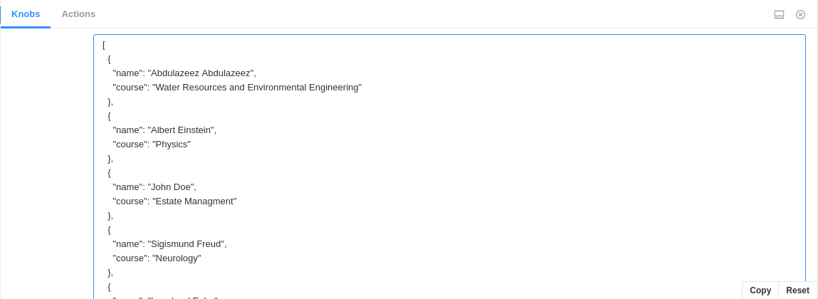
<Table data={object('data', data)}/>The first argument to object() is the display name in the knobs panel—here, it is "data". The Storybook explorer now includes a knobs panel where you can edit, add, or remove entries from the data object without changing the story file.
What You Have Learned
You can now use Storybook to build and test React components in real time. Starting with a simple component and then a full student table, you have seen how to create stories for different prop states and how to use an addon to make data editing interactive. The complete code for this walkthrough is available in the accompanying GitHub repository.


