

Building a Real-Time Code Editor With CodeMirror
A web-based code editor that renders output live is a practical tool for quick experiments when you don't have access to a desktop editor, and it's also a solid foundation for larger platforms that need embedded editing functionality. This walkthrough shows how to put one together with React and the CodeMirror library.
Before we start, you should be comfortable with React hooks, functional components, component structure, and props.
Why CodeMirror
CodeMirror is a JavaScript text editor built specifically for code editing in the browser. It provides language modes for syntax highlighting and a collection of add-ons for more advanced behavior. The library also exposes a programming API and theming system, so you can tailor the editor to your app's look and needs. Combined with React, it gives us everything required to create an editor that updates the preview as you type.
Setting Up the Project
Start by scaffolding a new React application named code_editor:
npx create-react-app code_editorThen move into the project directory:
cd code_editorWe need two packages for this editor: codemirror and react-codemirror2. Install both now:
npm install codemirror react-codemirror2Reusable Tab Buttons
The editor will have three tabs, one for each language: HTML, CSS, and JavaScript. Instead of writing three separate button elements, we'll build a reusable Button component.
Create a folder named components inside src, and inside that folder create Button.jsx:
import React from 'react'
const Button = ({title, onClick}) => {
  return (
    <div>
      <button
        style={{
          maxWidth: "140px",
          minWidth: "80px",
          height: "30px",
          marginRight: "5px"
        }}
        onClick={onClick}
      >
        {title}
      </button>
    </div>
  )
}
export default Button
This component does the following:
- It is a functional component that gets exported.
- It destructures
titleandonClickfrom the component's props.titleis a text string;onClickis a callback that runs when the button is pressed. - It applies inline styles to the
buttonelement to make buttons look decent. - It attaches the destructured
onClickfunction as the button's click handler. - It renders
{title}as the label, so the text is set by whichever prop is passed in at each usage site.
With the component in place, open App.js and import it:
import Button from './components/Button';We now need state to keep track of which tab is open. Use the useState hook to store the name of the active editor tab:
import React, { useState } from 'react';
import './App.css';
import Button from './components/Button';

function App() {
  const [openedEditor, setOpenedEditor] = useState('html');
  return (
    <div className="App">
    </div>
  );
}
export default App;
The state default value is 'html', so the HTML editor shows first. Only one tab can be visible at a time, so switching requires a function that updates the state based on which tab is clicked. Here's the onTabClick handler:
import React, { useState } from 'react';
import './App.css';
import Button from './components/Button';

function App() {
  ...

  const onTabClick = (editorName) => {
    setOpenedEditor(editorName);
  };

  return (
    <div className="App">
    </div>
  );
}
export default App;
The function argument is the name of the tab being selected, supplied at each call site.
Rendering the Tab Buttons
Now add three Button instances for the three editors:
<div className="App">
      <p>Welcome to the editor!</p>
      <div className="tab-button-container">
        <Button title="HTML" onClick={() => {
          onTabClick('html')
        }} />
        <Button title="CSS" onClick={() => {
          onTabClick('css')
        }} />
        <Button title="JavaScript" onClick={() => {
          onTabClick('js')
        }} />
      </div>
    </div>
To summarize what's happening here:
- A
ptag provides context about the application. - A
divwraps the tab buttons; it carries the classtab-button-container, which we'll style later inApp.css. - Three
Buttoncomponents are declared. Each receives the two required props:titlefor the label andonClickset toonTabClickwith the matching editor name.
Now use the JavaScript ternary operator to show only the section associated with the current value of openedEditor:
...
return (
    <div className="App">
      ...
      <div className="editor-container">
        {
          openedEditor === 'html' ? (
            <p>The html editor is open</p>
          ) : openedEditor === 'css' ? (
            <p>The CSS editor is open!!!!!!</p>
          ) : (
            <p>the JavaScript editor is open</p>
          )
        }
      </div>
    </div>
  );
...
The logic reads like this: if the state is 'html', display the HTML section; if it is 'css', display the CSS section; otherwise the value must be 'js', so display the JavaScript section. Currently placeholder p tags stand in for the actual editors; those will be swapped in later.
At this stage, clicking a tab button updates the state and switches the visible section. The app looks like this so far:
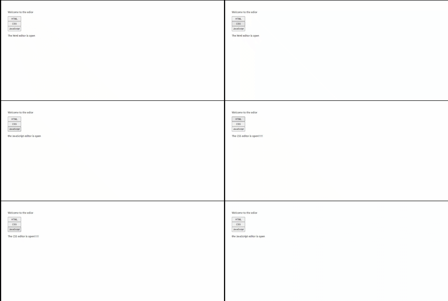
The buttons appear stacked in a column, so let's change that. In App.css, add rules for the wrapper to display it as a flex row:
.tab-button-container{
  display: flex;
}
The tab-button-container class now lays out its children in a horizontal line:
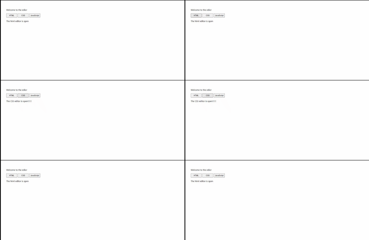
That's the infrastructure established: three tab buttons, each switching the display to its corresponding editor panel. Next we'll build the editor components themselves and replace the placeholder p tags with real CodeMirror instances.
Building the Reusable Editor Component
With the CodeMirror libraries installed, create an Editor.jsx file inside the components folder and start with the imports and component shell:
import React, { useState } from 'react';
import 'codemirror/lib/codemirror.css';
import { Controlled as ControlledEditorComponent } from 'react-codemirror2';

const Editor = ({ language, value, setEditorState }) => {
  return (
    <div className="editor-container">
    </div>
  )
}
export default Editor
The component imports React and the useState hook, pulls in CodeMirror’s CSS, and imports Controlled from react-codemirror2, aliased as ControlledEditorComponent for clarity. The return statement currently holds an empty div with a class name.
From the props, the component destructures language, value, and setEditorState. These are supplied at each usage of the editor inside App.js.
Next, wire up the ControlledEditorComponent:
import React, { useState } from 'react';
import 'codemirror/lib/codemirror.css';
import 'codemirror/mode/xml/xml';
import 'codemirror/mode/javascript/javascript';
import 'codemirror/mode/css/css';
import { Controlled as ControlledEditorComponent } from 'react-codemirror2';

const Editor = ({ language, value, setEditorState }) => {
  return (
    <div className="editor-container">
      <ControlledEditorComponent
        onBeforeChange={handleChange}
        value= {value}
        className="code-mirror-wrapper"
        options={{
          lineWrapping: true,
          lint: true,
          mode: language,
          lineNumbers: true,
        }}
      />
    </div>
  )
}
export default Editor
CodeMirror identifies the target language through “modes.” Three modes are imported here because the project uses three editors:
- XML: Handles HTML and is referred to as XML mode.
- JavaScript: Imported from
codemirror/mode/javascript/javascript. - CSS: Imported from
codemirror/mode/css/css.
Since the editor is reusable, its mode isn't hard-coded. Instead, the language prop supplies the mode, while the actual imports must still exist for the modes to function. Inside ControlledEditorComponent, the key attributes are:
onBeforeChange: Fires on every write or deletion in the editor, functioning like anonChangehandler. It is used to capture the editor's current value and persist it to state.value = {value}: The current editor content, fed from a state variable via the destructured prop.className="code-mirror-wrapper": A style class provided by CodeMirror’s own CSS.options: An object holding editor configuration, which includeslineWrapping: truefor soft-wrapping,lint: trueto enable linting,mode: languageto apply the correct language mode, andlineNumbers: trueto display line numbers.
Implement the change handler next:
const handleChange = (editor, data, value) => {
    setEditorState(value);
}
The onBeforeChange callback receives editor, data, and value. Only value is needed, as it is passed to the setEditorState prop—each state variable holding the contents of its respective editor.
Selecting Editor Themes
CodeMirror offers various themes, demos of which are available on its official site. Add a dropdown to the component so users can switch themes. Five themes are included in this tutorial, but more can be added.
Import the chosen themes:
import 'codemirror/theme/dracula.css';
import 'codemirror/theme/material.css';
import 'codemirror/theme/mdn-like.css';
import 'codemirror/theme/the-matrix.css';
import 'codemirror/theme/night.css';
Create an array listing those imports:
const themeArray = ['dracula', 'material', 'mdn-like', 'the-matrix', 'night']Add a state hook to manage the selected theme, defaulting to dracula:
const [theme, setTheme] = useState("dracula")Then build the dropdown UI:
...
return (
    <div className="editor-container">

      <div style={{marginBottom: "10px"}}>
        <label for="cars">Choose a theme: </label>
        <select name="theme" onChange={(el) => {
          setTheme(el.target.value)
        }}>
          {
            themeArray.map( theme => (
              <option value={theme}>{theme}</option>
            ))
          }
        </select>
      </div>
    // the rest of the code comes below...
    </div>
  )
...
The code uses a label element for the dropdown’s caption and a select with option children. Each option is generated by mapping over themeArray. The select element includes an onChange handler that reads the chosen option and calls setTheme so the state updates accordingly.
To apply the selected theme to the editor, pass it inside the options object in ControlledEditorComponent, setting theme to the current state value:
<ControlledEditorComponent
  onBeforeChange={handleChange}
  value= {value}
  className="code-mirror-wrapper"
  options={{
    lineWrapping: true,
    lint: true,
    mode: language,
    lineNumbers: true,
    theme: theme,
  }}
/>
The complete Editor.js component now looks like this:
import React, { useState } from 'react';
import 'codemirror/lib/codemirror.css';
import 'codemirror/theme/dracula.css';
import 'codemirror/theme/material.css';
import 'codemirror/theme/mdn-like.css';
import 'codemirror/theme/the-matrix.css';
import 'codemirror/theme/night.css';
import 'codemirror/mode/xml/xml';
import 'codemirror/mode/javascript/javascript';
import 'codemirror/mode/css/css';
import { Controlled as ControlledEditorComponent } from 'react-codemirror2';

const Editor = ({ language, value, setEditorState }) => {
  const [theme, setTheme] = useState("dracula")
  const handleChange = (editor, data, value) => {
    setEditorState(value);
  }
  const themeArray = ['dracula', 'material', 'mdn-like', 'the-matrix', 'night']
  return (
    <div className="editor-container">
      <div style={{marginBottom: "10px"}}>
        <label for="themes">Choose a theme: </label>
        <select name="theme" onChange={(el) => {
          setTheme(el.target.value)
        }}>
          {
            themeArray.map( theme => (
              <option value={theme}>{theme}</option>
            ))
          }
        </select>
      </div>
      <ControlledEditorComponent
        onBeforeChange={handleChange}
        value= {value}
        className="code-mirror-wrapper"
        options={{
          lineWrapping: true,
          lint: true,
          mode: language,
          lineNumbers: true,
          theme: theme,
        }}
      />
    </div>
  )
}
export default Editor
Add the single custom class style to App.css:
.editor-container{
  padding-top: 0.4%;
}
Integrating Editors into App.js
First, import the editor component:
import Editor from './components/Editor';Declare state variables that will hold the content for the HTML, CSS, and JavaScript editors:
const [html, setHtml] = useState('');
const [css, setCss] = useState('');
const [js, setJs] = useState('');
Replace the placeholder paragraph tags used for the conditional renderings with the new editor components, passing each one its corresponding language, value, and setEditorState props:
function App() {
  ...
  return (
    <div className="App">
      <p>Welcome to the edior</p>

      // This is where the tab buttons container is...

      <div className="editor-container">
        {
          htmlEditorIsOpen ? (
            <Editor
              language="xml"
              value={html}
              setEditorState={setHtml}
            />
          ) : cssEditorIsOpen ? (
            <Editor
              language="css"
              value={css}
              setEditorState={setCss}
            />
          ) : (
            <Editor
              language="javascript"
              value={js}
              setEditorState={setJs}
            />
          )
        }
      </div>
    </div>
  );
}
export default App;
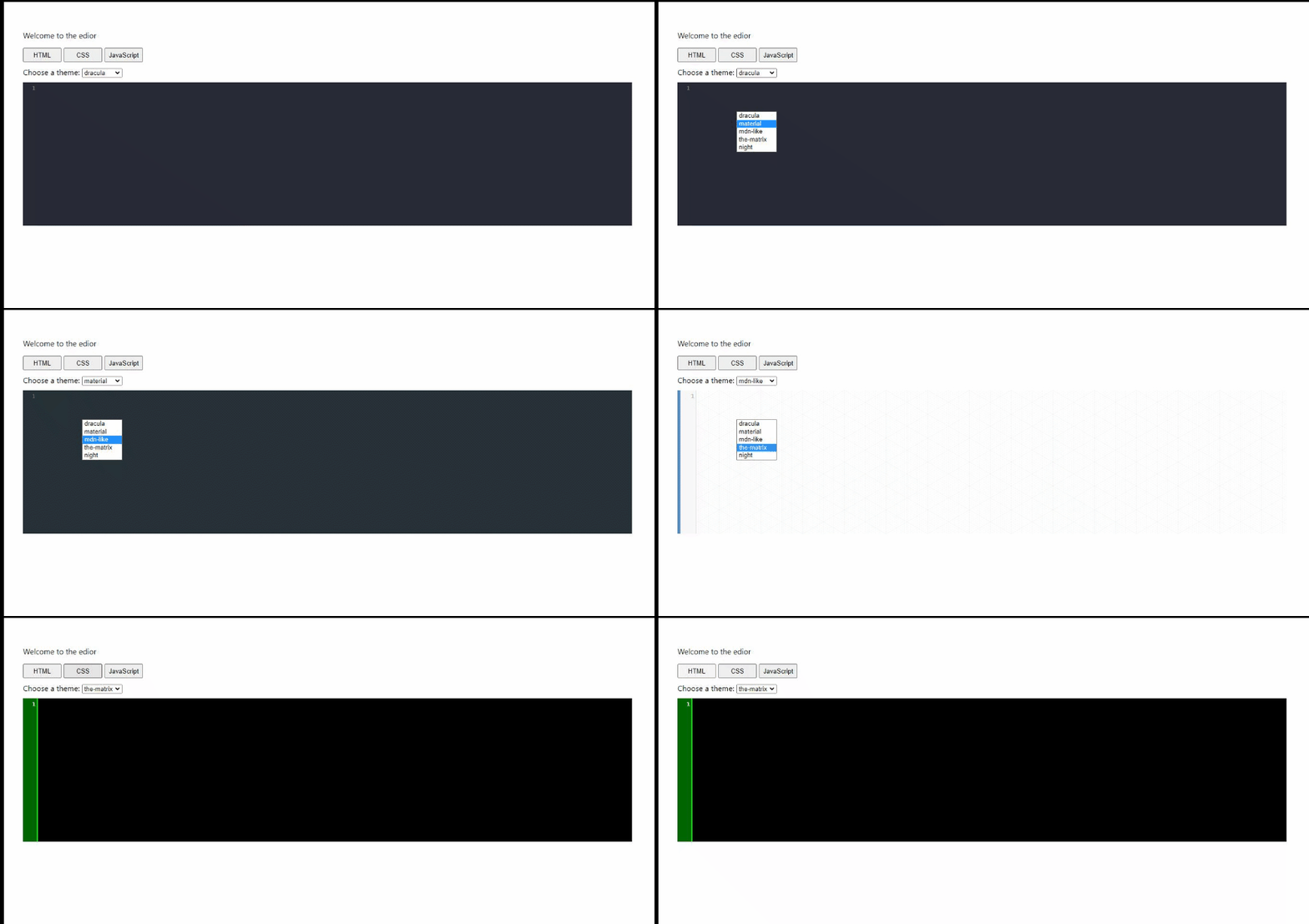
Each editor instance now maps to the correct state setter. The application currently renders the three editors alongside the tab switcher:
Displaying Output With Iframes
To preview the code being written, the app will rely on inline frames. An iframe embeds a separate HTML page into the current page. React usage doesn't change much beyond converting attribute names to camelCase—so srcdoc becomes srcDoc in JSX.
Iframes remain widely useful, though the emerging Portals proposal aims to address some of their limits—notably, the lack of a unique URL for embedded content in the browser’s address bar. Portals can feel like an iframe but can animate into and take over the full browser window. That feature isn't part of this tutorial, but is worth investigating separately.
Embedding the Output Inside an Iframe
The result produced by our HTML, CSS, and JS editors needs a container. We can achieve that with an iframe that pulls its content from a piece of React state rather than an external URL.
return (
    <div className="App">
      // ...
      <div>
        <iframe
          srcDoc={srcDoc}
          title="output"
          sandbox="allow-scripts"
          frameBorder="1"
          width="100%"
          height="100%"
        />
      </div>
    </div>
  );
The iframe makes use of several specific attributes:
srcDoc: This camelCase property is how React exposes iframe content. Unlikesrc, which loads an external page,srcDoclets us pass an entire HTML document as a string. We’ll create that document from our editor states soon.title: Provides an accessible description of the iframe’s contents.sandbox: We set this toallow-scriptsto let JavaScript run inside the result frame, which is necessary for our JS editor’s output to work.frameBorder: Defines the iframe’s border thickness.widthandheight: Defines the iframe dimensions.
Notice that we’ve wired the srcDoc attribute to a value called srcDoc. We need to declare this state with the useState() hook, alongside our other editor states in App.js.
const [srcDoc, setSrcDoc] = useState(` `);With the state declared, our next task is to populate it whenever the code in any of the editors changes. We also want to avoid a full re-render on every single keystroke.
Synchronizing the Result with Debounced Updates
The useEffect() hook is the ideal tool for watching our editor states and trigger an update of the iframe’s document. First, we need to import the hook.
import React, { useState, useEffect } from 'react';Now we can define the effect that runs any time the html, css, or js state values change.
useEffect(() => {
    const timeOut = setTimeout(() => {
      setSrcDoc(
        `
          <html>
            <body>${html}</body>
            <style>${css}</style>
            <script>${js}</script>
          </html>
        `
      )
    }, 250);
    return () => clearTimeout(timeOut)
  }, [html, css, js])
The effect uses an essential performance measure: a setTimeout() of 250 milliseconds. Without this delay, the iframe would be rebuilt on every single key press. Instead, the timer resets each time a key is pressed, so the iframe only updates after the user has been idle for a quarter of a second. Long-running or rapid typing avoids a flood of expensive updates.
Once the delay elapses, we call setSrcDoc() with the composed HTML template. This template wraps the html state inside tags, the css state inside a