
Extending grid lines through nested elements
CSS Grid originally had a significant constraint: only a grid container's direct children could be placed on its tracks. Subgrid changes that by letting a grid item pass its parent's tracks down to its own descendants.
This matters beyond convenience. For nested markup — a <ul> of <li> items, a <figure> paired with a <figcaption> — subgrid removes the trade-off between semantic HTML and direct participation in the layout.
A portfolio layout, flat and nested
Take a simple portfolio mockup: a header spanning two rows, plus a collection of images filling out the remaining columns. A flat grid handles it directly, with every participant as a child of the .grid container. The resulting structure is a 4x2 grid.
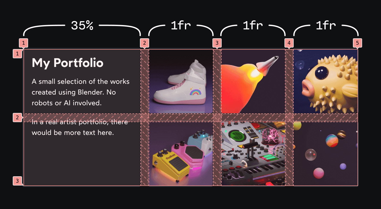
The HTML for that version, though, is semantically awkward. Images displayed as a collection ought to live in a list, both for assistive technologies and for search engines. Wrapping them in a <ul>, however, breaks the layout: the entire list collapses into a single cell in the second column, leaving the final two columns empty.
Subgrid fixes this by extending the parent grid through the <ul> so each list item can occupy its own cell.
- The
<ul>usesgrid-columnandgrid-rowto span three columns and two rows, declaring which portion of the grid its descendants may share. display: gridon the<ul>creates the child grid.grid-template-rowsandgrid-template-columnspass along the track definitions, with thesubgridkeyword linking the two grids so every<li>lands in its own cell.
Subgrid is not the only escape hatch
This is the scenario most people picture when they first hear about subgrid: nested semantic elements blocking direct grid placement. It is a genuinely useful fix.
But it is not the only fix. The same result is achievable by combining a Flexbox row with a nested grid, rather than sharing one grid template across both levels:
<style>
  /* Instead of CSS Grid, the parent uses Flexbox */
  .wrapper {
    display: flex;

    /* The first child uses 35% of the available size: */
    header {
      flex-basis: 35%;
    }

    /*
      The <ul> fills the rest of the Flex row,
      and creates a 3-column grid for its children:
    */
    .grid {
      flex: 1;
      display: grid;
      grid-template-columns: 1fr 1fr 1fr;
    }
  }
</style>

<div class="wrapper">
  <header>
    <h1>My Portfolio</h1>
    <p>
      A small selection of the works created using Blender. No robots or AI involved.
    </p>
    <p>
      In a real artist portfolio, there would be more text here.
    </p>
  </header>

  <ul class="grid">
    <img src="/img/thumb-sneakers.jpg" />
    <img src="/img/thumb-rocket.jpg" />
    <img src="/img/thumb-fish.jpg" />
    <img src="/img/thumb-guitar-pedals.jpg" />
    <img src="/img/thumb-machine.jpg" />
    <img src="/img/thumb-particles.jpg" />
  </ul>
</div>
In this case that alternative is arguably simpler. The more interesting territory lies elsewhere, in card designs and similar components where a single shared track structure is not just convenient but necessary.
A card layout built on shared tracks
Consider a card design for an artist portfolio:

The render shown here — "Bret's Dead Fish" — was created for the Animation Design module of the Whimsical Animations course. The fish is a nod to Bret Victor's talk, "Stop Drawing Dead Fish", which the course references.


